This is an Eval Central archive copy, find the original at freshspectrum.com.
In today’s blog post I’ll show you a contemporary approach to annual report design. Instead of ending up with 1 report, you’ll end up with 5, each designed to meet a separate need.
At the end of this process you will have 5 different styles of report.
- An Annual Report Slidedoc.
- A Presentation Deck.
- A set of 2 pagers.
- A set of Micrographics.
- An Interactive Online Report.
But before we jump into design, let’s first talk about the big design challenge and a few rules for reducing reporting frustration.
How do we write more reports without requiring a lot more time, effort, and expense?
This is our big design challenge. It’s the question I always get after I suggest that should focus as much, if not more, on writing more reports instead of just better reports.
To reach overwhelmed audiences we need to deliver the right amount of information at the right time. Yes, all the information your audiences need might exist inside your big “well-designed” pdf report. But overwhelmed people rarely even attempt to read long pdfs.
If we really want to reach these audiences, we need to offer our reporting through different mediums and communication channels. But to do that effectively, without spending lots more time and money, we need to change how we approach reporting.
That starts by reducing some of the frustration that creates time-sucks.
How to reduce reporting frustration.
First, understand that there is a difference between project documentation and reporting.
Documentation is about systematically describing the work. There are all sorts of reasons why this is an important thing to do, especially for researchers and evaluators whose work might face public scrutiny.
Reporting is about translating your work in a way to communicate it to a specific audience.
If you try to do both things with one document, you are likely going to fail at both challenges. This is what leads to a document that is too long for an audience but too short to act as proper project documentation.
Instead, I suggest treating these as different challenges. Write your project documentation in a Word Doc or Google Doc without a lot of worry about design. Just use simple headers, and don’t worry about being too concise. Unlike your reporting, your documentation might never be seen by an audience. And if it is, that audience will likely be small.
Second, reporting requires multitasking.
Almost any good report will require design, writing, and illustration.
Most amateur report creators try to do these three things simultaneously. They will write, tweak tables, move text around, visualize data, and add illustration as they go. As with most multitasking, this is a bad idea. It takes away the proper attention required for each step and forces you to focus only on the current part you are working on, and not the whole.
I approach these three things as separate tasks.
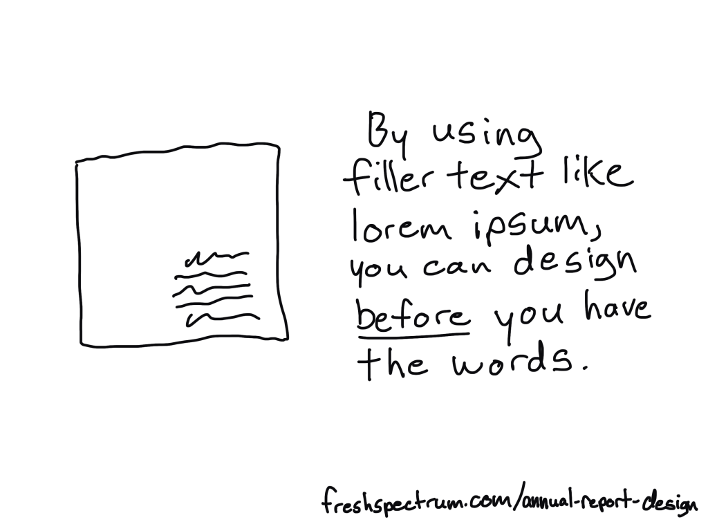
You can design before you have the content ready. I use filler text (lorem ipsum) and design individual page spreads based on target page counts and the anticipated amount of charts/visuals we plan to use.
You can, and should, let the design influence your report writing. This means sometimes writing with word counts in mind, or to meet structural needs of the report. But you should not adjust the design as you write. In fact, it’s usually better to write outside of the design in a separate document then merge them together later.
The illustration step is my last one. Even when I write these blog posts, I write them first and illustrate later. That way I can use illustrations strategically and really pair each one with the written text.
The 5 in 1 report design approach.
Our goal is to approach report design in a way that minimizes the required effort. Instead of treating each individual report type as a separate design, we look at the design holistically.
We start with the more comprehensive report design, then work our way down through the different adaptations. Personally, through my work with ReportPress, I would start with the interactive online report.
But considering you are likely NOT a web designer like I am, I would suggest starting with the Annual Report Slidedoc. This is the most comprehensive.
Step 1. Annual Report Slidedoc Design
I have written about slidedocs in the past, so if you are interested in the approach you should check out that blog post.
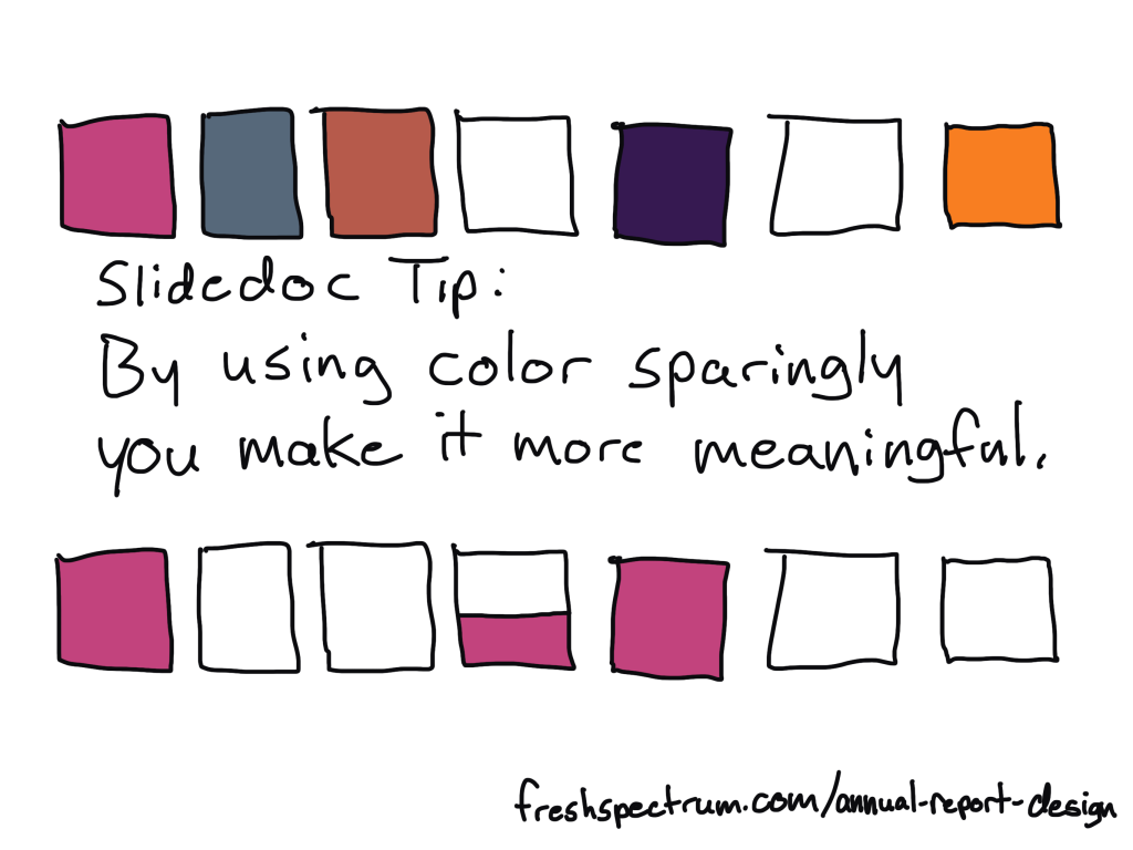
In short, I suggest using Canva or PowerPoint to design your slidedoc. It should be widescreen. Most of your readers will view pdfs on either a laptop or desktop screen, so this format takes advantage of the screen dimensions and limits unnecessary scrolling.
Don’t overload the slides, there is no trophy for having the fewest pages. As with any modern design that is read on a screen, your goal is efficiency in comprehension. It is better to be easy to flip through and read than it is to be short on page count.
I’ll have more guides on creating these styles of reports in the future, along with templates you can use, so if you are not currently following me by email you should join us.
Step 2. Presentation Deck Adaptation
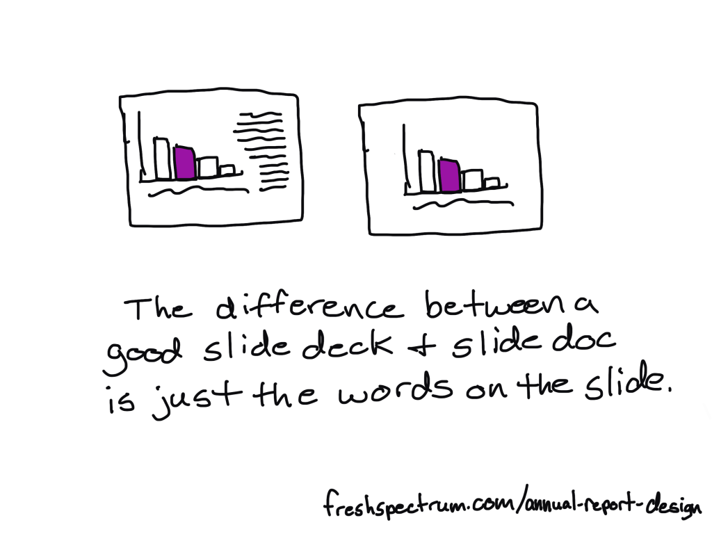
If you approach your slidedoc reporting like you are creating a presentation without the presenter, this first adaptation is simple.
Just make a copy of the slidedoc and remove most of the text. As a presenter, whether by webinar or live in-person, you are going to deliver all the talking points. The report itself can keep the same pace.
If you need to shorten the presentation, remove slides. If you need to focus the presentation for a specific audience, you will also remove slides.
The goal of this report design approach is that the presentation slidedeck is essentially completed in the process of building out your slidedoc.
Step 3. Two Pager Adaptations
There are lots of times in our work where you will want a short download, handout, or attachment in the form of a two-pager (or sometimes one-pager).
Originally when using this approach I would create a long infographic at this step. But the two pager is just far more versatile and delivers essentially the same amount of information.
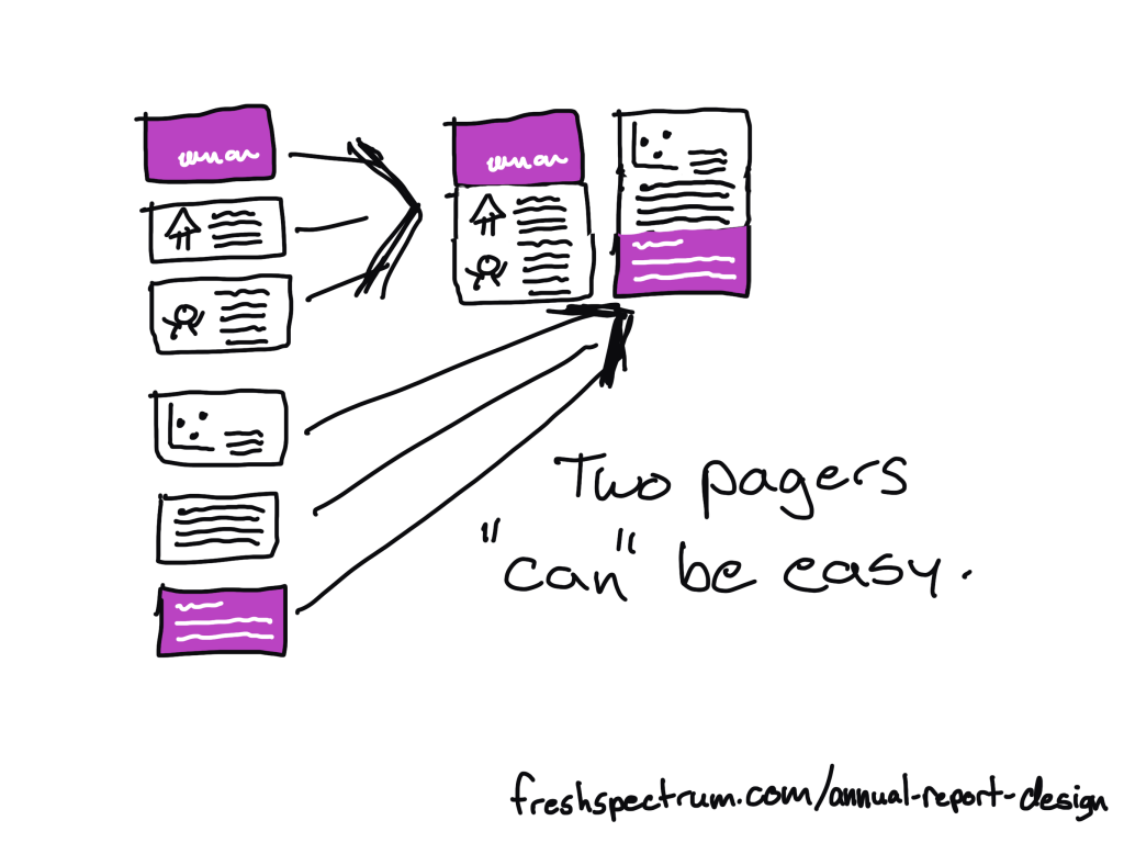
To make the two pager adaptations, you will take 4 to 6 slides and stack the content across two 8.5 by 11 pages. How many will fit depends on your content and reporting needs. A print-out can have smaller fonts, so you can often get away with 3 slides per pages stacked one on top of the other.
What that also means, is that you can start envisioning your two pagers as you design your original slidedoc. If you create sub-sections in sets of 5 or 6 slides, you set yourself up for an easy adaptation.
Step 4. Micrographic Adaptations
Okay, first question you probably have, what are micrographics? Are they the same as infographics?
Short answer, yes. It’s just a term I use for little infographics that are about the same size as a PowerPoint slide.
Micrographics are super useful. They can be shared as social media posts. They can get attached to blog posts as featured images. They can be used to illustrate articles. They can find their way into other people’s presentation decks.
Micrographics help spread evidence and ideas beyond the original report.
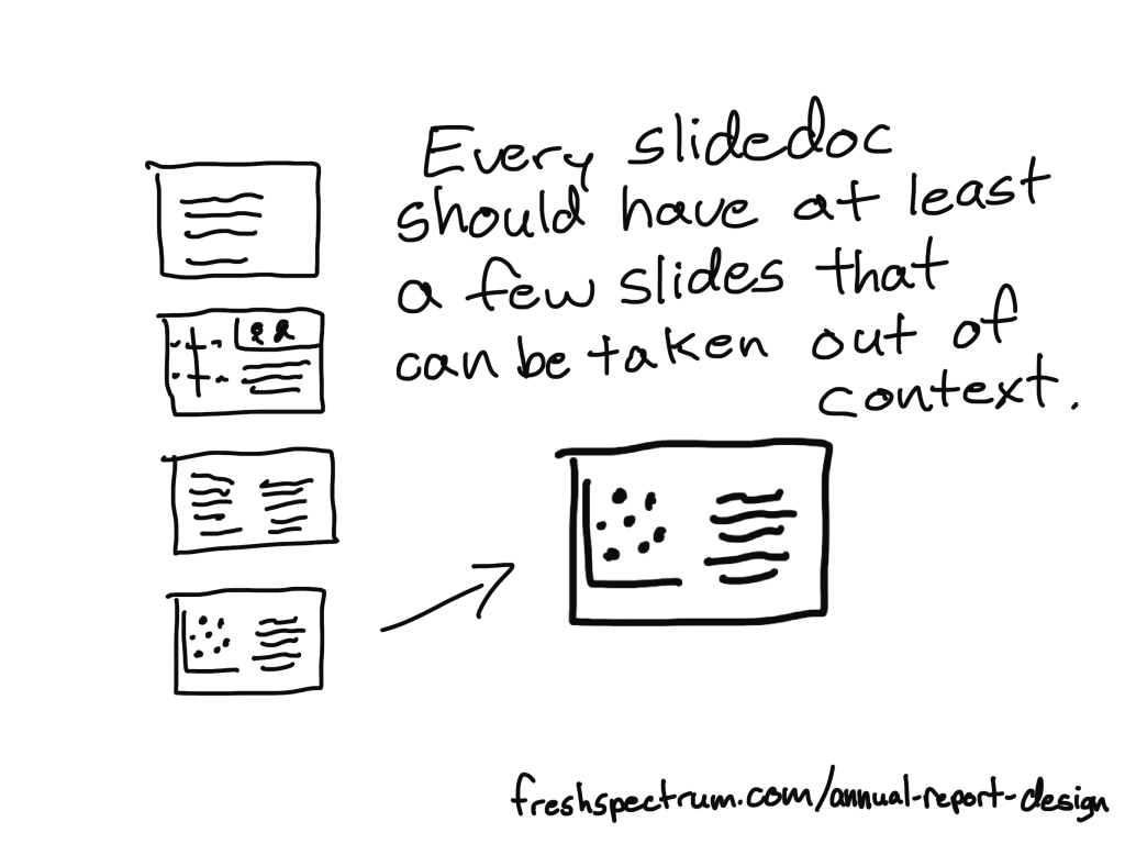
And a micrographic adaptation is easy. If you have a really nice slide in your slidedoc, add a link at the bottom of the slide to the source landing page (where the slidedoc lives) and export the slide as a separate image (png or jpg).
Micrographics are slides that can stand alone. Sometimes they are charts. Sometimes they are quotes. Sometimes they are diagrams. Sometimes they are just well written slides. By the time you complete a slidedoc, you should aim to have a handful of slides with stand-alone potential. These are the ones you adapt into Micrographics.
Step 5. Interactive Online Report Adaptation
There are lots of benefits to building an online report instead of just delivering a pdf slidedoc. But it also does not have to be an either/or thing. My recommendation is to do both.
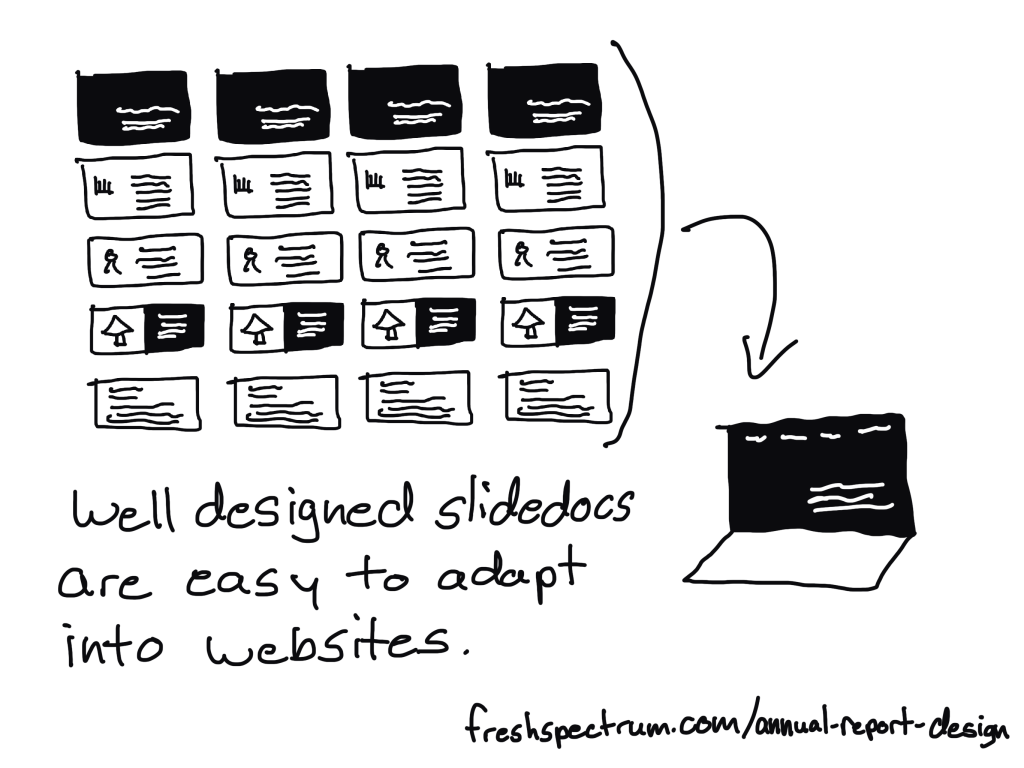
It can be really easy to adapt a well designed slidedoc into an interactive online report. Modern websites are often designed using containers, which align really well to slides in a slidedoc.
A few of the benefits to adapting your slides into a websites.
- Online reports can have interactive elements. Especially useful for charts that can take advantage of tool tips.
- Online reports can be built to be mobile-responsive making them much easier to read on a phone.
- Online reports can be auto-translated using modern web browsers (or a Google Translate plugin).
- Online reports are much better at being found through SEO (at the end of a Google search).
This is something a web designer can easily do with a CMS like WordPress. If you want help, reach out to me for a free consultation.
TLDR Summary
- Create a slidedoc report.
- Duplicate the report and erase most of the text, turning your slidedoc into a presentation.
- Quickly turn a set of 4 to 6 slides into a two pager.
- Find slides that can stand alone outside the report and download them as separate micrographics.
- Adapt your slidedoc into an interactive online report.
Conclusion.
I know creating a bunch of reports can sound overwhelming, but it doesn’t have to be overwhelming. You just need practice. But that’s why I’m here, to help you move forward.
If you have any questions, let me know in the comments.