This is an Eval Central archive copy, find the original at freshspectrum.com.
It’s time to change how we think about accessibility.
For just about half of my career I worked at company called Westat on a variety of different federal contracts. And when you work on federal contracts you quickly learn that every report destined to be shared publicly needs to be “508 compliant.“
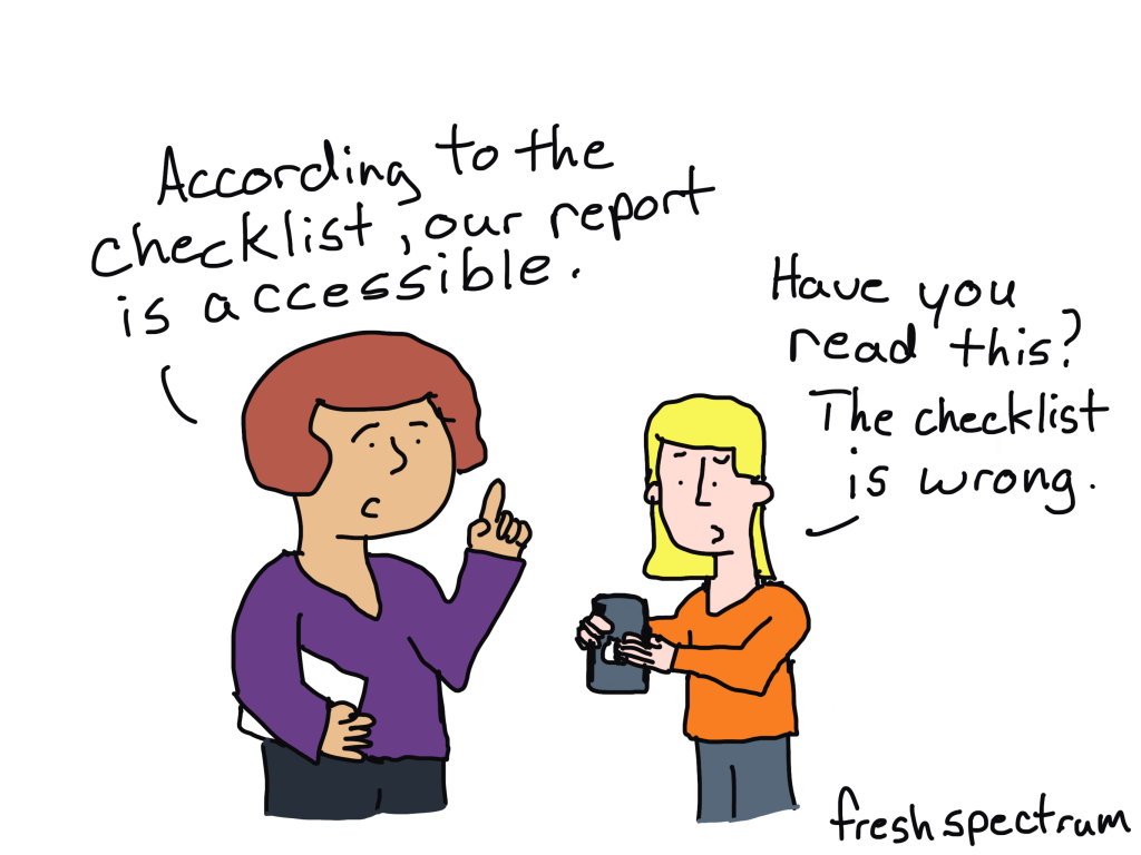
At a certain point, the phrase “508 compliance” becomes synonymous with accessibility. The problem though, is that it’s not. Compliance with federal law is NOT the same as making information accessible.

Accessibility is a philosophy
Think about a chart, like a scatter plot or line graph. Then think about all the data represented in that chart. How should that chart be communicated to someone with a visual impairment?
Is it enough to put all the data in that chart into alt text so it can be read like a data table?
Or is it more appropriate to talk through the story which the analyst believes the chart displays?
What about any side stories? Like outliers that call to you even though they are not part of the main story. Do you leave them out?
Technically, you can just pick any direction and create something the federal government would consider 508 compliant. But if you surround yourself with the right people who really care about making information accessible, this type of situation almost always leads to a larger philosophical discussion.
And that’s what SHOULD happen. There are not always easy answers with information accessibility.
Are PDFs really all that accessible?
Adobe has done a lot to support compliance (and so has Microsoft).
You can easily make a PDF 508 compliant. Adobe gives you the accessibility tools you need to do things like add alternative text, tag headings, and change the reading order.
But is that PDF constructed with all the tools and following a checklist box by box going to be more accessible than a simply written plain text email with basic headings? I think not.
What to do instead.
Emails and blog posts are powerful reporting formats.
As long as the designer doesn’t go super crazy with their formatting you can read emails and blog posts easily with your phone, tablet, laptop, desktop, or any other kind of device. You could even have Alexa or Siri read your emails and blog posts to you.
As for language accessibility, Google Chrome auto-translates in a ton of different languages. It’s not perfect, but that PDF you were using before is not auto-translating anything.
You’re not going to find the same templates and checklists for email and blog posts as you would for pdfs and word docs. But here is the thing…YOU DON’T NEED THEM. A simple plain text email or simple blog post with basic headings and paragraph tags is almost certainly more compliant and accessible than any PDF you can think of creating.
On Checklists and Guidelines.
Before we end today’s post, just know I am not against a good accessibility checklist, set of guidelines, or forcing federal agencies to ensure compliance.
But we can do more. And we should do more. And sometimes that means doing something completely different, which just happens to be something far easier to create.