This is an Eval Central archive copy, find the original at freshspectrum.com.
In today’s post I’ll share the steps I used in creating a line graph centered infographic.
The more I use Flourish, the more I like Flourish. Canva is a super easy tool for infographic design, but its chart builder leaves a lot to be desired. But since there is a native connection to Flourish, there is not really a reason why I should ever need to use Canva’s chart builder.

Starting with the Data
Before we can create an infographic we need a story to tell.
Inflation is in the news with rising prices across the globe.
Here in the US we track this data through the Bureau of Labor Statistic’s Consumer Price Index. The most recent numbers that show pricing data through March of 2022 puts us at a 20 year high for prices across all items.
There is a longstanding connection between energy prices and everything else, and when you search the data you can see the correlation.
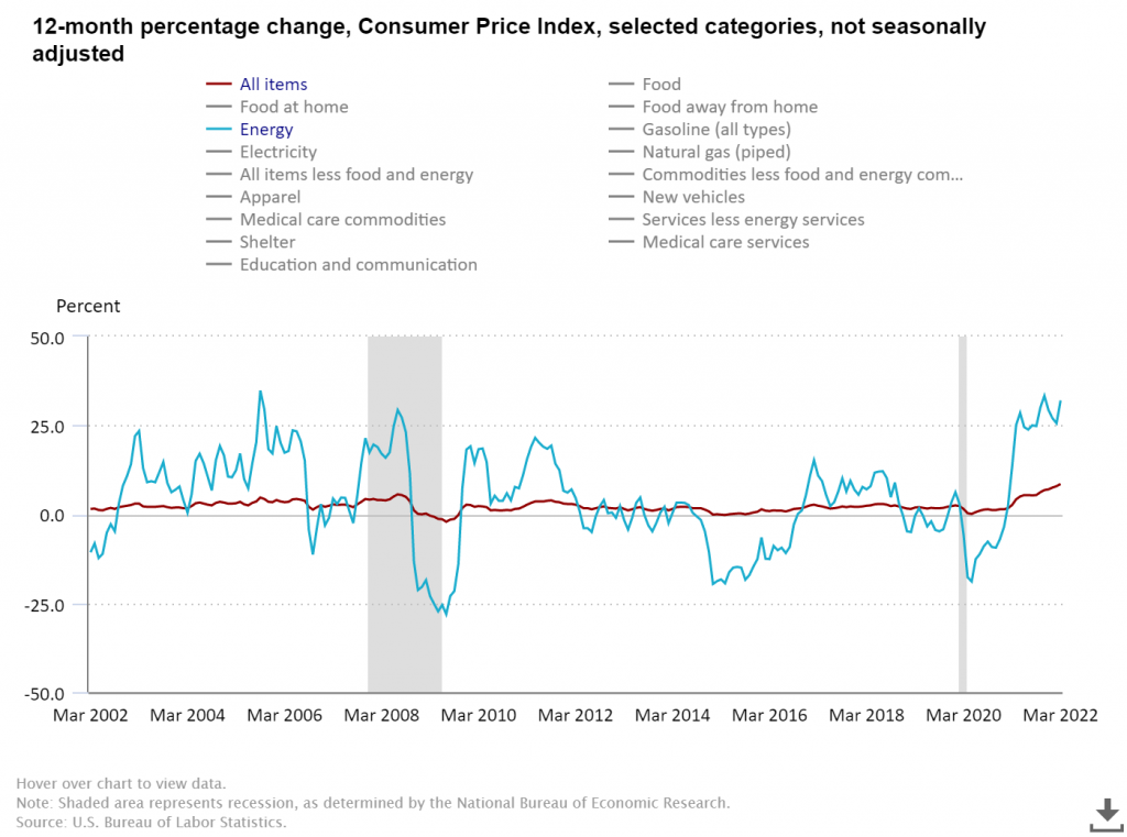
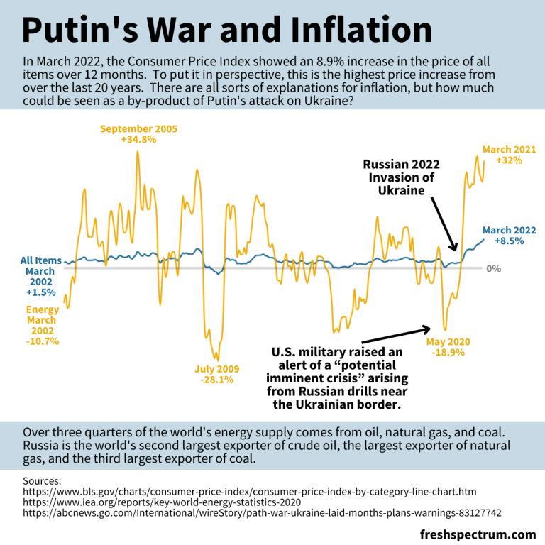
The argument I’m going to make in my infographic is that Russia’s expanded invasion of Ukraine sparked a rise in energy costs. And with the energy price’s rapid rise, all items have followed.
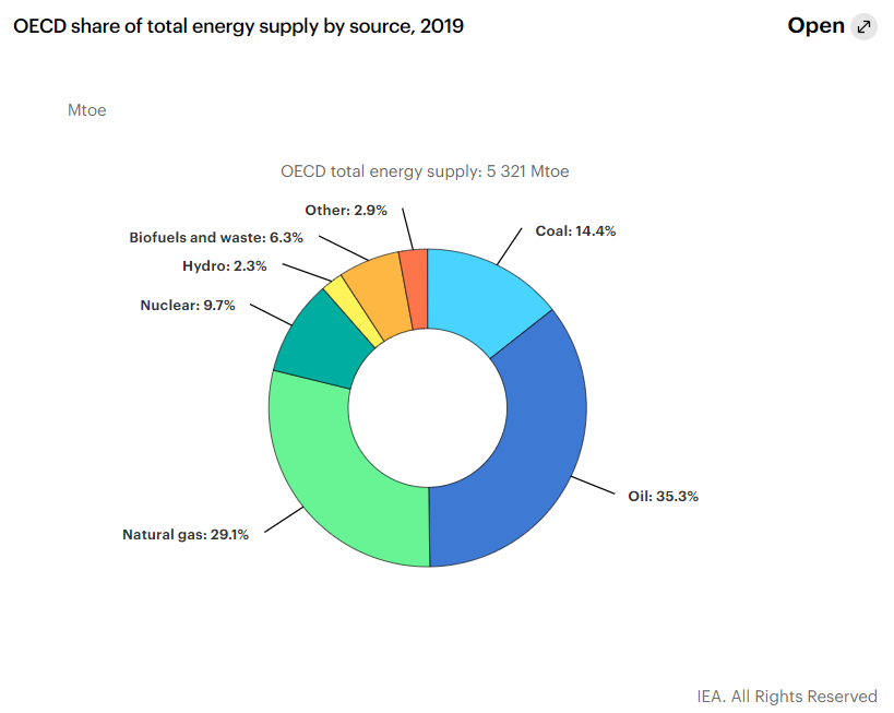
According to data from the international energy agency most of the world’s energy comes from three sources, oil, natural gas, and coal. Globally, Russia is the second largest exporter of crude oil, the biggest exporter of natural gas, and the third largest exporter of coal.
So as the war continues, and sanctions bring increased isolation of Russia from the global economy, energy prices continue their rise.
Creating a line graph using Flourish
For this infographic I’m going to redraw the Consumer Price Index line graph shared above using Flourish.
In Flourish, we’ll use the simple Line Chart starting point.
Every time you start a new visualization in Flourish, your first step is to choose a template starting point.
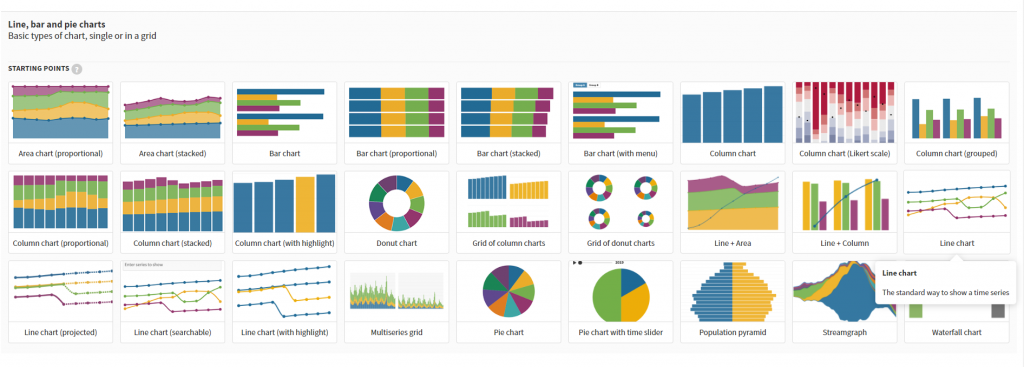
After selecting the template, Flourish will give us a chart with dummy data.
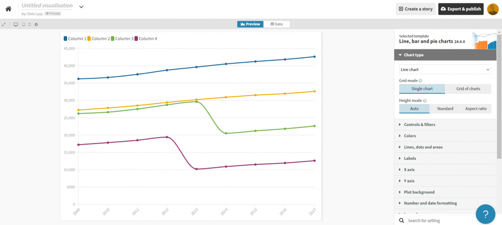
Click on the “Data” tab and you’ll see how the line graph data is structured.
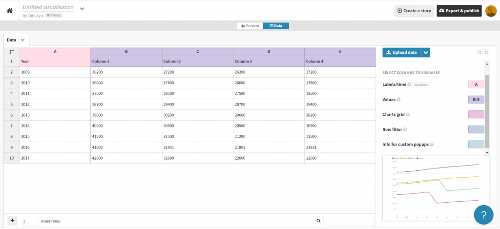
Depending on how your own data is structured, you might simply need to copy/paste. Unfortunately our data needs just a little cleaning.
Preparing our data in Excel for Flourish
So our BLS chart does come with a data table. But in its current format a simple copy/paste into Flourish won’t work. Sometimes you need to try a few things to get your data into the format you need.
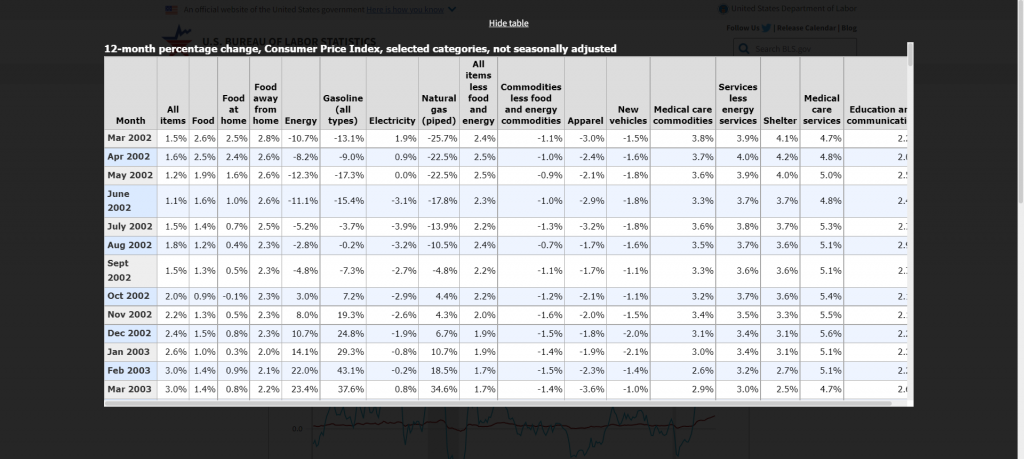
With this table I found I just needed to click on the “Show Table” button. Then use CTL “A” to highlight all the data on the page. Then I just pasted everything into an Excel worksheet.
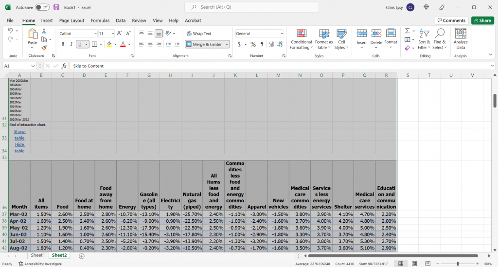
The copy action took more than just the table, so I just have to delete some rows and extraneous info. And since I really only want to plot two lines I cut the data down to just “All items” and “Energy.”
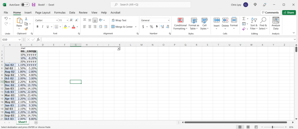
This isn’t a perfect worksheet, but that doesn’t matter. I just wanted to get the data to this point, where I can copy it and paste it right into Flourish.
Creating the line graph in Flourish
Our job now is to paste the data into Flourish, and delete any extraneous rows.
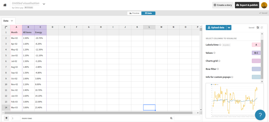
That’s all I had to do to have a pretty solid starting line graph in Flourish. If my goal was to create an embeddable interactive line graph I might take some more time tweaking the style. But I want to turn this chart into an infographic.
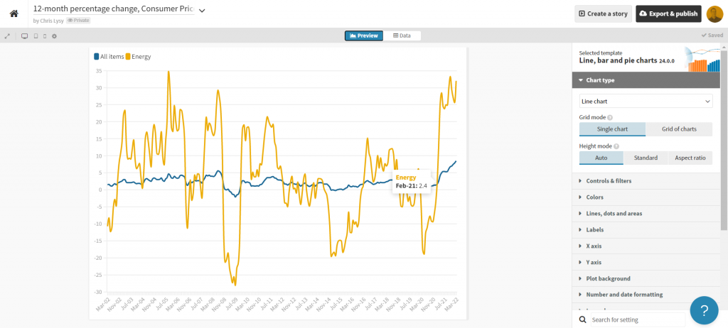
So instead of making the chart a self-contained finished product, I’m going to strip it down to the bare essentials. Then I’ll take it into Canva.
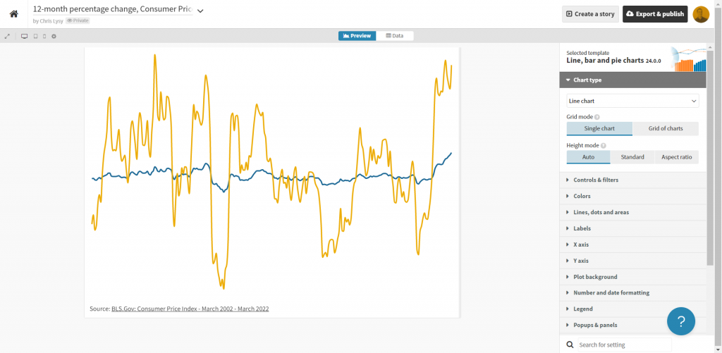
Turning the Flourish line graph into an infographic using Canva
First thing is to choose the style of infographic I want to create in Canva. I decided just to create a square, so I used a blank Instagram post.
Yes, there is an infographic category in Canva, but I don’t really like the long image format.
Once I’m in the Canva design app, I’ll venture down to the “More” menu button on the bottom left of the page and find the “Flourish” app.
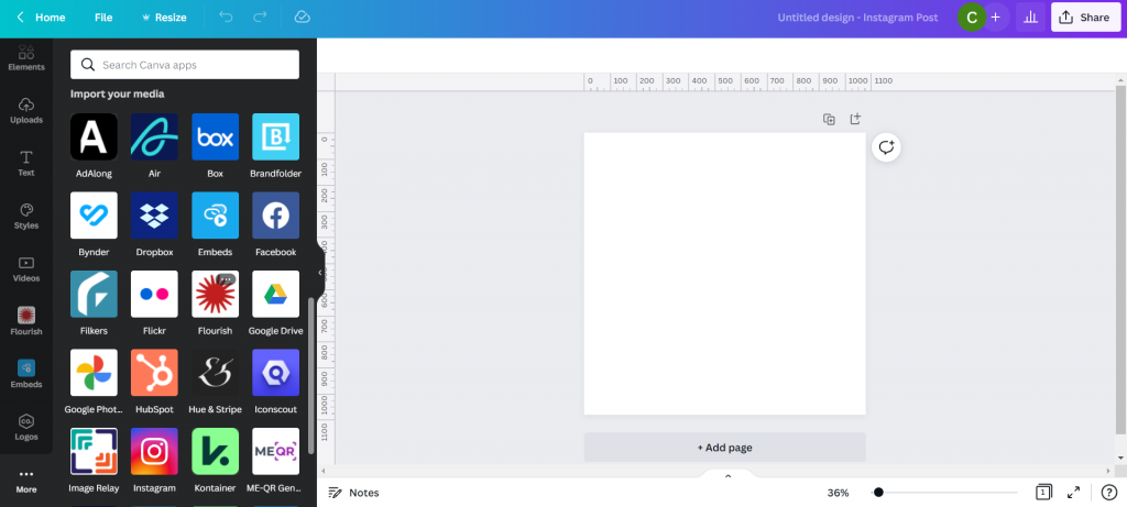
This let’s me import in visuals I created in Flourish.
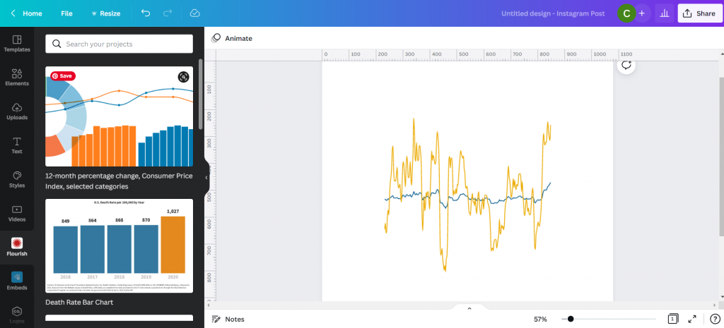
This isn’t simply an image right now, but an embedded interactive graph. I can adjust the size without distorting the visual right within Canva. I can also double click the box to interact with the visual, which lets me see individual data points.
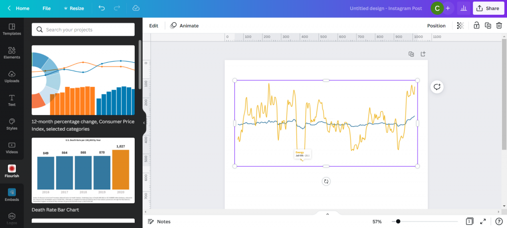
With my infographic style chart I’m not worried about showing the numbers for all the data. I just want to make sure I label the high point, low point, beginning, end, and any other spot that would be instrumental in telling my story.
I just the eyedropper in document colors to adjust the labels color to match each specific line (All items or Energy).
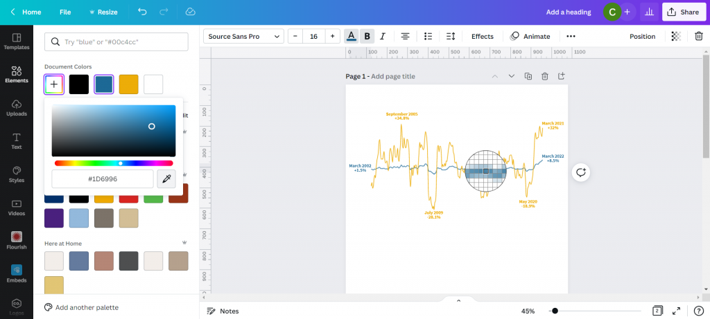
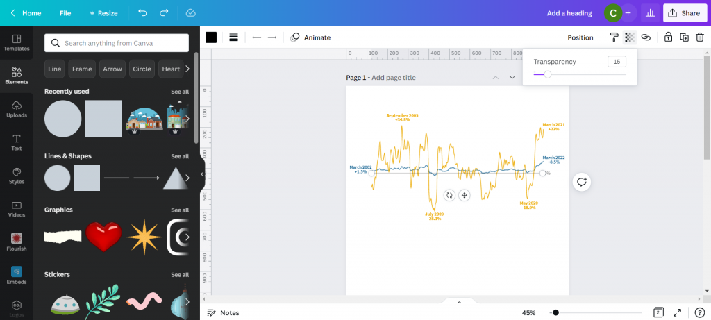
I also went ahead and dropped in a gray heavily transparent line to show where 0% would be in my line graph. I’m not worried about going any deeper because I’ll also share a link to the underlying data source.
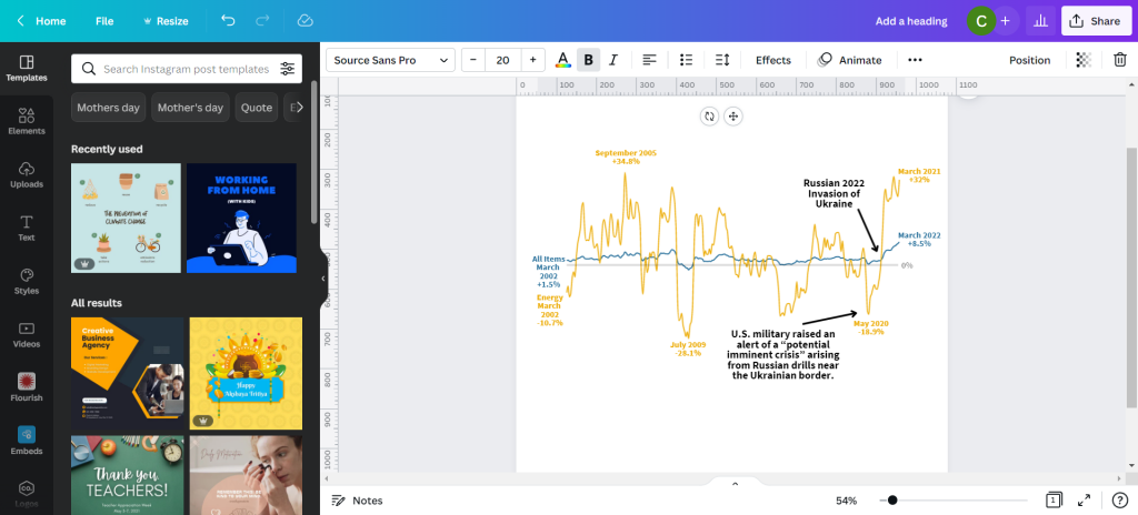
My next step will be to add annotations to tell the story. You’ll notice that I’m not really being super direct, more inferring the relationship. There is certainly a relationship between the war in Ukraine and the rise in inflation, and while it’s definitely not the only plausible explanation, there is enough of a connection to make for an interesting infographic.
My next step is to just tell a little bit of the story and what we are looking at in the chart. Just because an infographic is a visual thing doesn’t mean we have to rely solely on the graph.
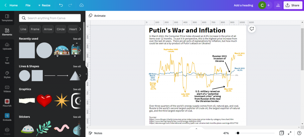
Not sure if this is an improvement or not, but I ended a few square color blocks to create a little more separation. I think it makes the chart look a little like a widescreen movie and helps to draw your eyes.
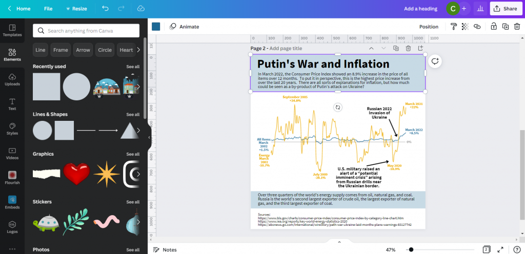
And here is my final infographic.
