This is an Eval Central archive copy, find the original at freshspectrum.com.
Trying to create an infographic in Canva that features a bar chart?
How will you go about creating that chart? Just a hint, there is definitely more than one way.
In today’s post:
How to create bar charts for your Canva visuals using…
- the Canva Chart Builder;
- Excel;
- PowerPoint;
- Flourish;
- Pixel Math.
But first, let’s talk about the Data I’ll be using for this tutorial.

The Data
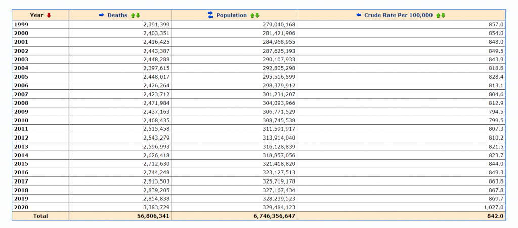
For this set of charts I’m going to use some CDC data on the US death rate per 100,000 for the years 2016 – 2020. I pulled the data from the CDC’s WONDER database.

Citation: Centers for Disease Control and Prevention, National Center for Health Statistics. Underlying Cause of Death 1999-2020 on CDC WONDER Online Database, released in 2021. Data are from the Multiple Cause of Death Files, 1999-2020, as compiled from data provided by the 57 vital statistics jurisdictions through the Vital Statistics Cooperative Program. Accessed at http://wonder.cdc.gov/ucd-icd10.html on Apr 6, 2022 9:20:01 AM
The Canva Chart Builder
So Canva has a built in chart creator. Let’s just go ahead and start with that. You’ll find it in the Elements tab by searching for Charts.
For this bar chart I went with the basic column chart.
![How to find the chart builder in Canva. [Screenshot]](https://blog.evalcentral.com/wp-content/uploads/2022/04/image-13-1024x499-1.png)
The chart populates with some fake data. I went ahead and cleared that data, then pasted in my own. You’ll also notice that you can also directly connect to data using Google sheets.
![Adjusting bar chart data in Canva. [Screenshot]](https://blog.evalcentral.com/wp-content/uploads/2022/04/image-12-1024x498-1.png)
Canva’s chart creator is nothing fancy. There are very few things that you can do with the chart itself.
![Settings in Canva's chart builder. [Screenshot]](https://blog.evalcentral.com/wp-content/uploads/2022/04/image-15-1024x501-1.png)
Conclusion. It works in a pinch, but you have far less control over the chart than you would with other tools. One of the things that I found particularly annoying is the inability to isolate a single bar and change it into another color. That’s something I do all the time with bar charts, and I’d have to hack the bar chart a bit with additional elements to make it look the way I want.
Starting with Excel
So I think at this point most evaluators would just fall back to their comfort zone and open up Excel. Even if they were ultimately trying to create an infographic using Canva. So let’s walk through how you might do that.
Simple Copy Paste
Easiest way to move a chart from Excel to Canva is just to Copy the chart in Excel then paste it into Canva.
![Copying charts out of Excel. [Screenshot]](https://blog.evalcentral.com/wp-content/uploads/2022/04/image-1-1024x543-1.png)
And if you like the way your chart looks in Excel, this works just fine.
![Pasting charts into Canva. [Screenshot]](https://blog.evalcentral.com/wp-content/uploads/2022/04/image-2-1024x477-1.png)
One thing to note is that you lose all of your ability to edit pieces of the chart post-Excel. This is because the copy/paste approach uploads the chart as a PNG file, which is a type of pixel based image.
This could be a good thing for you, because you don’t have to worry about any of your elements changing. But that also limits your ability to tweak the chart, and you could ultimately end up with a pixelated image.
![Chart pasted into Canva as a PNG.[Screenshot]](https://blog.evalcentral.com/wp-content/uploads/2022/04/image-4-1024x506-1.png)
Exporting an SVG
Another way to go would be to export your chart from Excel as an SVG. Simply right click on your chart and click “Save as Picture.” Then set the file type to SVG.
![Saving Excel charts as SVG pictures. [Screenshot]](https://blog.evalcentral.com/wp-content/uploads/2022/04/image-1024x547-1.png)
When we drop the svg into Canva, we end up with an image that can be stretched or shrunk without a loss in quality. Although the fonts you use might look a little wonky if the same font is not also found in Canva.
You also get very basic color controls (i.e. I can change the blue color to any other color).
![Importing an SVG chart into Canva. [Screenshot]](https://blog.evalcentral.com/wp-content/uploads/2022/04/image-3-1024x506-1.png)
There is another little trick we can do with this. Simply color a bar you want to highlight in Excel with a different color. Then take the same step to save it as an SVG.
![Saving an SVG chart with a highlight color in Excel. [Screenshot]](https://blog.evalcentral.com/wp-content/uploads/2022/04/image-7-1024x548-1.png)
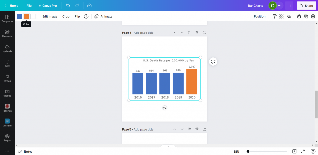
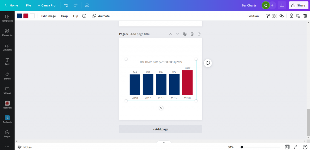
Now when you drop the SVG into Canva, you’ll be able to change both colors!

See, here is the same chart but I turned the lighter blue to a darker blue and the orange to a red. Without needing to go back to Excel.

So if that works, why not just rainbow color your chart?
This might be the only time I ever suggest you try to multi-color your bar charts.
![Creating a rainbow color bar chart in Excel. [Screenshot]](https://blog.evalcentral.com/wp-content/uploads/2022/04/image-5-1024x548-1.png)
Unfortunately, even though the chart ends up in Canva as an SVG, there must be some color limit. Because instead of being able to change all the bar colors, I now can’t change any of them…
![Adjusting a multi-color SVG chart in Canva. [Screenshot]](https://blog.evalcentral.com/wp-content/uploads/2022/04/image-6-1024x496-1.png)
Conclusion. Sure, it works. But you’re really still just creating the chart in Excel.
Starting with PowerPoint
Okay, so I know it may seem like PowerPoint and Excel charts would convert the same way into Canva. But that’s not entirely true.
I took my Excel chart and pasted it into a new PowerPoint then saved the file. Then I uploaded the PowerPoint pptx file right into Canva.
![Pasting an Excel chart into PowerPoint [Screenshot]](https://blog.evalcentral.com/wp-content/uploads/2022/04/image-11-987x768-1.png)
At first it was buggy, but then I changed the bar color and the chart appeared. Not only did it convert, it converted directly into Canva’s chart creator format. With all the data embedded behind the scenes.
![Importing a PowerPoint chart into Canva. [Screenshot]](https://blog.evalcentral.com/wp-content/uploads/2022/04/image-16-1024x499-1.png)
So now it works just like Canva’s chart creator.
![Changing the color of a powerpoint chart inside Canva. [Screenshot]](https://blog.evalcentral.com/wp-content/uploads/2022/04/image-10-1024x499-1.png)
Conclusion. Yes, it works. But it ends up working just like it would with Canva’s built in chart creator. Meaning a reduced ability to change much at all.
Using Flourish
So Canva actually acquired the data visualization chart builder Flourish. You can access the integration down at the bottom of the menu page where it says “More.”
![Finding the Flourish app inside Canva. [Screenshot]](https://blog.evalcentral.com/wp-content/uploads/2022/04/image-17-1024x501-1.png)
Using Flourish (which is currently Free to use) is more an integration than something you would do directly within Canva. That means you have to register for a free Flourish account and connect it to your Canva account.
Then from there, the easiest way to start is by choosing a template.
![Choosing a template inside Flourish [Screenshot]](https://blog.evalcentral.com/wp-content/uploads/2022/04/image-18-1024x522-1.png)
I chose a simple column chart.
Even though it’s a simple chart, there are tons of options you have control over. This can be both a benefit and a curse. Because you have to sift through all the options to find the ones you want to change. It can be a bit overwhelming.
![Creating a simple column chart using Flourish [Screenshot]](https://blog.evalcentral.com/wp-content/uploads/2022/04/image-20-1024x497-1.png)
After you are done creating your chart you can click the “export & publish” button to add your chart to Canva.
![Adding a Flourish chart to a Canva presentation. [Screenshot]](https://blog.evalcentral.com/wp-content/uploads/2022/04/image-19-1024x523-1.png)
Ultimately though, once you connect your Canva and Flourish accounts, you have access to all of your Flourish visualizations from directly within Canva.
All changes you want to make to your chart, except for size and placement, need to be done inside the Flourish editor.
![Finding your connected Flourish charts inside of Canva. [Screenshot]](https://blog.evalcentral.com/wp-content/uploads/2022/04/image-21-1024x497-1.png)
Conclusion. Using flourish might seem like overkill, and sometimes it will be overkill. But you can do things with Flourish that you can’t do with a lot of the previously mentioned tools. Flourish can even be used to create interactive visuals, which will then live within your Canva designs. This means you can use Flourish mixed with Canva to build full fledged interactive dashboards.
Pixel Math
Okay, so I don’t know if it’s because I’m a big nerd, but this tends to be the way I create most basic charts. In a nutshell, it’s like a digital version of using a pencil alongside a ruler.
I start with a shape (usually a rectangle).
![Using shapes to create a chart in Canva [Screenshot].](https://blog.evalcentral.com/wp-content/uploads/2022/04/image-22-1024x500-1.png)
Then I will measure the length of that shape based on the number of Pixels shown when I stretch the image on Canva. The current pixel dimensions of my square canva page are 1080 by 1080. My 5 bars will range in size from 849 to 1027. Each person gets a pixel and I still have a little room at the top and bottom of the page.
![Measuring a bar using Pixels in Canva [Screenshot]](https://blog.evalcentral.com/wp-content/uploads/2022/04/image-23-1024x507-1.png)
You’ll the see the sizing guide pop up as you stretch a bar. I’ll create the first bar, then copy and paste. Zooming into the page will help you size the bars better as you get closer to your target number of pixels.
![Zooming in to help measure a bar using Pixels in canva [Screenshot].](https://blog.evalcentral.com/wp-content/uploads/2022/04/image-24-1024x507-1.png)
Then once I’m done, I have a chart that’s way too big (or sometimes too small). But this is easy enough to solve, I just group all the bars together.
After you do your first sets of pixel measurement, you can group your bars and scale them up or down. Just keep in mind that if your numbers are not set (as in you will likely be changing the data in your chart at some point) you are not going to want to change the scale.
![The measured pixel math bar chart. [Screenshot]](https://blog.evalcentral.com/wp-content/uploads/2022/04/image-25-1024x504-1.png)
Doing my charts this way I have almost complete control over their style. I just need to overlay some text for the labels and title.
![Grouping and adjusting the pixel math bar chart in Canva. [Screenshot]](https://blog.evalcentral.com/wp-content/uploads/2022/04/image-27-1024x465-1.png)
And then once you have your chart finished, just keep the elements grouped and you can move it all around the page, stretch it, shrink it, change the colors, or change the fonts.
![Turning the bar chart into an infographic in Canva. [Screenshot]](https://blog.evalcentral.com/wp-content/uploads/2022/04/image-26-1024x506-1.png)
Conclusion. Okay, so this isn’t for everyone. With pixel math you are relying on your own mathematical skills and grasp of geometry. But I find for simple charts, sometimes it’s easier to just measure out some bars than try to bend a chart creation tool to your will.
Parting thoughts
So which chart creation tool is the best?
Probably none of them. I really wish the native Canva chart builder was better. Just being able to isolate the individual bars would make it far more effective.
There are also tons of other chart creation tools out there that can be used alongside Canva. From R to Tableau to Google Sheets.
Just pick the tool that works best for you.
