This is an Eval Central archive copy, find the original at freshspectrum.com.
Gone are the days when all your reports were just in black and white. Sure, black and white is still cheaper to print, but color printers do exist. And who even prints anything anymore when most of what we read sits on a screen.
It’s time to stop hiding from color. Luckily for us, there are a bunch of tools out there to help even the least color-savvy designers. For years, when anyone would ask, I used to send them to Adobe Color. But now-a-days Canva has come through with their own useful set of free tools.
This post highlights a bunch of the useful, mostly free, tools you can add to your own reporting toolkit.

In this post.
- The Basics of Color Theory
- Color Wheels for Graphic Design
- Color Palette Inspiration Tools
- Color Extractors
- Color Pickers
- Color Contract Checkers
- Personal Color Libraries
The Basics of Color Theory.
Do you know what it means if I say a color combination is monochromatic, complimentary, or analogous? Do you know the difference between hue, saturation, and value? If the answer isn’t a resounding YES, then I suggest you take a few minutes to watch this really solid intro video by GCF.
Color Wheels for Graphic Design
Color wheels are particularly useful tools when you already have at least one color in mind. For instance, you are trying to create a broader color palette for a project that already has a single color logo. You can use that color as your starting point when choosing supporting colors.
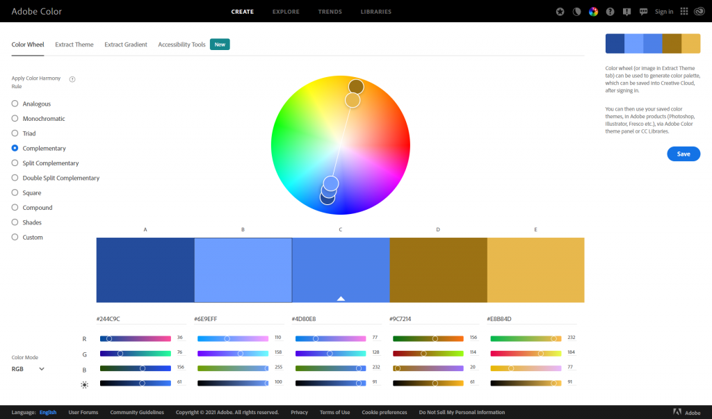
Adobe Color’s color wheel gives you 5 color options. Depending on the color harmony rule you choose, change one color and all the colors will change.
Canva’s color wheel runs similarly, although with less colors. For a lot of report palettes, this is probably not a bad thing. I often suggest you use two complementary colors and then monochromatic varieties of each color.
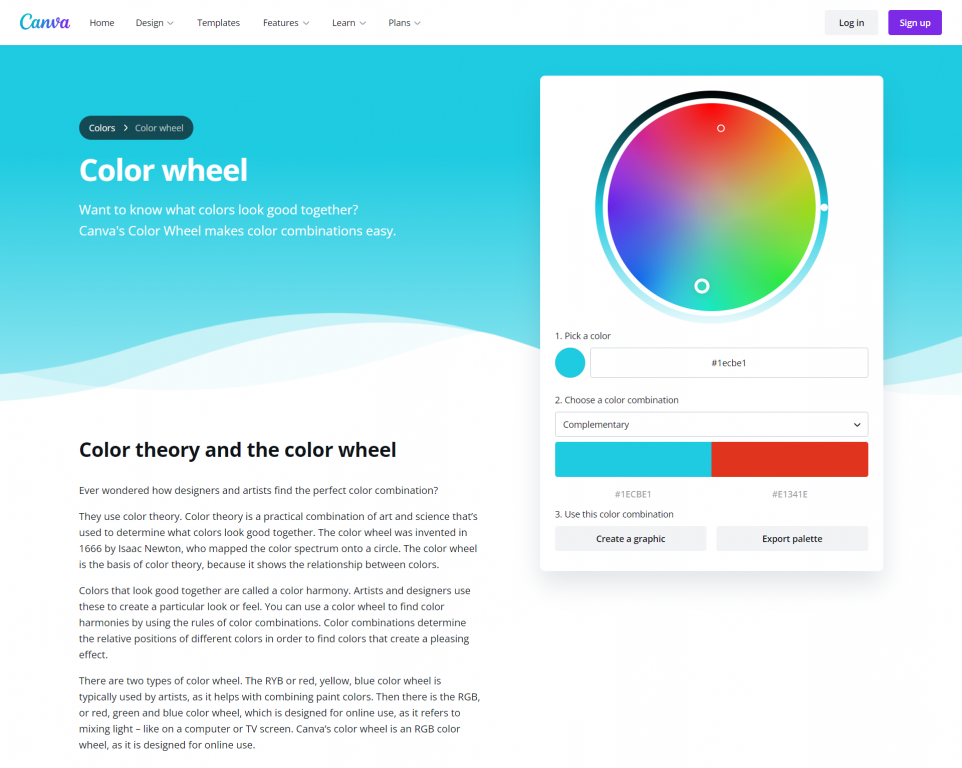
Canva’s color wheel page also gives a really nice run-down on color theory.
Color Palette Inspiration Tools
If you don’t know where to start, or only have a general feeling on your desired look, a little inspiration might help. Both Canva and Adobe offer a bunch of tools that might get you the inspiration you need to build a palette (or to discover one that they showcase).
Canva’s color palette tool lets you search color palettes based on keywords. Looking for something blue? How about a nature theme? Like pastels or bright colors? Just search away and you’ll be given lots of options to choose from.
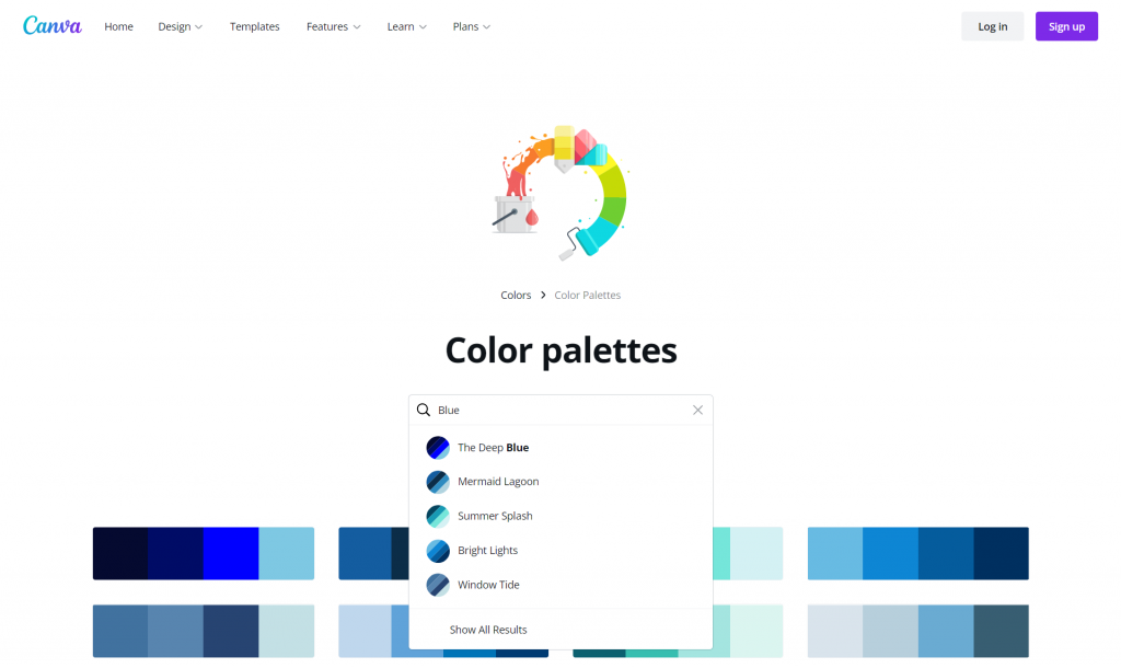
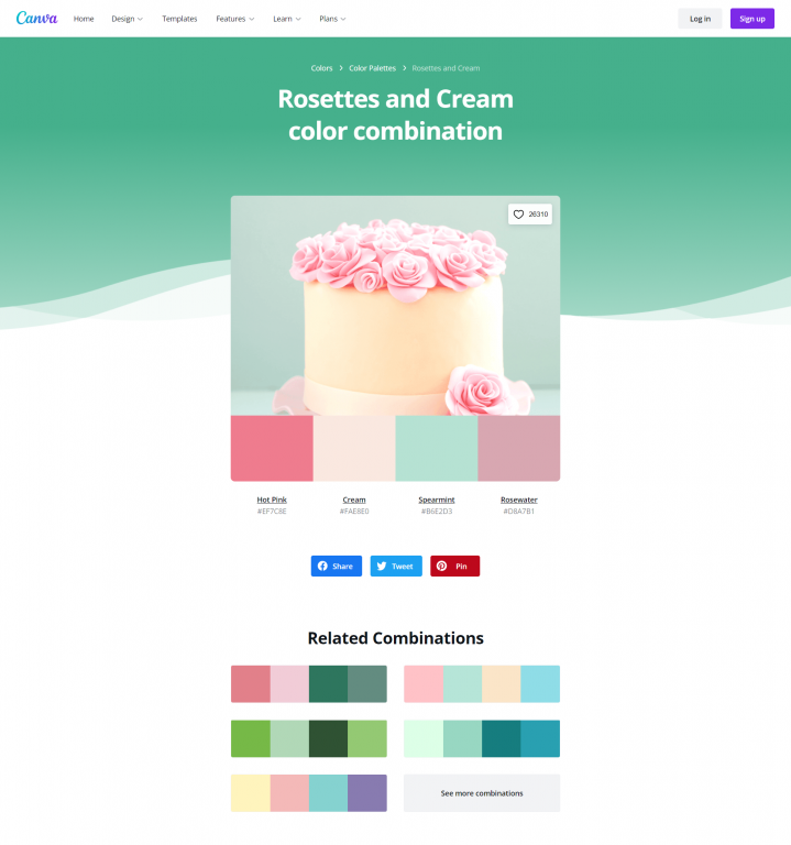
Another thing I like about Canva’s color palette search is that when you click on a palette you like you are brought to a page that shows the palette alongside a photograph that includes the colors. It also gives you related combinations.
Sharing these pages with stakeholders as you mull color choices can really help you get better/faster input on their likes and dislikes.
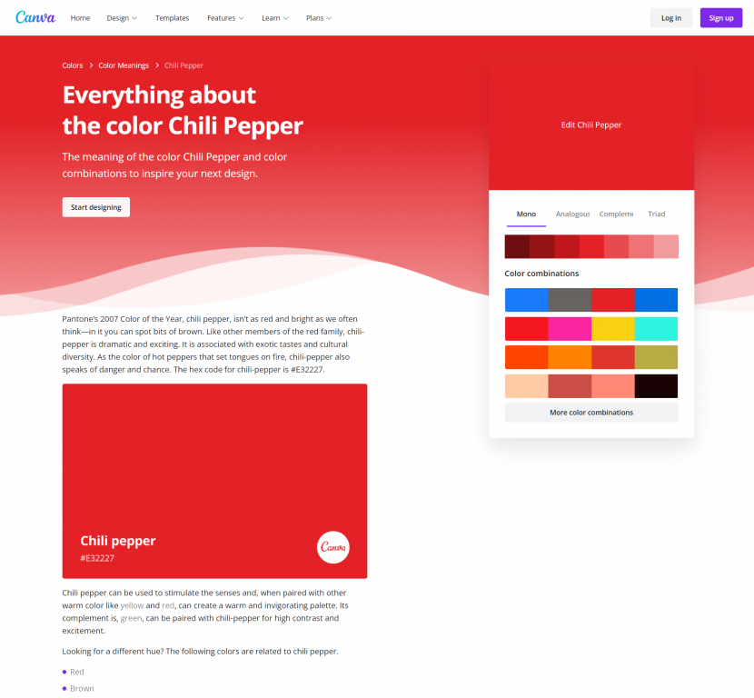
Another tool that Canva offers is a color meanings page. Certain colors have certain societal connotations. When you click on a specific color Canva will give you a run down of that color’s meaning, along with some potential supporting color combinations. You probably don’t need to do this with all of your colors, but it could certainly help you narrow down a list of your primary colors.
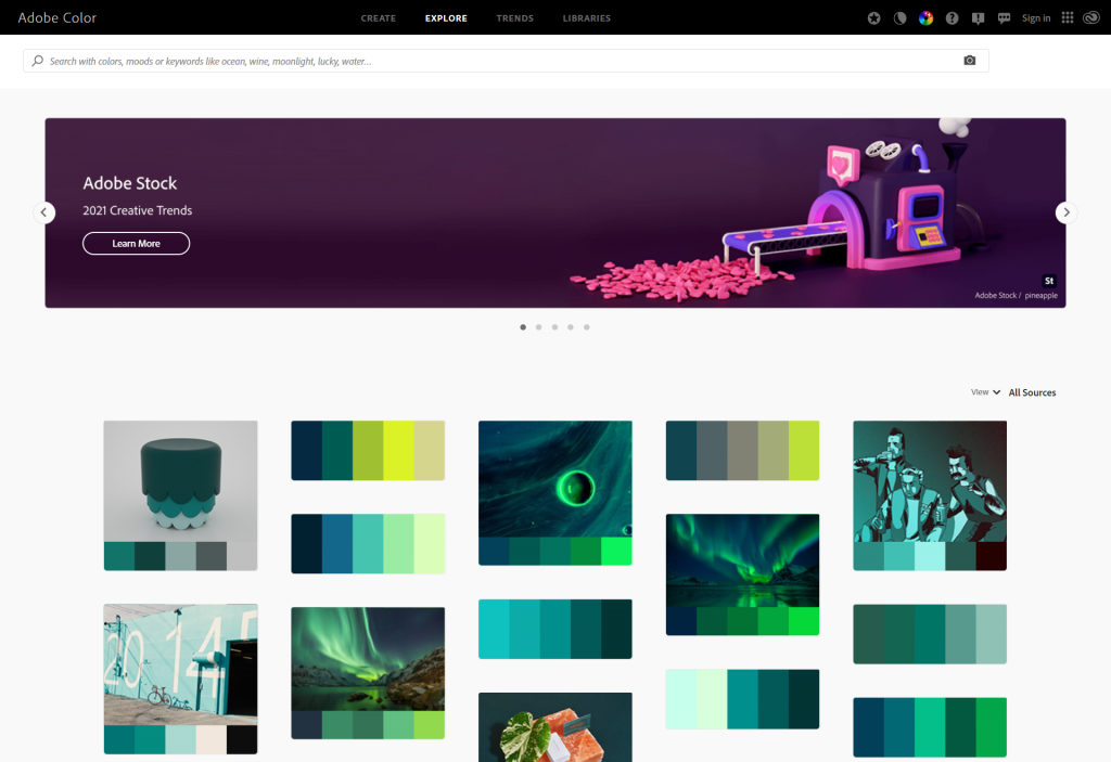
Adobe Color also has some tools that let you search for themes based on color, moods, and other keywords.
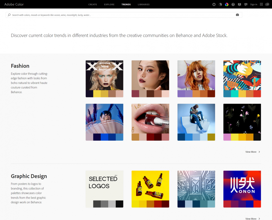
Adobe Color also features color trends drawn from their own designer social network (Behance) and Adobe Stock (Adobe’s stock photo library). These trends are categorized and the color schemes are shown alongside the images that inspired the theme.
Color Extractors
Do you want to create your own color palettes based on photographs or other images? You can use a color extractor.
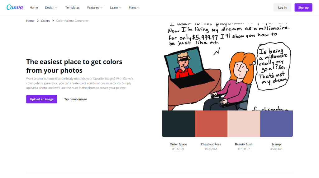
Canva’s color extractor (color palette generator) simply requires you to upload a picture. Then Canva will choose four colors drawn from that picture.
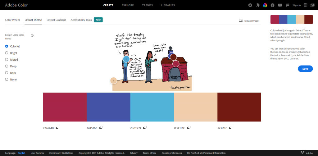
Adobe Color’s extract theme feature works similarly but has more features. Instead of 4 colors, it will pull five. If you want a different mood pulled from the same picture, just select the appropriate mood on the left. Also, if you don’t like the colors it picked from the page, you can drag the little circles around to choose different ones.
Color Pickers
Just want to pick individual colors from pictures? You can do this using all sorts of tools.
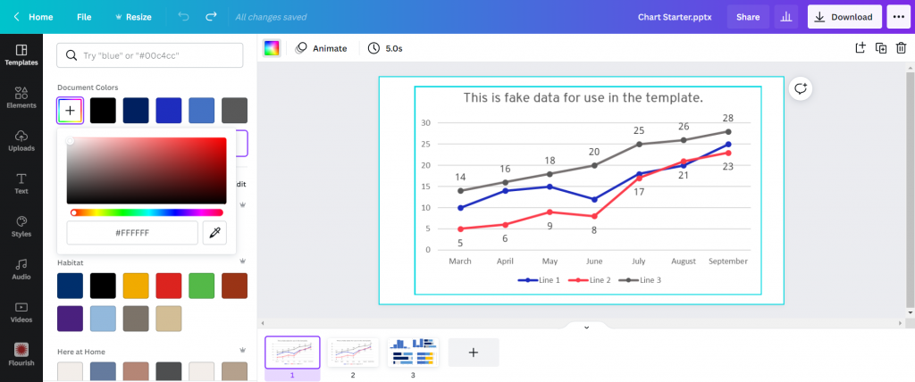
Canva has a color picking eyedrop tool. Just click on the colors button, then on the + (add new document color) and select the eyedropper. Then you can drag the eyedropper around your image to pick a color you want to use.
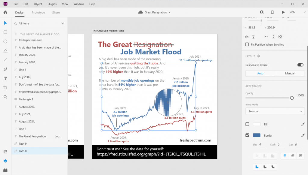
Adobe has similar eyedropper tools in their pieces of design software. For example, here is the eyedropper tool in Adobe XD.
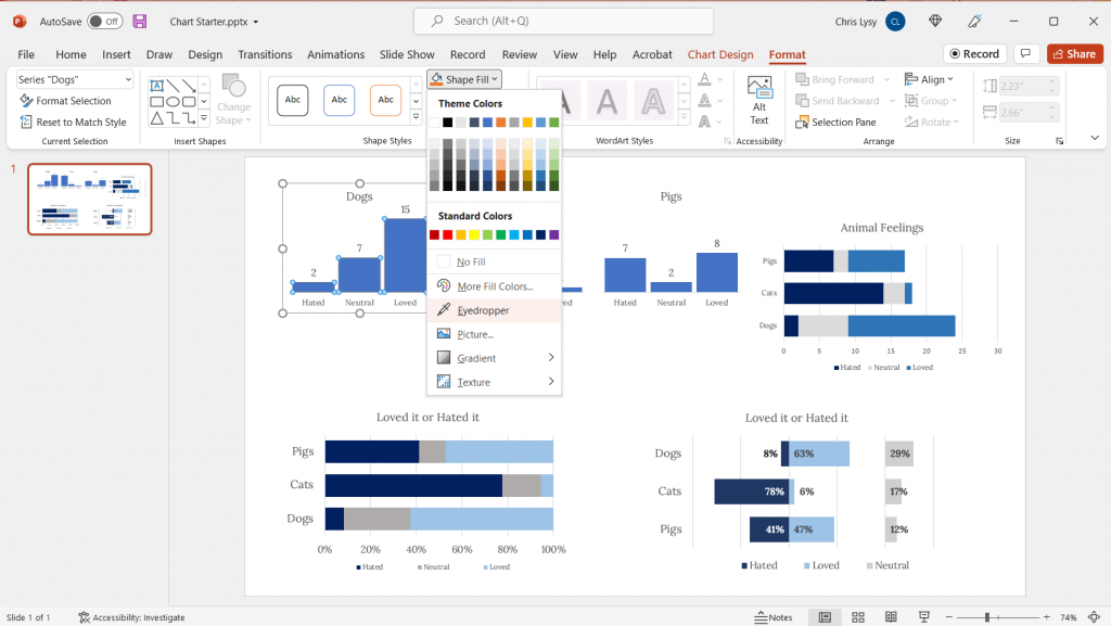
Even PowerPoint now has an eyedropper. You’ll find it when you click the little drop down menu button next your shape, outline, or text fill buttons.
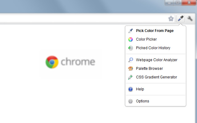
Another super useful eyedropper tool is one that you can get as a we browser extension. I use the Chrome extension “ColorZilla” often to pick colors from web pages. This gives me the hex code I can then put into other design applications.
Color Contrast Checkers
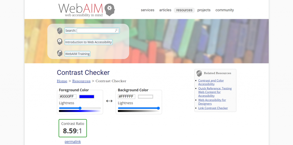
Wondering how accessible your color palettes would be for different people? One really simple Contrast Checker can found on the WebAIM site. They also provide lots of other information on keeping you designs accessible.
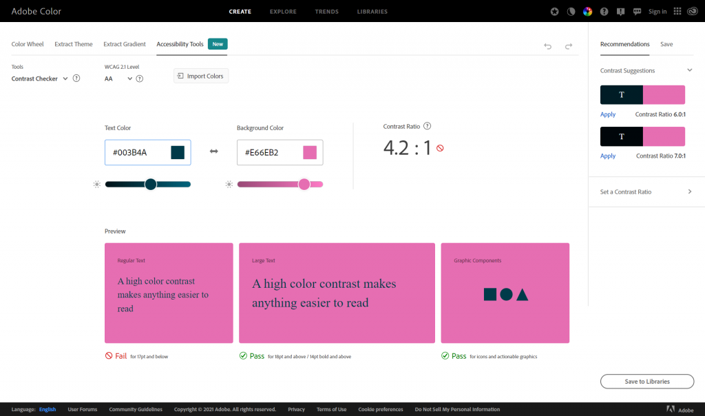
Adobe Color also recently added Accessibility Tools to their website.
Personal Color Libraries
Tired of copying and pasting hex codes?
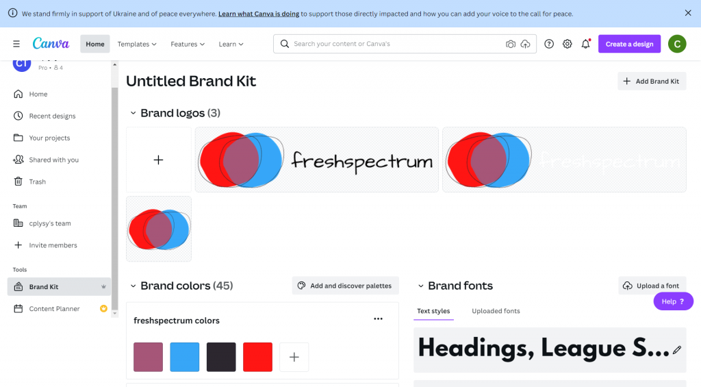
If you have Canva Pro, you can save multiple color palettes as part of your brand kit.
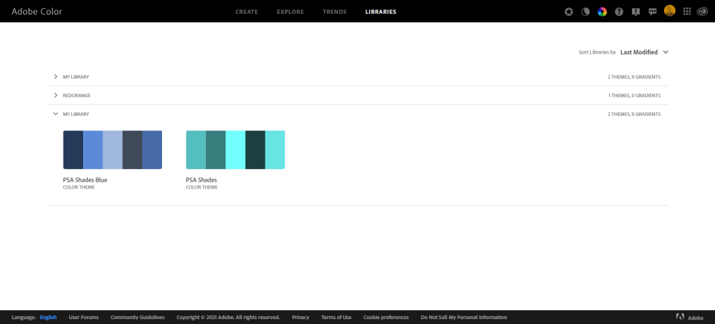
If you are an Adobe user, you can also add your color themes to libraries that will be accessible across all of your Adobe software tools.
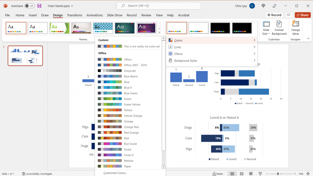
You can even set up your custom color schemes within PowerPoint. Just click on the design tab, then the dropdown next to “Varients.”
