This is an Eval Central archive copy, find the original at freshspectrum.com.
Have you ever created an infographic?
No? Why not? Infographics can be a fun way to deliver information to different audiences. They can also be really easy to put together.
Yes? Which type? There are all sorts of different infographic styles and formats.
Today’s post features highlights from one of my pro workshop sessions. During the 33 minute session we walked through the design process for a particular kind of infographic that I call slide style.
- If you read through this post, I’ll get right to the takeaway points.
- But I also opened up this particular session recording because I hope it will give you a better idea of how these workshops are structured.
- To access the session recording, you can find it free-to-watch by clicking this link.
Don’t want to watch?
That’s okay, you’ll get the gist by scrolling through this post.
Takeaway #1 An infographic is an audience connection device. Not a report replacement.

One of the biggest mistakes I see a lot is when an organization tries to reach all of their audiences with one report.
People complain, asking for something more visual. So the organization responds by making one infographic. [Facepalm]
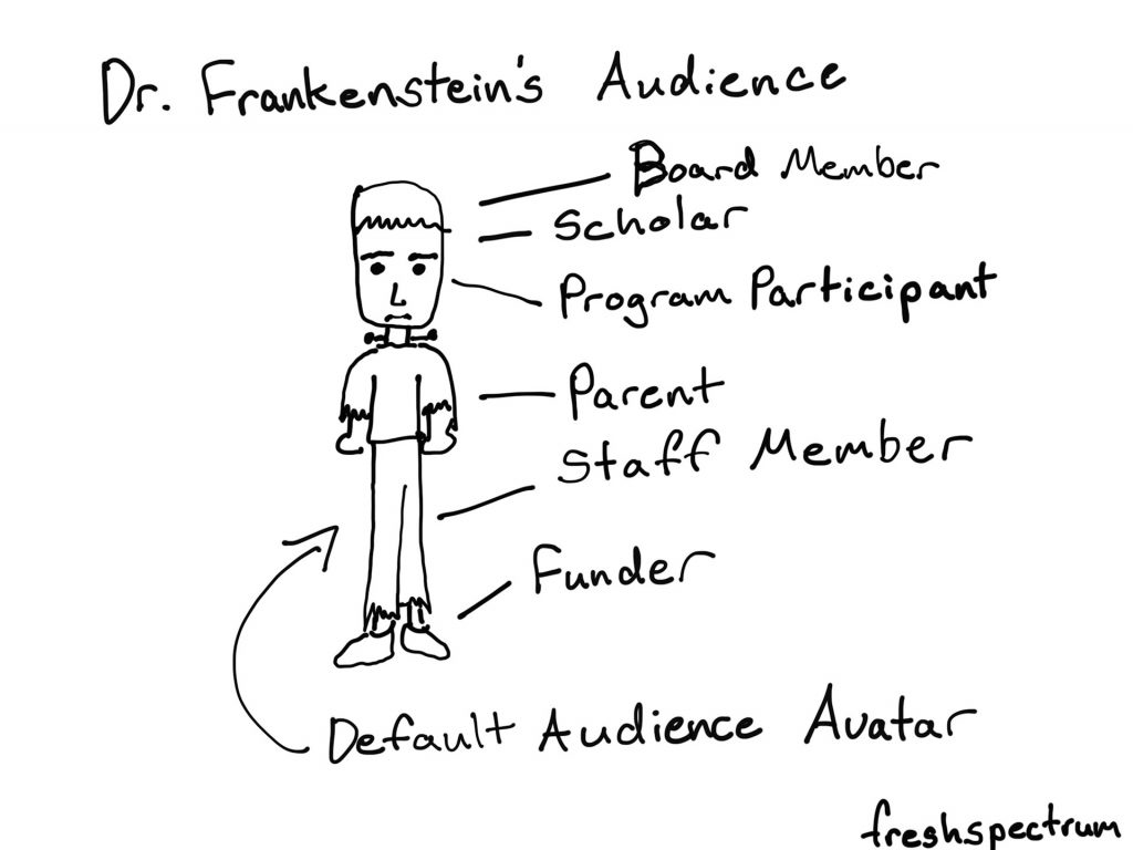
Yes, your report was probably super boring. But it likely also was built for either a non existent audience (something I refer to as Dr. Frankenstein’s Audience) or a very specific audience that does not include the person complaining.
Stop trying to serve everyone with one report.
One of the easiest ways to deliver multiple visual reports is to create a string of infographics designed to meet the needs of separate individual audiences.
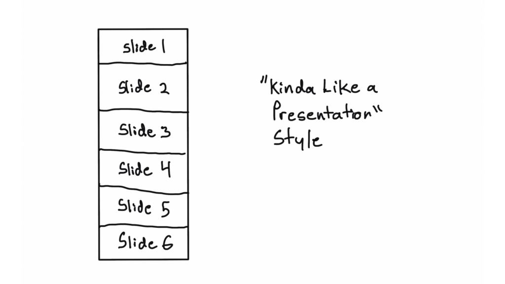
Takeaway #2 Most infographics are designed using a formulaic process.
Have you ever watched a cable TV cooking show, home design show, game show, or pretty much any mass production TV program?
It can get pretty formulaic, can’t it?
For example, every episode of house hunters. Realtor meets with couple searching for home. Shows three homes. One is definitely not what they were looking to find. The second is what they asked for but probably not what they really need, and it’s also way over budget. The third is perfect, just a little over budget but they can stretch…
Formulas are just conventions and structures that make it easier to produce something creative on a deadline. Most infographics are not going to be genre twisting award winners. And unless you’re building a fancy creative portfolio, let your infographics be purposeful communication tools.
Takeaway #3 Constraints can be useful tools. Especially for something open like an infographic.
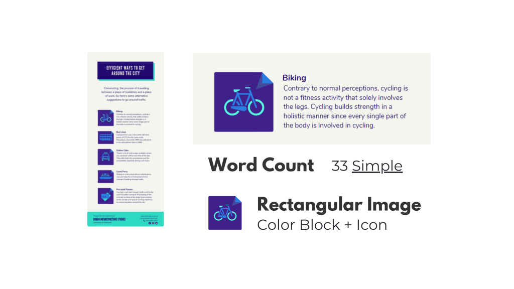
It’s hard to start with a blank canvas. Especially when that blank canvas can be any orientation or size that you can imagine.
Even as someone who spends his life creating stuff, I try to avoid the blank canvas. I also think that adding some constraints can make the design process much easier. Especially for something like infographics.
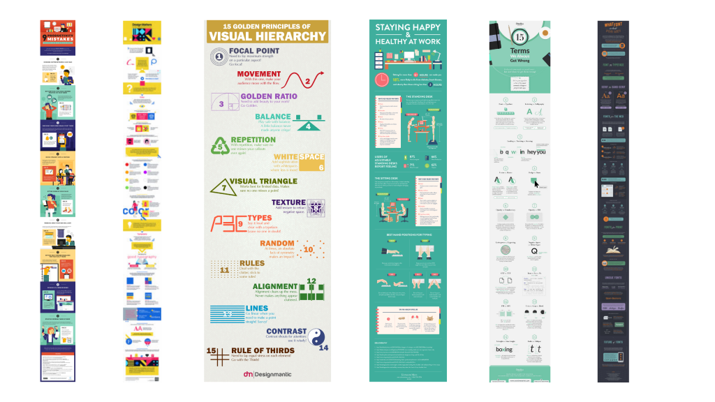
Looking for examples you like, and breaking down the components, can give you the proper foundation for a good infographic. This is also an effective strategy when working with a team.
Pull some examples, ask the team what they like. After they pick their favorites, tell them the exact word counts they should try not to go over if they want something similar. Also remind them that academic-speak and other jargon tend to have way more characters than the example infographic they probably chose.
Takeaway #4 A simple narrative can also guide your infographic creation.

We hear a lot about telling a story with data visualization. But it’s actually really hard to tell a story in just one frame. Usually you need at a least a few frames to properly set the story and then deliver the twist.
Infographics are hardly ever one frame, and this format gives you a lot of room to build. Considering there is rarely a limit on infographic length (unless you self-impose) you can take your time and develop a full narrative.
Creating and telling good stories takes practice, whether or not you use an infographic. But even telling a simple story can really boost the power of a report.
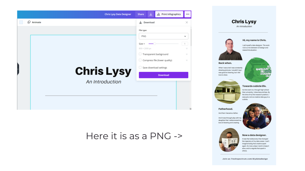
Activity – Create your own infographic.
If you do watch the video and decide to create your own infographic, I would love to see it.
Download it as a PNG and then share it on Twitter or LinkedIn. Mention my twitter handle (@clysy on twitter) or mention my name on LinkedIn (linkedin.com/in/clysy/). You can also just share a link in the comments.
DiY Data Design Workshop News
On Wednesday, October 13, we’ll have our 6th session (Splash Model Content Strategy). That means there are 5 other sessions you can watch right now if you join (~2.5 hours of content).
- Featured Images
- External Analytics
- Tableau One-Filter Dashboards
- Funnel Content Strategy
- Slide Style Infographics
I’ve also released the next 4 sessions. My plan with this workshop is to just keep presenting, 4 times every month. My goal is to create a large self-paced library with a wide range of workshop sessions you won’t find anywhere else. Then pair it with the kind of community and personal attention you rarely find at this price point.
Upcoming Sessions.
- 10/13 – Splash Model Content Strategy
- 10/20 – UX/UI Design Tools
- 10/27 – Social Media Insights
- 11/3 – Cartoon Illustration
- 11/10 – Slidedoc Reporting
- 11/17 – Personas and User Stories
- 11/24 – Thanksgiving Break
- 12/1 – Evaluating Resource Websites
Right now you can still join us at anytime. And at the moment, you can still lock in 20% off. This discount won’t last forever, so join us now!