This is an Eval Central archive copy, find the original at freshspectrum.com.
When I talk about report design there is always one message I make sure to deliver. People scan reports before they read reports (if they end up reading them at all).
But what does that mean really?
That’s what this post is about. We’ll walk through a couple of common reading patterns identified through eyetracking research. Then we’ll talk a little about the ramifications.

What do we mean when we say people scan before they read?
Most data people write reports like they were taught to write reports in university. Sentence after sentence after sentence.
Yes, by all means, use figures. But only if they are completely relevant to your words. And if you have no figures…well, that’s okay too.
But if you ask most data people how they read reports (other people’s reports), most will admit that they certainly don’t read the report like a book. Maybe you’ll start at the beginning, but doubtful you’ll read every word. Chances are, you’ll scan and every once and awhile stop to read a sentence or two.
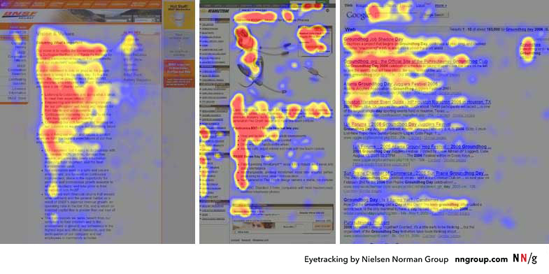
Eyetracking research backs this up. Especially for materials read on the web. If you want to dive deep into the subject, check out some of the work the Nielsen Norman Group has done over the years: How People Read Online: New and Old Findings.
Know that most users will read very little from a wall of text; support them by chunking your content into sections and bulleted lists, by using meaningful subheadings, and by special visual styling for keywords.

F Pattern reports in a Z pattern world.
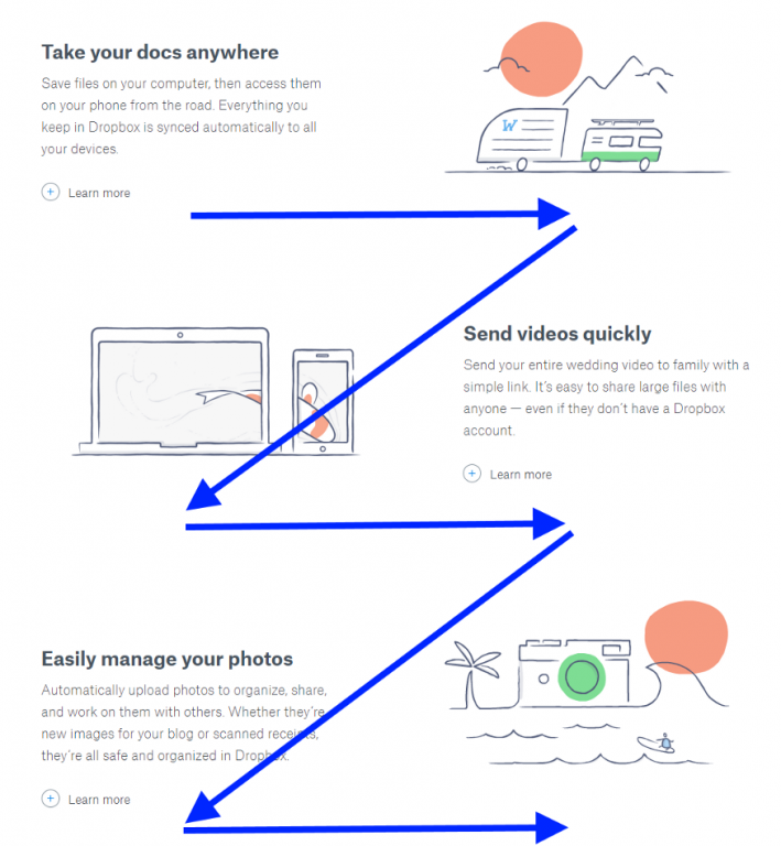
If you followed any of the links above, you’ll have noticed that there are several major eyetracking patterns depending on how the content is setup. I’m only going to focus on two here. The F Pattern and the Z Pattern (a.k.a. the zigzag pattern).
There is no superior pattern (these are just ways our eyes react to words and pictures on a page). But I do think that these reading patterns reflect the changing requirements we see in our own reporting worlds. In a way, we’re stuck between two mindsets.
On one side, the traditional report that is likely scanned with an F-Pattern. And on the other side, the modern visual report, that is likely scanned with an entirely different approach.
What is an F Pattern?

The F-Pattern is what happens when our eyes fall upon a big block of text.
At first we give it a shot, reading the top line (potentially the heading) and maybe a line or two following. Then our eyes drop until maybe a new paragraph, section, or sub-header. We’re a little less committed now so we might not make it all the way across the line of words. Then we drop to the bottom of the page.
In reports that are just straight narrative, with little to no section breaks, illustrations, or visual hierarchy, where our eyes stop while scanning is random and arbitrary.
Why People Scan in an F-Shaped Pattern
People scan in an F-shape when all of these 3 elements are present:A page or a section of a page includes text that has little or no formatting for the web. For example, it has a “wall of text” but no bolding, bullets, or subheadings.
The user is trying to be most efficient on that page.
The user is not so committed or interested that he is willing to read every word.
What is a Z Pattern?

The wide screens of the web are designed differently. Unlike the paper reports of the past, not everything is left aligned. We have sidebars and illustrations that shift from one side of the screen to the other.
Well designed sites are rarely filled with big blocks of text. Instead they guide the reader through intentionally, block by block, section by section.
As our reports adapt to meet the visual needs of primarily digital audiences, we need to understand that our reader’s eyes work differently on the web.
Think of the Z-pattern as the sister to the F-pattern. Both are naturally occurring eye patterns, as validated by eyetracking studies. The difference is in the type of content the user encounters. Usually, content-rich pages will trigger the F-pattern while pages with strong primary content are more suitable for the Z-pattern…
The Z-pattern is perfect for interfaces where simplicity is a priority and the call-to-action is the main takeaway. In short, the F-pattern organizes content, the Z-pattern emphasizes calls-to-action.

Know your report audience and sharing approach. Then design accordingly.
We’re in a period of transition.
We’re no longer governed by the spatial limitations of a typewriter. We can create reports with color and structures that don’t fit traditional molds. Yes, the structure might be different, but our reader’s eyes and reading patterns have been adjusting now for decades.
But even when we do create that long narrative report, adapt the design with respect to how people read. Use call-out boxes with larger fonts to layout the important takeaways. Use color and illustration to draw attention to the points you want to stick in your reader’s mind.