This is an Eval Central archive copy, find the original at freshspectrum.com.
Imagine going to a fancy restaurant (pre-COVID).
The dish you order is fantastically presented, it looks and smells phenomenal. It looks so delicious you consider taking a picture and sharing on your favorite social media account.
But what would happen if you surrounded that dish with a grungy atmosphere and put it on a dirty table? What if your server is pre-occupied with their phone and forgot to get your drink? What if the food was spoiled before it was cooked and plated? What if it makes you ill?
The presentation of the food is important, but context and quality really matter.

The same goes with a well designed chart. If you put it into a poorly designed report it’s never going to have the same impact. I often get asked to review charts in reports. But most of the time it’s not the charts that need the most work.
Want to make your charts shine? Start by fixing your report design. Here are some ways you can fix your report.
1. Incorporating white space into your template.
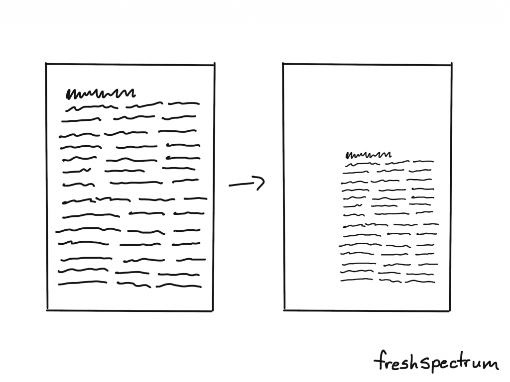
When you write a report it’s standard practice just to fill page after page with words. But just because you write it that way doesn’t mean it’s the best way to present your words to others.
A little white space can give your words breathing room. Even if it means reducing the type face, the result is worth it.
My suggestion, put your words into a basic 3 or 4 column grid for your final draft. But keep at least one column empty. Use it only for call-outs and captions. It can do wonders. Not sure how to do that? This post I wrote on creating a sidebar style one-pager in Adobe XD will give you the gist. Then just copy and paste the page until you have enough for your full report.

2. Designing your sections and subsections to create a rhythm.
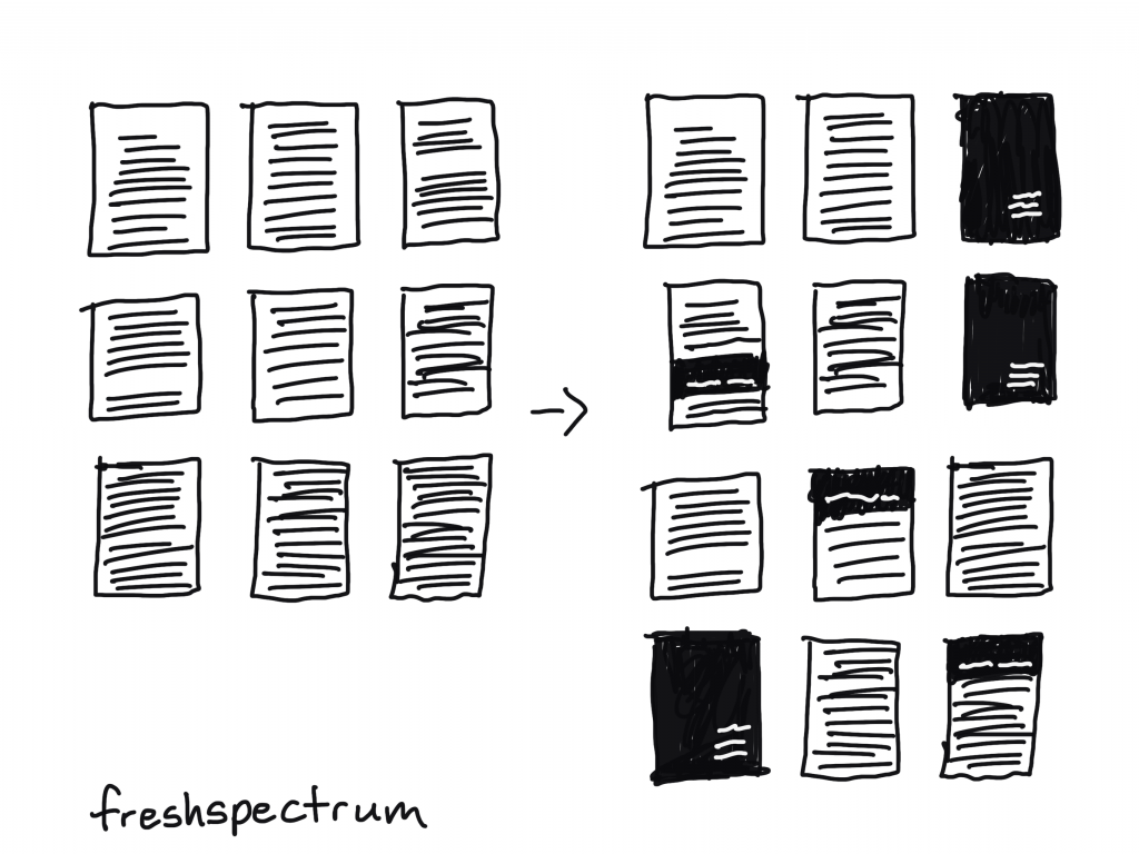
Blank pages and empty color blocks might seem like wastes of space, but they can really set a nice rhythm for your reader to follow. This improves the overall skimmability and makes the report feel like more than just one continuous stream of thought.
All you really have to do is create a mostly blank page at the start of a new section. And possibly use some kind of color block or large header to denote section breaks. Also don’t be afraid to start the next section or subsection on a new page. This can give your reader a chance to catch their breath.
Ann K. Emery has a nice post that shows the value of sectioning. I suggest you check it out. A Two-Hour Turnaround: How to Transform a Text-Heavy Report into a Visual-Lite Report.
3. Making your colors consistent.
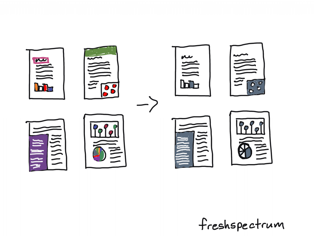
Color can be an incredibly useful tool in spotlighting specific information or differentiating important points. But you need to see color, not just in a single figure, but in the context of the whole report.
Far too often individual charts/tables/pictures get picked without regard to the other elements in the report. The result is a hodgepodge of colors that don’t fit together.
Before you finish with your report, go back through and make your colors consistent. If there is a reason to break the rule (to showcase a specific point) then do it intentionally. Haphazard colors and formats are quick tells that the report has been designed by an amateur.
Having trouble with colors, this post might be helpful: How to develop a data visualization color palette.
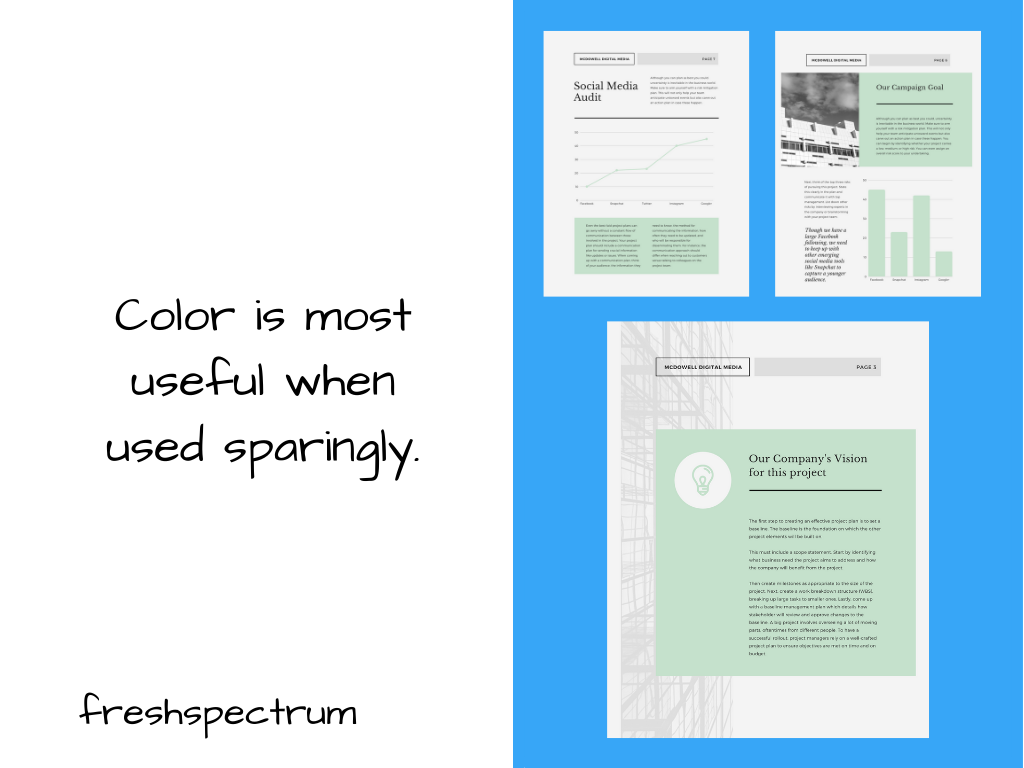
4. Add basic illustrations to create visual break points.
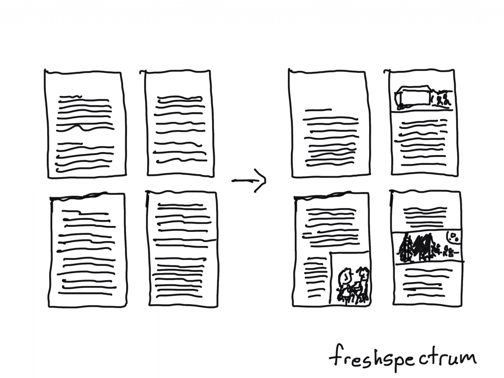
In a lot of reports you only find pictures when there is a chart to share.
But pictures can really help create break points, especially in long narrative sections. Skim readers often react to long narrative sections by skipping to the next section header or visual. So if you want them to stop and look more often, a mid-narrative illustration can really help.
And if it’s an evaluation report, you can always drop in one of my cartoons: 111 Evaluation Cartoons for Presentations and Blog Posts.
5. Systematically spotlight important takeaways.
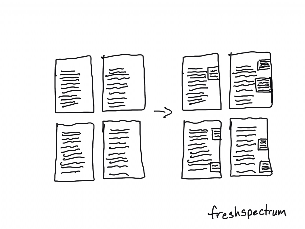
The idea that your target report audience is going to pick up your report and read it like a book is a good bit outdated. That’s just not how people read. Especially since most reports now-a-days are going to be read on a screen.
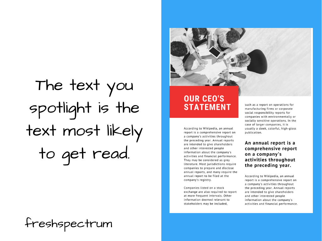
Systematically spotlighting take-aways with call-out boxes can help you layout a broader narrative. Even if your reader only skims your report.
If you’re interested in diving deeper into how people read, this Nielsen Norman Group post is a solid read: How People Read Online: New and Old Findings.
6. Review and revise as a skim reader.
Okay, so you can complain about how nobody takes the time to read anything but what good does that do. We are oversaturated with information. It overwhelms and reduces our ability to pay attention to even the things that are most important to us.
My suggestion, just understand that and adapt your report.
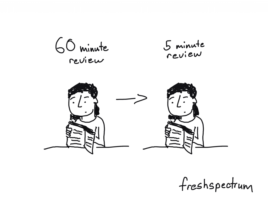
Your report should tell a story even to people who just skim it. But when you have your head down writing out all the stuff it’s hard to see what the skim reader will see.
So take 5 minutes and review the report like somebody who doesn’t have the time or attention span to properly review the report. What are they going to get out of it? Is there anything interesting that might really draw them in?
If not, don’t be surprised when nobody reads it.