This is an Eval Central archive copy, find the original at freshspectrum.com.
This is the second in a series of posts on data design in Canva. Today I’ll show you how to use Canva to create Moodboards.
Have you ever watched an interior design show?
There is a moment where the designer shows up with a board filled with colors, sketches, and pictures in order to present their design concepts. This is before they start throwing things away and repainting the walls.
Moodboards are used in all sorts of design settings from fashion to magazines to websites. But they can also be really useful for report design.
One of the biggest report design challenges is that a team tends to wait until everything is written before putting together the design. So when it comes time to actually design your report, the person doing it tends to find a quiet room and just create alone.
The problem occurs when they make a design choice or two that somebody with a bit of authority dislikes. Maybe they’ll just decide to stay unhappy or they’ll push for a complete redo of the design.
This is where a moodboard comes in. It’s like an incomplete barebones prototype of a design idea. Here is how to create one in Canva.
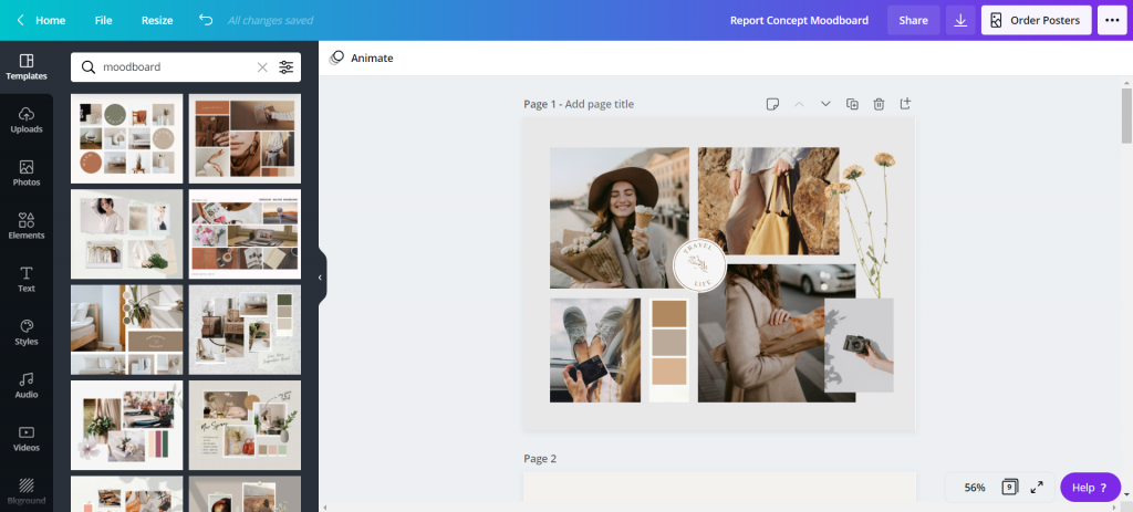
Create a Presentation, then search for “Moodboard” templates.
A lot of the templates you’ll find seem made for interior designers and wedding planners. But that’s okay, we can still use them.
Think about the elements they show. For a report, you’ll often want to show a few different page template concepts, the color scheme, a picture or two, and maybe an example of how you’ll do call-out boxes or quotes.
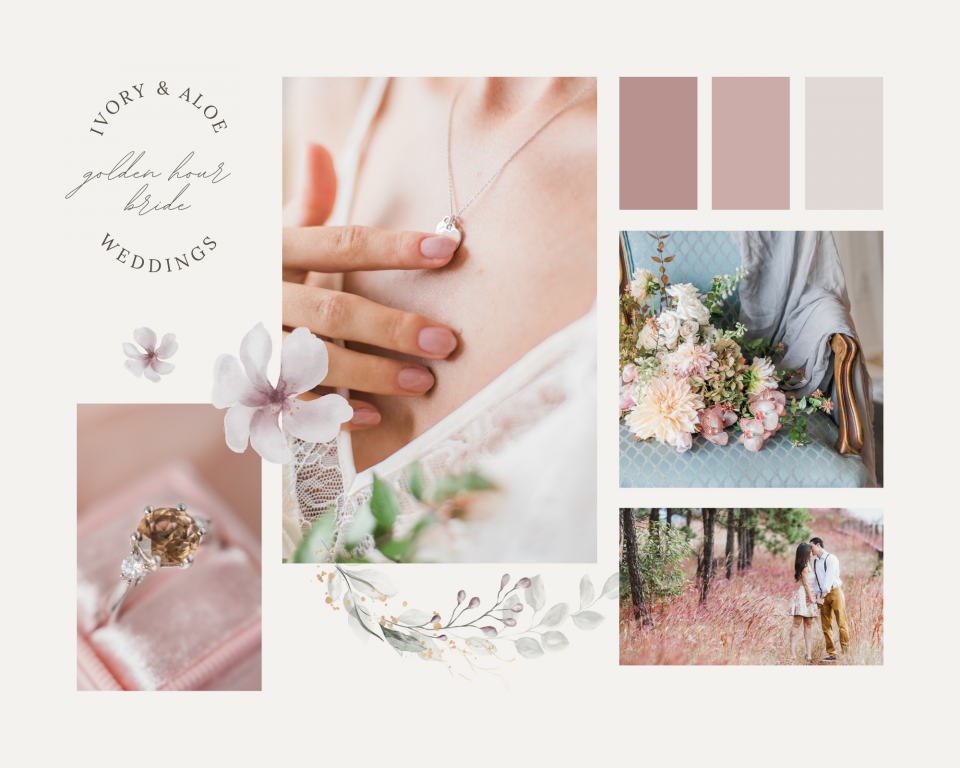
Starting with a Wedding Planner Template
This template is clean and includes a lot of rectangles, which can quickly be replaced by page designs. The next section I’ll show you a transformed version.
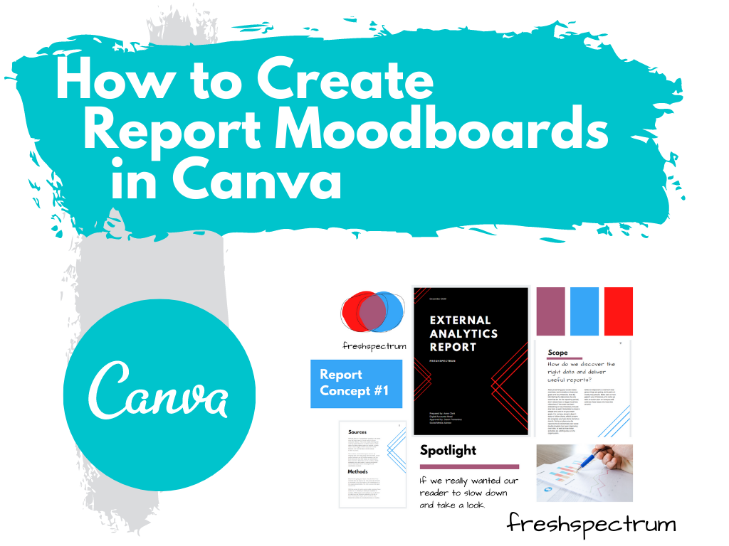
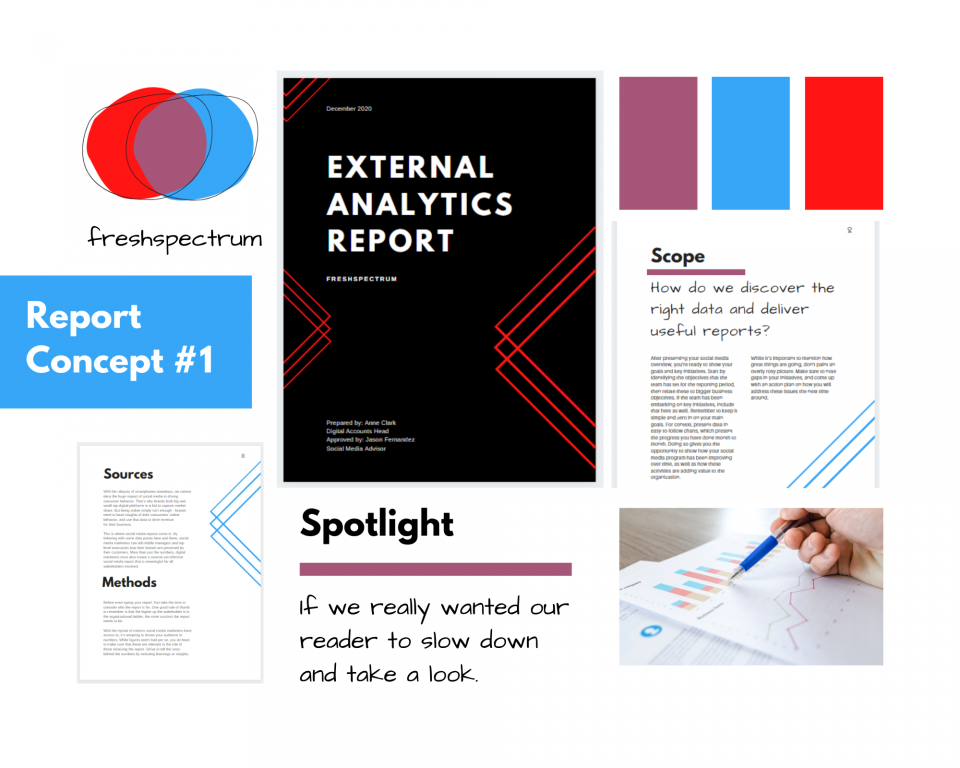
So here is the moodboard redesigned as a report moodboard.
So for this report concept I used my logo to draw out the color scheme.
Since this is just a concept, a single slide will do. I included the logo, a cover page, two inner pages, a picture, the colors, and an idea of how I would spotlight some of the report text.
I changed up the headers, but the words have nothing to do with the report. Depending on how important the concept is, I might go in and turn all the words into descriptive phrases that highlight my design decisions.
Most of the time, early in the process, I’ll create two or three of these to send to the writing team for their feedback. It’s always good to share at least two versions (“this or that” gets better feedback than “thumbs up, thumbs down”).
Now let’s try a more random moodboard.
The goal of a moodboard isn’t always to give a prototype. Sometimes it’s just about conveying the “feel ” of the report visually. While you might be able to visualize your idea in your head, it’s often harder to convey that visual idea to others.
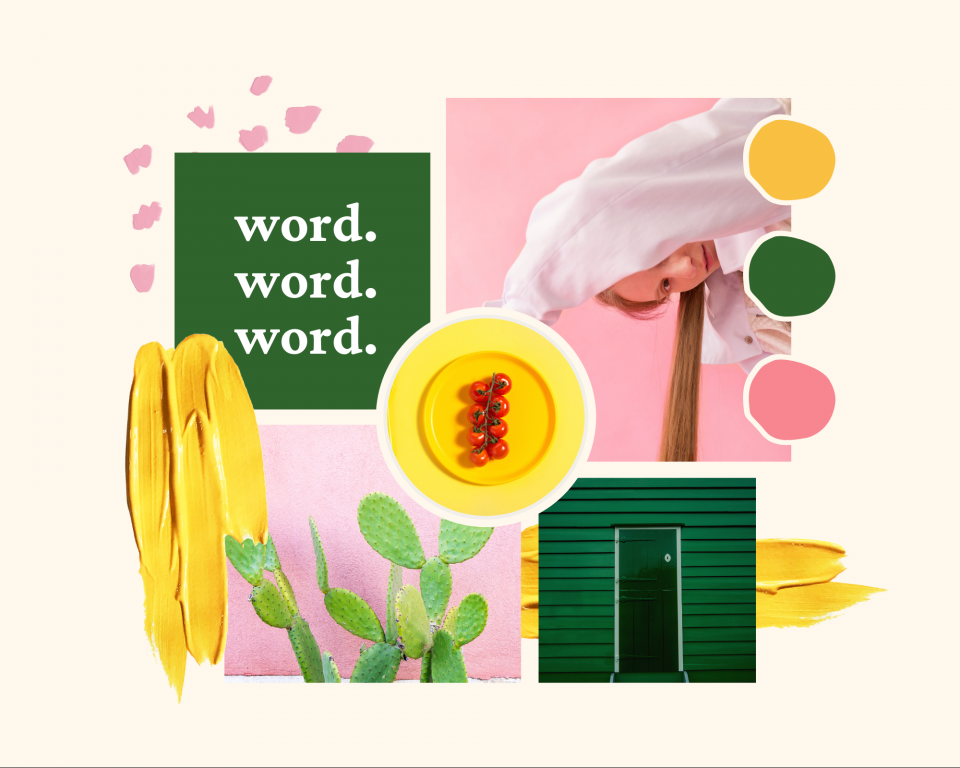
Visual metaphors and other inspiration.
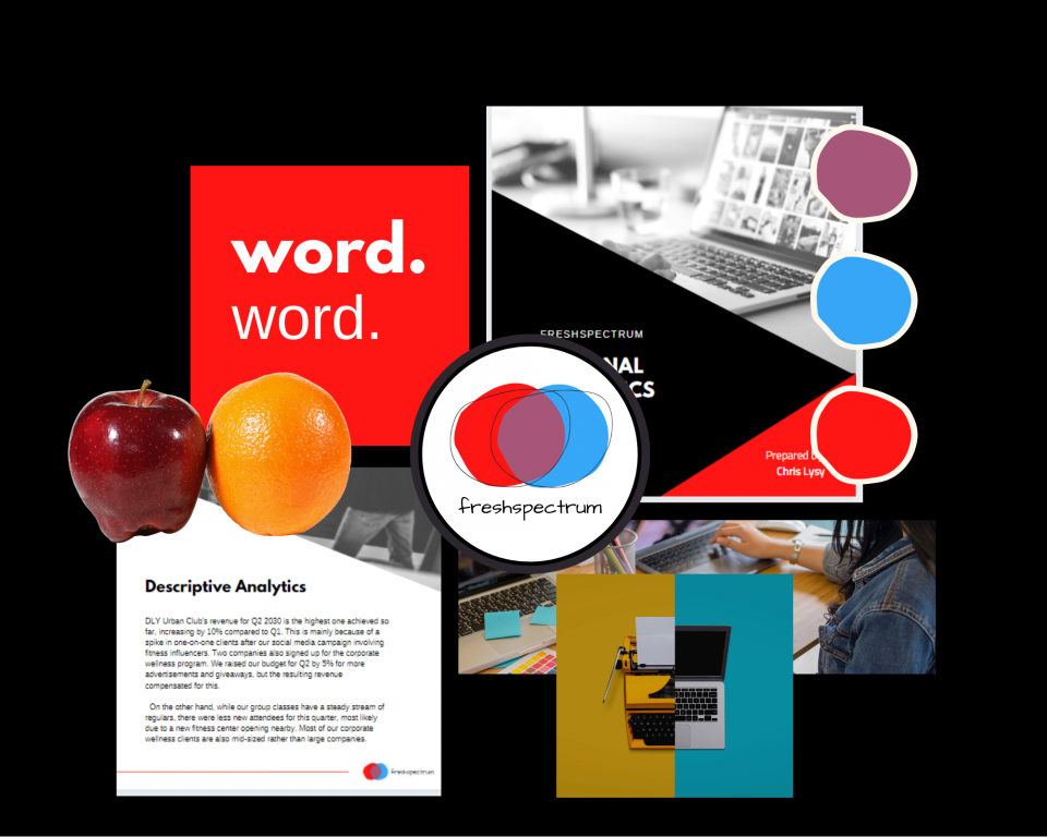
Okay, so here is another concept for the external analytics report.
My approach to analytics is all about thinking through the eyes of the website user. I also ground my approach using comparisons to other websites. So instead of just showing design elements I also put in a few visual metaphors (apples to oranges, person with two side by side computers, typewriter/computer). Then I have a cover page and an internal page, along with the colors and my font choices.
No right or wrong way.
Moodboards are part of my design process. I use them for all sorts of things. It gives me a chance to address certain important design choices before the report is even finished. And it greatly reduces the overall amount of back and forth design choice editing.
Most organization style guides (even the really big guides) still provide a lot of room for different design interpretations. So try it, there is no right or wrong way.
