This is an Eval Central archive copy, find the original at freshspectrum.com.
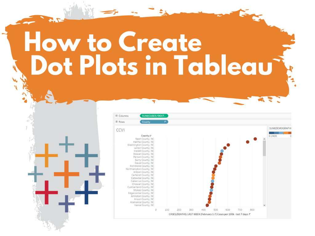
This is the first in a series of posts on data design in Tableau. Today I’ll show you how to use Tableau (Public or Desktop) to create a Dot Plot. This time we’ll use our Dot Plot for an Exploratory Analysis.
Visualization is not always just about reporting. Visuals can help you to analyze and make sense of your data, not just report it to others. This is one of the biggest values brought to you by a tool like Tableau. And you can get that value even with the free Tableau Public.
Not Getting Overwhelmed by Your Data.
Alright, so let’s find a dataset that is interesting if not a bit overwhelming. Given that we are still immersed in COVID-19, let’s start there.
Here is a National COVID-19 Community Profile Report.

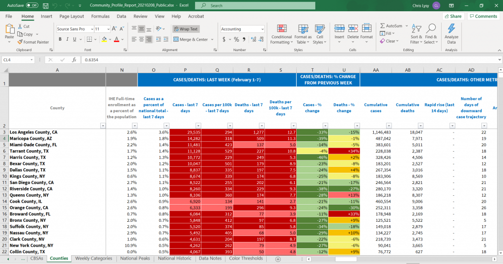
On that page you will find a PDF report that’s updated daily. For each PDF there is also a related Excel spreadsheet. That’s what we’ll explore.
There are bunch of sheets here, the one we’ll look at in Tableau is the County Tab.
Not Getting Overwhelmed by Tableau.
So there is a lot you can do with Tableau. As such, it can be overwhelming if you’re not used to the platform.
Let’s not let it. It doesn’t matter if you know everything Tableau can and can not do. We’re just going to use it to make a spreadsheet less overwhelming.
Drag and Drop your Spreadsheet
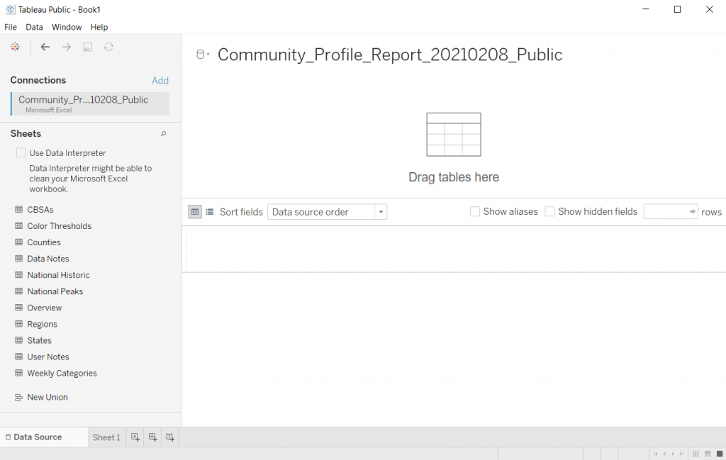
So when I use Tableau, most of the time I’ll just open up the program. Then I’ll drag and drop a spreadsheet I want to peruse onto the Tableau window.
Tableau will then open it up.
Pick a Sheet
Let’s choose the Counties sheet. Just drag it from the left to the spot where it says “Drag tables here”
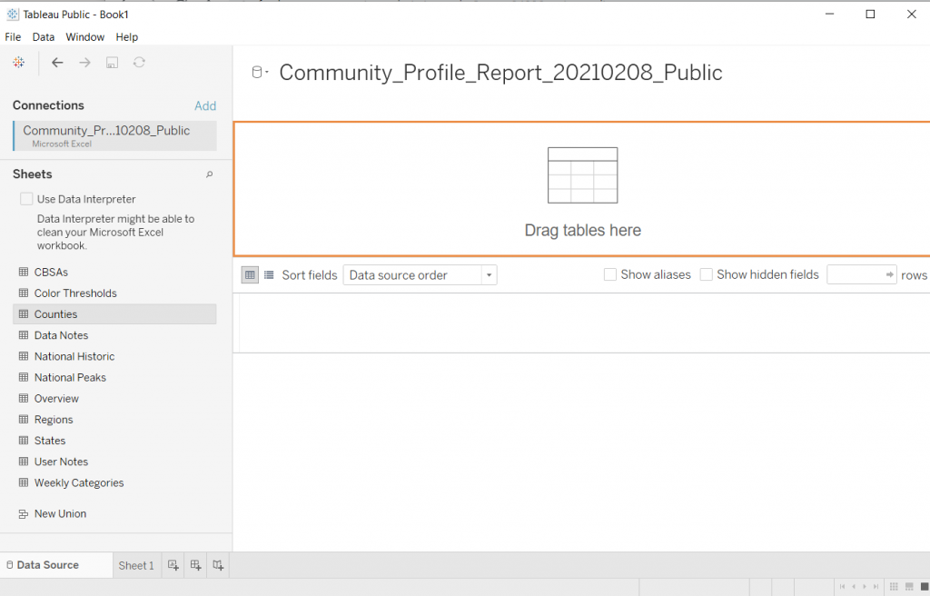
Tableau will show you the data.
If you take a look at the preview, you’ll notice that it didn’t pull the data in a way that’s super useful. This is because of the formatting of the original Excel file.
I used to advise people to tailor the spreadsheet in Excel first then drop it into Tableau. But that’s just extra work, let’s see what happens if we click the little “Use Data Interpreter” box.
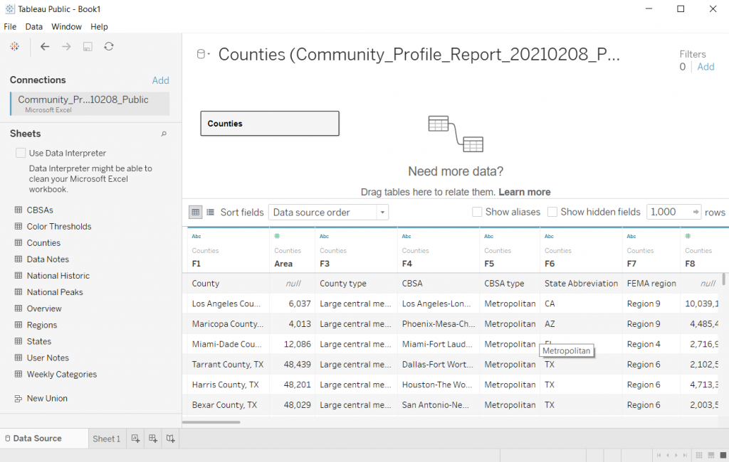
Clicking the Use Data Interpreter Box
Sweet, that cleaned up our dataset. If I were going to use this for some major analysis I might do some more cleaning. But I don’t really care about that right now, I just want to explore.
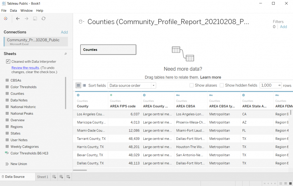
Clicking on Sheet 1
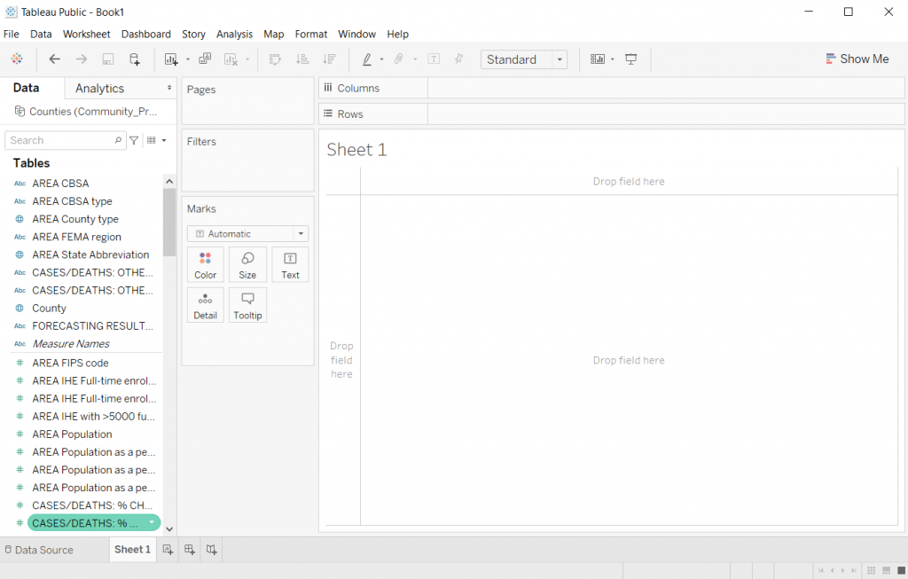
Once you have the data source setup, you can start exploring by clicking on the first sheet.
Filtering the Data
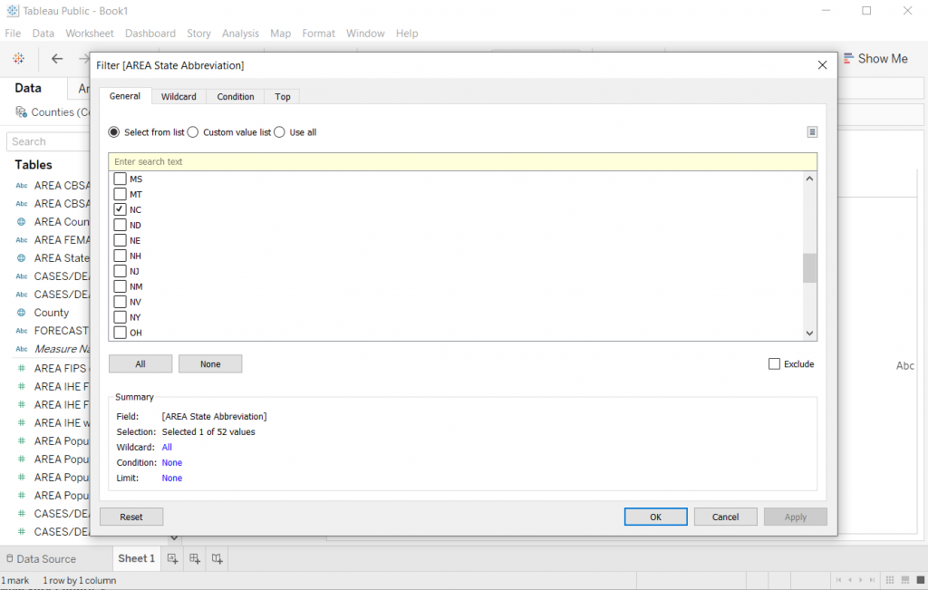
Alright, so every county in the Country is a lot. Let me start by just looking at my state.
I’ll drop the “State Abbreviation” variable into the Filter spot on the page. This will give me a popup where I’ll select NC.
Showing the data.
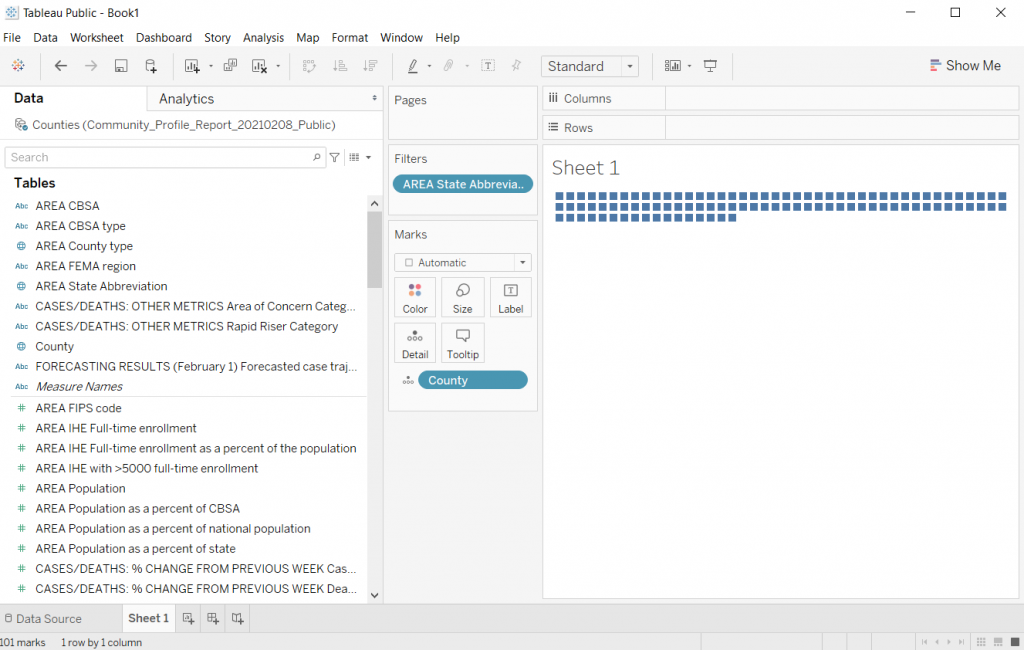
The first step in creating a dot plot (there is no real order to this but it ended up being the first thing I did) is to drop county in the detail box under marks.
Creating the Dot Plot
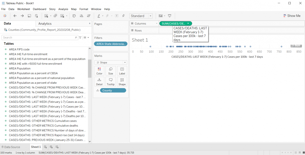
Now we just need to drop a variable we want to look at in the Column’s spot.
I’ll look at Cases per 100K from the last 7 days. This will give us a nice normalized set of data to compare across NC counties.
Poof, dot plot created.
*Yes, it says “Sum” but since every county has one and only one data point, the “sum” is just the value. You can check this by changing the data from Sum to Average. If the values change it means you have multiple values per data point.
Filter Out Null
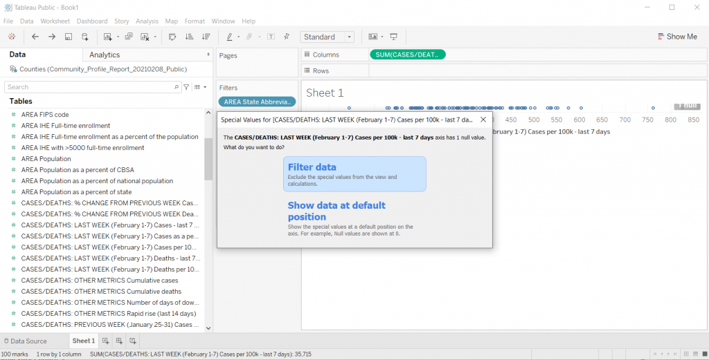
Who wants to look at Nulls. I’ll go ahead and filter it away (this one is just an artifact of the dataset).
Making the dot plot bigger.
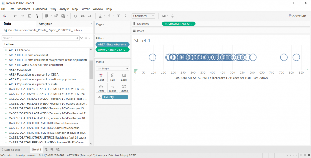
If the chart is too small, you can just drag the bottom down (below the horizontal axis). This will make your chart bigger.
Changing the shape.
We can the shape of the mark using the shape button. So if you don’t like the little hollow circles, this is where you change it up.
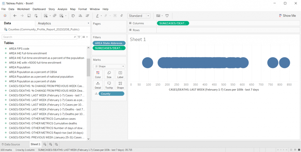
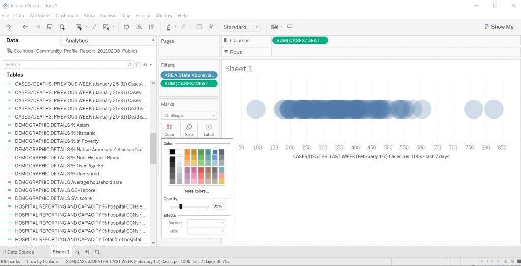
Adding Transparency
I like this trick when you have smaller datasets with just a bit of overlap. Click on color then lower the opacity. This gives you a kind of heat map effect on your dot plot (this works well with scatter plots too).
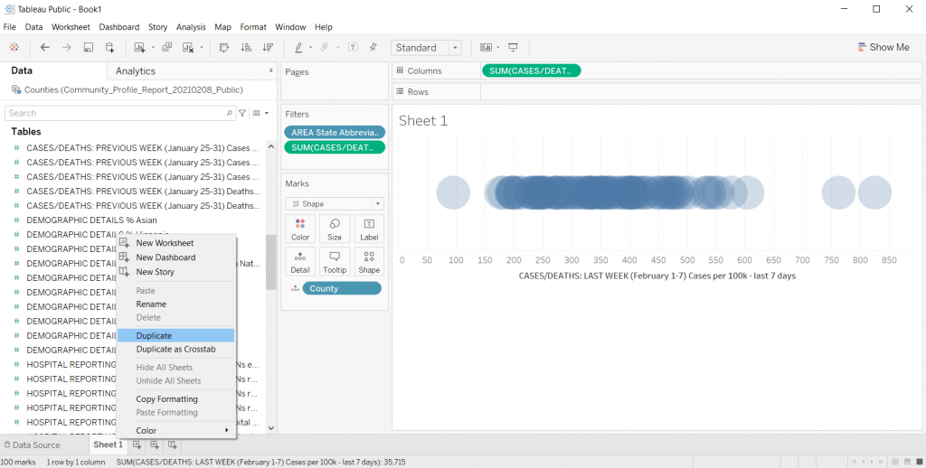
Trying Different Things by Duplicating the Sheet
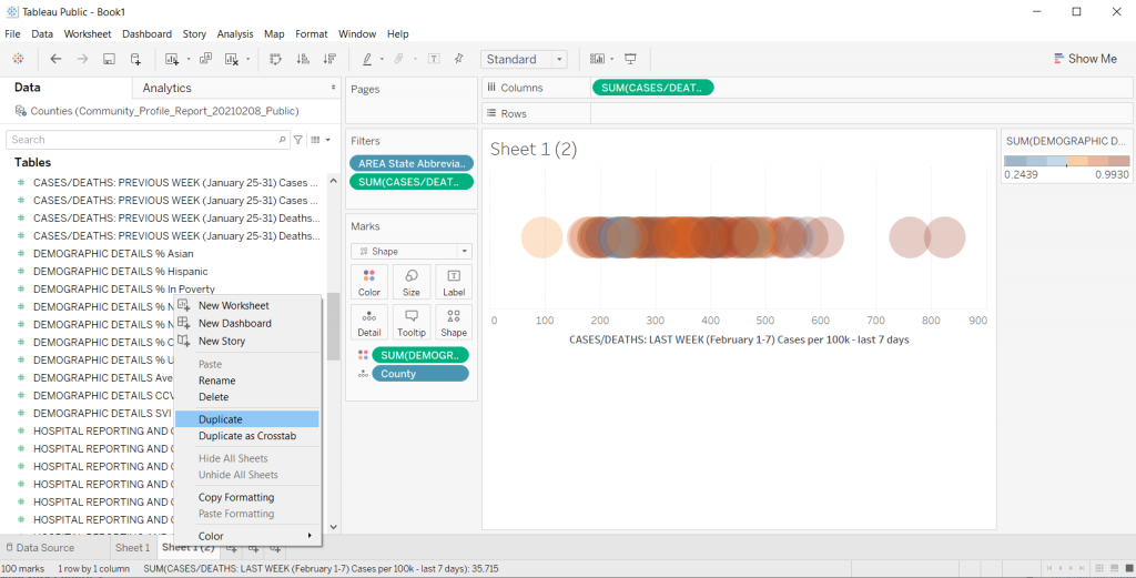
When I’m exploring data in Tableau, usually I get to a good base visual, then I duplicate the sheet. Just right click on “Sheet 1” at the bottom of the file and click Duplicate.
Honestly, there is too much overlap for this particular chart to be very useful. If NC only had something like 30 counties it would look different, but with 100, it really looks just like a dark line.
Adding a Color Variable
So one of the ways to increase the usefulness of a dot plot (for exploration) is to visualize another variable using color.
So there is a CCVI score in the underlying dataset. It’s something called the COVID-19 Community Vulnerability Index (CCVI). A take on the CDC’s Social Vulnerability Index (also in this dataset).
Since there is a CCVI score for every county, I’m going to drag this variable into the color spot. Then I’m going to change the color (by clicking edit colors) to a diverging Orange-Blue. I’ll also click the Stepped color box (6 steps) and click the reversed box to make the scale go from Dark Blue (low vulnerability) to Dark Orange (high vulnerability).
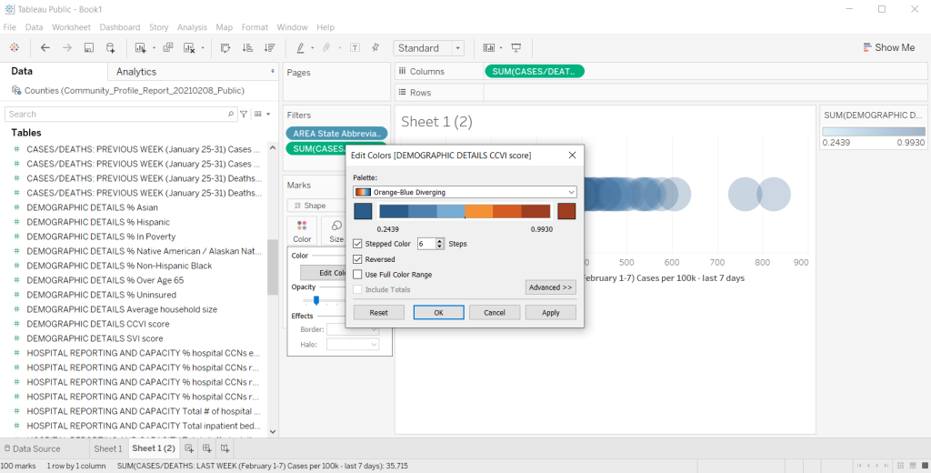
This is also kind of impossible to see anything with, so I’ll go ahead and duplicate the sheet again to try something different.
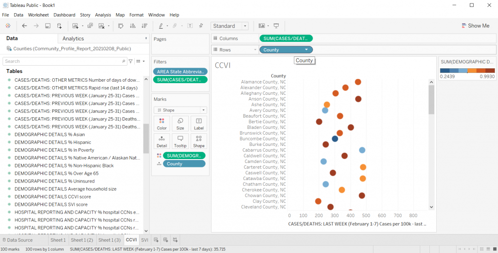
Let’s add some separation.
There are times when I like seeing everything on the same line, especially if I want to bundle something up at say a National level. But this single line dot plot isn’t really showing me much.
Instead, I’ll drop the County variable into the row column. I also took away the transparency on the dots and fiddled with their size a little. This gave me something I could scroll through and sort.
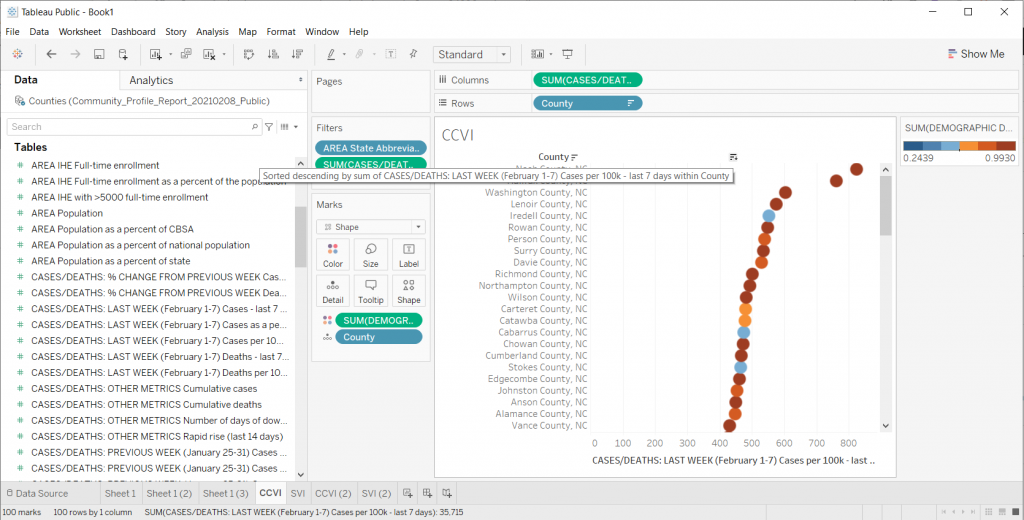
Quick Sorting of the Data
So if you put your cursor to the top of the dot plot, you’ll find a way to quickly sort your visual. This certainly gave me a view where I could see some differences. This particular view/variable didn’t shout at me but it definitely gave me a clearer picture of underlying case data.
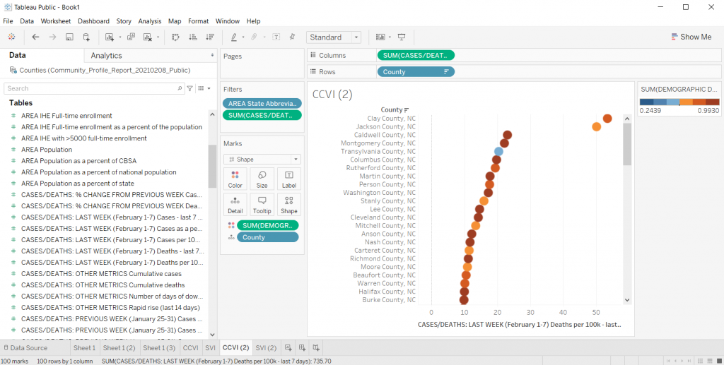
Changing the Data
Once you get a view you like, you can start changing the variable still using the same visual. For instance, instead of just looking at cases per 100K, what if I started to look at deaths per 100K?
Instead of looking at CCVI, what if colored the dots using the SVI data instead? Do certain patterns start to emerge?
Comparing Views
In Tableau, if you ever want a side by side view, you can just click on the “Dashboard” tab and give yourself a nice large size dashboard. Then put sheets side by side.
It doesn’t have to be perfect, remember, this whole exercise is just about using visuals to explore your data.
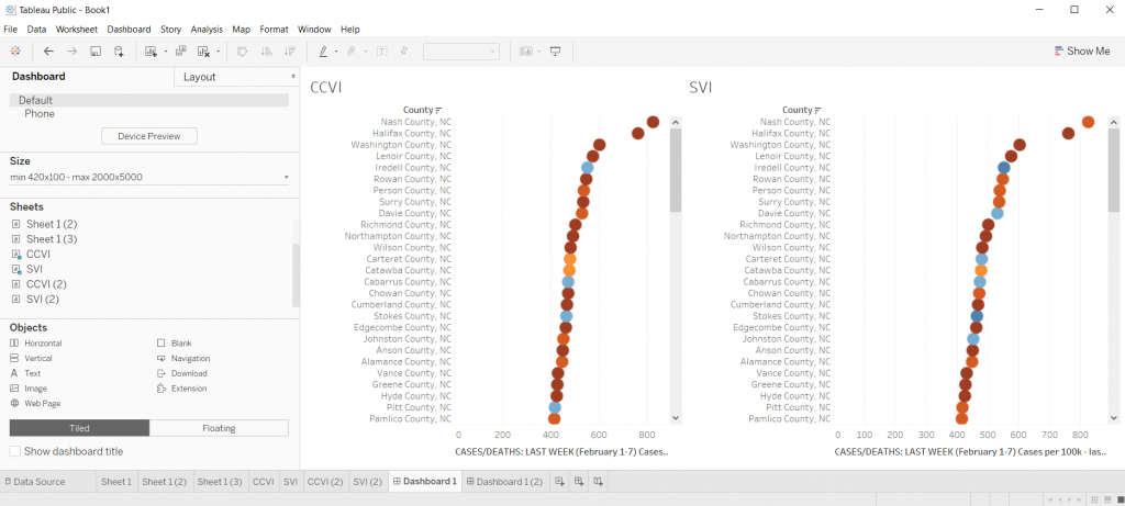
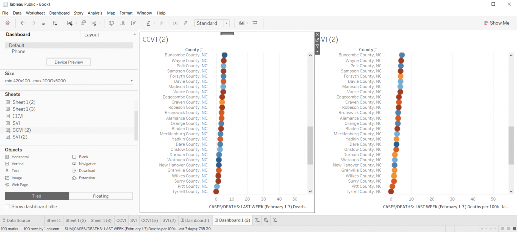
So what have I discovered?
Nothing earth shattering. I was just playing around with data as a way to show you how to play around with data in Tableau.
It does look as though the CCVI is more likely to correlate with a higher incidence of COVID-19 compared to the SVI, and even more so with COVID-19 deaths per 100K. I could sense enough of a pattern to get me curious and push me to dive deeper. And ultimately that was really my goal.
Playing with data means a lot of not-finding anything notable, hopefully followed by a “hmm, that’s interesting.”
Try it Yourself
Now it’s your turn, try to dive into the dataset I shared above. Is there anything you can learn?
