This is an Eval Central archive copy, find the original at freshspectrum.com.
This is the third in a series of posts on data design in Adobe XD. Today instead of charts, I’ll show you how to use Adobe XD as a print design tool for one-pagers. We’ll design a really simple but totally versatile sidebar style one-pager.
What you’ll find in this post:
- An Oversimplified How To
- How to do more with your one-pager.
- Some nice free graphic design guides.
- My new virtual learning community.
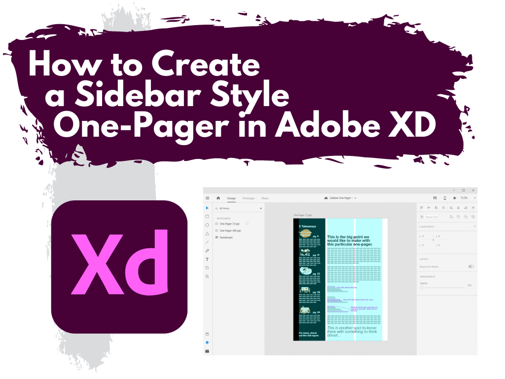
Before we dive into today’s tutorial. A note about using columns or grids in your designs. Do it. It’s one of the best ways to give your reporting a more polished professional look.
Using a grid permits a designer to more rapidly lay out enormous amounts of information because many design considerations are addressed in building the grid’s structure at the outset of a project.
An Oversimplified How To
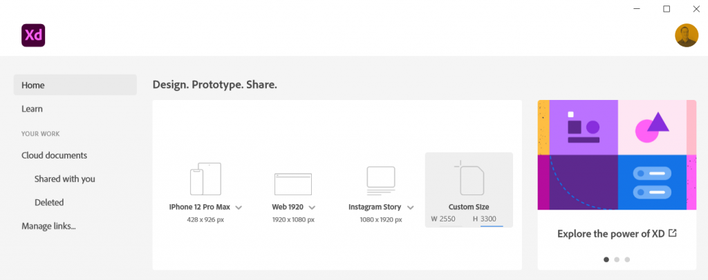
Step 1. Create a custom size artboard in Adobe XD. We’ll be creating a simple 8.5 by 11 one-pager, but we’ll need to convert that to pixels.
A web search will tell you to do 300 pixels for every inch which will give you a 2550 by 3300 art board. (I’ll tell you later in this post the pixel dimensions I use most often for one-pagers, because it’s different).
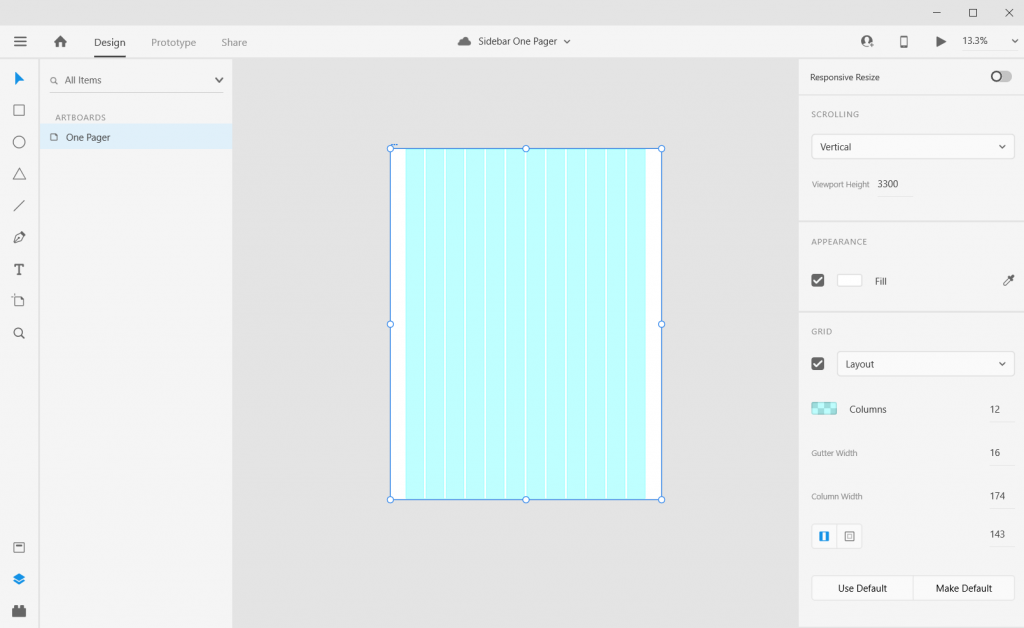
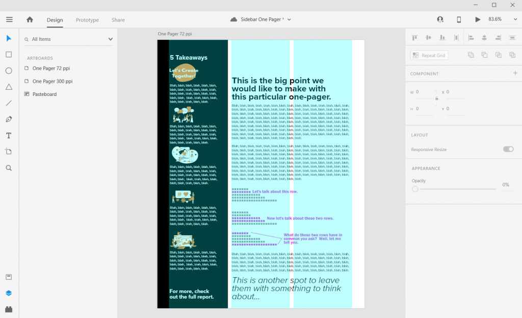
Step 2. Once we create the artboard we’ll select it and check the box under grid for the layout.
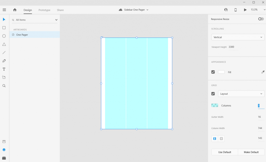
Step 3. Let’s go with one of the most common page layouts and use 3 columns.
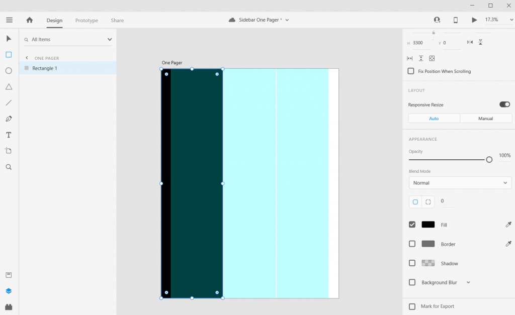
Step 4. Once the columns are set, draw a rectangle (and give it a dark color) and place from the left edge to the edge of the column.
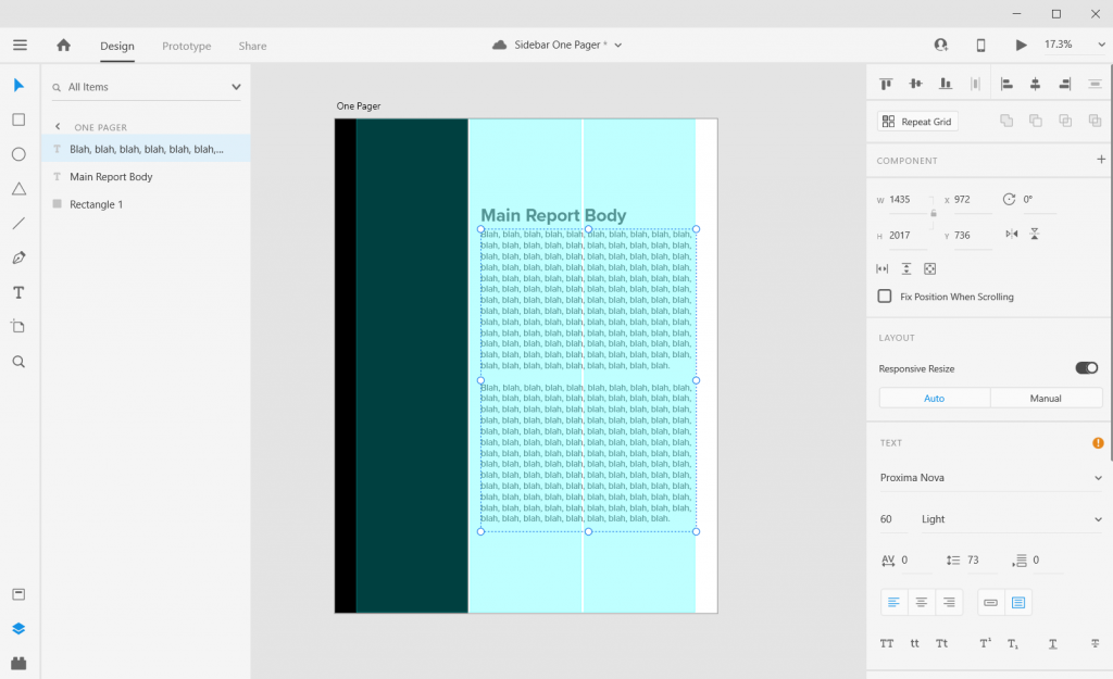
Step 5. Now add some text boxes in the right two grids where the text will go, the font sizing will be wonky so just create what you think looks okay (this is because of the artboard size that I’ll get into later).
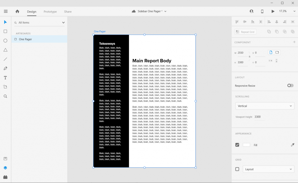
Step 6. Now add some text boxes in white for the left hand sidebar.
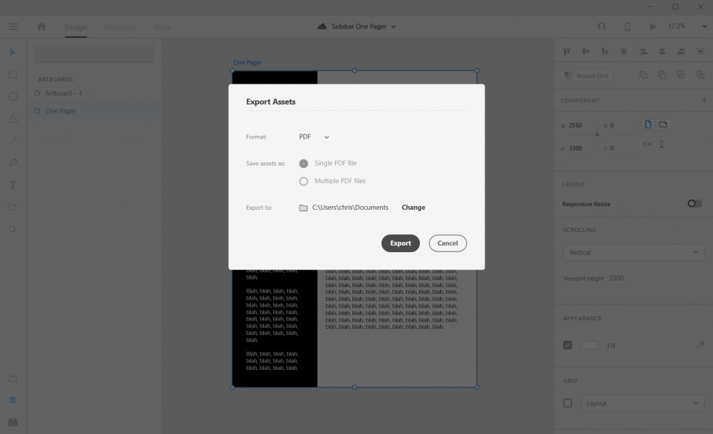
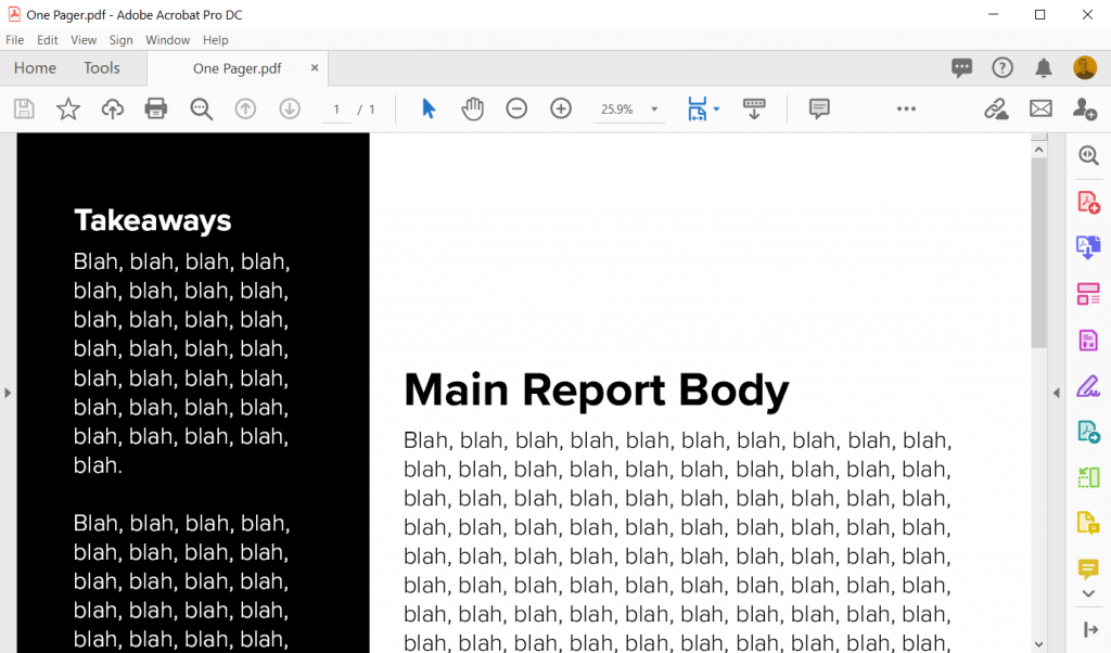
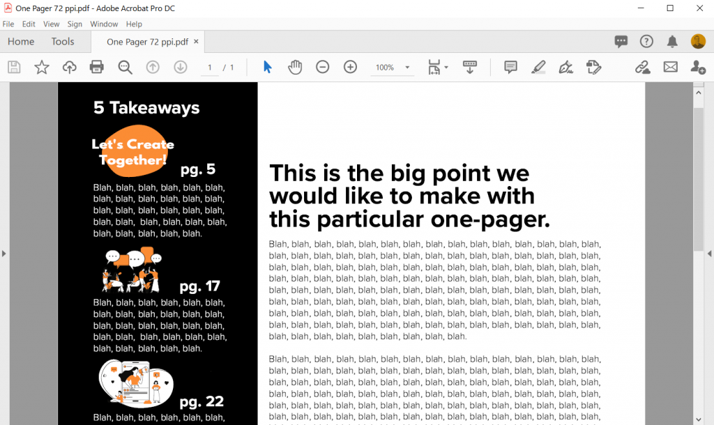
Step 7. Now export your completed one-pager design as a PDF. Then open it in Acrobat and marvel at your new layout design skills.
How to do more with your one-pager.
Okay, so that was a really basic one-pager design. Let’s tweak it a bit and make it cooler/more useful.
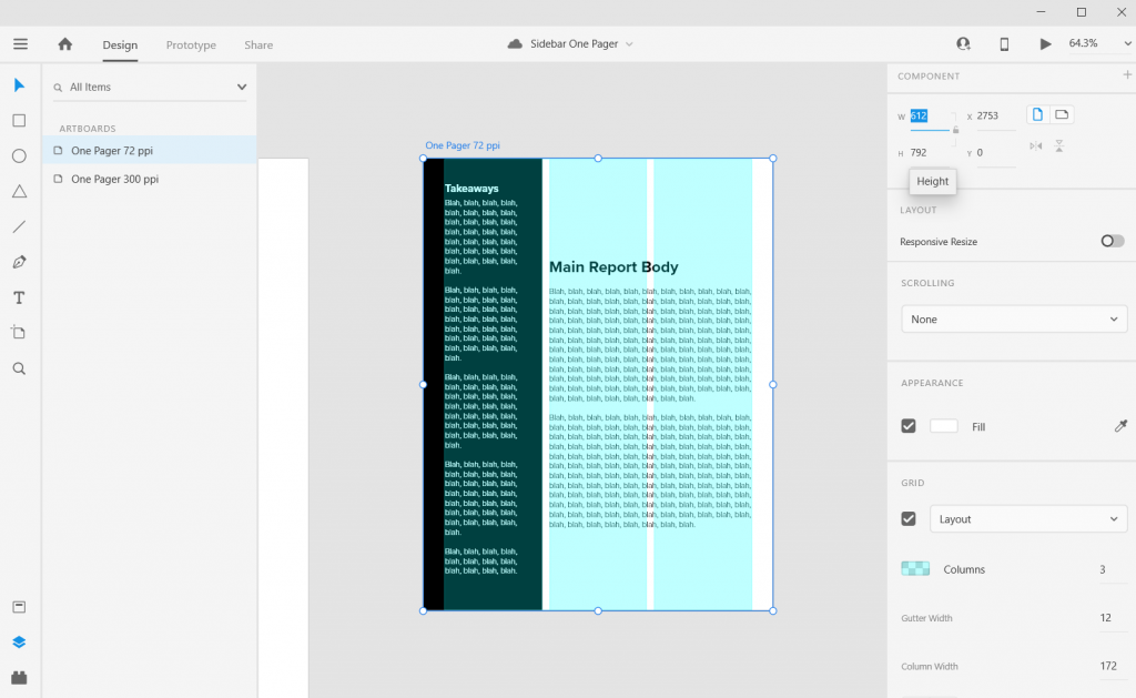
Change the Artboard Size to 72 pixels per inch
So the conventional web guidance of 300 pixels per inch is based on old print thinking. The idea goes, well a high quality print is 300 dots per inch, so we should just multiply inches by 300.
But our digital screens are optimized at 72 pixels per inch. And since XD is a vector design tool (the pixel ratio won’t impact quality) and a web design tool, let’s create an artboard that is 612 w and 792 h.
Don’t worry I won’t go anymore into the pixel nerdery. Just know that using this ratio, all of the font sizes suddenly will work out properly!
Adjust the Gutter Width, Margins, and Fonts
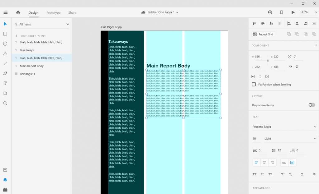
The Gutter is the space between columns (I’ll usually go with multiples of 4). With this one I went with a gutter width of 12 pixels and a margin of 36 pixels. This automatically set the column width at 172 pixels.
Now I can also set the font sizes at appropriate levels. So for the main body text I used a 10 point Proxima Nova font and a size 26 bolded header font.
Icon Illustrating the Sidebar
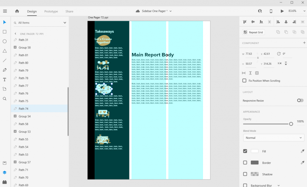
Sidebars are a good spot for a little icon illustration. I’ll left justify those against the side the column (you’ll see why in a few).
Charts and Pictures in the Main Body Section
I like using the main body to make the major point the one-pager is trying to express, then add any relevant chart or illustration. You can even drop a final thought and make it stand out through italics or a larger size.
In XD your text and shapes will be vector (meaning they will scale to any size without quality loss). If the Pixels/Icons/Charts you enter into the document are not vector (i.e. pngs, jpgs) they might lose quality. Usually if the file size is large enough and you don’t skew it, you won’t notice a difference. But the best way to check is to export it into a pdf and see what it looks like at 100%.
Takeaway – Page Numbers
One-pagers are often sub-reports with content pulled out of larger reports. They don’t tell the whole story, but give teasers.
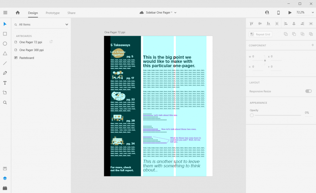
When there is a larger report, I like to drop in page numbers for anyone wanting more detail.
Don’t be afraid to leave white space.
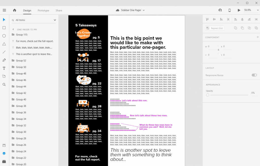
I like to leave a bit of white space when possible. This can make the one-pager feel less intimidating.
Most often I’ll leave it in the top of the right two columns. Putting it at the top makes it feel more intentional, not like you just ran out of thoughts.
Exporting into PDF
You can export your reports right into pdf.
I never suggest writing your report in design program. I usually use Word documents or Google Docs to write. Then I copy and paste the text into prepared templates in XD.
Some nice free graphic design guides.
A lot of my interest in grid based design started when I found the work of the late Massimo Vignelli. There are a couple of his works available on the web for free download, and they are well worth the read.
The Vignelli Canon

The famous Italian designer Massimo Vignelli allows us a glimpse of his understanding of good design in this book, its rules and criteria. He uses numerous examples to convey applications in practice – from product design via signaletics and graphic design to Corporate Design. By doing this he is making an important manual available to young designers that in its clarity both in terms of subject matter and visually is entirely committed to Vignelli’s modern design.
Designed by Massimo Vignelli, 2009, 96 pages.
Graphic Design for Non-Profit Organizations
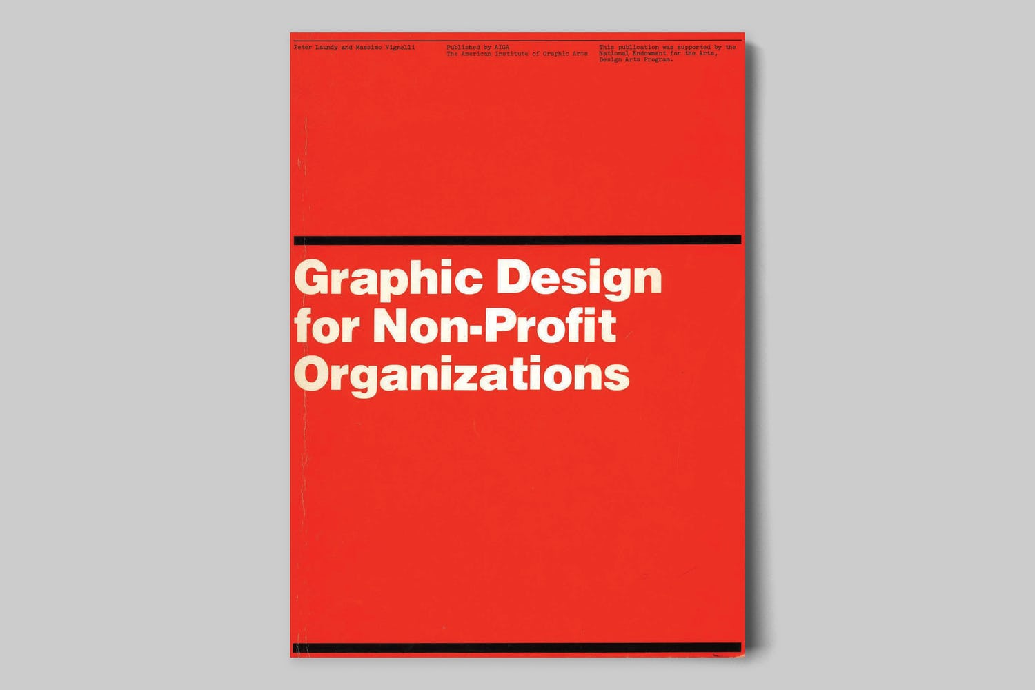
The document presented here focuses on improving structural design and general best practices for Non-Profit Organizations. However, the scope of the teachings apply to achieving good design across any industry. These works are the property of their respective owners and should be used for non-commercial research and education purposes only.
Designed by Massimo Vignelli & Peter Laundy in partnership with AIGA, 1980, 52 pages.
A Learning Community for Creative Data People
So I’m considering building a new virtual learning community. This would be a peer learning group, not just me telling you how to do things. It’s for data people (researchers, evaluators, public health professionals, etc.) who are interested in exploring and building up their creative side.
It’s for the people who believe as I do, that if we want people to make data informed decisions, we (the people who know the data) have to be more creative in how we approach doing and sharing our work.
Interested? You can learn more here and join the waitlist: