This is an Eval Central archive copy, find the original at freshspectrum.com.
This is the third in a series of posts on chart design in Excel. In each post we will take on a different chart type. Today we’ll go with the chart that brings correlations to life, the Scatter Plot.
What you’ll find in this post:
- An Oversimplified How To
- How to create a good looking scatter plot.
- A little bit of inspiration.
- Some other considerations.

An Oversimplified How To
Creating a scatter plot is really simple in Excel. It just takes two columns of data and a couple of buttons.
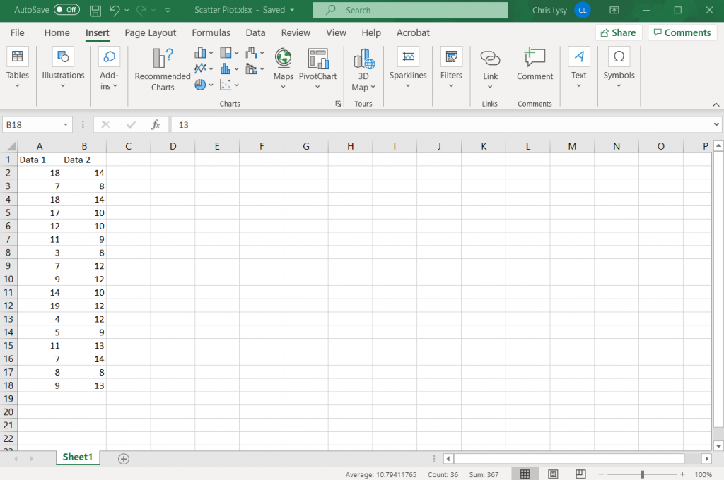
Step 1. Highlight two columns of numbers.
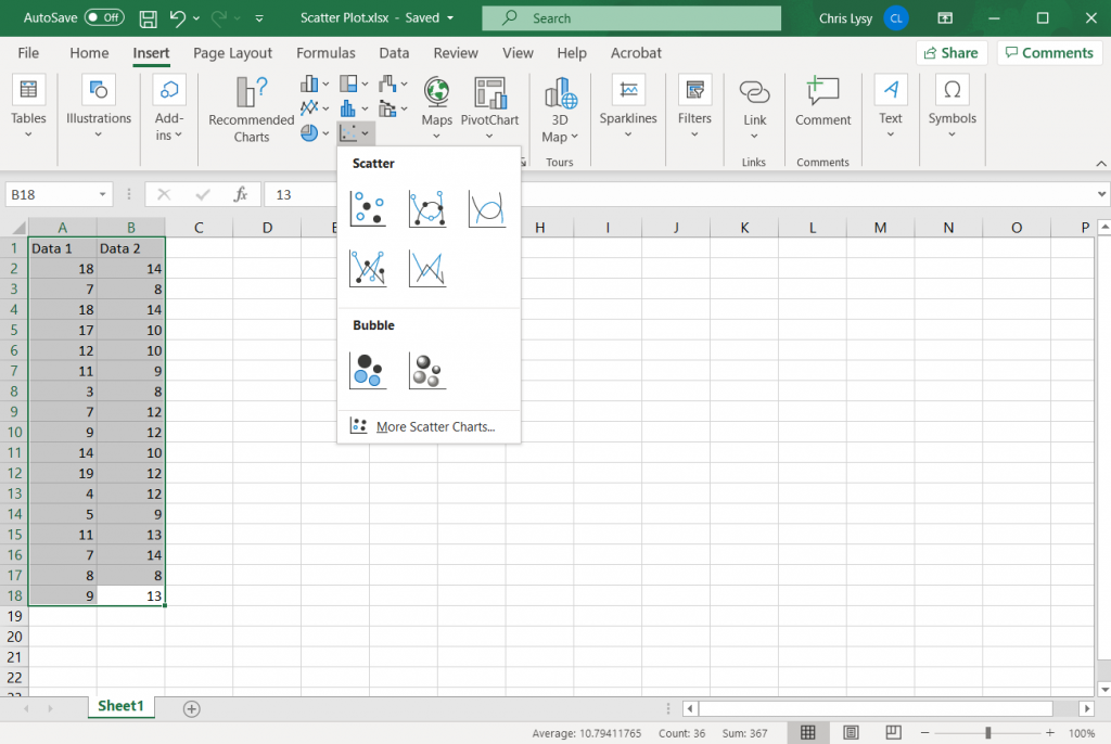
Step 2. Click on the insert tab, then the scatter plot icon. Then select the first option.
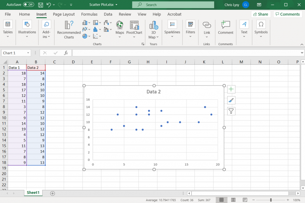
Step 3. Woohoo, you created a scatter plot!
How to create a good looking scatter plot.
Okay, so that’s the most basic of basics. Here are some more steps you probably want to take to create something worth sharing.
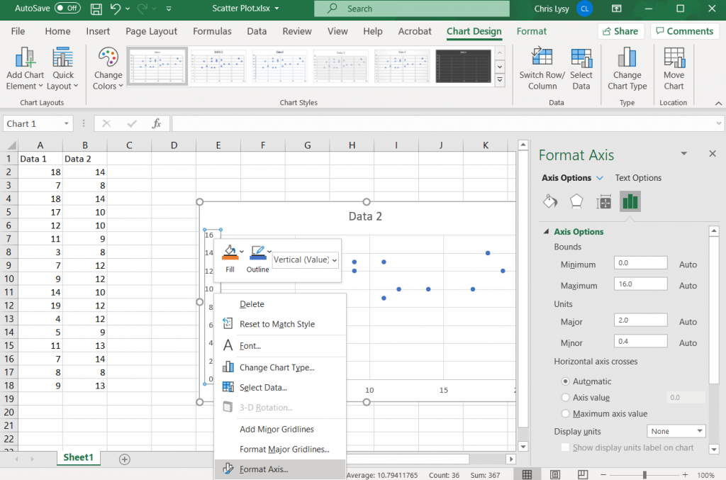
Setting up your Axes
With any scatter plot, the range you choose for each axis is going to heavily impact the look of the chart. You don’t have to start your axis at 0, unless it makes logical sense. Your X and Y axis also do not need to share ranges (especially if the data is fundamentally different).
For my random data set I’ll just use the value ranges for each data column to set the minimum and maximum values.
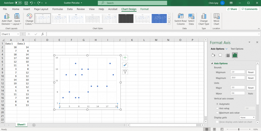
Setting Major Units
While setting up the Axis bounds, also setup your major grid units. This will control what numbers are shown on each axis. If you choose to use grid lines, this will also set where there the gridlines appear.
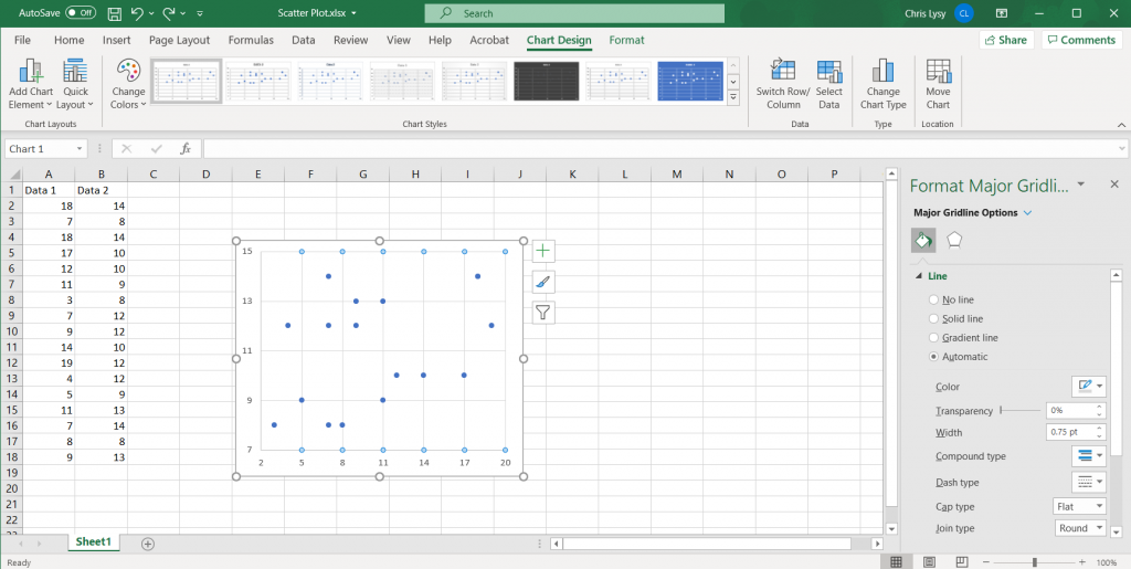
Setting Gridlines
Often with scatter plots you have far more data than you really want to label individually. So setting up grid lines is important. I try to space my gridlines so it feels a lot like a map’s latitude and longitude. The default lines are a light gray, I usually just stick with those lines.
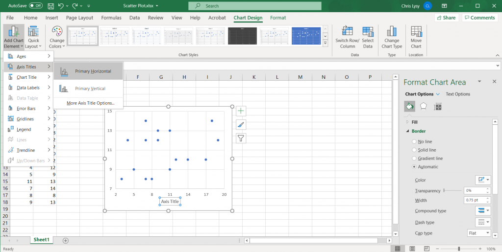
Labeling each Axis
Since we are dealing with two different variables, labeling each axis is important. We can add axis labels quickly in the Chart Design tab, by clicking on Add Chart Element > Axis Title and then Primary Horizontal and Primary Vertical.
Tweaking the Marker Size
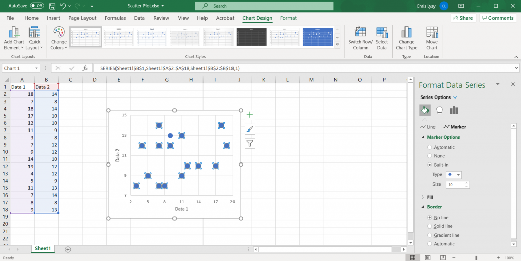
Depending on how many data points you have in your data set, you might want to increase or decrease the marker size. You can do so by clicking on the individual markers and going to the format tab. Here you can also change the marker type and size.
Since I only have so many markers, and there isn’t any overlap, I’ll go ahead and increase the marker size.
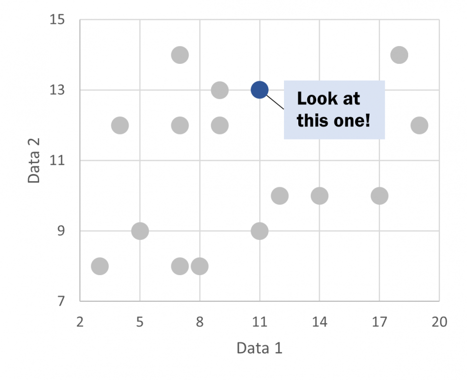
Highlighting an Individual Marker.
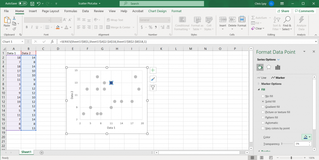
Highlighting individual data points can be useful in scatter plots. Especially if you are attempting to localize a larger dataset. The easiest way to call attention is to lighten the color of all data points (and possibly turn to gray). Then use a darker color to spotlight the specific data points you would like to highlight.
Adding Annotations
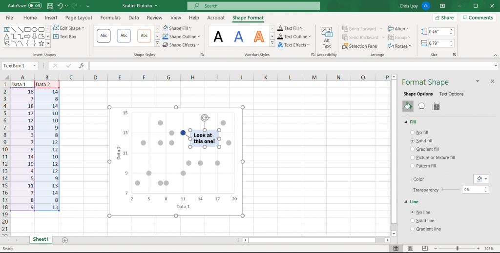
Simple annotations can give scatter plots added value, especially if you chose to highlight certain data points. Just select the chart, then go to the insert tab. And then insert a text box.
To draw a connection to a specific point on the line, insert a shape (line).
Saving the Image
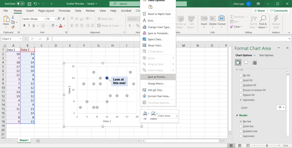
Once you have made all the changes you want to the chart you can save it as a picture. Just right click on the chart area and click “Save as Picture.”
Alternatively, you can just copy and paste the chart from Excel into Word or PowerPoint. If you’re staying within the Office suite, this is the ideal way to move the image as it retains your full ability to reformat the graphic.
Also, just a note, if you notice your text box or inserted shape is missing this is why. When you insert a shape you need to have the chart selected. If not, it will live in the spreadsheet but not the actual chart image!
Beyond the Basics
This is just the basics. There are all sorts of things you can do with scatter plots.
A little bit of inspiration.
I love scatter plots.
They are one of the best ways to pack a ton of data into a single chart.
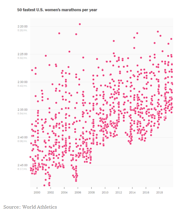
Take a look at the following chart. It shows the fastest women’s marathons each year. Ultimately, it tells the story of marathon runners getting faster.
They could have instead, taken the average of the top 50 times for each year and drawn a line chart. The line chart would have told the same story, but seeing the underlying data lets us see that it’s not just a few outliers bringing up the average.
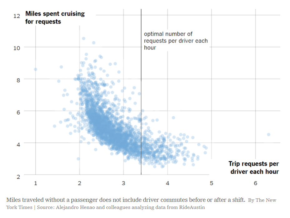
The following scatter plot tells a story of how much cruising time is spent by rideshare drivers compared to trip requests. It’s not a simple linear relationship, and the distribution of data points shows that.
The creator of the chart also added a single reference line, communicating what they see in the chart to the user. Annotations and reference lines are incredibly useful in scatter plots.
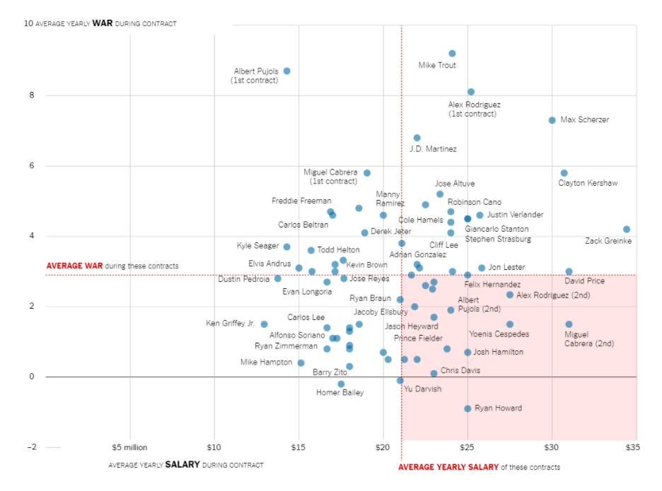
The following chart shows a baseball stat (wins above average) against a players salary. It includes two reference lines showing average (one for the x axis and the other for the y axis) which splits the chart into 4 quadrants.
Basically the chart suggests that the players in the upper left quadrant are paid less than average but contribute more than average to their team’s success. The players in the lower right contribute less but are paid more. With these reference lines you get to take a bunch of random points and tell a cohesive story that is easy for the reader to grasp.
One other thing to note, is that instead of the focus being on the overall distribution (as it was for the previous two examples) the focus is now on individual baseball players. Which is why each point (well most points, including every point on the outer edges) is labeled with the players name. In this way, it’s still a scatter plot but it’s used to illustrate more of an individual-focused story.
Other Considerations
Correlation is not causation.
With scatter plots we are showing the relationship between two variables. But just because we can see a relationship does not make it meaningful. One of the most commonly used examples is ice cream sales and murder rates.
Visualization can be powerful, and even if you are not lying with the data, understanding that spurious correlations exist should influence your data design choices.
Outliers Pop
Any outliers in a scatter plot will become visually prominent. The white space and separation will naturally draw the eyes of your reader.
If this outlier is important, fantastic, that’s what you want. If the outlier is un-important (easily explained away by some known quirk in the data) you should use an annotation (perhaps below the chart with an asterisk in the chart) to explain it. We can’t help but focus on the outliers.
