This is an Eval Central archive copy, find the original at freshspectrum.com.
In this series of data design posts, we draw inspiration from charts in the news and other spaces featuring data visualizations. Then we recreate the charts using easy freemium tools.
In this post I am going to walk you through the process of creating your own hex tile grid using Canva.
The Inspiration
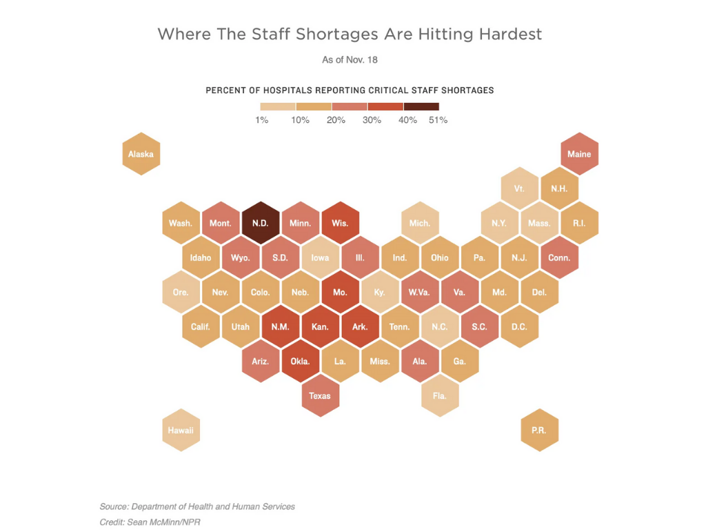
So over the last few years there has been an uptick of tile-grid maps. The idea behind these kinds of maps is pretty simple, coloring maps based on geographic borders gives larger western states more visual prominence. More people live in DC than Wyoming, but in those maps, DC would all but disappear.
Tile grids are pretty simple. It’s just a collection of icons tiled together in a way that approximates the geography you are representing.
This tile grid map created for an NPR article by Sean McMinn uses a hexagon icon as its base tile. Let’s go ahead and try to recreate the style using Canva.
Getting Started in Canva
I’ll start by creating a blank “Presentation (4:3).” In Canva, no matter the sizing, you can create multiple pages. I just find the 4:3 dimensions to be pretty easy to use across the web and via print.
The first thing we’ll want to do is paste in our inspiration image. Then we will want to go into the elements page and select a Hexagon.
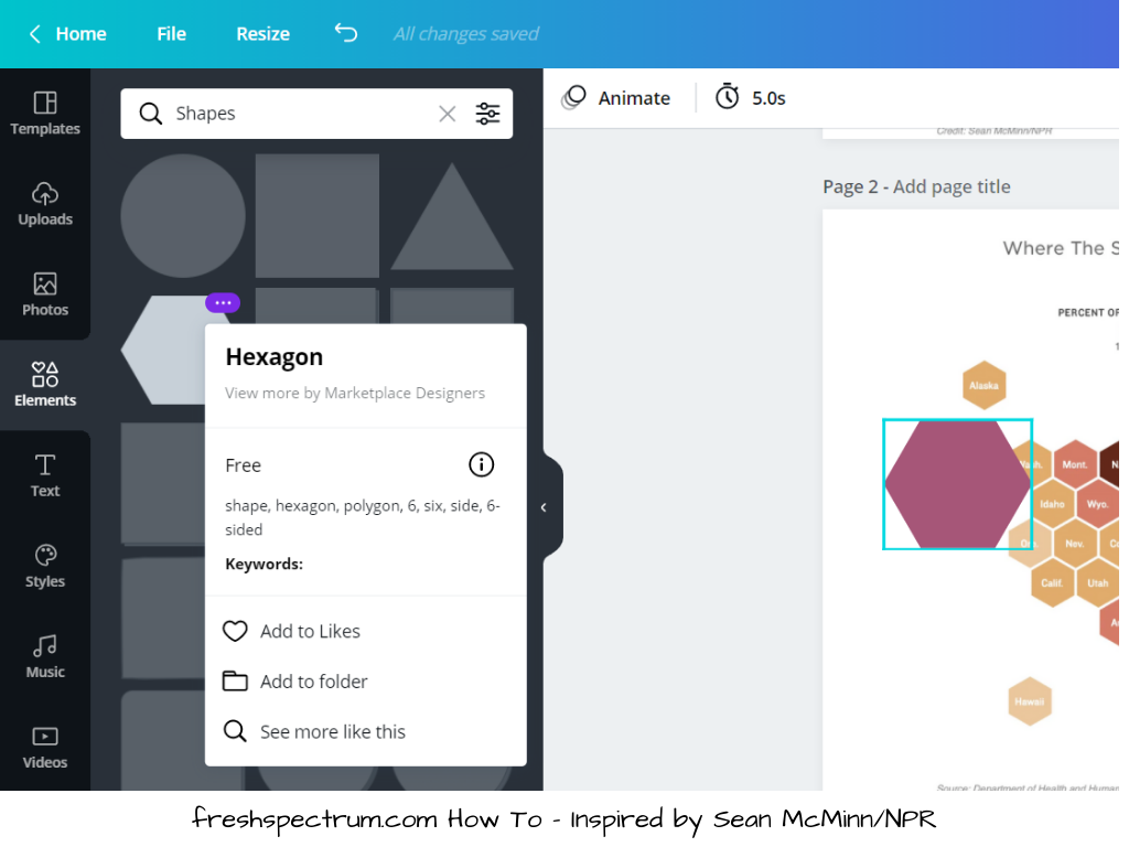
After we add the hexagon, you’ll want to select it, then resize down to match the hexagons from our inspiration page. Just put over top of one of the state tiles. You might also have to spin the shape around.
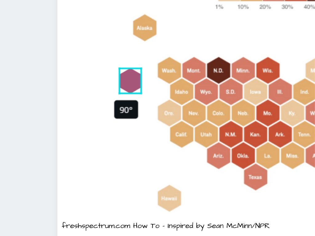
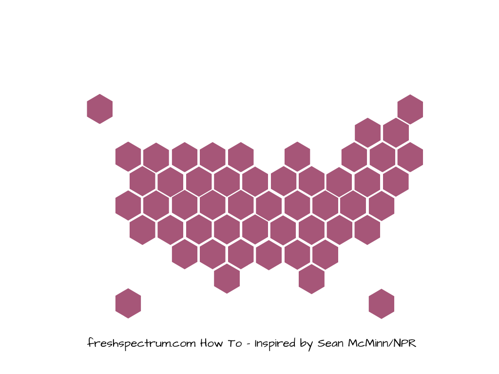
So ultimately our starting point will look something like this.
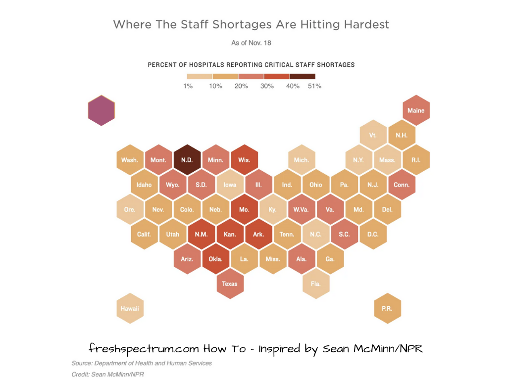
Building out the Hex Grid
After we have the shape sized properly, basically we just copy and paste the shapes, covering each tile. You can also select multiple at once then paste them across working like it’s a puzzle.
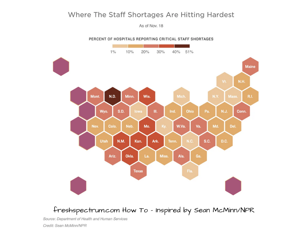
Keep going until you have the entire map covered.
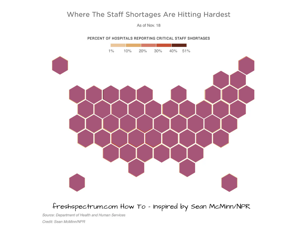
Once you do this, you can go ahead and delete the background inspiration image. You’ll be left with just your own tile grid.
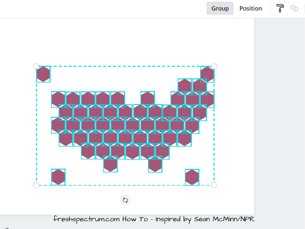
After you finish created the grid, I suggest you select all the tiles and click on the “Group” button. This will keep them all locked together. If you are a stickler for pixel perfect positioning, you can also use the group function to check.
As you can see from my wobbly lines, I am not a stickler most of the time.
Adding the Labels
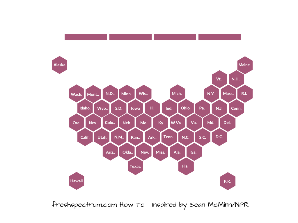
After we have our base grid, we can go ahead and add all of our labels. I just use text entry and write them out. Yes, it takes a few minutes, but ultimately these kinds of things can be re-used over and over.
I’ll also add a few rectangle block elements at the top to act as a color key.
Just like with the regular grid, I like to put all the labels together in their own group. In Canva I will just duplicate the page, then delete out the background hex grid on the duplicate page. If the labels are white I’ll change the background color to something dark. Then I’ll just select all the labels and click Group.
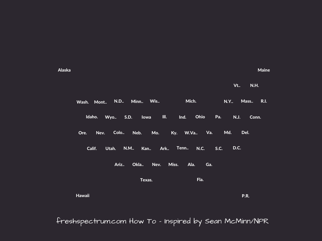
At this point, we have two groups. One with all the hexes in a tile grid. The other with all the labels. I duplicate pages when I want to try new things and color schemes. And I can always copy and paste the labels or hexes as needed.
Changing the Colors
So I don’t bother with the colors until after I have all the basic stuff setup. But once I do, the colors are pretty easy.
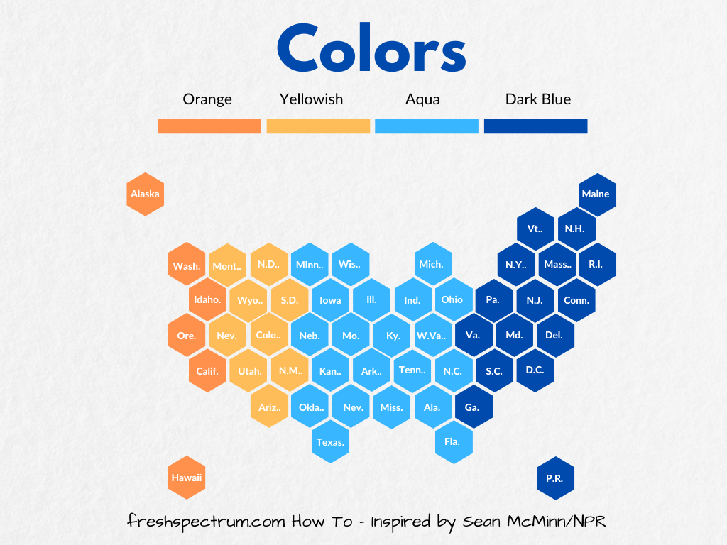
Just click on one of your elements then click on the color block at the top. This will give you color options. Select whatever color you would like.
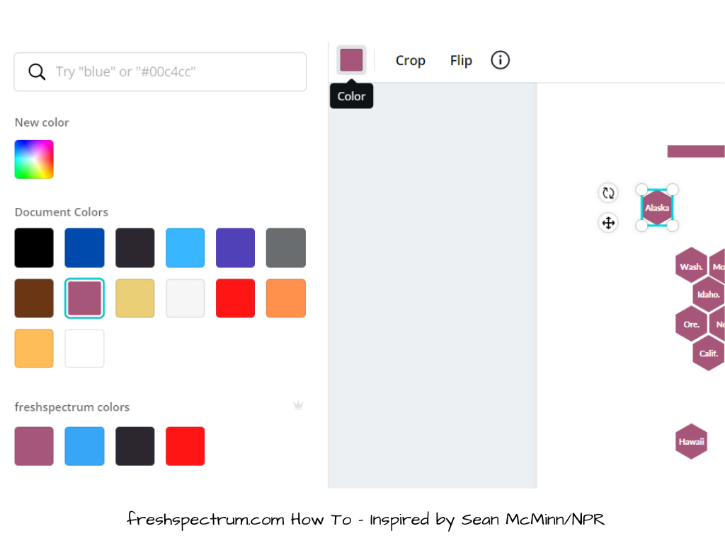
You don’t have to click on each individual hex to change the colors. You can click on one single tile then use the format painter up top (looks like a little paint roller) to copy the colors to other hexes. You might find it easier to lose the labels while working with the colors, then just paste the labels on top again.
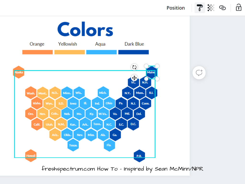
And there you go, a hex tile grid just like grid created by Sean McMinn.

Making Alternative Styles
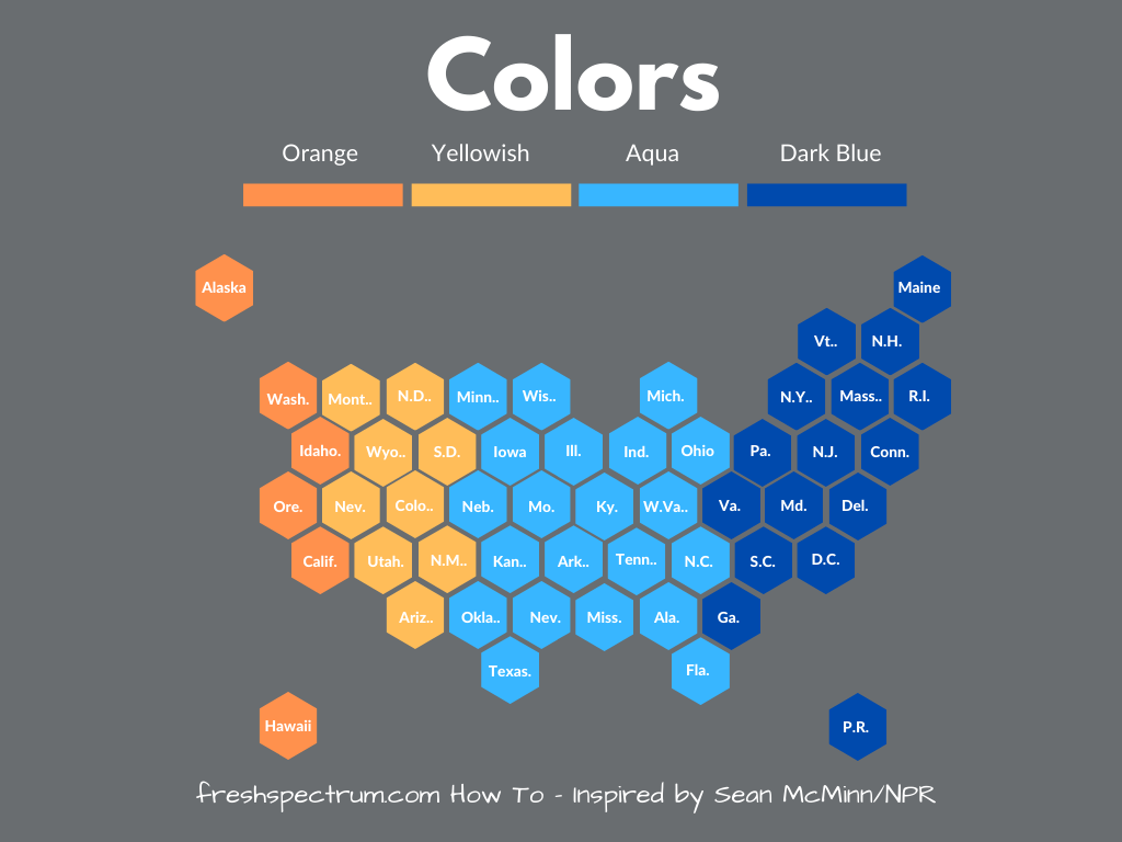
Once you have the basic pattern down you can do a bunch to the formatting. Like perhaps changing the background color.
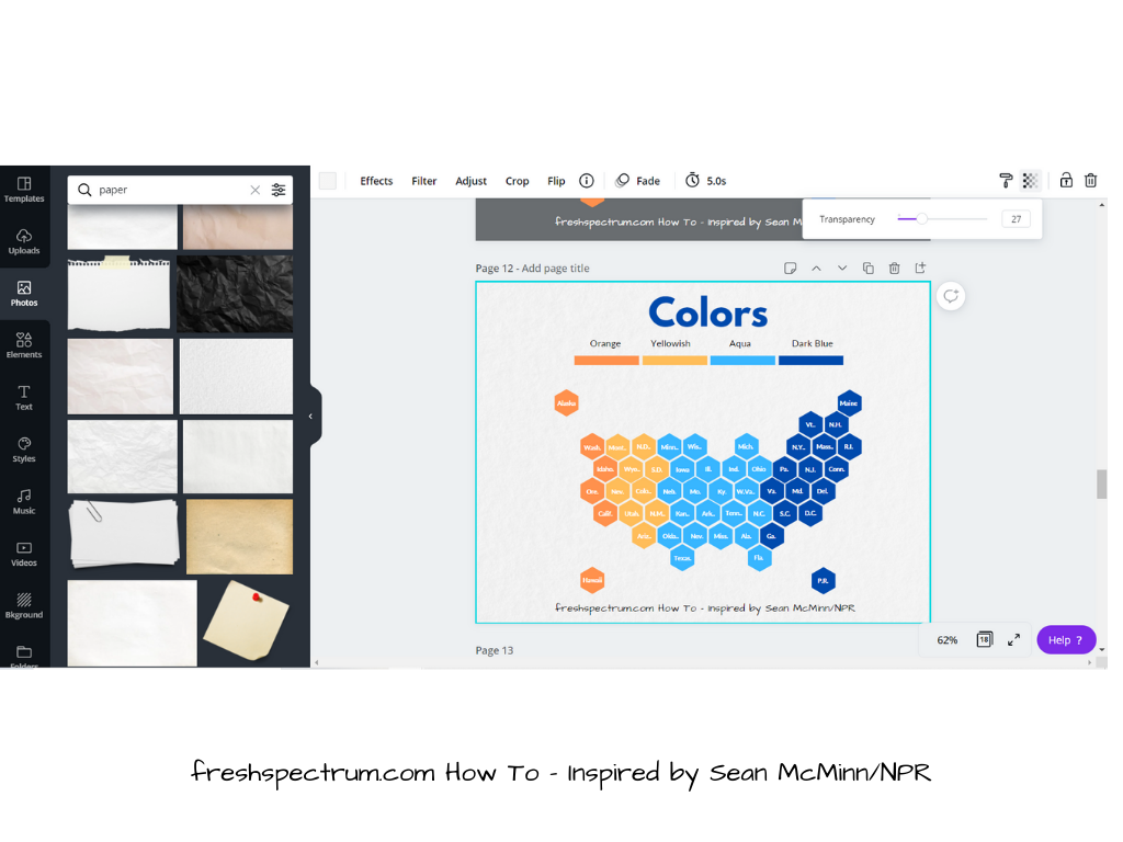
Or you might want to give it a little textured paper feel.

To do this, just search the photos for a texture you would like to use. Insert the picture and send to back. Then turn down the transparency, this will let the background color shine through. So if you want it dark, just put a dark color in the background. You can also use this approach to match brand colors. It’s fun, but it’s usually best not to get too carried away with textures.
The Q*bert Hex Map
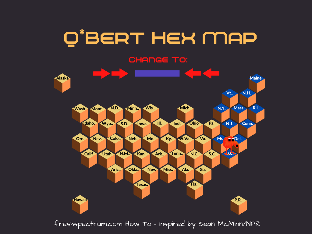
Playing with this visualization type I couldn’t help but think about the Atari game Q*bert.
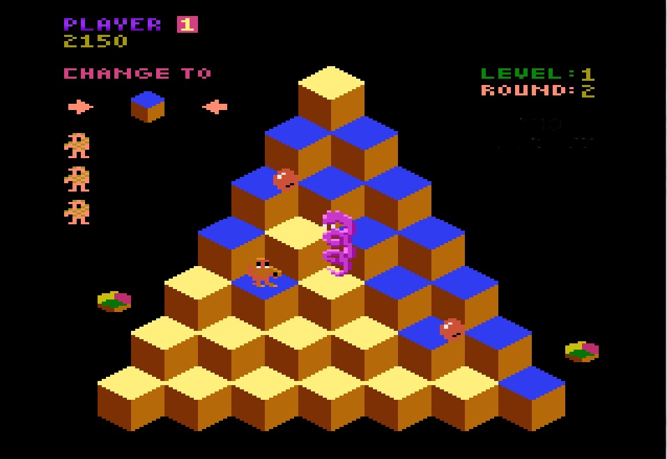
So I decided to make a little variation on the Hex map. What do you think?
