This is an Eval Central archive copy, find the original at evalacademy.com.
Part 1 – Take them on a journey
Evaluators are notorious for bad reporting. According to Jane Davidson it has to do with our training. Often evaluators are trained in social sciences – a world that prepares people for academic style research and how to write scientifically. The problem is this doesn’t work in the “real world.” Leaders and decision makers don’t want to comb through pages and pages of text to try and find findings and what they should do about them. #TLDR
At Three Hive Consulting we took Jane’s advice and started unlearning these bad reporting habits. Instead we looked to creative fields like graphic design and visual storytelling to inform our reporting. Canva is a great place to start learning about design. They have free courses and tutorials that walk you through design basics you can apply to your reporting. In this series of posts, I am going to walk you through how I reno’d draft evaluation reports using six of Canva’s design lessons. This first post relates to Canva’s design lesson “Take them on a journey.”
The importance of storytelling
The best way to engage an audience is to tell them a story. Our brains love stories and are much more likely to remember information is we activate our imagination and our emotions through story, as opposed to showing facts alone.
A well-crafted story will take people on a journey. If you think back to your favourite stories they likely have two common characteristics. The first is, good stories feature transformation – there was a problem, someone (or something) overcame that problem and now there is some sort of resulting change. The second is, good stories have a clear structure – a beginning, middle and end. This journey is what activates our imagination and emotions and gives our message staying power. Not only this, a good story will motivate people to act.
As evaluators we want our stakeholders to use our findings (i.e. act). The problem is evaluators often take people on a really boring journey full of facts and data in our reports. As Jane describes in her editorial, Unlearning Some of our Social Scientist Habits:
“Executive Summary (lots introductory information, methodology, sampling, random snippets of findings that fail to give a clear sense of the program’s quality or value, plus something incomprehensible about moderator variables), Introduction, Literature Review, a theoretical model and detailed explanation of the relevant social science theory explaining the links along some variables (unfortunately not a program logic model, and not even remotely linked to an evaluation question—this part contributed by a university faculty member with no evaluation expertise), Methodology, Findings (about 20 pages of raw data, all presented separately by source and data type with virtually no explanatory narrative, none of it linked back to the questions), Conclusions (some glimmers of hope in here, but by now we are 37 pages into the report and have lost most of our audience), Appendices.”
It is no wonder the only action stakeholders take when reading these types of evaluation reports is to shut their eyes! We need to stop this useless reporting if we want them to engage and act on the findings. Unlearning this is hard, but once you give yourself the freedom to let go you will never look back. Instead, let’s look at how to craft a story to take our stakeholders on a more interesting journey.
Crafting your story
Get to know your audience
Before you begin crafting your story you need to get to know your audience (aka your stakeholders) in order to make that report accessible. Who are they? What are their needs and how can this information address them? How can the information you discovered solve their problem? What do you want them to do with the information? Asking questions like these are critical for crafting your story so the content is relevant and resonates with your audience. Refer to my post, Three Ways to Increase the Chances Your Evaluation Results Will Actually Get Used, where I dig into stakeholder analysis and how to tailor reporting needs to different stakeholders.
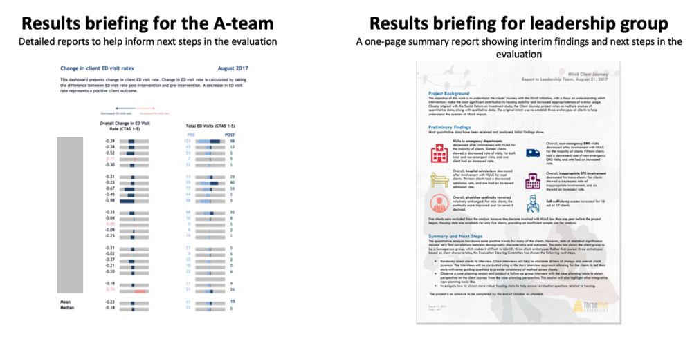
Results briefing for the A-team: Detailed reports to help inform next steps in the evaluation (Left)
Results briefing for leadership group: A one-page summary report showing interim findings and next steps in the evaluation (Right)
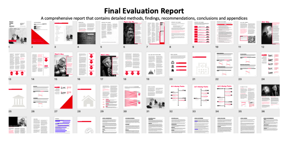
Final Evaluation Report: A comprehensive report that contains detailed methods, findings, recommendations, conclusions and appendices
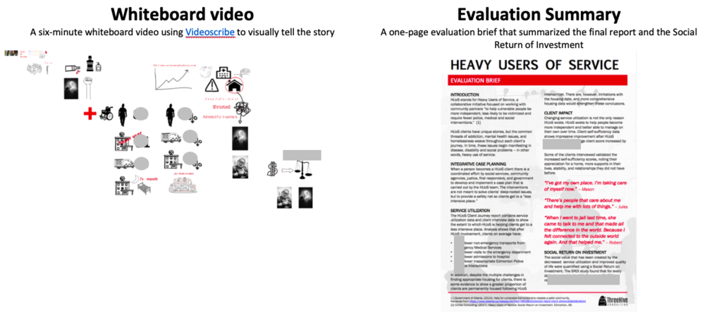
Whiteboard video: A six-minute whiteboard video using Videoscribe to visually tell the story (Left)
Evaluation Summary: A one-page evaluation brief that summarized the final report and the Social Return of Investment (Right)
Figure out the point(s)
In this post Stephanie Evergreen talks about the most important question in data viz, “what’s your point?” This question is just as important with your overall evaluation reporting. Jane discusses in her editorial how evaluators have a bad habit of producing reports with pages and pages of data but little acknowledgement of how the findings were used to answer any question of value; “when, oh when are they going to get to the point?” she asks. Bottom line when it comes to reporting – have a point. It seems somewhere along the way we forgot about those thesis statements and may need to re-learn how to incorporate those.
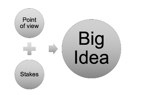
But since we’re trying to unlearn our scientific writing style perhaps we should think of our thesis statement as a ‘big idea’ – term coined by master communicator, Nancy Duarte. A big idea is the core message you want your audience to hold on to. A big idea contains two components:
-
Point of view – your point of view on a subject
-
Stakes – the reason why the audience for your report should care.
For your evaluation, the point of view should come from the findings – what is the data telling you? The stakes should be driven by who the evaluation stakeholders are (specifically for this evaluation report) and how do they intend to use the findings? Combining these will help you figure out your point or big idea. Everything you put in your report should then focus on that big idea.
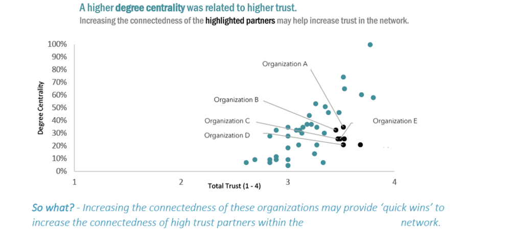
We recently conducted a Social Network Analysis with a client. Ultimately, this client wanted to understand what its collaborative network looked like and how it could be strengthened. Throughout the report we presented the findings, so they answered the evaluation questions. In addition, as results were presented, we identified the meaning behind the findings and by calling out the ‘so what’ in italics (see below). You’ll notice we also didn’t use generic graph titles like, “Relationship between degree centrality and trust.” Instead, we told people the point – “A higher degree centrality was related to higher trust.”
Lead the audience to a destination
Taking an audience on a journey means we need to lead them to a destination. You were hired to evaluate something for a purpose. Hopefully you’ve discovered answers to questions that your stakeholders didn’t know before they hired you. Leading our stakeholders to a destination means we need to not only outline what they should they do with the information (i.e. recommendations), but in order to motivate people to act we need to outline why they should act (or not). What will happen to them as a result? What will happen if they don’t act? Nancy Duarte describes this as a “new bliss.” For evaluators this means not just listing off recommendations but why our stakeholders should implement those recommendations. For example, if we are recommending a department reorganization it is important to outline what that new bliss will look like after the reorganization (e.g. a saner workload.)
So how can we re-jig how we report our findings, so we incorporate these storytelling principles and take our stakeholders on a journey that motivates them to act? Below is a reporting structure we encourage you to try. It gets rid of that long-winded scientific style that forces people to flip through pages and pages of information searching for the point. Instead, this structure presents an alternative that weaves those two important characteristics of storytelling – transformation (what, so what, now what) and a clear structure (beginning, middle and end).
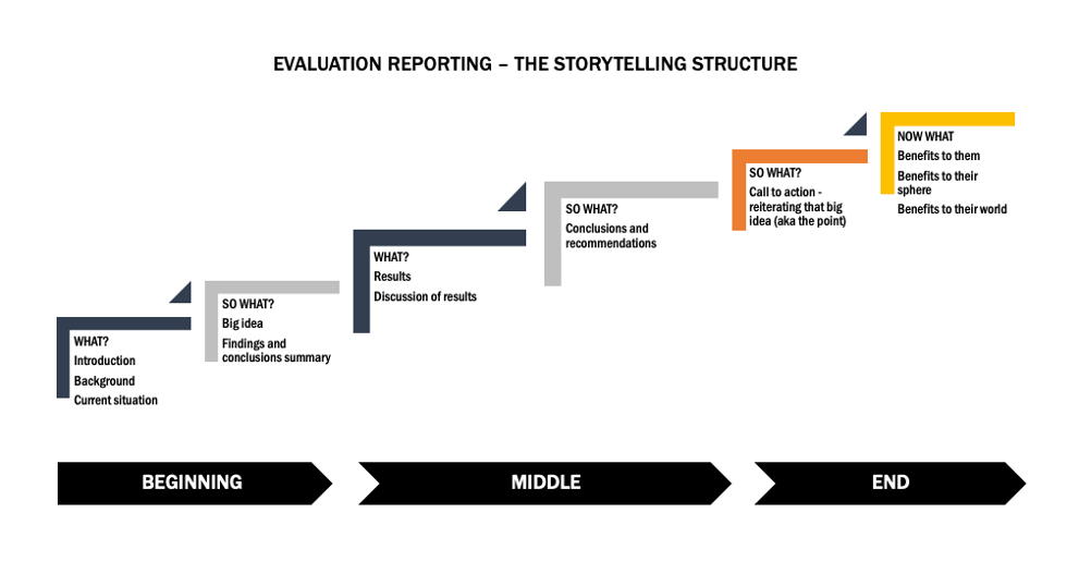
Try it out and make sure to stay tuned for the next article in our six part series, “Consistency is cool” where I show you how I reno’d an evaluation report using consistent design (e.g. font, colours, heading levels).
Sign up for our newsletter
We’ll let you know about our new content, and curate the best new evaluation resources from around the web!
We respect your privacy.
Thank you!