This is an Eval Central archive copy, find the original at freshspectrum.com.
Data illustration is about more than data visualization. And it’s also different from data design. So what is it exactly?
If you were to search for information about data illustration over Google, you’ll probably end up with a bunch of results about data visualization. I get it, when I tell someone I do data illustration they immediately think about data visualization. But as someone who regularly creates charts and graphs for clients, cartoon illustrates books and presentations, and also does a bit of graphic and web design, I think that’s a mistake.

The three big tasks in data reporting.
I find that when we share data there are generally three different tasks people often do at the same time even if they don’t think of it that way.
There is the writing task. Unless you’re a data visualization consultant or graphic designer this is probably the thing you’re doing the most as you put together a report.
There is the design task. This is something a lot of data people think comes after the report is done. But if you ever find yourself spending time in Word tweaking the size of tables and testing different heading sizes, you are doing a bit of design.
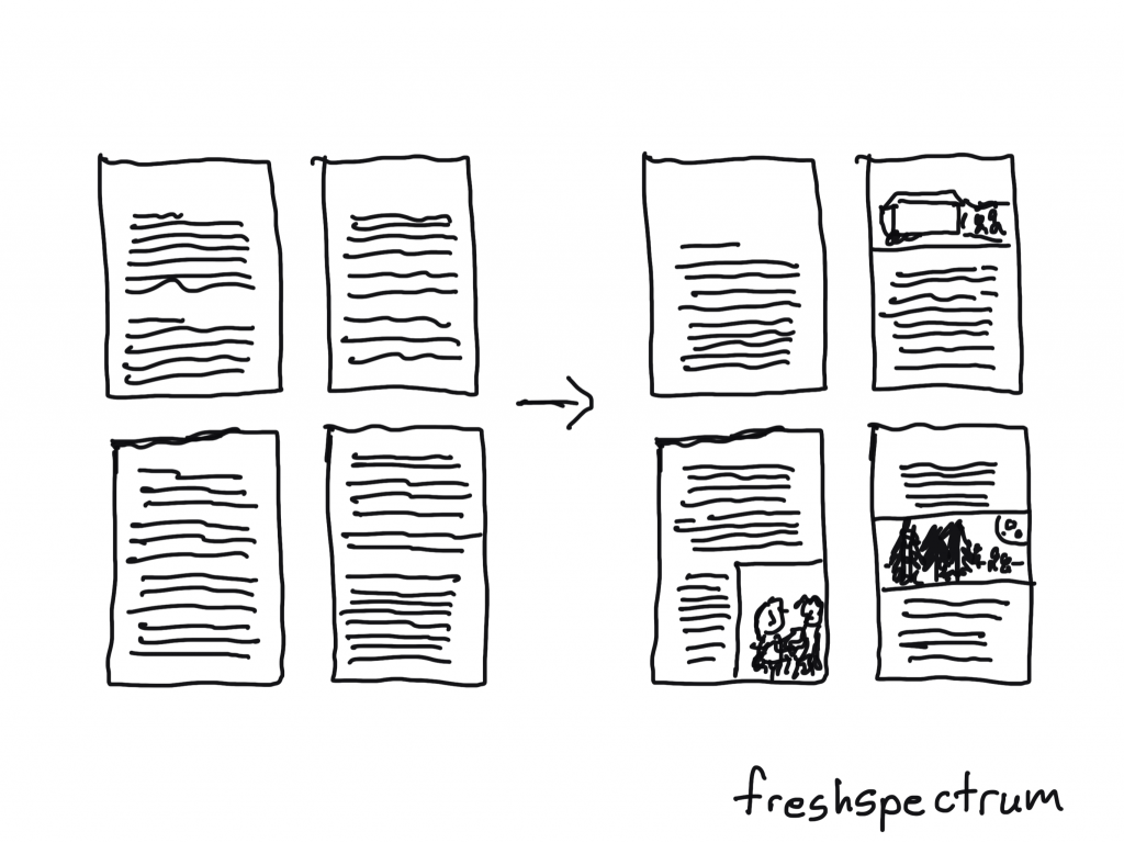
There is the illustration task. This is something that most data folk I know do almost incidentally. If there is a data table, they might add a chart or graph. If they have a good photo, they might add it at the end of a section, if they have the space.
When I teach report design, my personal goal is often to get my workshop participants to approach each one of these tasks separately, systematically, and with a little bit more intention.
Why I got a little tired of data visualization.
I’m still a data guy at heart. Someone who does enjoy creating a really nice chart or graph. Someone who loves exploring datasets and making new discoveries through visualization.
But I find that that data visualization field is a little too concerned with optimizing charts and graphs. And not concerned enough about the context within which those charts and graphs appear.
Yes, you could probably make the chart on page 47 a little bit more effective with a different type of chart. But adding 20 more pictures to your report (of any style) would be way more beneficial.
The same with graphic design. A little bit more intention and negative space in your page layouts would certainly make your 60 page report more readable. But creating a 5 page executive summary filled with illustrations would allow your analyses to reach a far greater audience.
It’s why I stopped nitpicking chart choices and report page length.
If you like the pie chart better than the bar chart, keep it. Want to make your technical report 130 pages in default Microsoft Word style with 200 pages of appendices? As long as you create some shorter visual adaptations, go for it. You’ll probably get just as many readers as you would if you were to turn your long report into a well designed 60 pager.

Data illustration presents the biggest opportunity.
A lot of my clients have similar problems with their reports that limit accessibility.
- The reading level is often too high for the intended audiences.
- They try to solve all their reporting challenges with one report.
- And finally, there are just not enough pictures.
On the front page of this site I claim that better illustration is the fastest way to help you boost the impact of your data work.
The reason I say this because most people already know that their writing could use a little help. They also recognize that their design skills are not the best. When they have the budget, a lot of people seek out support by hiring graphic designers and editors. When they want to learn, they join academies and take courses.
But hardly ever does someone say to me, we just don’t have enough pictures even though most of my clients know that I am also an illustrator.
To become a good illustrator takes a lot of time and practice. I’ve been cartooning for like 15 years now and I know I still have a lot to learn. But illustration is a process that can be learned by anyone. And while it may take time to master, it’s not hard to get started.
An illustration is an enlargement, and interpretation of the text, so that the reader will comprehend the words better. As an artist, you are always serving the words. You must never illustrate exactly what is written. You must find a space in the text so that the pictures can do the work. Then you must let the words take over where words do it best. It’s a funny kind of juggling act.
Maurice Sendak
A Chinese painting is often accompanied by words. They are complementary. There are things that words do that pictures never can, and likewise, there are images that words can never describe.
Ed Young
How to get started with data illustration.
With data illustration…
- your work will look more professional.
- it will be easier to skim.
- you will be more likely to engage a distracted reader.
- you will have more opportunity to add context.
I wanted to give you a process, so I developed a framework.
My OSEE framework is a four step data illustration process. The point of the framework is to give you direction on how to approach illustrating reports, presentations, and all sorts of other data products.
I plan to write a good bit more about data illustration in the upcoming months. But to get you started I also created a short little 15 page guide which you can download for free here: