This is an Eval Central archive copy, find the original at freshspectrum.com.
For the past 5 or so years Canva has been my go to tool for all sorts of everyday designs. This includes the presentations that I used to design in PowerPoint.
Why Canva? Because I find the workflow easier. I can quickly adapt my presentations into other formats like videos or infographics. I also have Pro which gives me access to all sorts of royalty-free content, so I don’t have to scrounge around the web looking for icons or photos.
But every tool has its quirks. In today’s post I’ll walk you through eight tips on using Canva for slide deck and slide doc design.
Tip 1: Picking your presentation slide size 16:9 or 4:3.
When deciding to create a presentation, Canva gives you two main options. You can use the old standard 4:3 slide deck or the new widescreen standard 16:9. So which should you choose?
It’s not as straightforward as you might think. Yes, almost all laptops and desktop monitors are widescreen and that’s where many people will view your work. But, there are also other considerations.
Will it be printed?
This is especially important for slide docs and for in-person presentations where you might hand out print outs of your deck. The old standard 4:3 is a lot closer to a standard 8.5 by 11 letter size piece of paper (as well as A4) compared to 16:9. When printed full size, most people will never notice that it was not designed for paper.
Will it be converted to video?
Now if you plan to turn your presentation into a recorded video. 16:9 is actually the identical ratio used in 720p, 1080p, and 4K video. So if you want to turn it into a standard video, definitely go with the widescreen 16:9.
Will it be shown on a projector or TV?
If you plan to present live, will it be in a boardroom with an HDTV or a room with a white screen and projector. If HDTV, then 16:9 will show perfectly. If a white screen, either will work just fine.
Will you be adapting slides into infographics or featured images?
I like to create multi-purpose slide decks. This means being able to export individual slides as images for use in illustrating reports, social media, or blog posts. In these types of situations I prefer a 4:3, as it provides a nice big image similar to the size I use for my comics.
Will you be using it in a webinar?
Webinars happen on screens, BUT there is often a big right hand column designed to show attendees and a chat window. And while you might use a two monitor setup to present your slidedeck, chances are most people are not watching it with two monitors. So a 4:3 presentation creates more room for the side panel.
So bottom line, which should you choose?
I still have no clue and bounce back and forth often depending on the situation. In other words, to each their own, there is no one size fits all solution here.
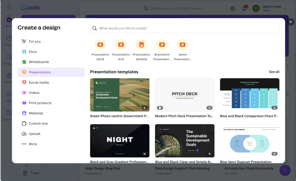
Tip 2: How do I choose a template?
Canva is a template first kind of tool. Even on the free plan, there are tons of templates to choose from. Plus, even if you are on a free plan, you can still use a premium Canva template. You just need to delete or replace the premium elements before downloading your design.
Slide templates in Canva are multi-page. So when you search, you’ll see the cover first. But if you hold your cursor over the cover it will start to show all the internal pages. You also get to see the entire internal spread by clicking on the template.
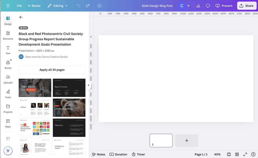
You have the option to apply ALL the pages, or go through and pick which ones you would like to use. As a designer I find lots of Canva templates over do it when it comes to color, making it a bit meaningless. But I think that’s because the template exists to show what’s possible, not to lay out a meaningful report.
My suggestion is to not just apply all pages but figure out the page spreads that best help you present your findings. Use color meaningfully to indicate when a section is changing or to spotlight important findings.
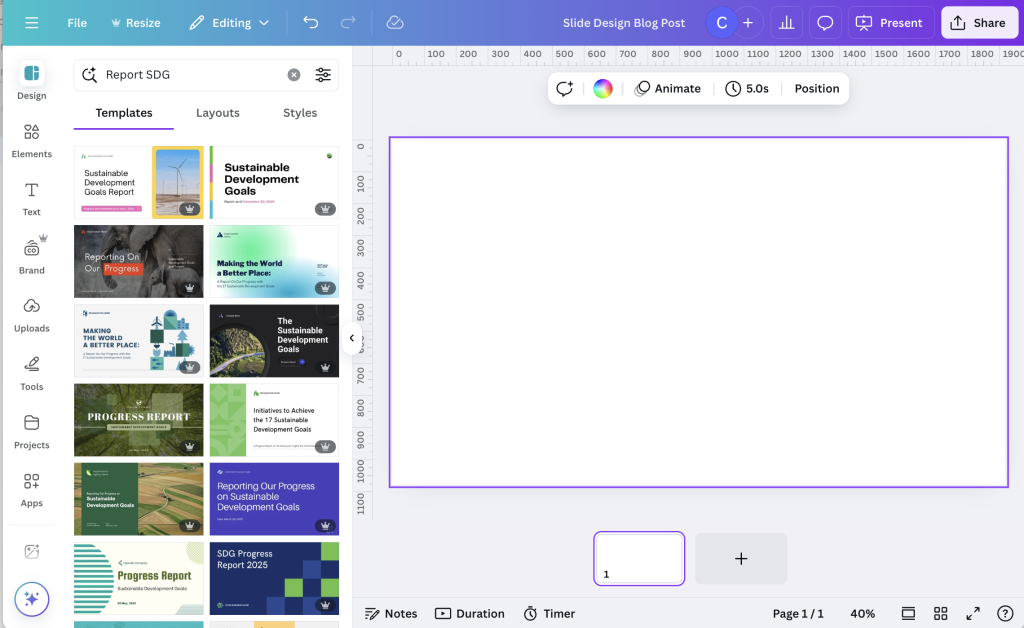
Because there are so many, finding templates you like can be tricky. It involves a lot of random searches and a good bit of scrolling.
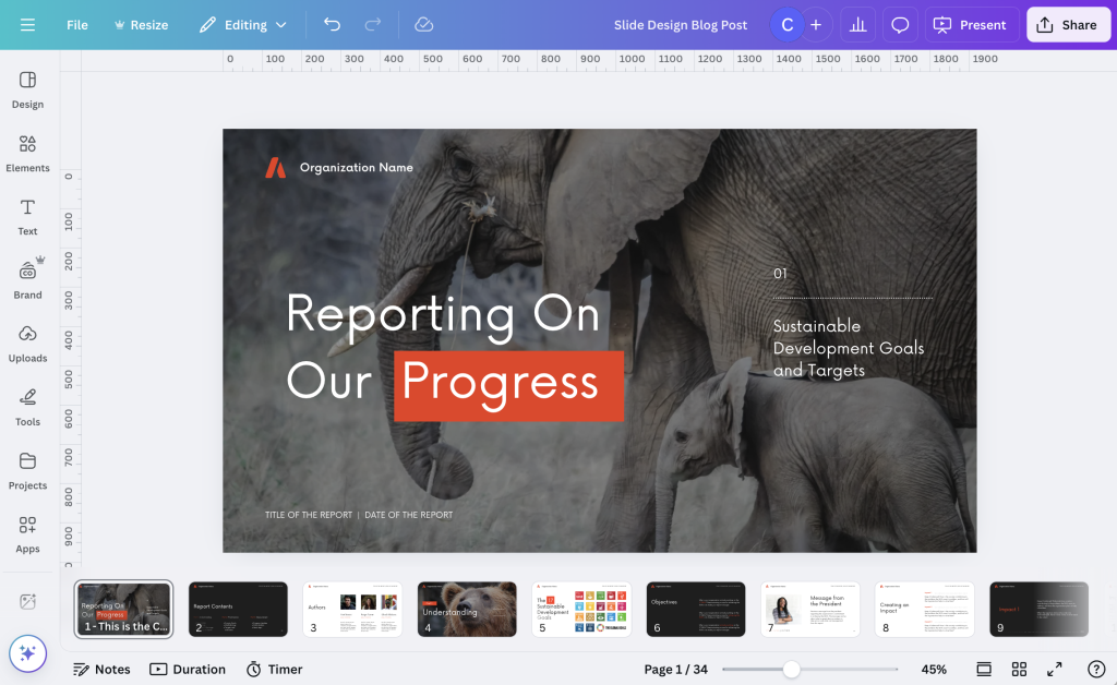
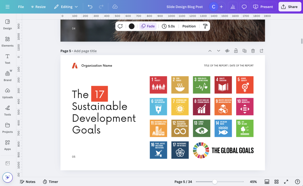
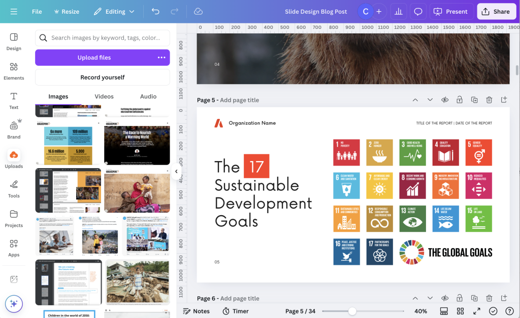
One of my favorite sets of Canva templates for data reports comes up when you search “SDG Report.”
Tip 3: Change the view to get a full sense of the presentation.
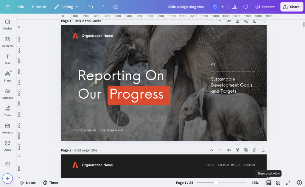
In the bottom right corner you have a couple of view options. You can choose scroll view, thumbnail view, or grid view.
Scroll view gives you all the slides underneath the editable slide. I find this to be a pretty intuitive way to create full presentations and slide doc reports, since it gives you a bit of context as you design. You can also skip around pretty easily.
Thumbnail view lets you go through the slides by scrolling up or down. It does not give you the little mini under the deck menu you get in Scroll view. I like this view when I’m trying to create a set of small infographics, as it isolates each slide.
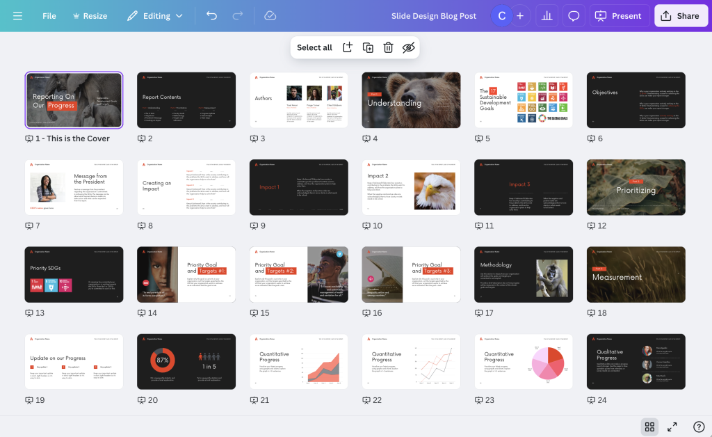
Grid view lets you see your entire presentation as a set of smaller icons. This is the best view to use when changing up the order of your presentation slides or if you just want to get a bird’s eye view of your presentation.
Tip 4: If you plan to turn individual slides into single graphics, name them.
Each slide has a space where you can give it a page title. This is easiest to see with the thumbnail view.
The cool thing about these page titles is that it changes the way the individual slide is named on a download. If you leave the slides un-named, and download a single slide, the file will take the name you put in for the entire slidedeck. If you download a single named slide the file name will be the name you put in for the slide.
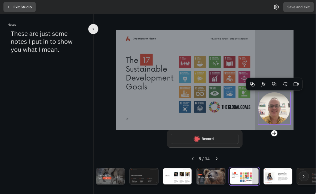
Tip 5: If you plan to use your slides to create a video use the notes for your script.
It’s really pretty easy to turn your slidedeck into a video using Canva. There are a couple ways to do this, but my favorite is just to use the “Record Yourself” feature you will find inside the uploads folder.
As you record, just move slide to slide. Each slide will record its own video. When you are finished with one, just move to the next. If you mess up, you can restart the recording and it will just delete the recording from that slide (not the whole presentation).
My tip is to use the notes section of your slides to write a script. These notes will show up on the recording screen for each slide acting as a simple teleprompter.
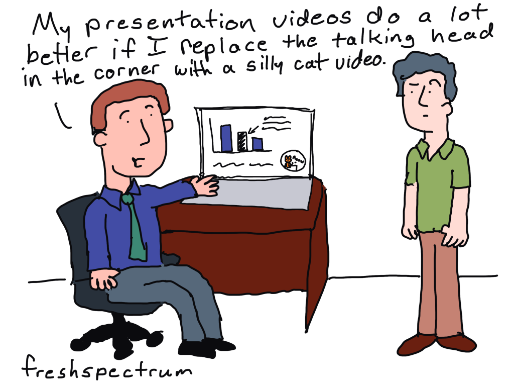
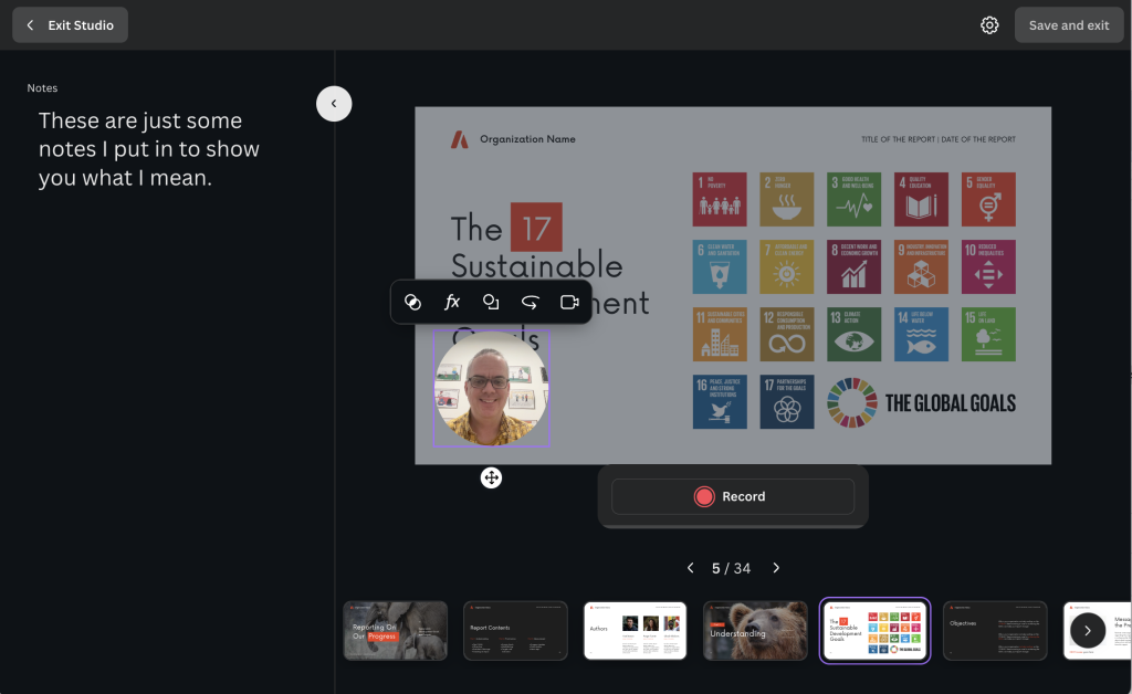
Tip 6: If you plan to create a video, design space for your talking head.
If you know that you will be creating a video and intend to include the video of yourself talking, plan for it in your design. Instead of having your video cover up the text on individual slides, go ahead and design a space for it ahead of time.
One simple way to do this is to create a space on the page, maybe using a colored rectangle, that will never include any content. That way you have a place for your talking head on every slide.
Tip 7: Download your slide decks as standard PDFs, at least most of the time.
Most of the time I present slides these days I am doing so over a Zoom call. I also don’t tend to use animations, so a standard PDF file works just fine. I just open up the pdf, take away any toolbars and put the pdf viewer into the “single page view.” This is the best way to make sure the presentation looks just like it was designed.
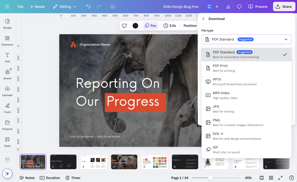
Sometimes you might also consider downloading your slide deck straight into PowerPoint. While this works pretty well most of the time, just know that occasionally things like fonts or certain images will get altered in the process. So definitely check all your slides over before sharing with others.
Tip 8: Create your slide decks and slide docs together.
A slide doc is essentially a slide deck with more words. It’s like creating a presentation that doesn’t require a live presenter. If you want to learn more about slide docs, I wrote a post about it: What is a Slidedoc?
If you plan to create both a slide doc and a slide deck, I suggest starting with the slide doc. Then adapt that slide doc into the slide deck by simply removing the words and giving your visuals more space.