This is an Eval Central archive copy, find the original at freshspectrum.com.
So how do you waste data?
I’ve decided to start the year by really digging into my own report design process. My hope is to eventually create a set of tools that can be used to help guide the review of an organization’s reporting strategy.
Part of that review will be very user centric. But in today’s post I wanted to switch the perspective a little, focusing on the data and identifying the stages where we find the most waste.
I came up with five stages.
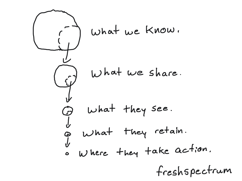
Stage 1. What we Could Know vs. What we Know
This first stage is mostly about your research, evaluation, and data collection methods. To put it simply, if you don’t ask the questions, you won’t know the answers.
When writing this post I almost skipped this stage because it’s not really about reporting. But I think it’s important to recognize that having asked the right questions is foundational.
The collection methods also directly influence data quality. Poorly administered surveys, bad interviews, and confusing question language can produce low quality/unusable data (which is a waste).
We also potentially waste data by not tapping into relevant existing data sources or through poor data governance.

Stage 2. What we Know vs. What we Share
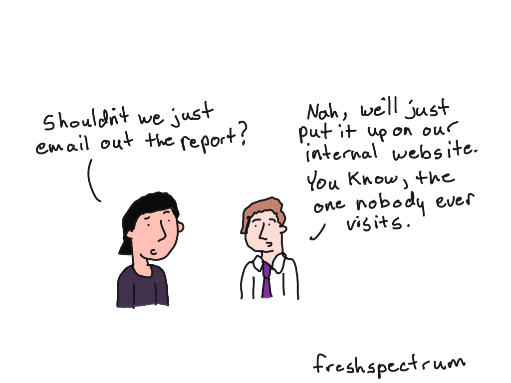
Stage 2 is where we traditionally put a lot of focus. It’s the stage that usually pushes an evaluation team to write a long wordy report. It’s also where we see the most resistance to shorter visual reports from conservative evaluation teams, because the assumption is that creating a shorter report means sharing less of what we know.
I always encourage my clients to continue writing their longer reports because I think it’s important to document what we know. Even if very few people will ever read this technical report (and you should expect that very few people will actually read the long report).
We can also waste data by not making these reports public, and by not sharing the underlying data sources.
Stage 3. What we Share vs. What they See
This is where the status quo reporting methods really start to break down. Most often, only a small subset of your overall intended audience will actually see your reports. We can waste data by not adapting our longer reports into formats that are more accessible to a variety of audiences.
Creating shorter visual reports can increase accessibility, but it also requires making choices about what to share and what to not share. It’s a balancing act because if we don’t share enough in our accessible reports, we also waste data (see stage 2).
This is where layering can help. Make sure your shorter accessible reports link back to the longer ones as well as the underlying data sources.
We also have to choose appropriate reporting methods for the platforms we plan to use for dissemination. Far too often organizations merely send links to longer pdf reports through their social media and email newsletter content. This is a missed opportunity, as simple adaptation to things like infographics and carousels can greatly increase exposure.
Stage 4. What they See vs. What they Retain
Just because someone sees your report, or actually reads your report, does not mean they are going to retain what you shared. Jargon, giant blocks of text, poor formatting, and bad graphic design reduces the information your audience will potentially retain.
Alternatively, better design, writing, and illustration can increase retention.
Stage 5. What they Retain vs. Where they Take Action
Retention is not always enough. If your ultimate goal in sharing data is to give your audience the data they need to make decisions, you need to share your data in an actionable format. Your audience needs to be able to answer the follow-up “so what” question in order to make use of the data.
There are a lot of evaluators uncomfortable with this stage. But I believe that the people who best know the data, should play the role of an influencer and guide. If you want to get better here, storytelling, copywriting, and presentation design can be really useful skills to learn.