This is an Eval Central archive copy, find the original at freshspectrum.com.
What do you think of when I say, “qualitative data visualization?”
Do you just pull up a picture of a word cloud in your head, or does something else come to mind?
For years I would just say that good qualitative data visualization is really just illustration. But you could say the same thing about quantitative data visualization. So after digging in a bit over the last few years my definition started to become a bit more nuanced and specific.
In today’s post:
- My definition of qualitative data visualization.
- The reason why the usual definition of data visualization doesn’t work as well for qualitative.
- How to use graphics to facilitative and enhance the communication of qualitative information and data.
- And what I think are the four primary goals of qualitative data visualization.

Re-defining Qualitative Data Visualization
Qualitative data visualization is the use of graphics to facilitate or enhance the communication of qualitative information and data.
This is how I define qualitative data visualization.
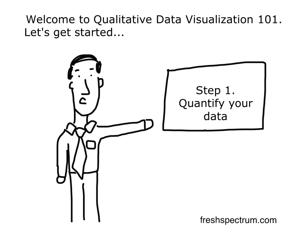
Here is something I’ve learned over the course of my career. The regular old definition of data visualization, and the way most of us think about data visualization, is just not helpful when it comes to qualitative data. Take for instance this definition that comes from tableau.
Data visualization is the graphical representation of information and data.
What Is Data Visualization? Definition, Examples, And Learning Resources
If we’re talking about a bar chart or a line graph, this definition is perfect. We have turned a bunch of numbers into a picture. And the picture helps us understand the numbers. Without the graphical representation it would be much harder to see what’s going on with the data.
This is why quantitative data visualization is really most similar to descriptive statistics. Just like data viz, descriptive stats help us understand numbers and see things we would not see by just looking at the data table.
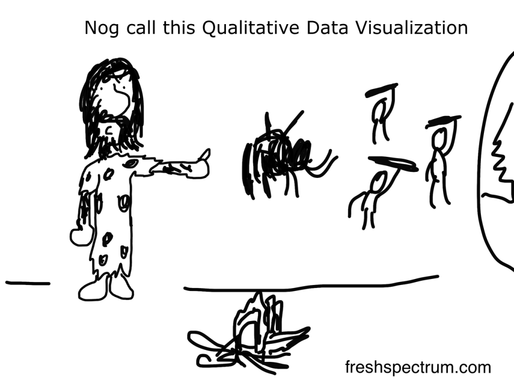
So why is qualitative data different?
There are some times when a graphical representation of qualitative information can help us see the data in new ways. Even a simple word cloud that counts and visualizes frequencies can be helpful at times. But I would argue that it’s not the main benefit of qualitative data visualization.
Take an interview, a focus group conversation, or a case study. Most of the time you won’t need visuals to help you understand this kind of data. Because the problem is not that the information is hard to interpret.
The problem for most qualitative data is that there is just so much of it. The thing that gives qualitative data value, the depth and richness of the information, makes it harder to share with audiences too overwhelmed to take the time to read it and process what they’ve read.
How to use graphics to facilitative and enhance the communication of qualitative information and data.
At this moment I’m working on a new course on qualitative data visualization (my goal is to have it ready by early fall). In the course I talk about my O.S.E.E. approach to qualitative data visualization.
O.S.E.E. is the acronym I give to the four main goals of qualitative data visualization.
1. Organize
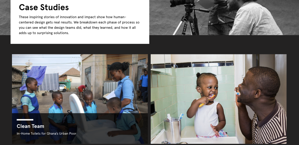
The digital world is a visual world. Just about every article on every major website has at least one featured image. This serves a functional purpose beyond aesthetics. These images are modern navigational tools that help us process information and travel from page to page.
So everything we share needs pictures. Even if that information is not destined for the web, web design has completely altered our expectations for print design.
I start with organize, because even basic stock photos, generic icons, or other simple images can provide value in facilitating communication.
2. Spotlight
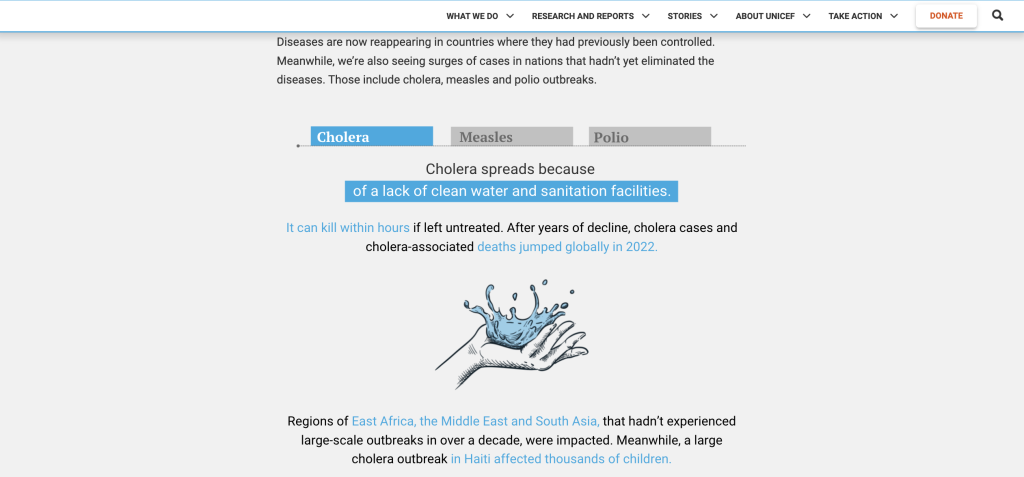
When someone picks up a report, they’ll probably skim it first. And in that skim they are most likely to look the pictures before reading the words (even the headers). So if you want to make sure someone comes away from your qualitative report with certain pieces of information stuck in their head, spotlight that information with a visual.
3. Engage
Time is precious, it’s why most people will skim before they read. With an engage visual you are not just sharing information, you are inviting the viewer to read more. These types of images help create curiosity gaps which propel your reader forward into your analyses.
For example, most of my comics are purposefully designed to be engagement tools.
4. Enhance
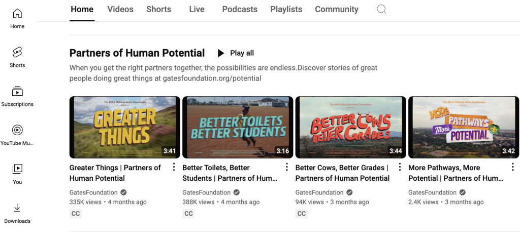
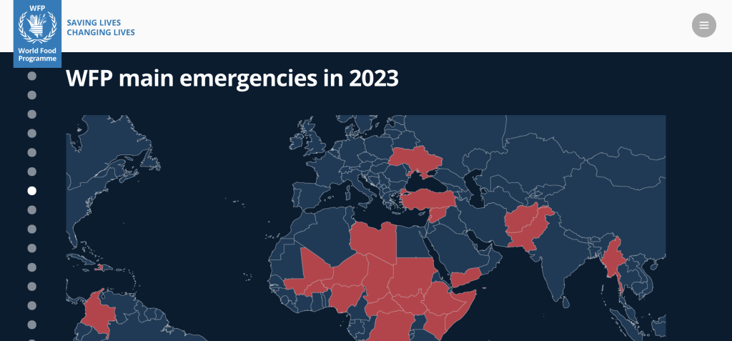
Qualitative data visualization isn’t just a chore. It’s an opportunity to integrate other pieces of information, or re-arrange what has already been shared, in order to enhance communication. Enhancement visuals can often take more work, but they also provide a lot of extra value.
What are your thoughts?
How do you conceptualize qualitative data visualization? Leave me a comment and let me know!