This is an Eval Central archive copy, find the original at freshspectrum.com.
Trying out a new series this week. The idea is simple, I find some inspiration and then use that inspiration to create a set of Canva report page templates.
If you keep your eyes open, design inspiration is literally everywhere. Mailers, posters, text books, magazines, websites, and social media are just a handful of potential inspiration sources.
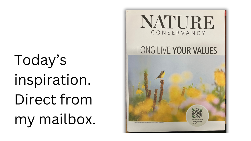
This week’s inspiration comes from one of those little “magazines” that shows up in your mailbox after giving to a charity. This one is from the Nature Conservancy. Let’s dig in and see what we can find. You’ll find the Canva template link for all of these at the bottom of the post.
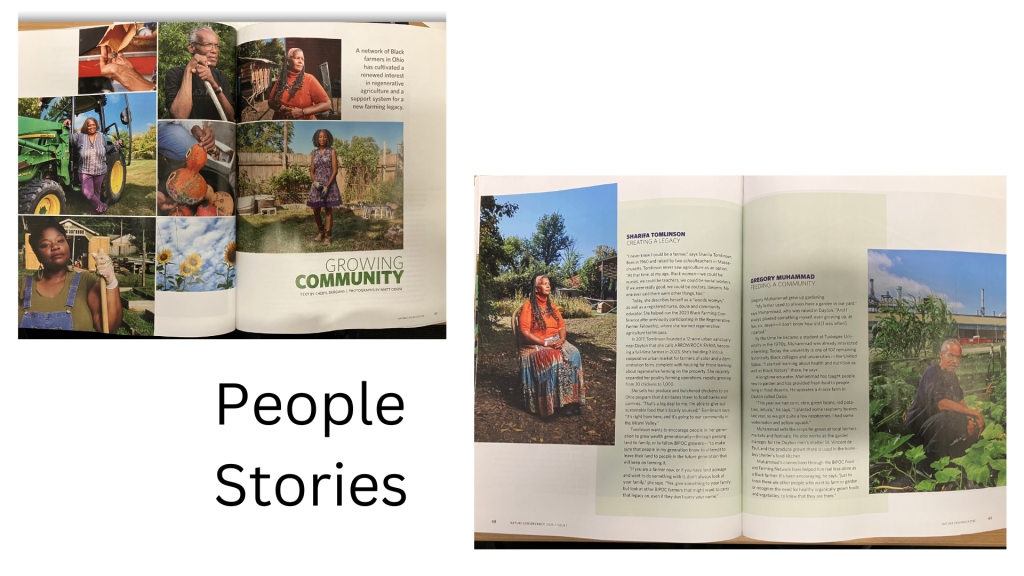
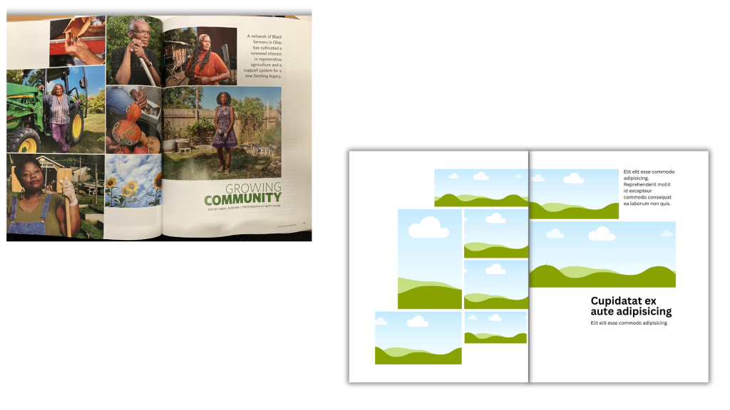
Sidebar with multi-photo spread.
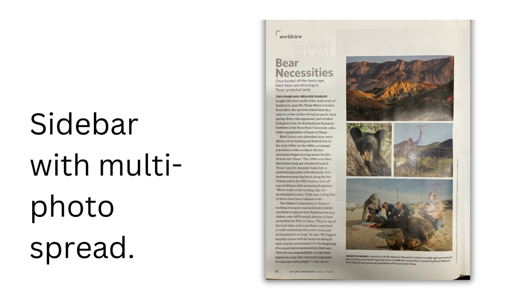
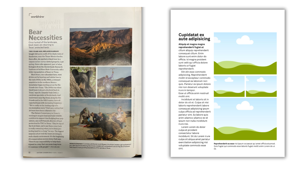
This spread is something you see in magazines all the time. The written article is only given a sidebar, the rest of the page is made of up a photo grid.
Yes, words are important. But the more important the words, the less space you should give them on a page. Because it’s going to make it that much more likely someone will actually read those words.
Another cool thing about this kind of spread is that you can use anything in those visual spots. Want to share a collection of charts instead of photos, go for it.
The little infographics spread.
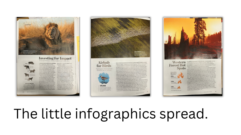
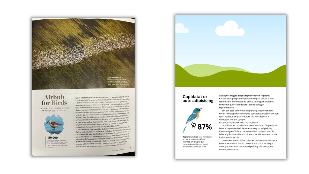
I saw this spread being used multiple times in the magazine. Basically, you have a big photo taking up the top half of the page. The bottom half right 2/3 is an article. The bottom half left 1/3 is a little miniature infographic.
This would be a great opportunity for a sound byte style data point or simple chart. The big picture at the top draws you in, the infographic delivers a point, and the article expands upon the point.
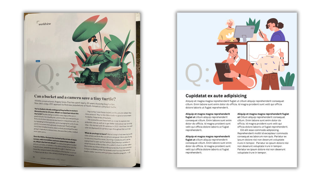
Big Q little a.

Q&A posts are standard fare for so many magazines.
This spread continues the trend of only using half the page for written content. The big Q at the top let’s you know it’s a Q&A post.
I think this kind of thing would work really well in many reports. Find a stakeholder (partner, participant, program staff member, etc.) and do a quick Q&A. Not only would this split up the narrative in a logical way, it’s also a nice way to incorporate other voices into your reporting.
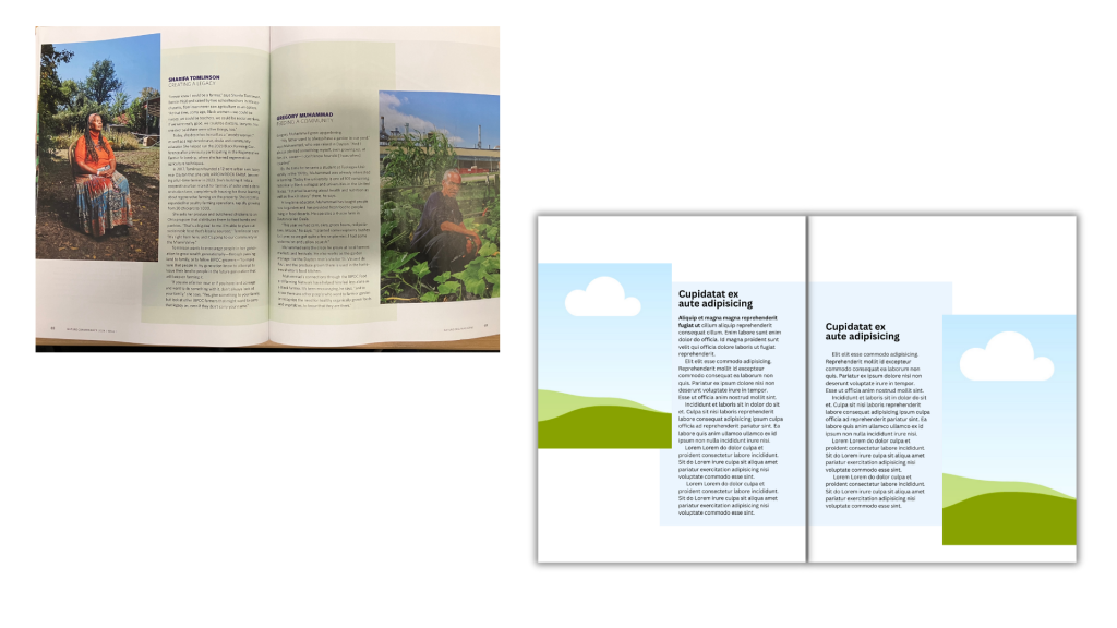
People Stories.
When you can do it, having actual pictures of interviewees is a really nice way to bring a human element into your reporting. A lot of qualitative reporting tends to fall into summary style with lots of quotes and arranged by topic or code.
But simply giving space for each participant’s individual story is a super easy way to go. Then you can bring all the pictures together at the beginning of the story as a collage to set the scene.
Timeline graphic
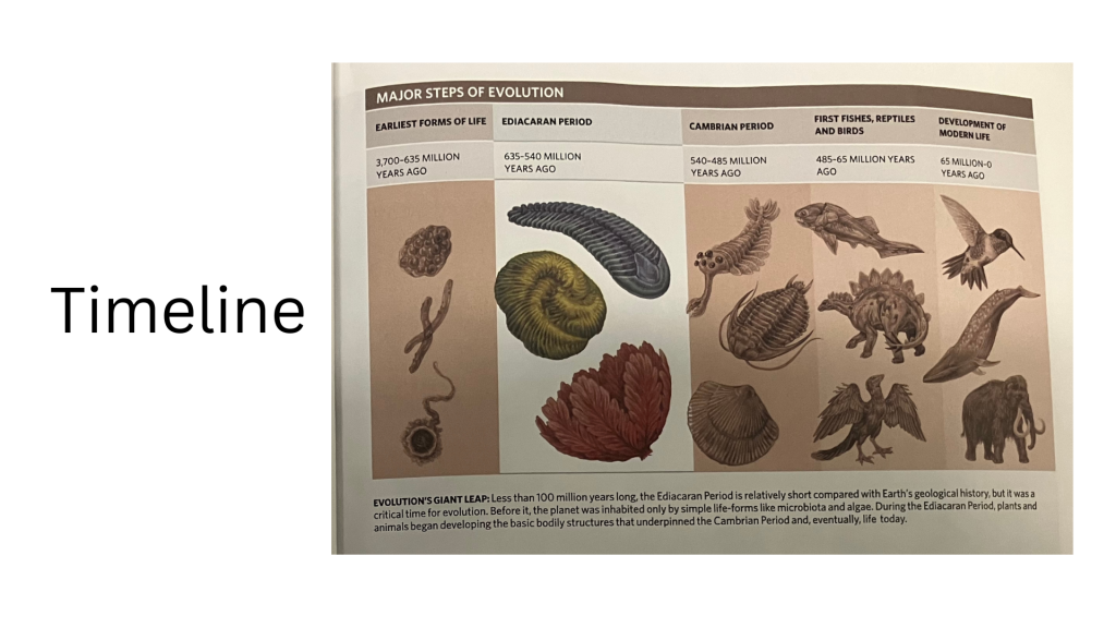
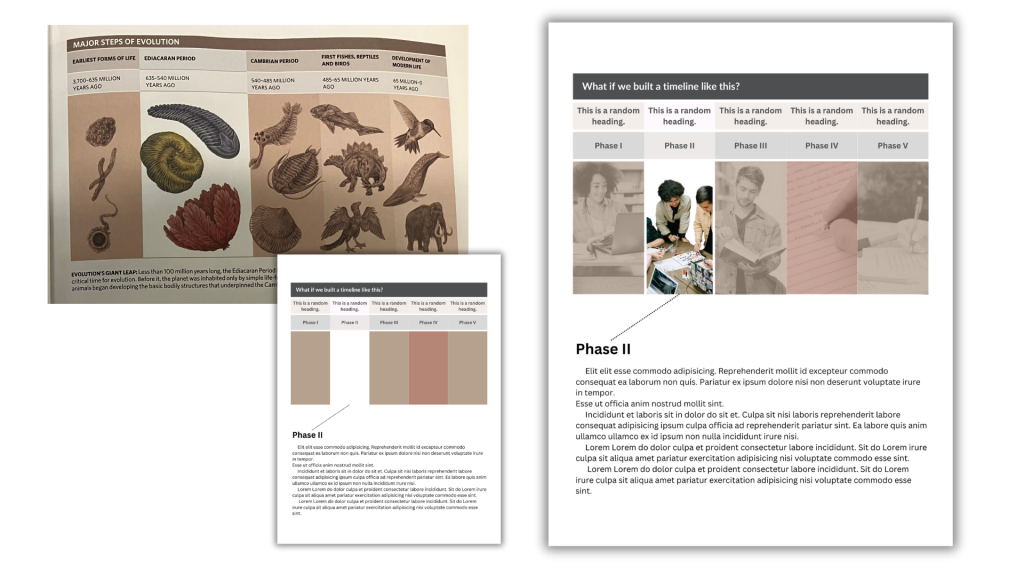
I like how this timeline was laid out. It’s really simple, the step that is the focus of article gets white background with color objects in the foreground. Everything else gets muted backgrounds and sepia tones. The focus section in the example also gets a little bit more landscape than others, and since it’s evolution there is even a little overlap of pictures between phases.
There are all sorts of places for simple timelines in most reports. Especially when a project has particular phases.
In my template I decided to black and white the pics and make them a little transparent to pull in some background color blocks. I also removed the background on the phase I want to highlight. If this were a real report, you could have a page for each individual phase, doing the same treatment isolating each block.
Want the Canva templates?
I stopped worrying about whether I was using pro stock or not. I’m a pro user but you can make any template free by just replacing premium content with free elements or uploaded content. For most of the individual pages it will be an easy switch out.
Also, make sure you sign into your Canva account BEFORE clicking the template link.
