This is an Eval Central archive copy, find the original at freshspectrum.com.
A couple of years ago I put out a book called the Reporting Revolution. And while I still believe just about everything I wrote in that book, I know many of you are not actually looking to start a revolution. You just want to start creating better reports.
So, with that in mind, today’s post is just a collection of baby steps. Simple things you can do now to improve your reporting.
1. Don’t focus on making your long report look better.
Your long report will only ever reach a small audience, even if it’s fantastic. And longer reports usually take lots of time and effort to make them pretty. It’s far more valuable to put that time you would spend updating your longer report into creating short reports.

2. Create a slidedoc.
A slidedoc could replace your long reports, but it doesn’t have to replace one to be useful. Slidedocs are simply just fantastic adaptations. Slidedocs are easier to create than infographics, and offer far more utility.
The easiest way to think through a slidedoc design is to consider it like a really nice visual presentation that doesn’t require a presenter to deliver. If you are already creating nice visual presentations, start from the slidedecks and just add words.
If you want a little more guidance on where to start, I wrote a blog post on slidedocs a couple of years ago that is still very relevant.

3. Create two graphs instead of one.
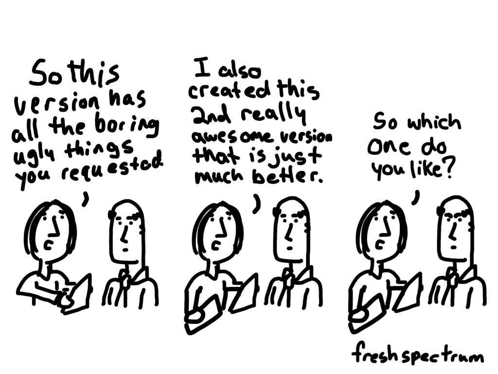
Don’t agonize over chart choice before you start designing. Instead go with a basic chart (like a bar graph) and then create something fancy (like a dot plot or slope graph) with the same data. Now you have choices that can be compared and contrasted.
This is useful if you are on your own, but it’s especially useful if you are working with a team. A “this one or that one” conversation produces far more useful comments than a “yes or no” or “what do you think of this” conversation.
4. Always create at least one micrographic with any report.
Ask yourself, “if someone is going to share this on social media, what image would go along with the post?” Don’t just fall back to the report cover. Find a particularly interesting chart, question, or finding from your report. Then feature it in a slide-sized little infographic.
Here is a post I wrote with tips on creating simple infographics.

5. Add some white space.
If your pages are wall to wall text, it’s going to feel too dense to read.
Page count restrictions are deceiving. It’s almost always better to create a report with more pages and more space around the words than it is to create a report with fewer, but more dense, pages.
For tips on how to do this check out this short video, Ditch the Text Walls, Embrace the White Space!
Want more tips?
You should consider joining my upcoming live course, Everyday Visual Reports, which will be taught on February 20 & 22. This course is designed to be super practical with things to learn at all skill levels.
