This is an Eval Central archive copy, find the original at evalacademy.com.
This article is rated as:


The placement of axis labels in our data visualizations plays an important role in enhancing the clarity and impact of our charts. While Excel is a powerful tool for creating impactful data visualizations, its default charts often leave much to be desired. In previous articles (see Data Visualization Best Practices and 7 Tips for Better Data Visualizations) we have discussed methods for improving the overall look our charts, but we have not discussed how to justify y-axis labels in our bar and stacked bar charts. In this article, we will discuss a quick approach for justifying our y-axis labels within the Microsoft suite of applications (e.g., Word and PowerPoint), as well as a workaround for justifying y-axis labels directly in Excel.
The Problem
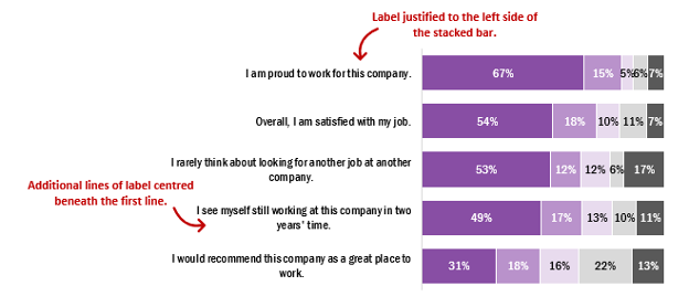
First, it is important to highlight the problem with the default y-axis labels in Excel. On creation of a new chart, whether a bar or stacked bar chart, the first row of text is justified to the left edge of our bars, but subsequent lines are centred below the first line of text. This leads to awkward looking labels that distract from the overall appeal of the chart. While this issue may not be immediately apparent if y-axis labels are short in length or if the chart is large enough to allow sufficient room for the full label to display in a single line, this becomes an issue when we are wanting to plot charts with lengthy y-axis labels. For example, a label may be a survey or evaluation question that is being addressed.
To illustrate this, the example below depicts the default y-axis labels of five staff engagement questions. Some labels will be justified as needed, but others will require editing to improve the overall look of the chart.
The Simple Solution
The simplest solution for justifying the y-axis labels is to leverage other Microsoft suite applications (e.g., Word or PowerPoint), as Excel does not have a simple approach for justifying these labels without additional data preparation.
How to Justify Y-Axis Labels in PowerPoint or Word
-
Copy & Paste (Ctrl +C, Ctrl + V) the Excel chart into PowerPoint or Word.
2. Left-click on the y-axis labels (Vertical (Category) Axis).
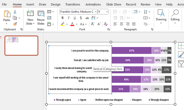
3. Within the Home tab, navigate to the Paragraph section of the top ribbon.
4. Left click on the arrow icon in the bottom right of the Paragraph section. This will open the Paragraph menu.

5. Under General > Alignment the default will be set to Centered.
6. Change the Alignment to Right.
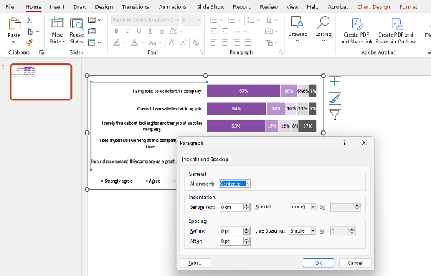
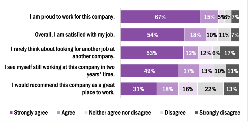
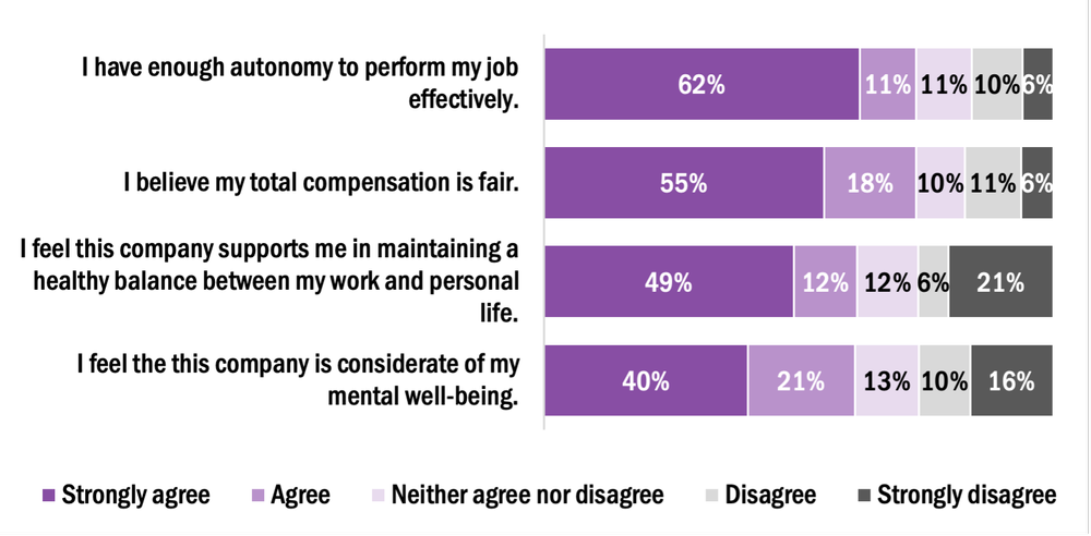
7. The resulting chart will have right justified y-axis labels.
Right-Justifying Labels in Excel using Chart Templates
While justifying labels in Word or PowerPoint accomplishes the goal of improving the overall look of our charts, this process typically needs to be completed manually for each chart. However, we can leverage chart templates in Excel to apply this formatting to all similar charts within our worksheets.
Creating a New Chart Template to Right-Justify Y-Axis Labels
1. Copy & Paste (Ctrl +C, Ctrl + V) the updated chart back into Excel.
2. Right click on the formatted chart and Save as Template…
a. Name the template (e.g., Right justify labels)
3. With the template saved, right click on any additional chart requiring formatting.
4. Navigate to Change Chart Type…
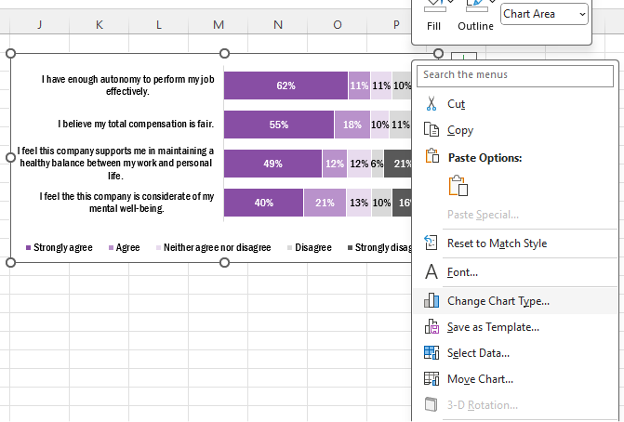
5. Go to your saved Templates at the top left of the All Charts tab.
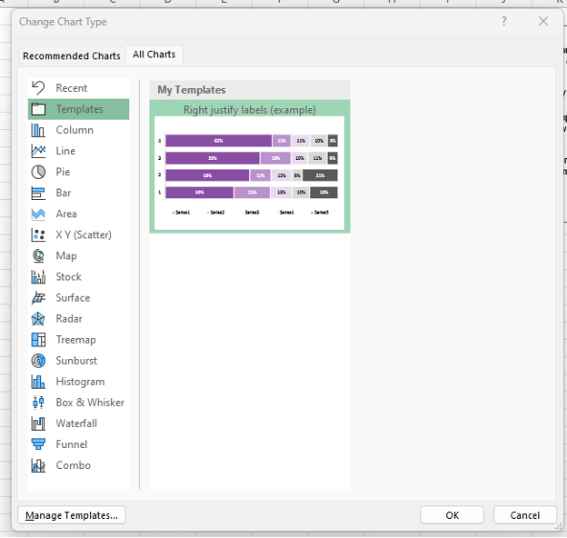
Note: When applying a chart template to another chart, both charts need to be identical in style. For example, a stacked bar chart with five levels of agreement would need to be identical between the template and the chart for which the template will be applied.
6. Select the template you want to apply and click OK.
7. The new template will be applied to the new chart.
The More Complicated Approach
The following approaches work well when working between Excel and PowerPoint (or Word). However, sometimes you may want to justify the labels entirely within Excel. The workaround requires some additional steps in setting up your data but will allow for complete formatting and control within Excel.
How to Justify Y-Axis Labels in Excel
1. Prepare your data for charting.
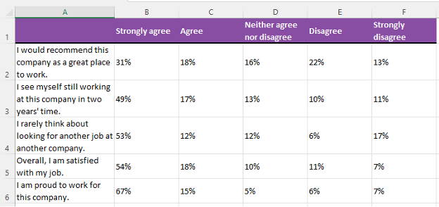
2. Insert a new column to the left of Column B.
a. Right click on Column B and Insert.
3. Label this new column as ‘Label’ and insert 0% into all cells below.
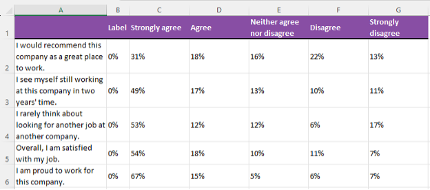
4. Highlight the data from Cell B1 (‘Label’) to Cell G6 (7%).
5. Go to the Insert tab in the top ribbon and insert a 100% Stacked Bar Chart.
a. Right click the new chart and go to Select data…
b. Switch Row/ Column to get the data presented properly.
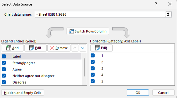
6. Add data labels and format the chart as necessary (see Data Visualization Best Practices).
7. The chart will have 0% labels on the left side of the stacked bars. Right click and Format Data Labels…
a. Under Label Position select Inside End.
8. Also, within the Format Data Labels menu, navigate to the Label Options and select Values From Cells.
a. Highlight cells A2:A6 (the axis labels) and click OK.
b. Toggle off the Value and Show Leader Lines boxes under the Label Options.
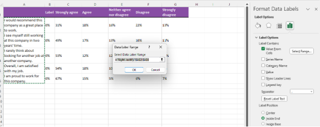
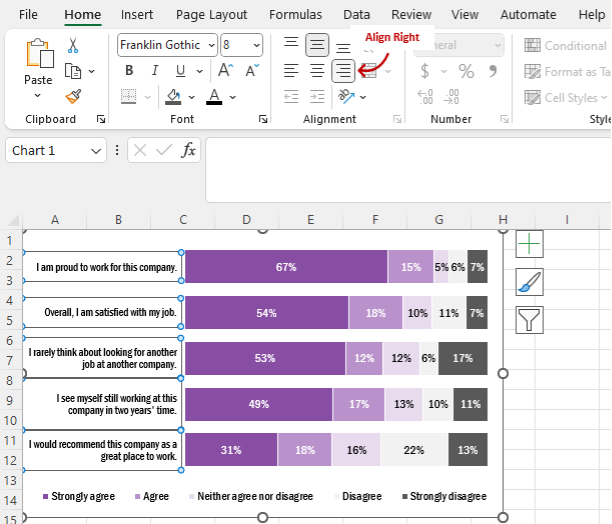
9. Manually adjust the text boxes for each of the labels by dragging the text boxes (use the circles around the text box to resize) to the far left of the chart.
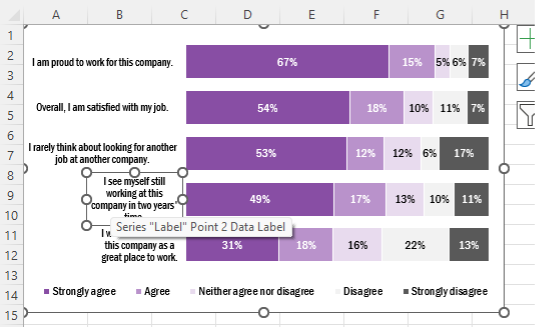
10. Select all the data labels and under the Home tab > Alignment click on the Align Right option.
Wrapping Up
While powerful, Excel has some limitations in its default charting options. However, with the flexibility of the Microsoft suite of applications, as well as additional Excel charting options, it is possible to format engaging charts with a little patience and know-how.