This is an Eval Central archive copy, find the original at evalacademy.com.
This article is rated as:


This will be the first installment in our Data Visualization Applications series. Here we will outline how to transform your data into effective data visualizations using our own tried and tested Data Visualization Best Practices. And what better place to start than the simplest, and most effective, data visualization: the bar chart.
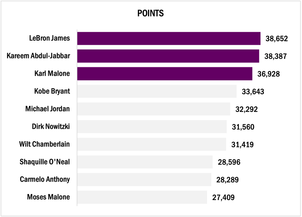
For this tutorial, we will look at the all-time highest-scoring NBA players. Feel free to pull more NBA statistics or use your own data to practice the fundamentals behind creating an engaging bar chart.
The following tutorial assumes that your data are both reviewed and cleaned. However, this is rarely the case. If you need help getting your data to a workable state, here are some resources to help:
Initial Chart Selection
-
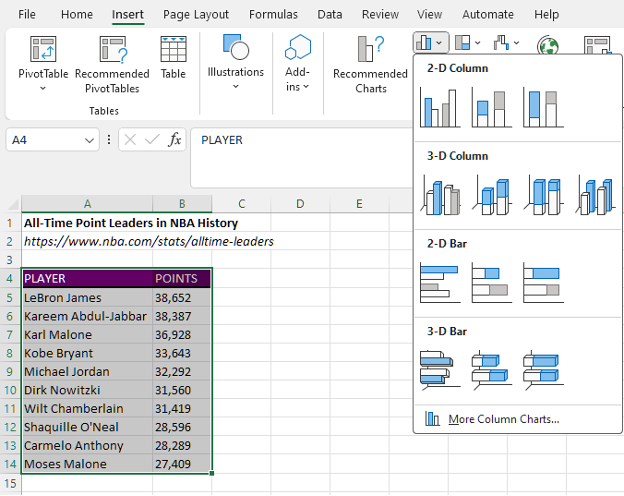
Highlight the data will be included in the bar chart.
-
Navigate to Insert along the top ribbon of Excel.
-
Within Insert go to Charts > Clustered Bar.
Applying Data Visualization Best Practices
This section will outline the process to transform the initial bar chart into something much more engaging by applying data visualization best practices.
First Impressions
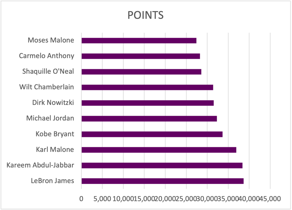
Before editing the bar chart, review the initial bar chart output and ask questions:
a) Are the data ordered properly?
b) Does the data require data labels?
c) Are gridlines beneficial to the overall interpretation of the data?
Simplify
-
Remove unnecessary gridlines by left clicking on any gridline and hitting Delete.
-
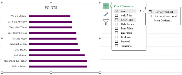
Alternatively, hover over the chart with your mouse until a + (Chart Elements) icon appears in the top right.
-
Within Chart Elements toggle off the Gridlines option to remove the gridlines.
2. Remove the x-axis labels by left clicking on the axis labels and hitting Delete.
-
Again, you can use the Chart Elements menu to remove the x-axis.
-
Under the Axes option, toggle off the Primary Horizontal axes.
Reorder the Data
1. Left click on the y-axis to highlight.
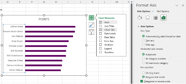
2. Next right click on the y-axis and select the Format Axis option.
-
Alternatively, select the y-axis and use the keyboard shortcut Ctrl + 1 to open the Format Axis menu.
3. The data are presented in ascending order. To switch to descending order, toggle on the Categories in reverse order option.
Add Data Labels
1. Left click on any bar within the bar chart.
2. Right click in the highlighted bar and Add Data Labels.
-
Or use the Chart Elements menu to toggle on Data Labels.
Improve the Appearance
Bar Thickness
1. Left click on any bar within the bar chart.
2. Right click in the highlighted bar and Format Data Series.
-
This menu can also be accessed using the Ctrl + 1 keyboard shortcut.
3. Adjust the Gap Width to 35% (or your preferred bar width).
-
Note: A smaller Gap Width results in a wider bar, and vice versa.
Adjust Colours
1. Apply your colour palette to the bar chart by right clicking on any bar and selecting the Fill option.
-
If all bars are highlighted, colour will be applied to all bars.
-
You can individually select single bars (ensure only one bar is highlighted) and follow the same step to apply colour to a single bar.
2. Highlight the top three bars using your primary colour (check to see if you have a style guide).
3. Mute the other bars with a secondary, muted colour.
Using a darker colour to highlight key information will direct the reader’s attention to important detail. By muting other bars, the focus is further drawn to the primary information.
Adjust Fonts
1. Left click on the chart to highlight the entire bar chart.
2. In the Home tab, select your Font of choice.
-
Ensure that your chart font is sans serif to the best results.
3. Fonts can be selected by scrolling through the list of fonts or by typing in the name of the font if you already know the name of the font you will be using.
4. With the chart still highlighted, adjust the Font Size to 9 pt.
5. Next, change the Font Color to Black.
-
The default font colour is a dark grey that is not as sharp as crisp, black font. Change the colour for improved readability.
Improve the Chart Title
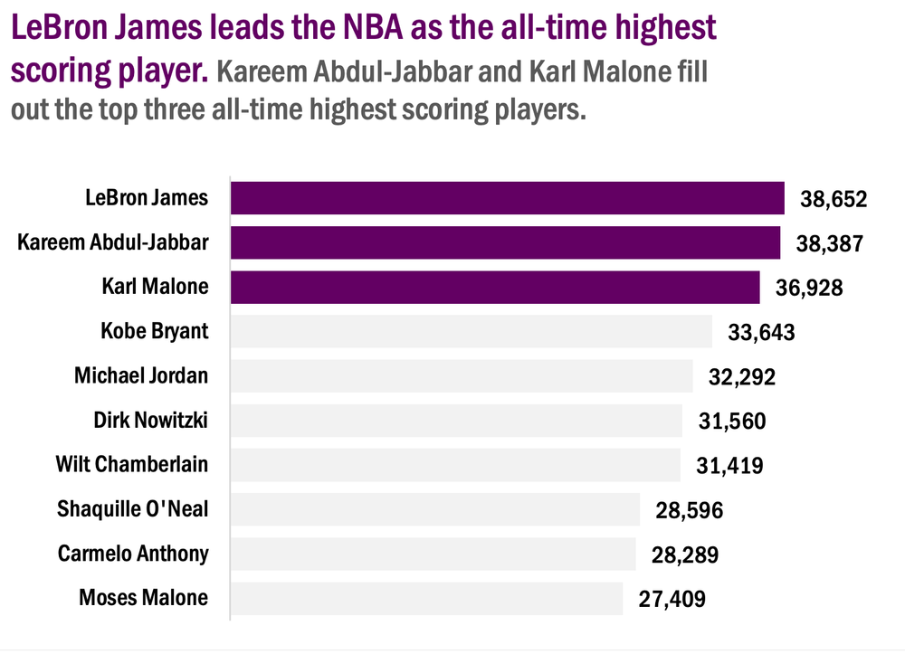
Excel will pull the column heading as the chart title for your bar chart. However, this title is often uninformative without more context. Instead of keeping a vague chart title, craft something much more informative that describes the data being presented.
1. Left click on the Chart Title.
2. Type in the improved title and hit Enter.
-
The chart title will be edited in the function bar above your spreadsheet.
-
Also, by right clicking on the title and selecting Edit Text you can edit the text directly within the chart.
Final Tweaks
1. Emphasize the chart title by increasing the main point to 14 pt font.
-
The subtitle (if any) can be deemphasized using a slightly smaller font of 12 pt.
-
Note: When drafting the title within the chart itself, you will have to click and highlight the section to which you wish to apply changes.
2. Further emphasize the title by using your primary colour in the text of the main title.
Final Thoughts
There are myriad ways to present your data. However, using simple, clean data visualizations will greatly improve the impact and effectiveness of your visualizations. The simple bar chart is among the most effective means of presenting data and should not be overlooked.