This is an Eval Central archive copy, find the original at freshspectrum.com.
Looking for an evaluation related cartoon for your next presentation or blog post? Well, over the last decade I’ve drawn hundreds.
In this post, I’m sharing 111 of my evaluation cartoons, including a lot of community favorites. Please feel free to save to your computer, add to your presentations, and share them on the web.
What about licenses?
So if you’re giving a presentation or writing a blog post, I consider these non-commercial uses. The only attribution I require is keeping the signature in the cartoon (most often freshspectrum, but sometimes clysy). You can add more (always appreciate links back to this site) but I do not require this.
I hate filling out paperwork. Filling out paperwork is making me do work so that you can use my stuff. I charge for this, because, well, I hate paperwork. So I’m just using the Creative Commons language, because I also dislike writing legal-ease kinds of stuff.
All that said, if you like my stuff, consider becoming a Patron of mine. This helps compensate for the costs of sharing my stuff publicly (mainly web hosting). $5/month would be awesome but $1/month is also very much appreciated.
My Creative Commons License
Attribution-NonCommercial (CC BY-NC)

This license lets others remix, tweak, and build upon your work non-commercially, and although their new works must also acknowledge you and be non-commercial, they don’t have to license their derivative works on the same terms.
View License Deed | View Legal Code
What about Commercial Uses?
I’m still usually okay with these types of uses. Especially if I don’t have to do any paperwork and my cartoons are secondary to the overall product you are offering. But reaching out and asking (chris @ freshspectrum .com) is encouraged.
I’ll probably just say go for it, and encourage you to become a $5 or $10 patron.
On to the Cartoons
You’ll find others out in the world, but here is a pretty big set that includes most of the community favorites. I’ve also decided to scatter in some comments to add a little additional context.
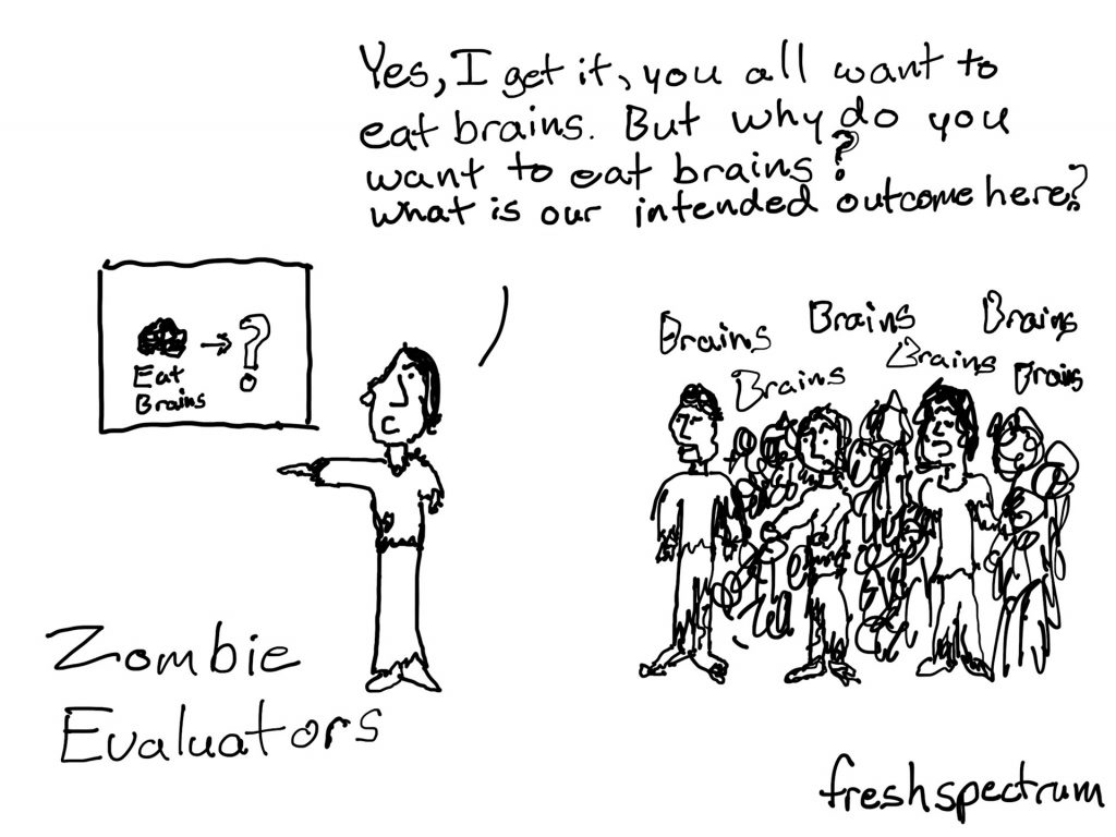
I drew this Zombie evaluator cartoon for a halloween. But it’s definitely become on of my favorites for anytime use. I have been asked how the evaluator draws on the whiteboard without hands.
My tongue in cheek response is usually, “maybe she had them when she was drawing it on the board in the first place.”
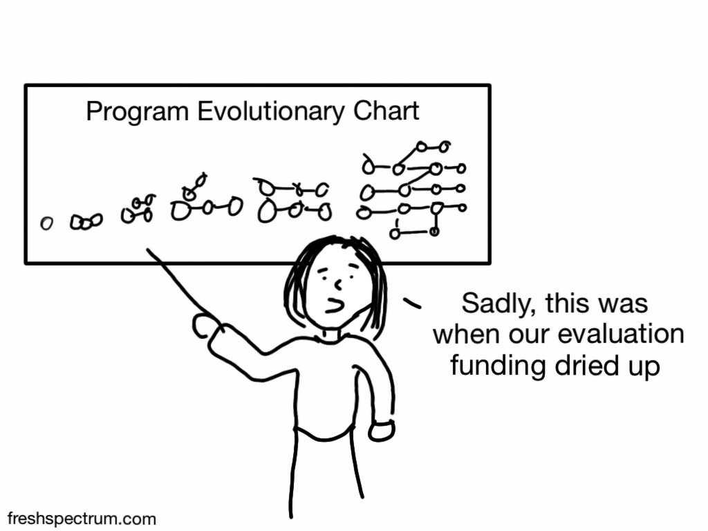
I drew this program evaluation evolution cartoon at the request of another evaluator. Not sure if they ever used it, but I think there is a pretty common sentiment here.
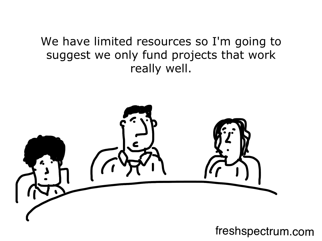
The logic behind doing “what works” often gets applied to newly forming programs. But taking the time to evaluate the past to find what did work, or applying the lessons of past evaluations, is something that few organizations actually take the time to understand.
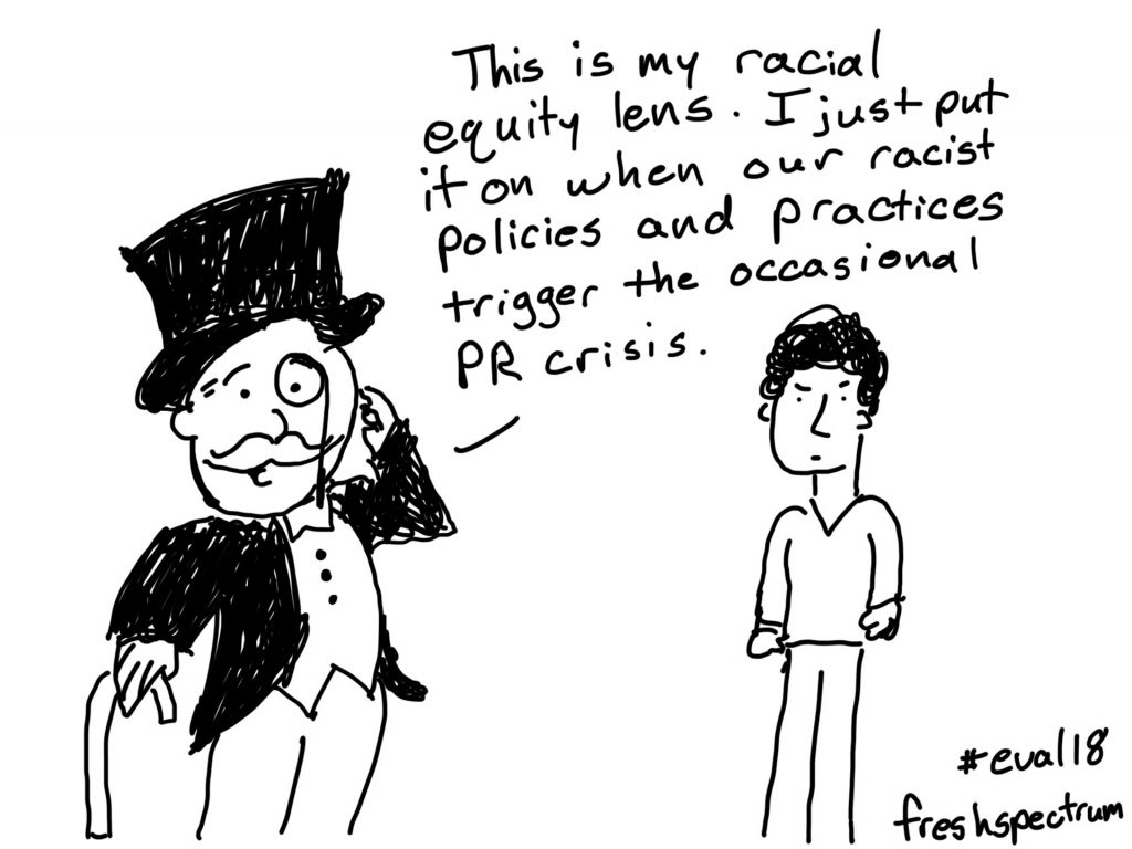
I like mixing puns with sad social realities…
It’s much easier to say things about racial equity than do things about racial equity. It’s also much easier to do things about racial equity than do enough of the right things in the right way to make significant progress on issues of racial equity.

There is a quote from Michael Scriven that comes from his evaluation thesaurus.
Causation: The relation between mosquitos and mosquito bites. Easily understood by both parties but never satisfactorily defined by philosophers or scientists.
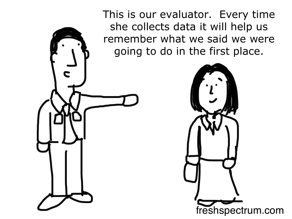
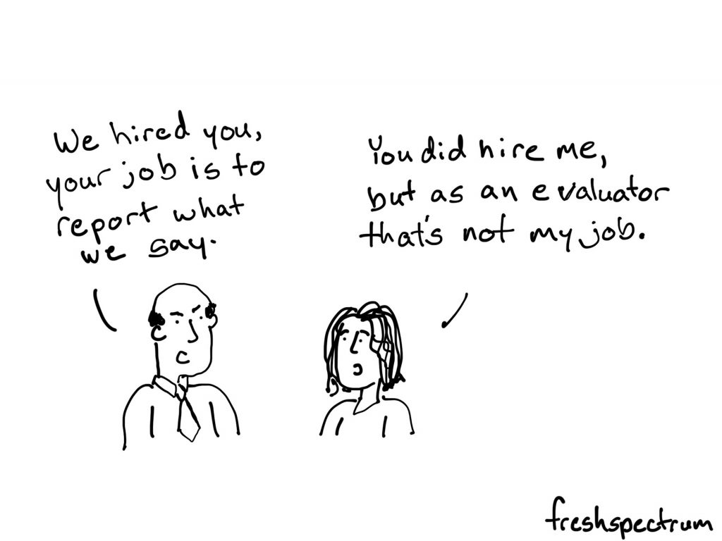
Good evaluators carry a set of ethics with them as they pursue their profession. Evaluation can be really important, for good or for bad, and really political.
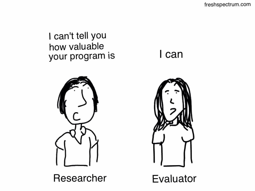
This researcher vs evaluator cartoon has been a perennial favorite. I find it on a lot of bulletin boards and in presentations. I think there is a hunger for many in the evaluation community to describe their work simply.
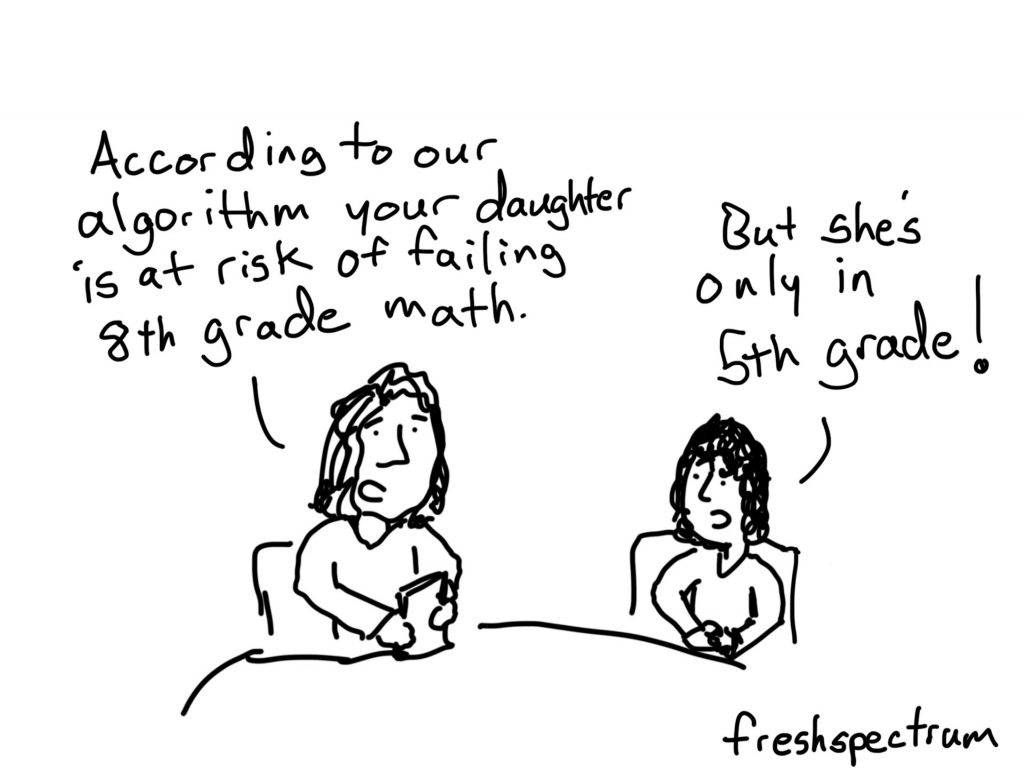
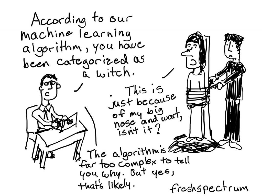
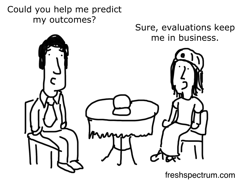
I am not against data science and predictive analytics, but maybe sometimes we take it a bit too far.
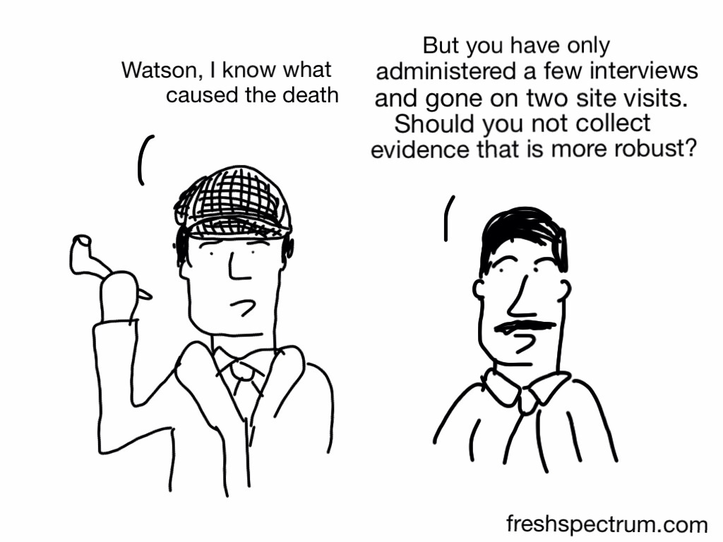
This Sherlock cartoon is really just an attempt to show detective work as a form of qualitative evaluation. I edited it at the request of Michael Quinn Patton for use in one of his books, but this is the original and I like it better.
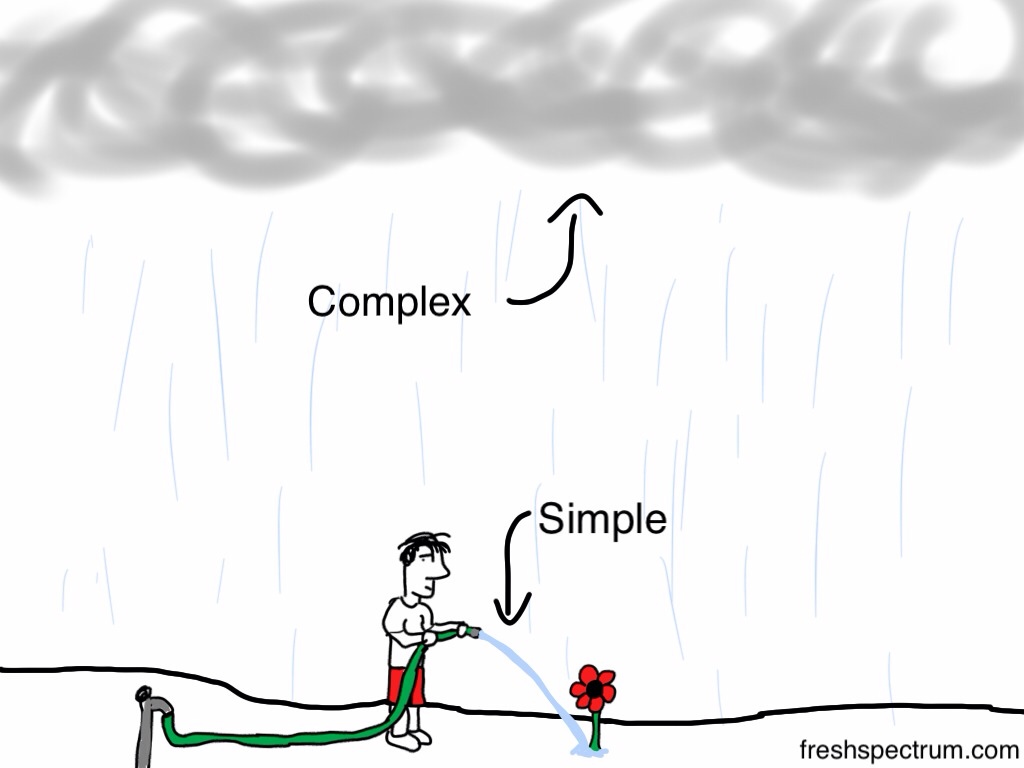
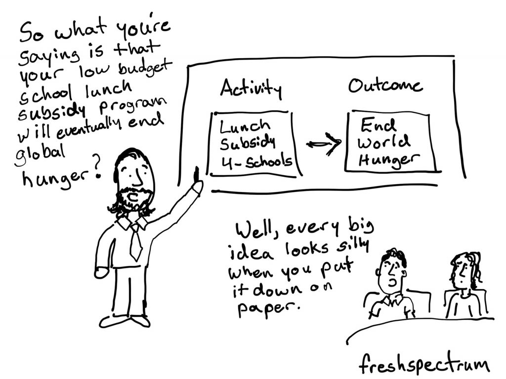
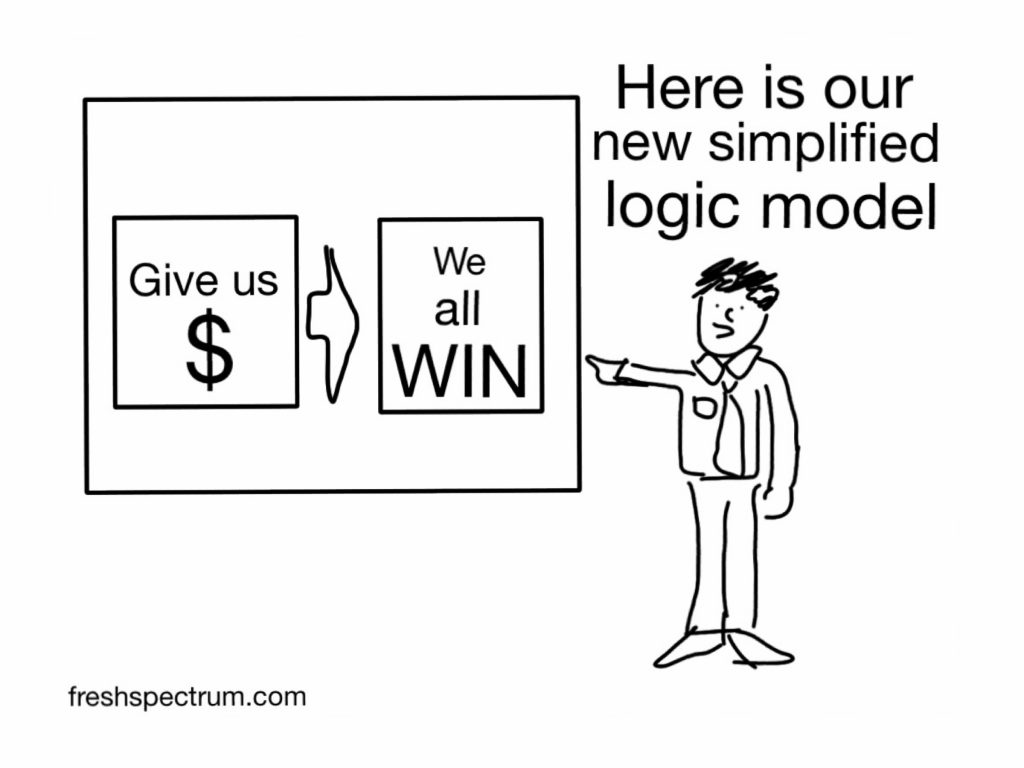
Most of the crowd favorite cartoons tend to be short and a little over the top. This is definitely one of them.
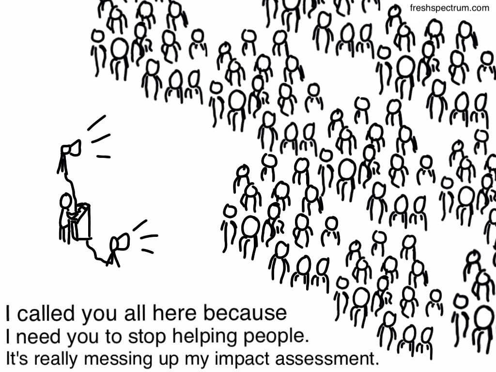
I drew this one while pondering the differences between attribution and contribution.
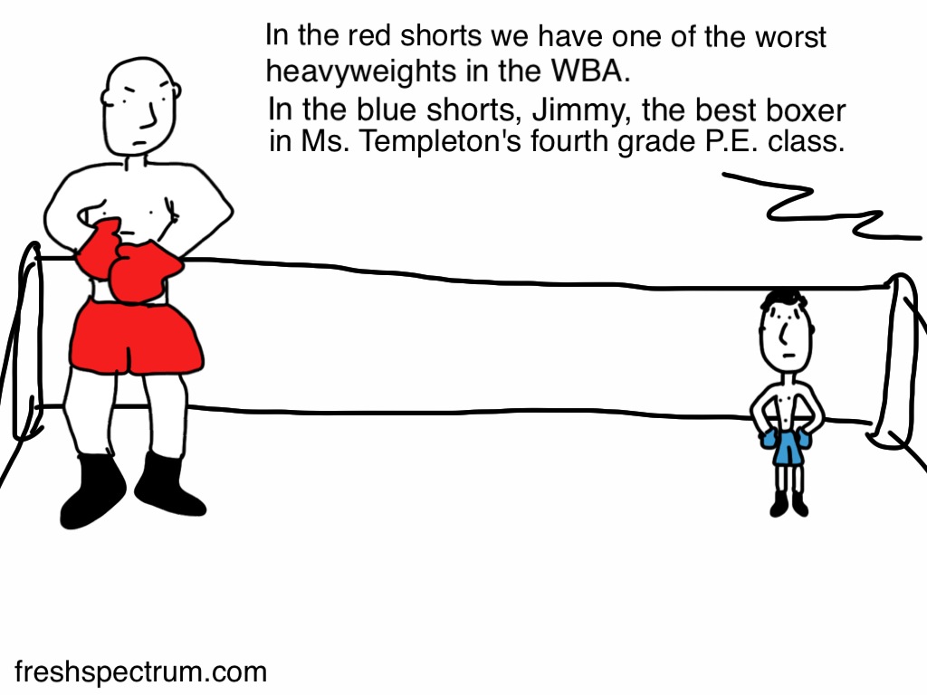
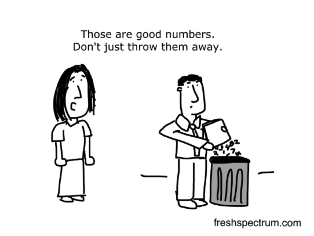
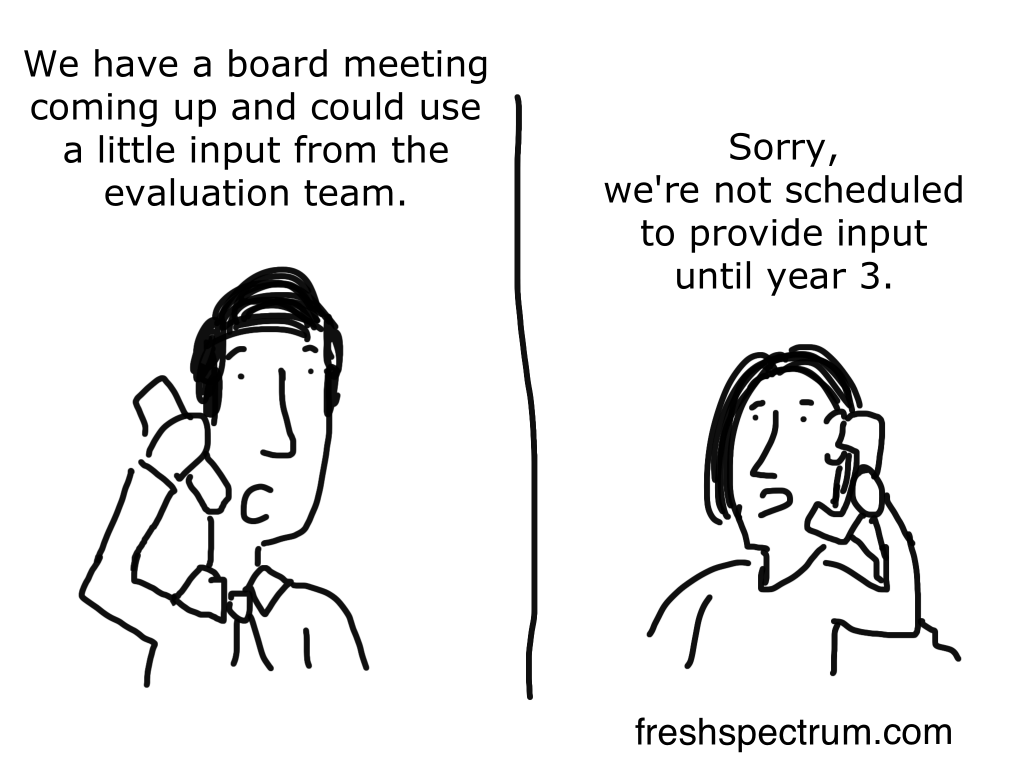
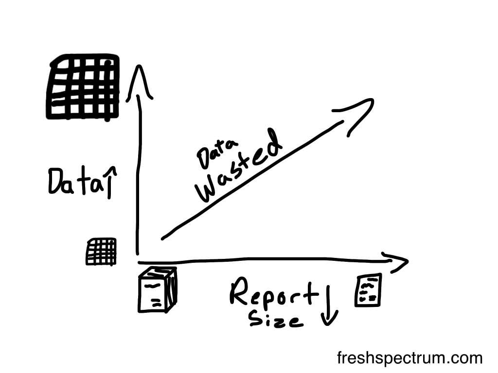
One of the reasons I started becoming disillusioned with contract evaluation was the amount of money that gets put into data collection/analysis. But by the time the contract gets around to dissemination, it’s almost like an afterthought. What a waste.
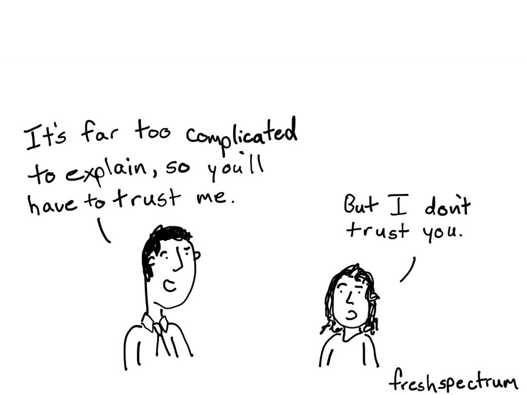
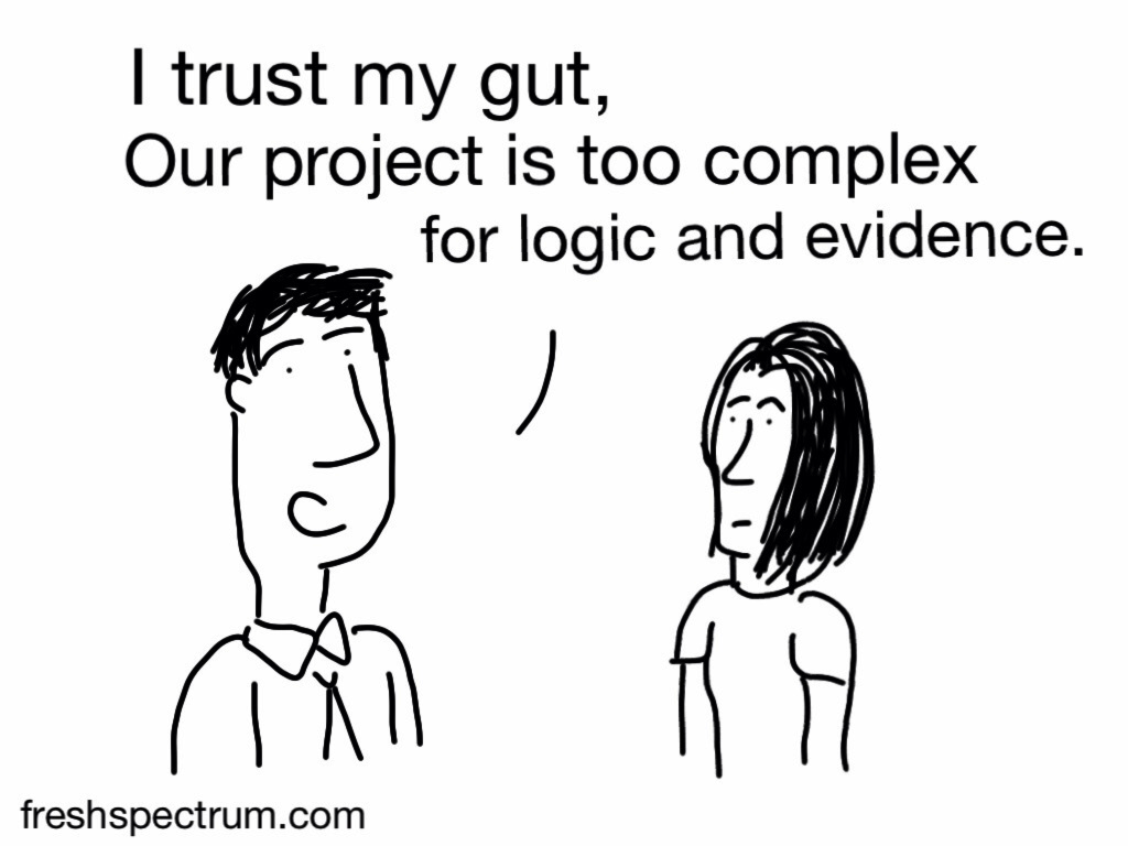
Seen this on a few bulletin boards too. There are lots of things that are complex, but that’s no excuse to not use data. In fact, quite the opposite.
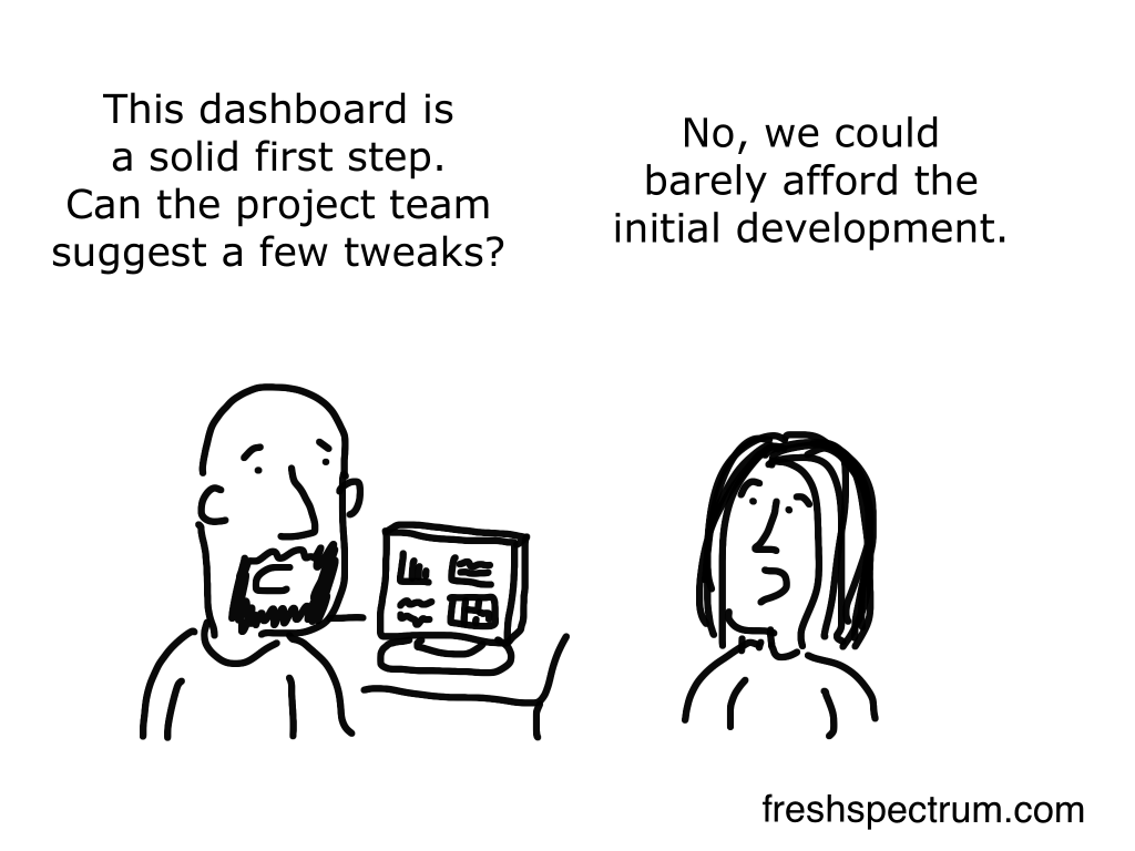
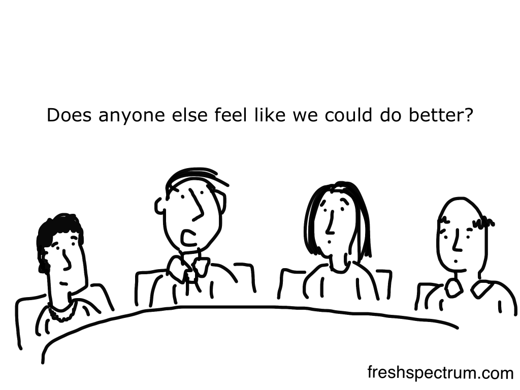

The word failure can be stigmatized in organizational settings. It’s an easy target for a cartoon, but honestly I’m not sure it’s the kind of word that should get glorified either. Doing something wrong could be someone’s “failure” but it could also be someone else’s “lesson learned.”
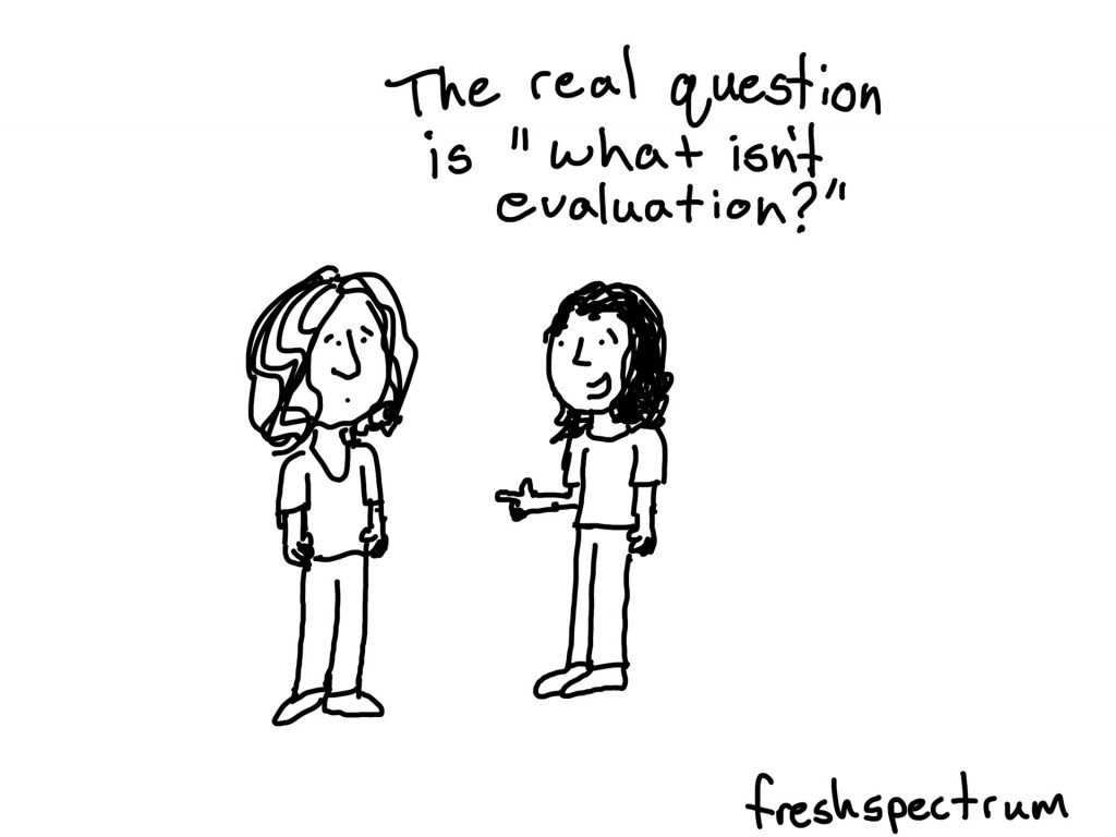
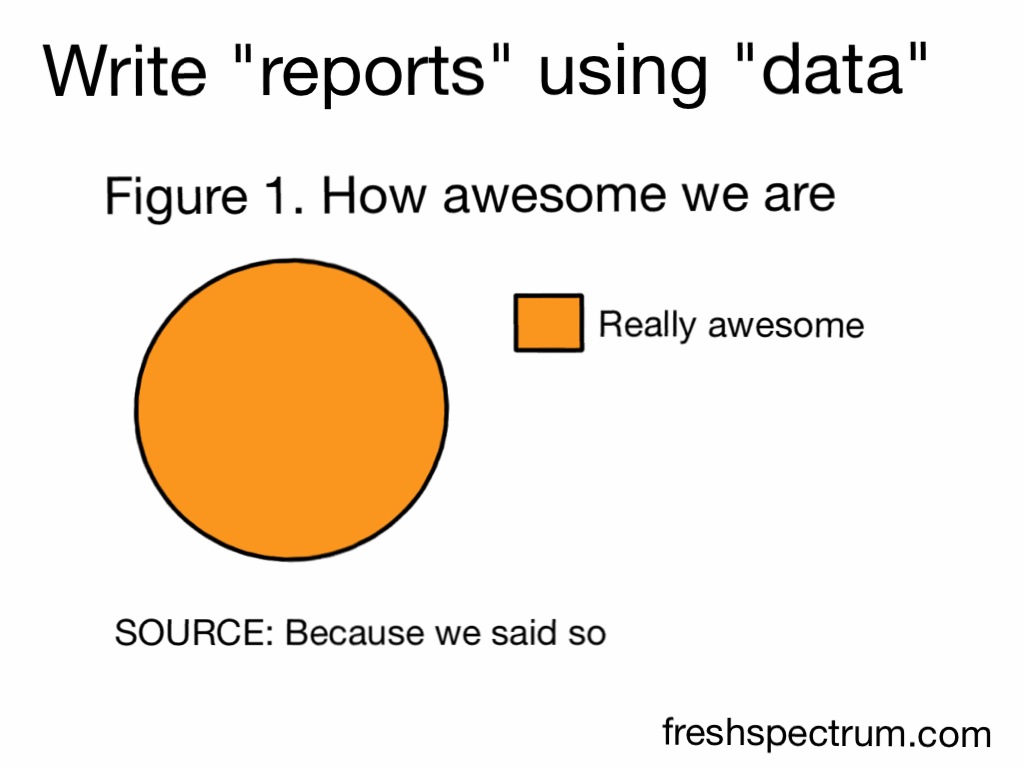
Charts and jargon can really obscure ridiculous assumptions and sources. Sometimes it’s fun to just vastly oversimplify.
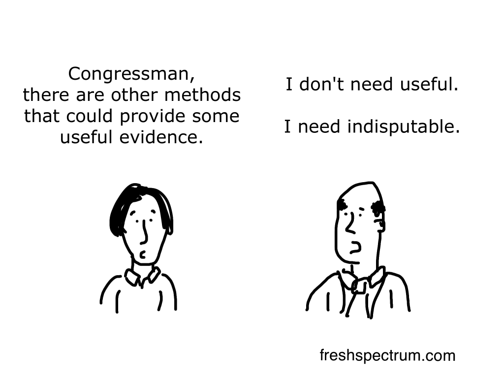
This is one of those cartoons that I rarely see anyone use, but I think it’s a really important concept. I think the idea of something being “indisputable” is a real driving force behind the perpetual rhetoric that drives methodological choice.
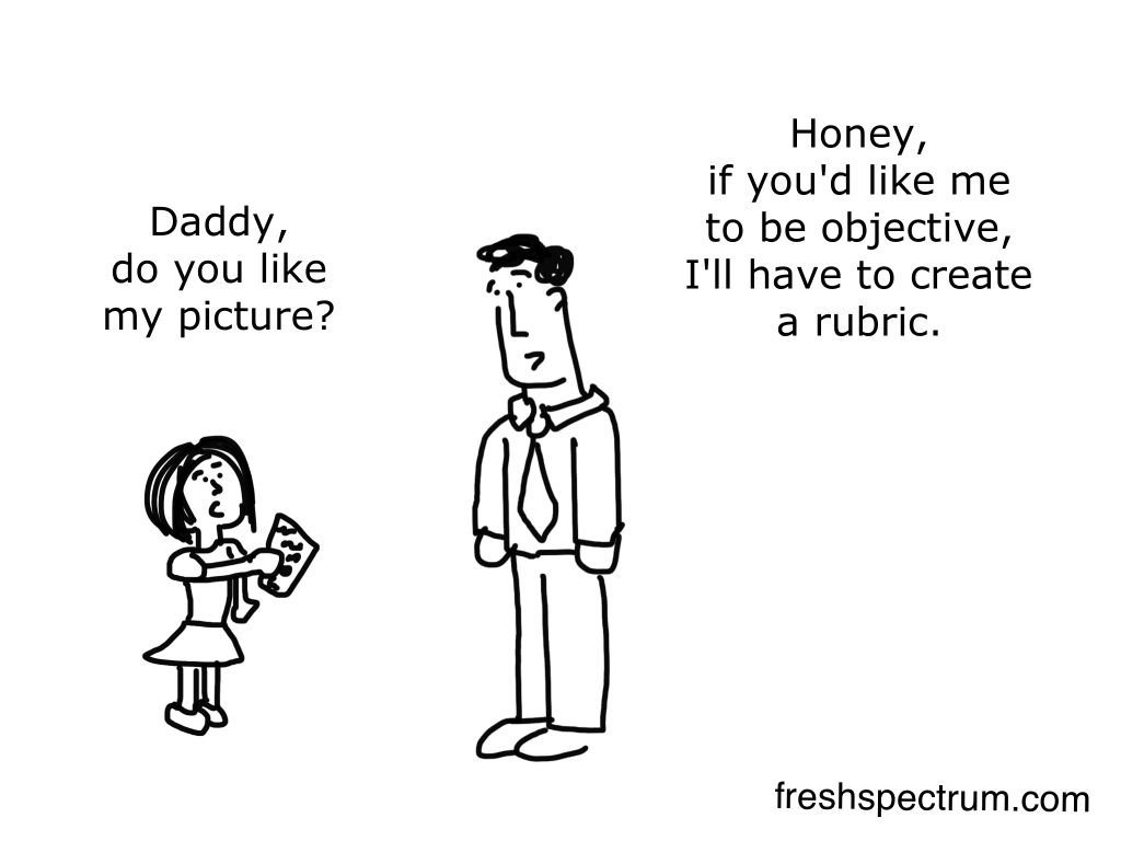
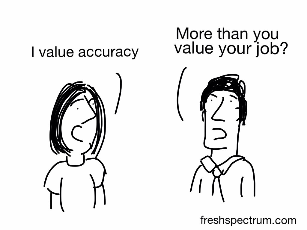
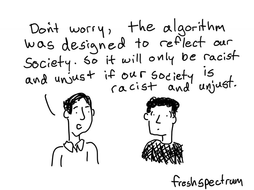
If you read enough of my cartoons you’ll see a lot of repeating ideas. I kind of look at it like taking photographs. Sometimes you need to take them at different angles to see which works the best.
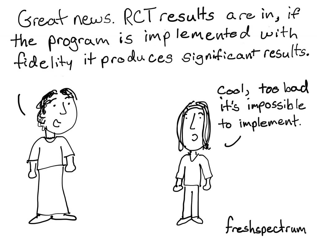
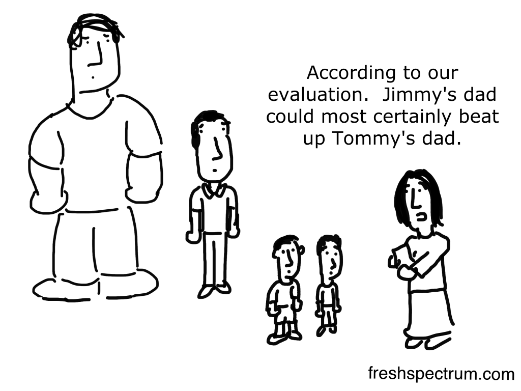
This is the “my dad could beat up your dad” playground argument with an evaluator involved.
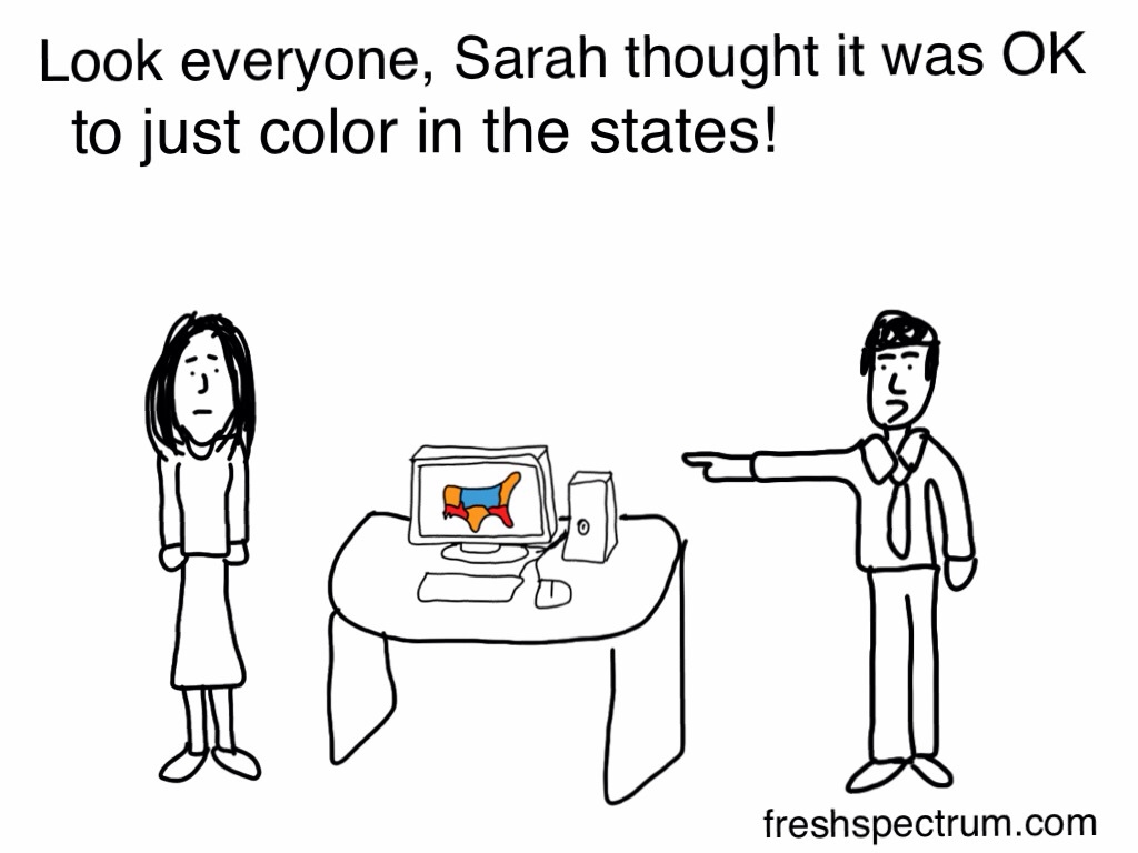
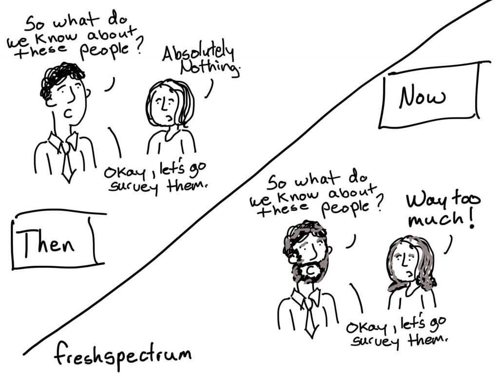
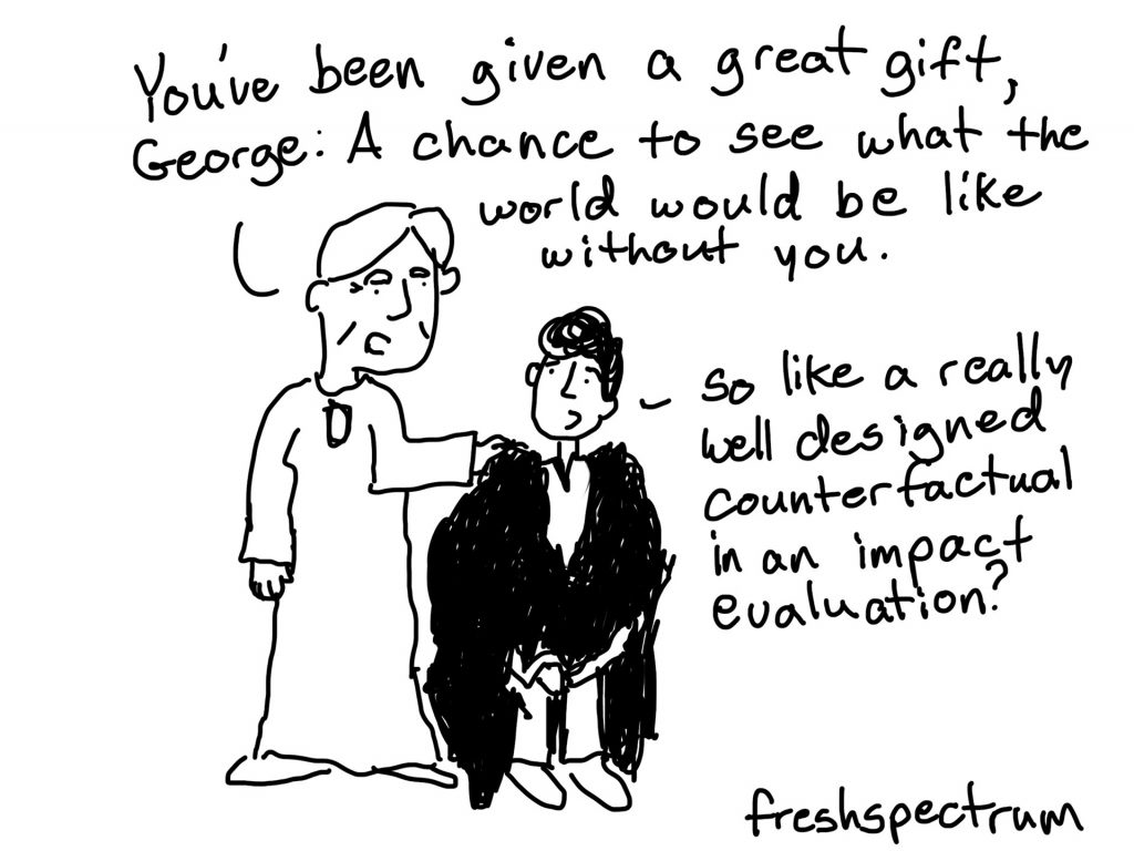
Designed this one for Christmas time, but It’s a Wonderful Life is really a true evaluation story.
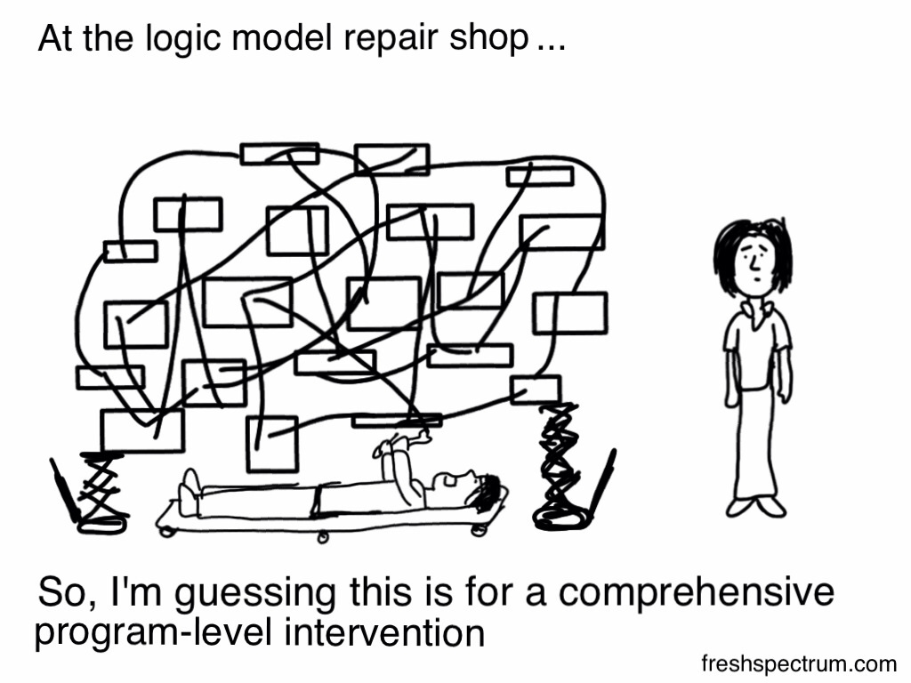
Another crowd favorite. I learned early that if I wanted a popular cartoon in the evaluation world, it should include a logic model or theory of change.
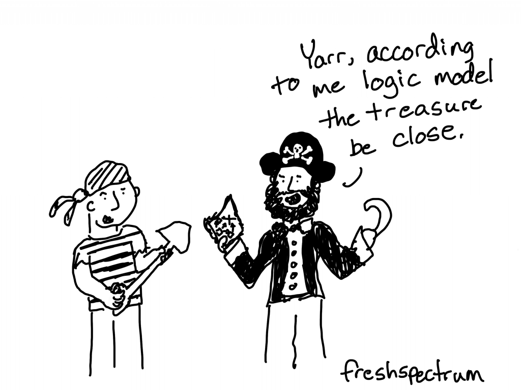
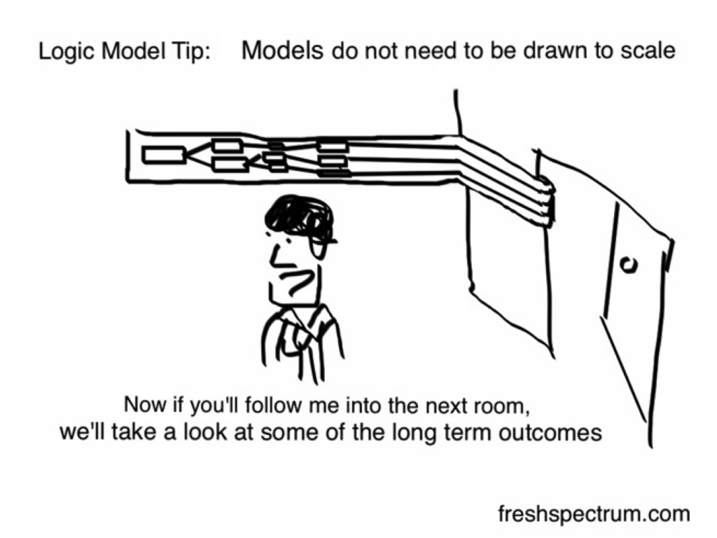
Can you tell that this is one of my earliest cartoons? Now-a-days, I would take out the tip part at the top. Honestly, I think it would be really cool to draw a logic model to scale.
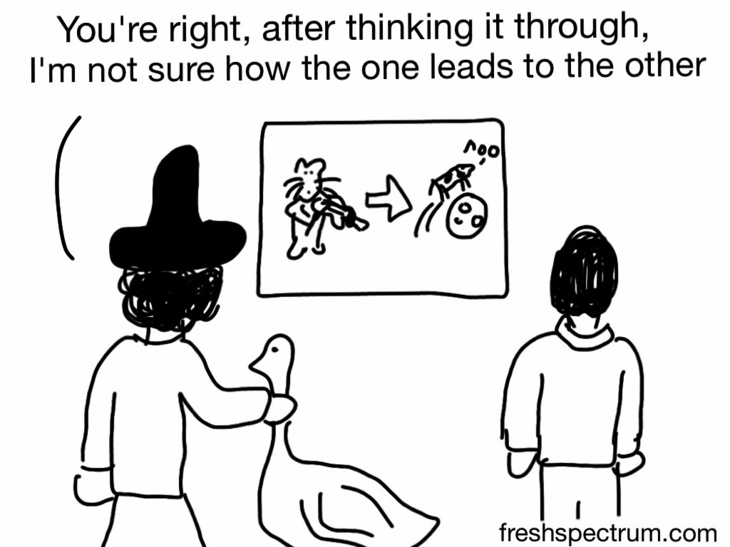
I really wanted to drive home that this is mother goose. So I added a goose. This sparked the comment, “why is she strangling that goose?”

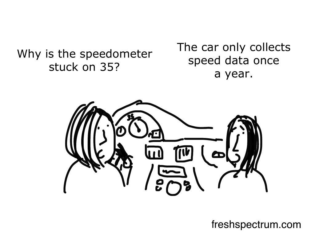
So many data dashboards I kept seeing were really annual reports carrying a car dashboard metaphor too far. I think it’s funnier to think about cars with annual reporting systems.
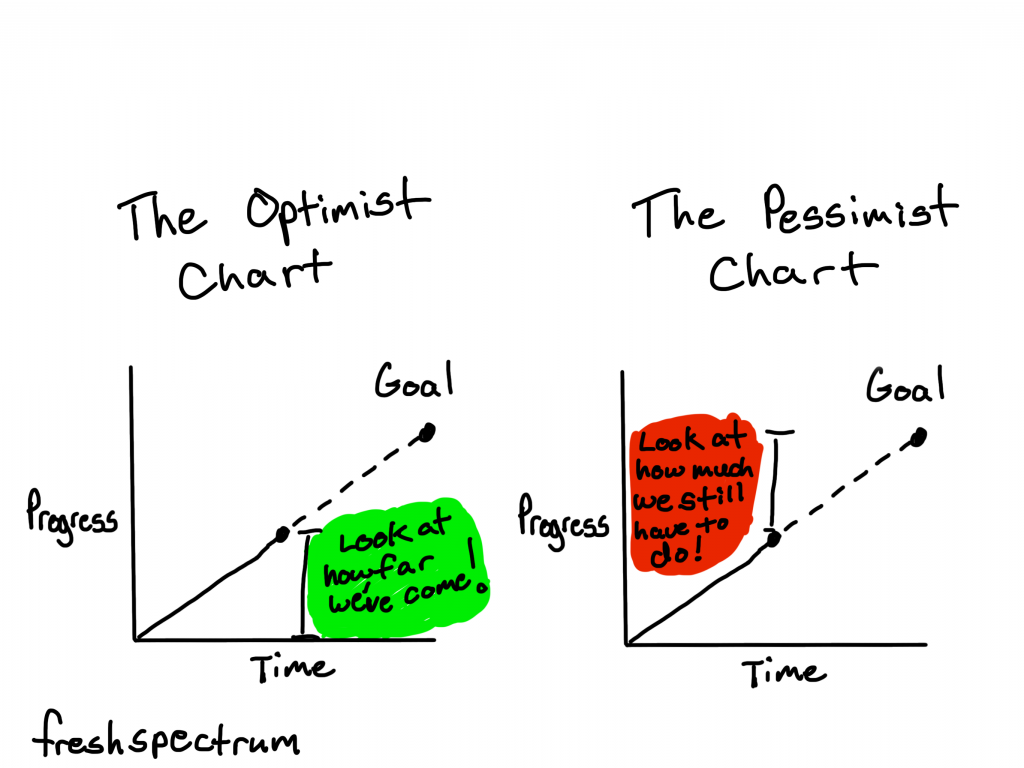
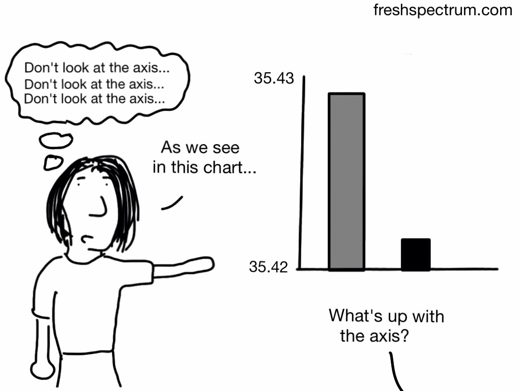
Charts are always about perspective. With some annotation and a little bit of color you can make them say all sorts of things.

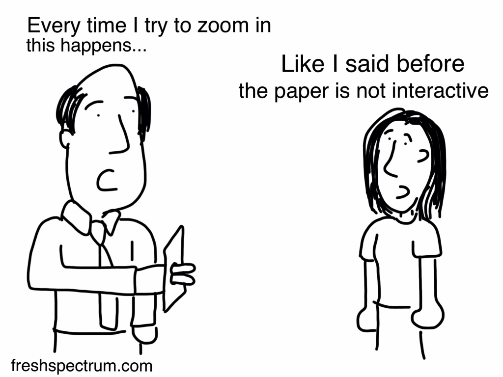
Every once and awhile when I write on paper, or sketch in a little notebook, I’ll want to undo something I just wrote. So I’ll tap the paper with a couple of fingers just like I would do when using procreate on my iPad. It never works.
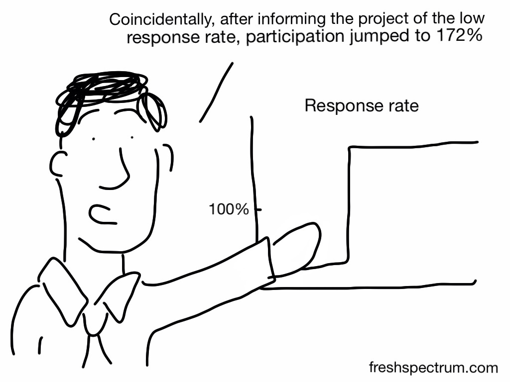
This cartoon came out of a post talking about everyday ethical challenges. The story goes, the survey has a low response rate so the program is informed. Then all of a sudden way too many people respond for it to be actual participants.

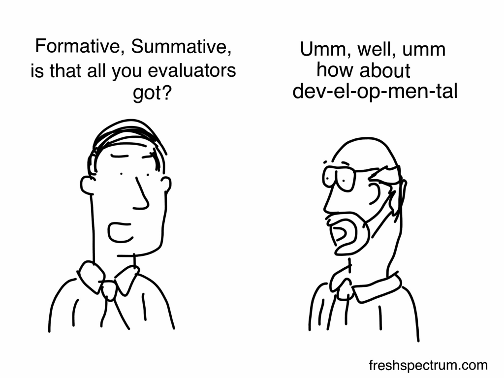
This cartoon was inspired during a Michael Quinn Patton presentation. It’s the story he uses when talking about coming up with the idea of developmental evaluation.
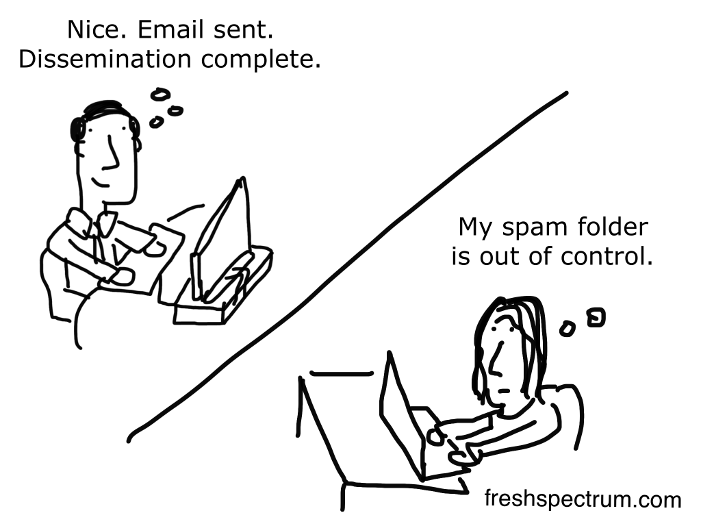
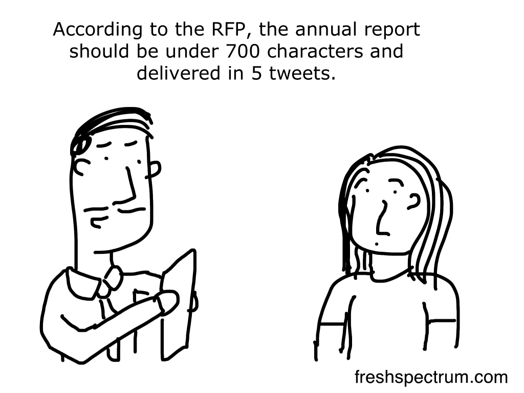
Open and click rates for emails that people actually look forward to read are usually pretty low. Often <30% of people will open a group’s newsletter and <5% will actually click on anything in that email. Now think about what happens when someone gets an email that includes a link to a long pdf report.

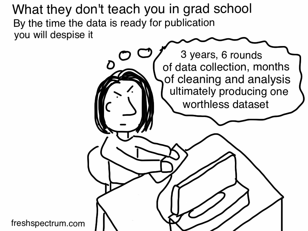
Drew this one for a friend who had just earned her PhD. I know it sounds a bit mean-spirited but honestly, most research and evaluation reports end up in a pit. If you want people to use your work, you might have to spend as much time (or more) advocating, presenting, and sharing. For most work, once it gets to a published state, we move end up moving on.
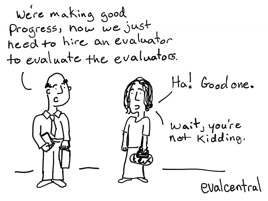
Of course evaluations can be evaluated. Like wouldn’t it be good if we regularly evaluated peer review? But sometimes it is hard enough getting a decent evaluation budget, asking for an evaluating the evaluation budget seems like a stretch.
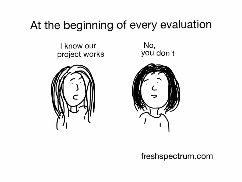
Funny thing about this cartoon. If an evaluator reads it, they think it comes across as mean. Like the evaluator is just being too honest.
When a project person reads it they have the opposite reaction. They think, what nerve does this evaluator have coming in and saying they know best.
Seriously, share this cartoon with friends who are evaluators and friends who are program people. Ask them what they think when they read it.
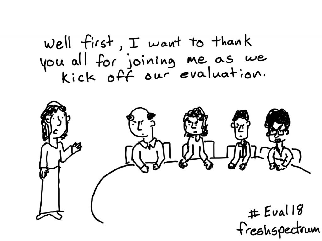
This one was inspired by someone’s story of leading a commissioned evaluation for a program that was not included in making that decision. This happens more often than any evaluator would like, and it can really set things off on the wrong foot. I had to make sure the table of people looked mad enough to make this whole scene feel appropriately uncomfortable.

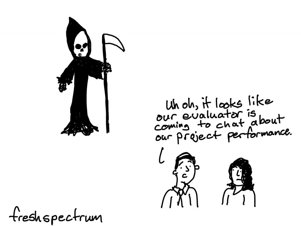
It’s hard to be the harbinger of a project’s demise, but somebody’s got to do it. I know most evaluators don’t want to see their work this way. But if we work in a world with limited funds and unlimited problems to solve, deciding what programs are not effective enough to be worth the money is a critical role.
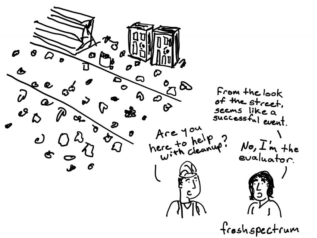

Another crowd favorite. I believe it was originally inspired by Jane Davidson talking about causation. Not everything needs a control group or 100% certainty.
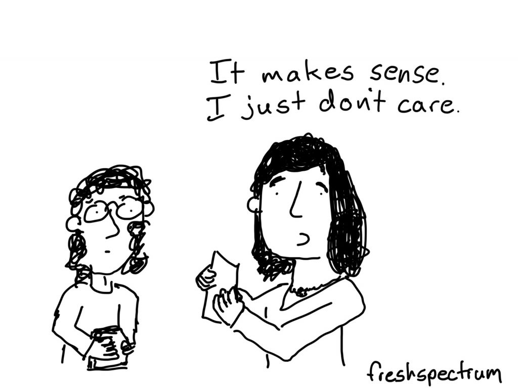
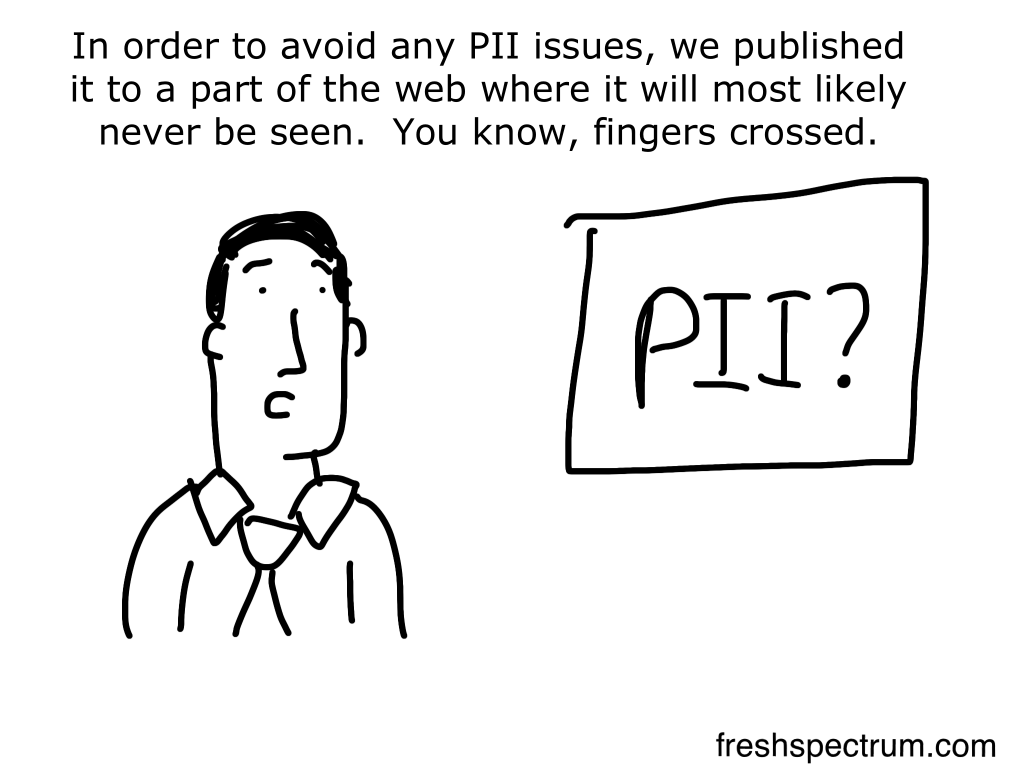
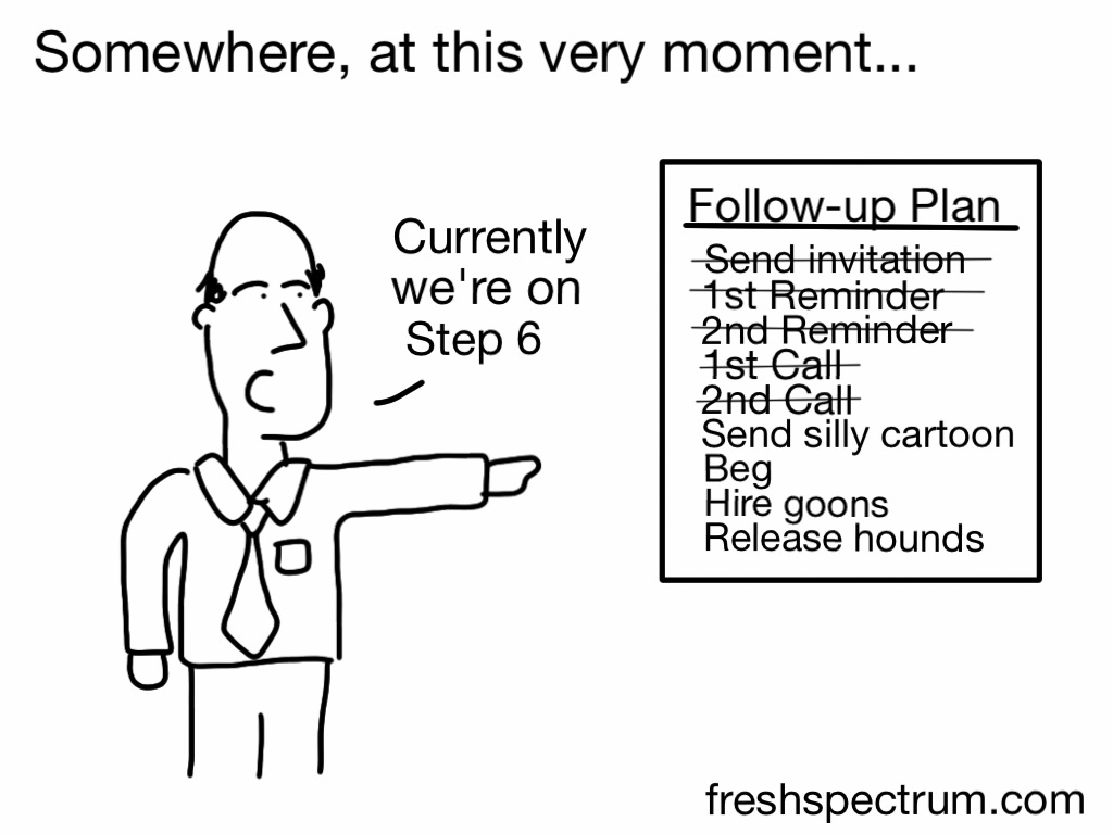
I spent a number of years doing data collection grunt work. It basically meant continuing to follow-up with people until they completed a survey. That’s really the secret to high response rates, perseverance (and goons).
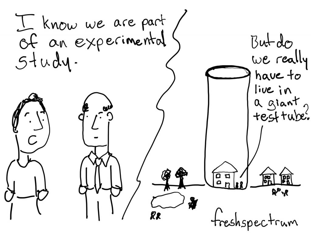
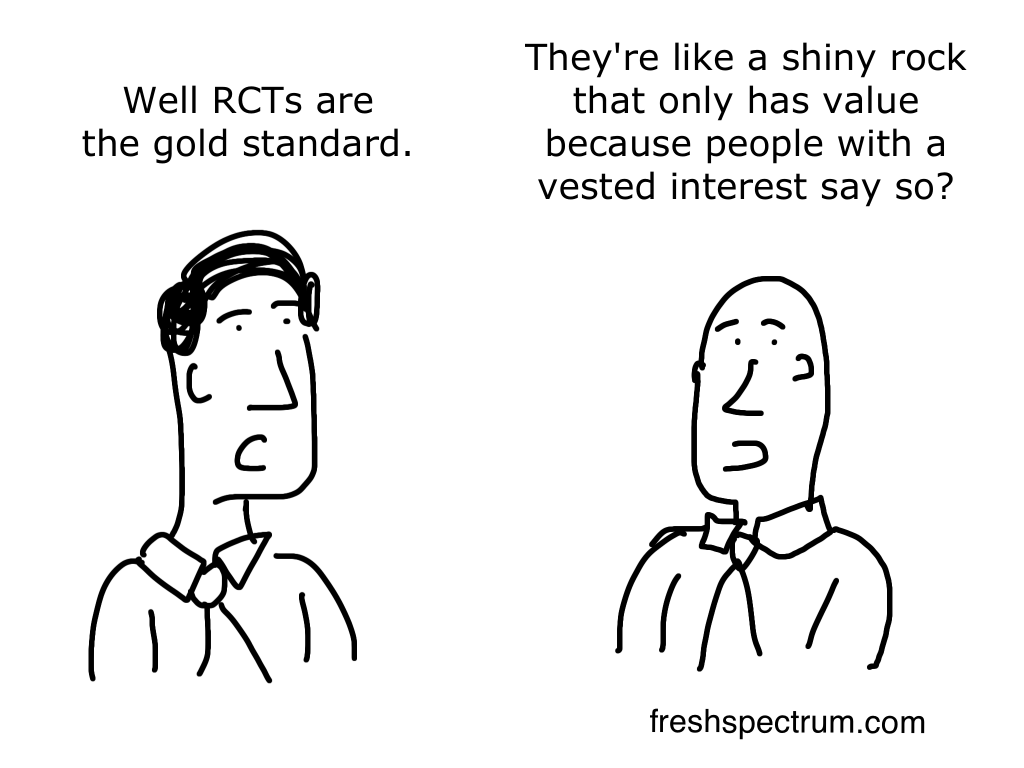
Just to make sure we are all on the same page. I am not against RCTs as a method. I am just against the idea that any particular method is superior to all the other methods. The RCT Gold Standard is pretty much a meme that predates the internet..
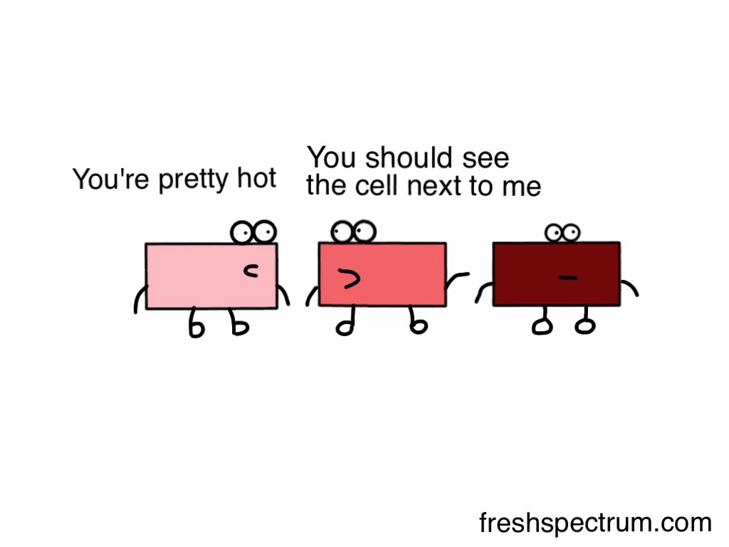
This cartoon always made me giggle. But if someone doesn’t already know what a heat map is, it would fly right over their head. This is a good lesson for using cartoons. Just because you think something is funny doesn’t mean your audience will.
Lots of jokes are audience dependent. Be prepared that something you think is funny could easily go over like a lead balloon.
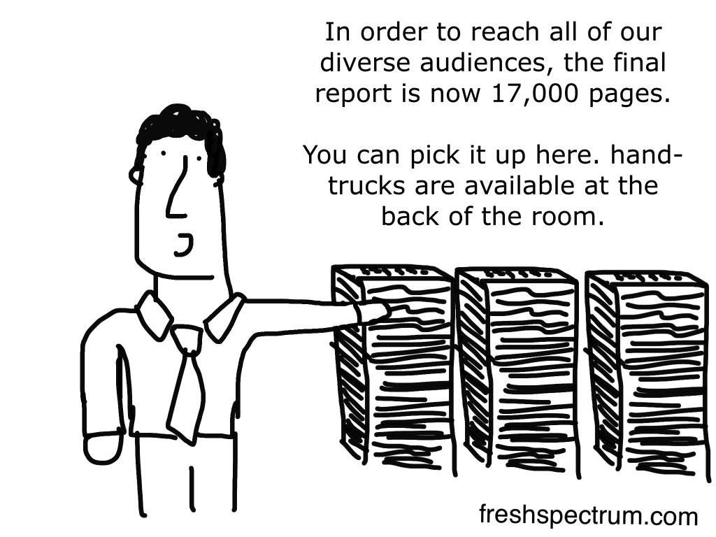
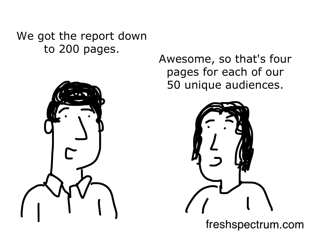
Long reports often get a bad name. But if you really want to reach a bunch of different audiences you are not going to do it in one short report.
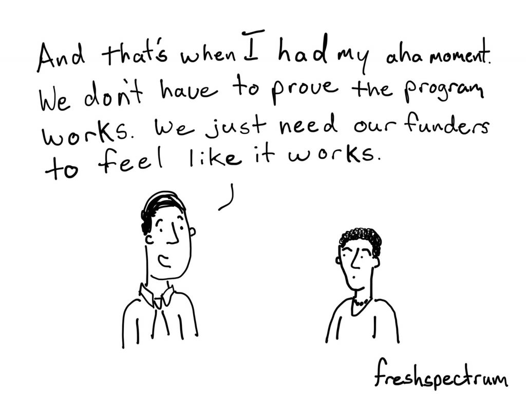
There is definitely a difference between effectiveness and perceived effectiveness. Unfortunately the one that should matter the most, often doesn’t.
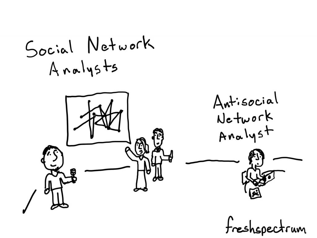
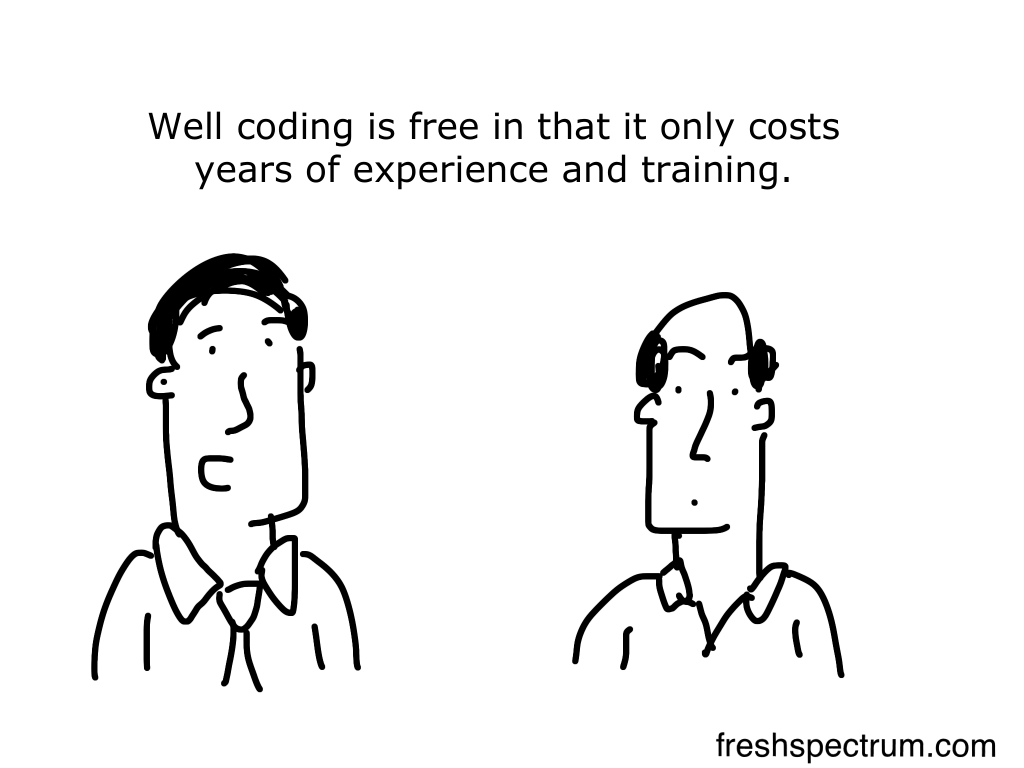
Given the amount of code often required to do a network analysis, and the reputation held by people who know a lot of code, I wonder how accurate this cartoon might be.
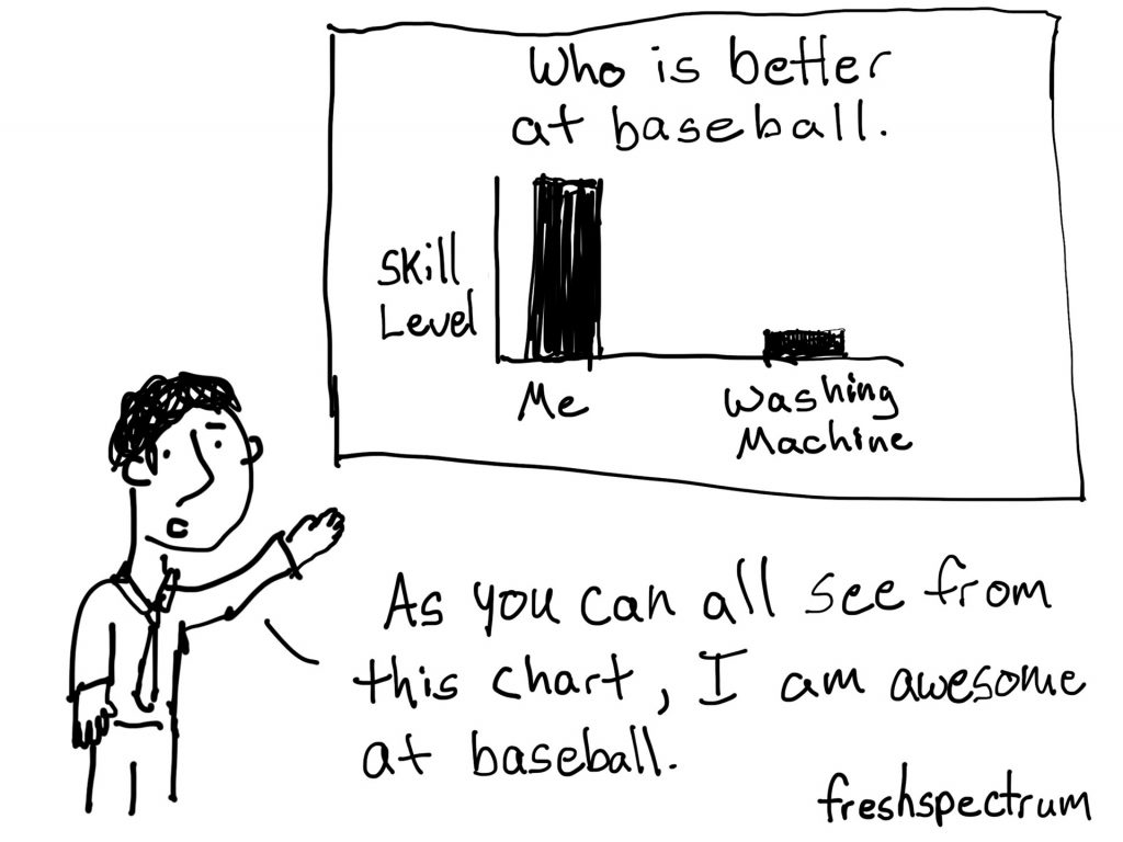
There was this chart on the side of a Lipton tea box that I always found fascinating. It compared flavonoid content of tea versus a couple of juices and coffee. But it also included broccoli. It was so completely random and inspired this cartoon.

Sounds silly I know. But honestly, if someone takes the time to bedazzle all of their charts, I would probably take a closer look.
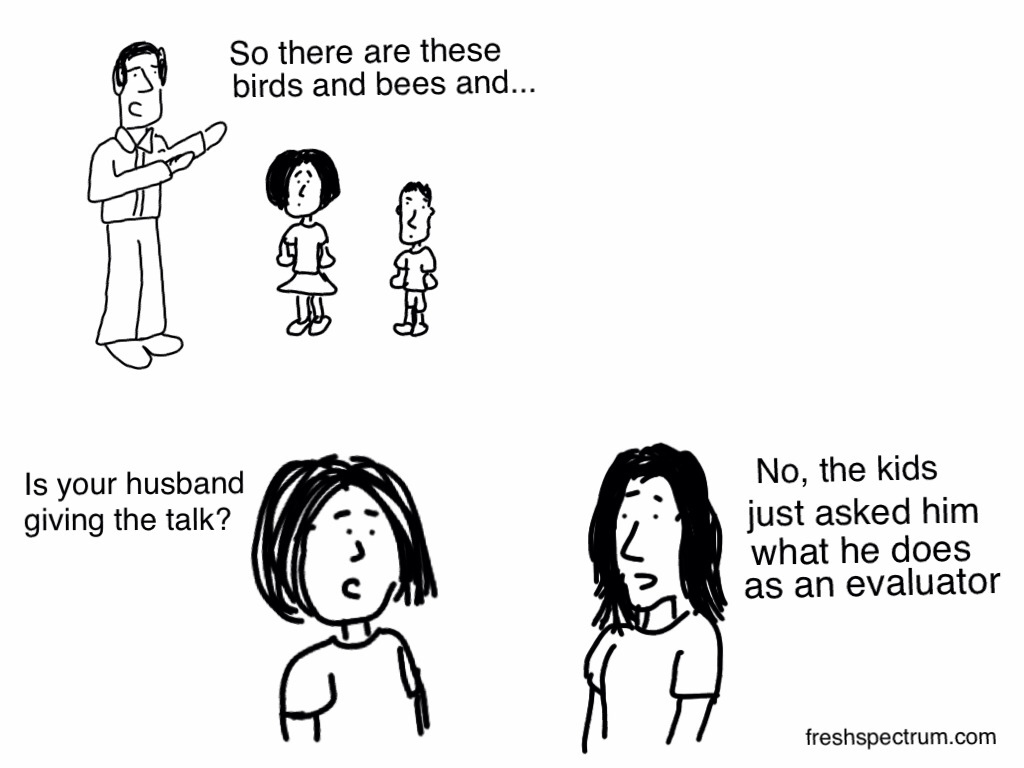
If you ask an evaluator to describe what they do to non-evaluation audiences a lot will struggle. Or they’ll just dive into a string of metaphors comparing evaluation to other professions.
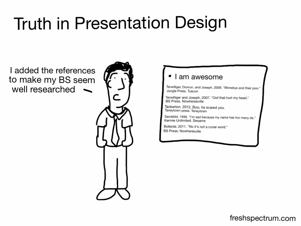
This also works for blog posts. Just add a bunch of random resources at the end using citations and not including links.
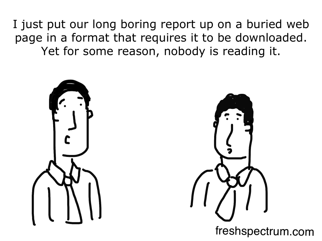
It’s not just what you report but how you report that matters. You could create a brilliantly accessible report but if it gets buried on a boring/confusing/poorly designed website nobody will read it.
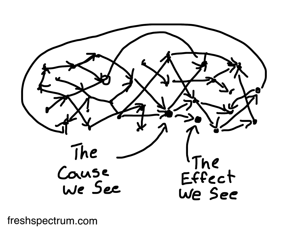
What we see and what actually happened are two different things. This is what makes true attribution so hard. It’s also what makes cultural responsiveness and stakeholder engagement so critical as the negative side effects of an intervention can easily outweigh the benefits. Yes, you don’t know what you don’t know. But you’ll never know if you don’t even try.
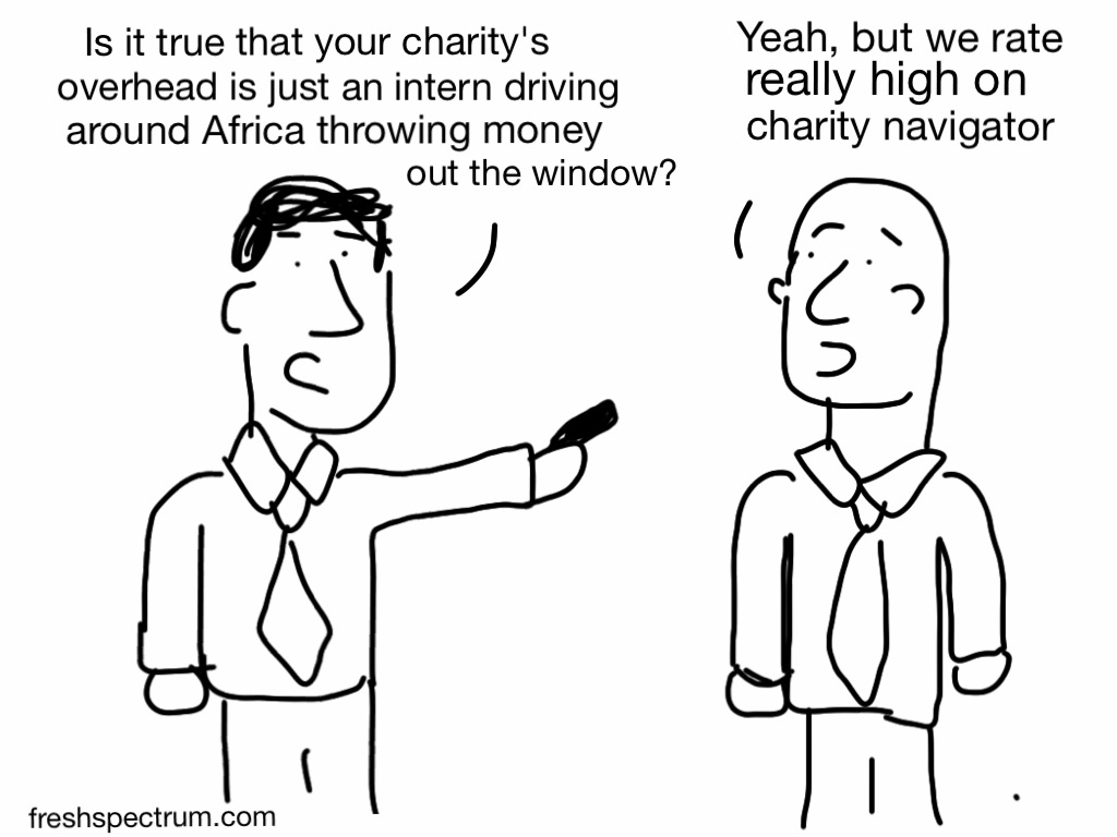
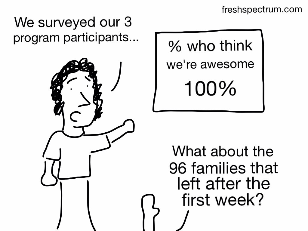
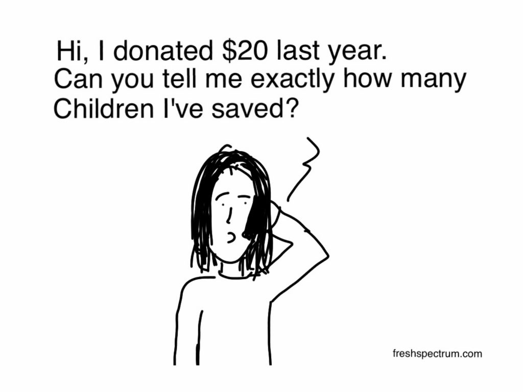
That’s why we donate to things right? We want to know our money is going to actually helping solve a problem we believe needs to be solved. If the charity gets back to you and says, “no, but it helped us buy paper towels for the break room,” I’m not sure that would go over well.
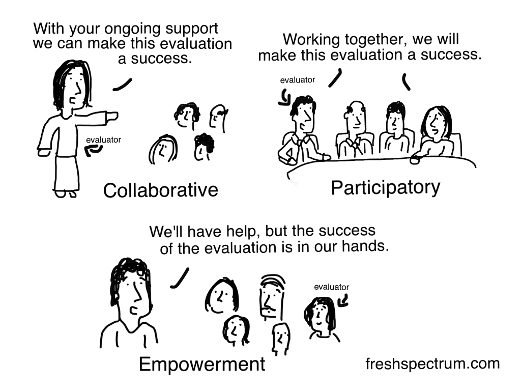
Drew this one for David Fetterman. There are all sorts of methods, approaches, and frameworks in evaluation that overlap or appear similar. The difference between collaborative, participatory, and empowerment evaluation at the most basic level is the role of the evaluator, which is what I tried to share with this cartoon.
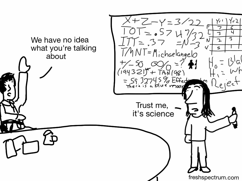
“What I cannot create, I do not understand.”
It’s a Feynman quote that I think we can expand upon.
“What I cannot communicate, I can not help you to understand.”
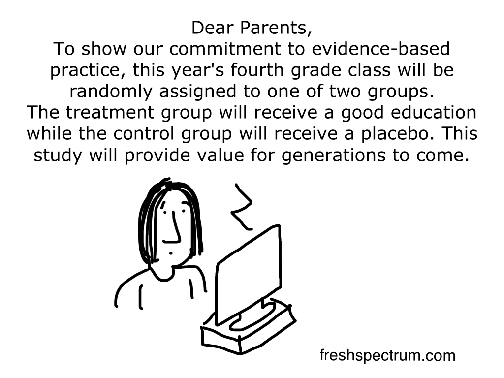
In the time of COVID-19, I fear that we maybe be running this experiment. But the two groups are not being assigned randomly.
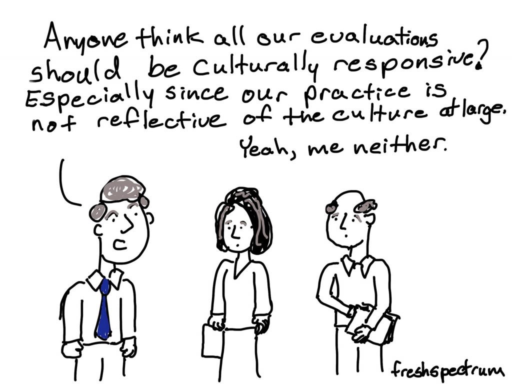
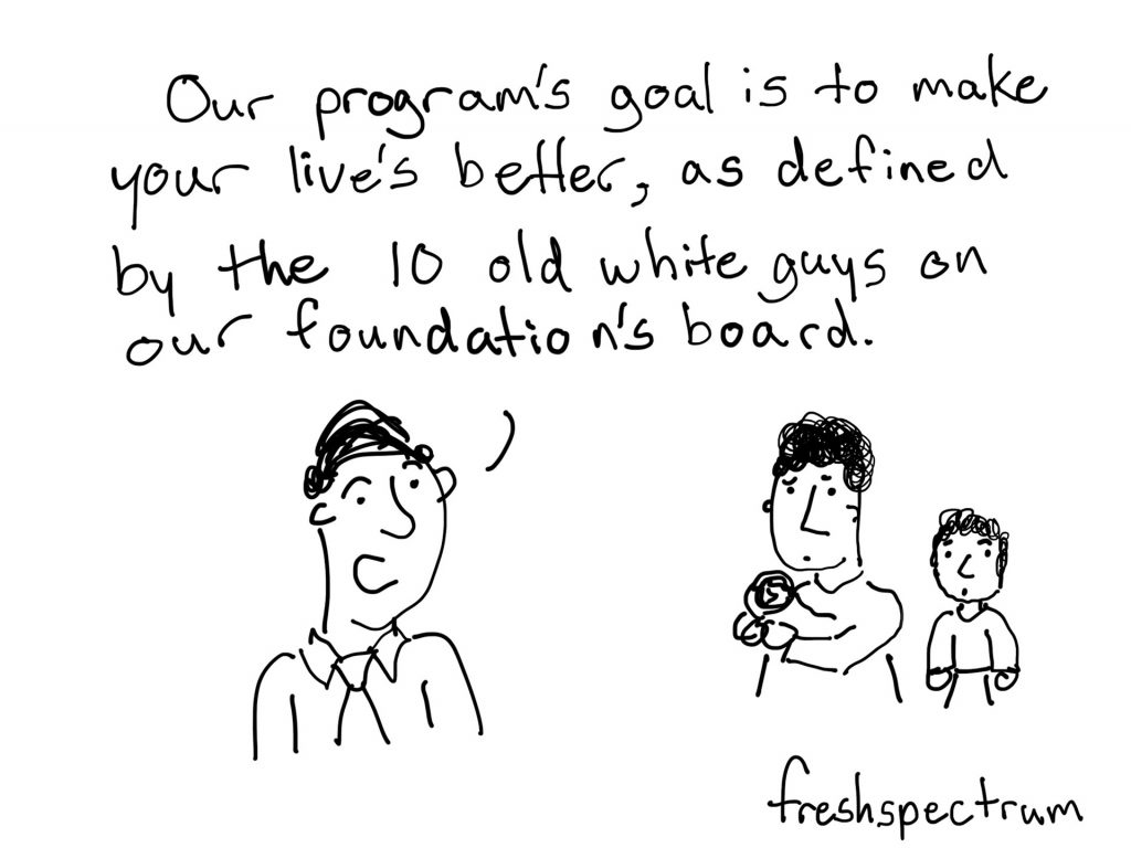
TATMWPIAP (There Are Too Many White People In Authority Positions). I note the irony in saying this as a white person who sometimes finds himself in authority positions.
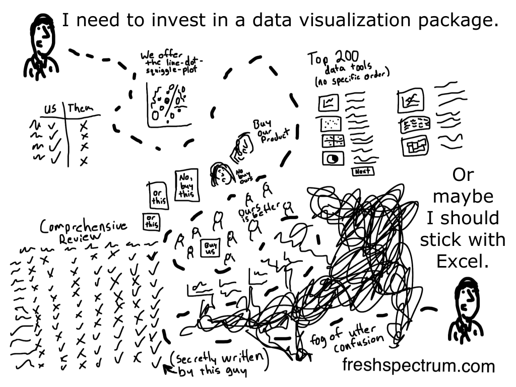
I don’t think it’s too surprising that many of the evaluators who teach data visualization design do so using common tools like Excel and Power Point.
I love tech, and there are some really cool pieces of software out in the world, but if it’s a much shorter distance to teach someone to design using tools they already know. It’s a pragmatic starting point, and most evaluators are nothing if not pragmatic.
So what cartoon is your favorite?
Do you have any favorite evaluation cartoons from this list? Do you have any favorites from outside this list?
Also, if you use any of my cartoons in presentations or on bulletin boards, would you take a selfie with them? You can share it with me here in the comments, on twitter, or on LinkedIn.
I love seeing the cartoons in the wild!