This is an Eval Central archive copy, find the original at evalacademy.com.
This article is rated as:


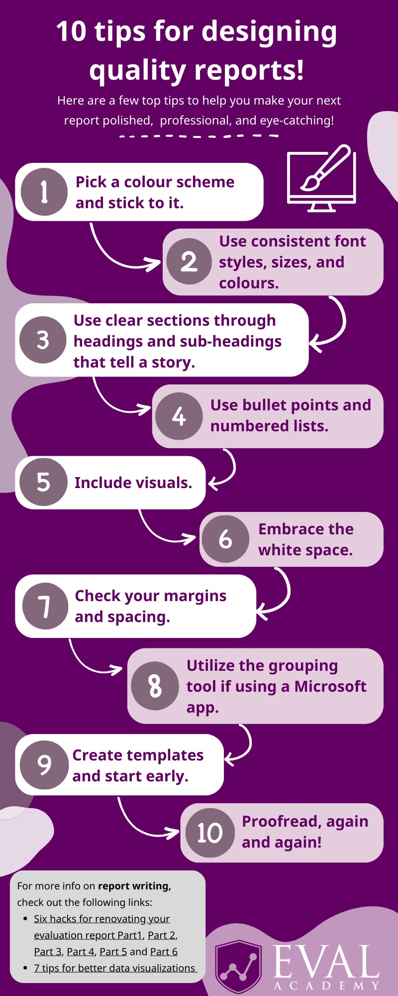
Eval Academy just released a new infographic, “10 tips for designing quality reports!”

Many of us have come across reports that feel cramped, unengaging, and let’s face it, a little bit boring! Dedicating some time to designing your report before writing can significantly affect its overall quality. By taking some time to focus on design, you can create a report that is not only refined and professional, but also visually appealing.
Back in November 2022, we shared five elements to include in your reporting style guide. In this article, I dive a little deeper as I reflect on my recent experience of designing an engaging and visually appealing report for a Three Hive Consulting client. You can download the infographic here – I recommend printing it and keeping it in sight to help you keep design in mind when writing your next report!
Before we jump into it, I recommend checking with your client or organization to see if they have set branding, including fonts and colours, that they would like you to use in reporting. If so, integrate that into each of the following steps.
1) Pick a colour scheme and stick to it.
-
This includes colouring for fonts, quotes, visuals, graphics, and cover and end pages.
-
Consider the content of the report and the tone you want to portray. How do your chosen colours support that message?
-
Use a colour wheel to find complimentary colours.
-
Stick to a limited colour palette. I’ve found that 3 different colours tend to work best.
-
Consider the accessibility of your colour palette. Is it colour-blind friendly? Or do the colours have cultural significance you should be aware of? There are a number of tools available online that provide further information on colour-blind friendly palettes and how to choose colours:
-
Microsoft also has tools available to help you pick colours from any application you have running and copy them in a configurable format to your clipboard! You can learn more about Windows PowerToys Colour Picker here.
2) Use consistent fonts.
-
This includes consistent font styles, sizes, and colours from your colour scheme.
-
Choose easy-to-read font styles such as Serif (e.g., Times New Roman, Georgia, Cambria) and Sans Serif (e.g., Arial, Helvetica, Calibri).
-
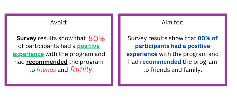
For body text, avoid using too many styles such as bold, italicized, or underlined which can make a report look cluttered. See below for an example:

3) Use clear sections that tell a story.
-
This includes using page breaks, headings, and sub-headings to make it easier for readers to find information.
-
Headings should be clear and descriptive to help readers quickly understand what each section is about and how it relates to the overall story.
-
Use different fonts to distinguish between headings, sub-headings, and content.
-
Pick one font for headings. This should be large and easily distinguished when skimming. Using a block of colour can help people quickly identify a high-level heading.
-
Pick one font for the body text.
-
Vary the font size, bolding, and italics in a consistent manner to delineate different heading levels.
-
-
-
-
Clear sections help to organize information in a logical way to improve readability.
-
Consider using a table of contents with hyperlinks to make finding sections that bit more efficient!
4) Use bullet points and numbered lists.
-
This can include using icons within lists to make them more eye-catching.
-
Bullet points and lists help to highlight important points, improve how information is structured, and emphasize information.
-
They can also help to make complex information easier to read and understand.
-
Bullet points and lists can save space in a report, whilst also adding more white space!
5) Include visuals.
-
Charts, graphs, and other visual aids can help make data easier to understand and can make the report more interesting. For example, take a look at our article 3 Easy Ways to Quantify Your Qualitative Data.
-
Choose the right type of visual aid depending on the type of information you’re presenting as mentioned in our articles 7 Tips for Better Data Visualizations and Dial Down Your Data.
-
Make sure visuals are high-quality, simple, and formatted consistently – for more information, take a look at our article Chart Templates: The Time Saver You Should Be Using.
-
But don’t rely solely on visual aids, they’re there to support the information presented in the report!
6) Embrace the white space.
-
White space, also known as negative space, refers to the blank or empty areas in a report.
-
The trick is not to cram too much information onto one page! Use white space to break up long paragraphs or chunks of text and create sections to make it easier for readers to scan and digest the information presented.
7) Check your margins and spacing.
-
Checking margins and spacing for consistency ensures visual appeal and readability. It also helps to avoid clutter and ensures the report stays aligned when printing and sharing.
8) Utilize the grouping tool.
-
The grouping tool in Microsoft applications allows you to group related objects together. This can be useful for organizing content in a logical and visually appealing way.
-
Grouping allows for easier editing, more control over design, and can improve efficiency!
9) Create templates and start early.
-
Whether you’re creating your report in Microsoft Word or PowerPoint, before you even start writing I recommend creating a template that combines all of these elements! This will save you time when you’re writing, ensure consistency, and allow you to have greater control over the design.
10) Proofread, again and again!
-
Last but certainly not least, proofread your report multiple times! I like to proofread first for content, spelling, and grammar, and then again for formatting. Take a break between these different sessions to help you look at the document with fresh eyes.
-
Ask a critical friend or colleague to proofread. No matter how thorough you are, there’s always that one typo that slips through the cracks!
For more information on report writing, check out the following Eval Academy links: