This is an Eval Central archive copy, find the original at evalacademy.com.
This article is rated as:


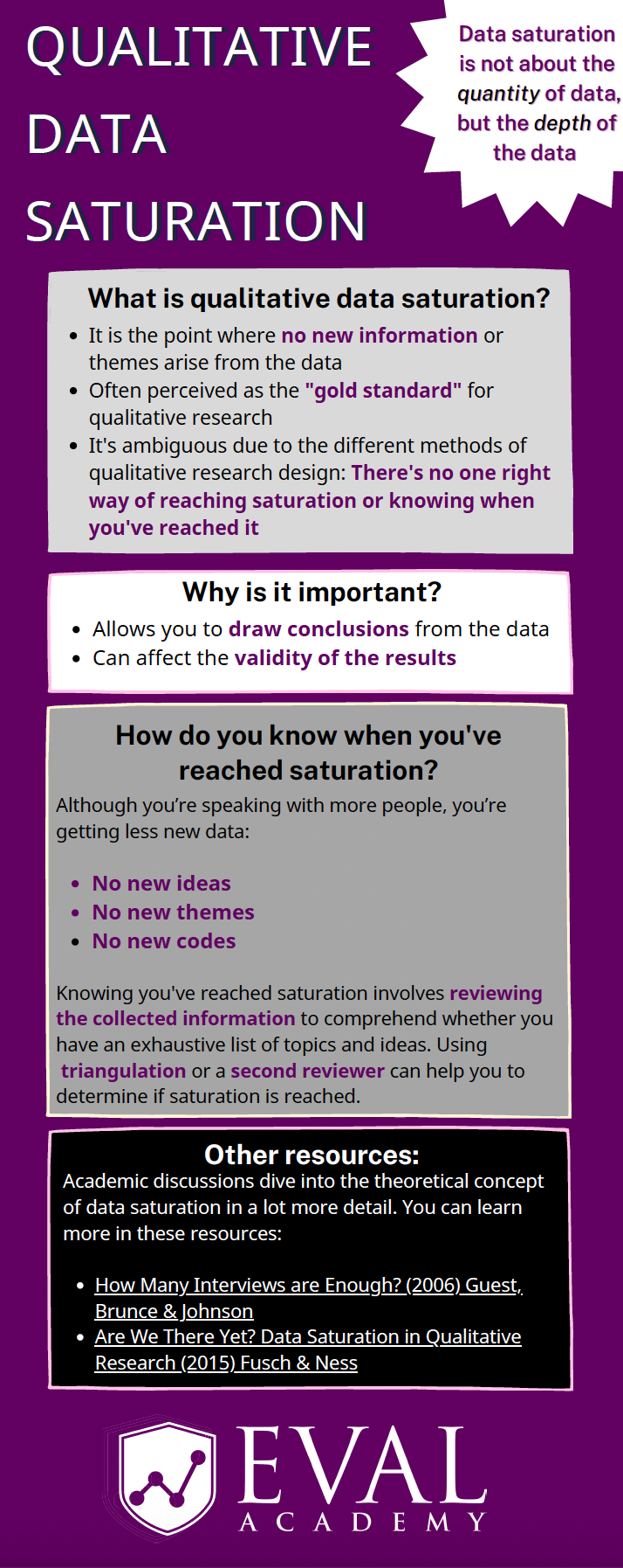
Eval Academy just released a new infographic, “Qualitative Data Saturation”
Who’s it for?
This infographic is for those who collect or who will be collecting qualitative data and are looking to support the validity of their results. It’s a helpful resource for those who are both new and experienced in evaluation!
What’s the purpose?
This infographic defines qualitative data saturation, lists why it is important and identifies how you know when you’ve reached saturation. It also includes links to further resources for those who are looking to dive a little deeper into the theoretical concept of qualitative data saturation.
What’s included?
A printable 1-page infographic that outlines qualitative data saturation.

Learn more: related articles and links
You can learn more about qualitative data on Eval Academy through the following links:
Some helpful Eval Academy resources to collect and track your qualitative data include:
What do you think of our new infographic? Let us know in the comments below!