This is an Eval Central archive copy, find the original at freshspectrum.com.
Do you know how to identify a UX Problem with your reports or communication designs?
It’s not all that hard.

But first, a story.
The door without the handle

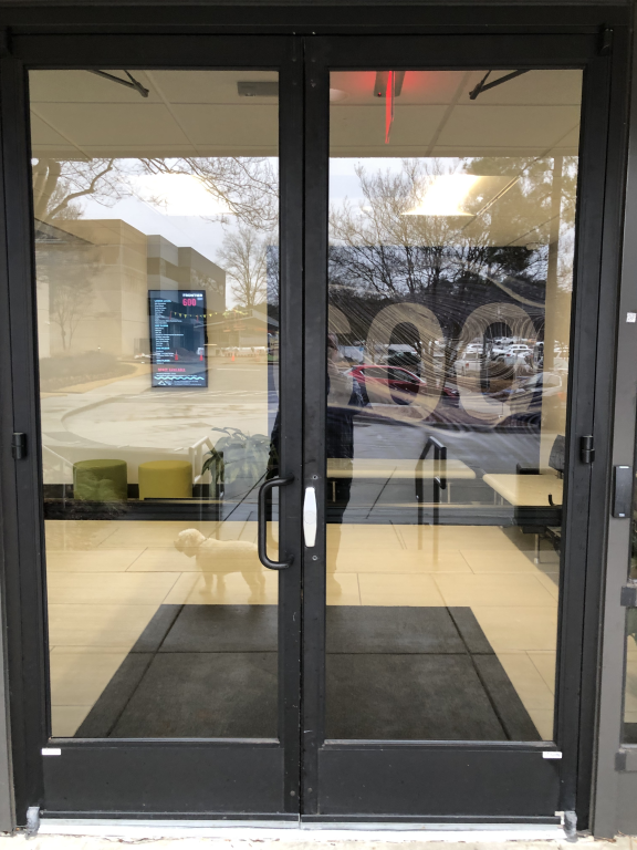
I took this picture last week on my way back into the office after taking my dog for a walk. What you might not see at first is that the right door is missing a handle.
I know what you’re thinking, “well, just use the left door then.”
But the left door was locked. The left door is ALWAYS locked. The right door is the only one that can be opened from the outside.
So to open the door I had to awkwardly grip that little metal piece on the right door and pull it enough to get my fingers in between the doors and then pull it the rest of the way open.
This was the second time that week that the door handle simply disappeared. It was reported to the facilities crew and eventually (a few hours later) the right hand door handle was replaced.
What is a UX Problem?
I like to think of the door thing as a UX problem. It’s something that is incredibly easy to experience, and sometimes incredibly easy to fix, but often very hard to predict.
How to experience the door problem.
- Walk up to the door and try to open it from the outside.
Possible fixes for the door problem.
- Replace the handle.
- Prop the door open.
- Unlock the left door.
- Have someone sit by the door and open it when someone walks up.
How to predict and prevent the door problem?
- You don’t.
- Seriously, who could have predicted that at some point the door handle would have just disappeared?
- I mean I’m still really curious as to how this happened twice, but I’m just a tenant in a co-working space and don’t actually know the facilities people.
- Well, sure you could prevent it by welding the handles and make them really impossible to take off, but this kind of seems like overkill for an incredibly rare problem.

UX Problems don’t usually fix themselves.
Let’s say you have a newsletter that you send out. And anytime someone goes to click on one of the links in your newsletter, they get taken to the wrong place.
Very few people will ever tell you. They’ll just shrug and move on with their days.
Same thing goes for a confusing section of a report. Very few people are ever going to complain that they don’t understand what you are talking about. The vast majority will just stop reading.
So how do you find your UX problems?

Look at your reports through a reader’s eye view.
UX problems might be hard to predict, but they’re usually incredibly easy to experience.
The ideal way is to test your designs with real people. Even if it’s not a person who is actually a part of your primary audience. You can ask a coworker to read your report or design and tell them to pretend they were a member of your target audience.
At the very least, you should read your reports from an audience perspective. And not just before they’re published but after they’re published too.
Because most of the UX Problems that happen with reports are not because of how the reports are written but how they are published and shared. And we rarely check our work once we pass it on to the web & communication’s teams or share it on social.
Want to go deeper?
I’m currently recruiting participants for the spring cohort of my information design academy. You should consider joining us!