This is an Eval Central archive copy, find the original at evalacademy.com.
This article is rated as:


Creating clean and consistent charts does not need to be complicated or time-consuming. With some forethought and a style guide, you can draft templates for all your charting needs. Chart templates will alleviate the pains of trying to reformat every new chart from scratch. From adjusting text size and font to formatting bar width and colour, a template will save you a significant amount of time in drafting your next evaluation report.
Investing in creating chart templates for your next report will:
-
Save you hours in your reporting. While you will spend time upfront to draft your templates, it will save you time in the long run when formatting your other charts.
-
Apply “most” chart formatting to all charts of the same type (i.e., a bar chart template will apply best to other bar charts).
Note: I say most and not all because you may have some manual formatting (e.g., a custom title) that will not always apply to subsequent charts.
-
Give you peace of mind knowing that your charts are consistent and professional looking. This will allow you to focus on better telling the story of the data and not worrying about minor formatting issues.
Learning to create chart templates is best done by doing. And we want to go beyond generic Excel chart templates and create something visually engaging for our evaluations. Therefore, here I will walk through how to format an appealing and impactful chart to use as the backbone for your first chart template.
Creating a Chart Template
Sometimes the best data visualizations are the simplest (here are some tips to help improve your data visualizations), and few charts are as simple and effective at presenting data as the bar chart. And creating a standard template for your bar charts will speed up the reporting process.
The Excel Default
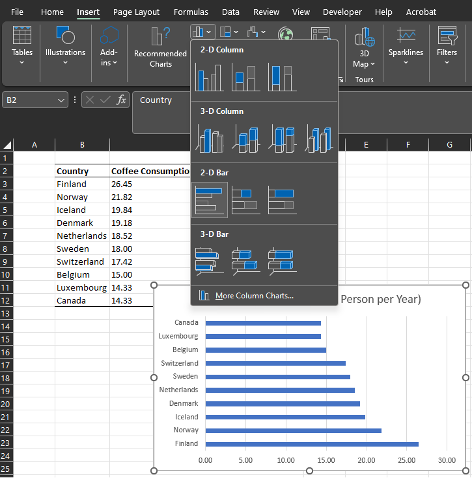
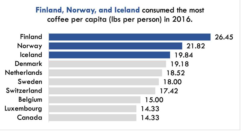
1. Highlight the data from which you want to draft a bar chart. In this example, we will plot the top ten coffee-consuming countries.
2. Navigate to Insert > Charts > Clustered Bar Chart
Drafting a Better Template
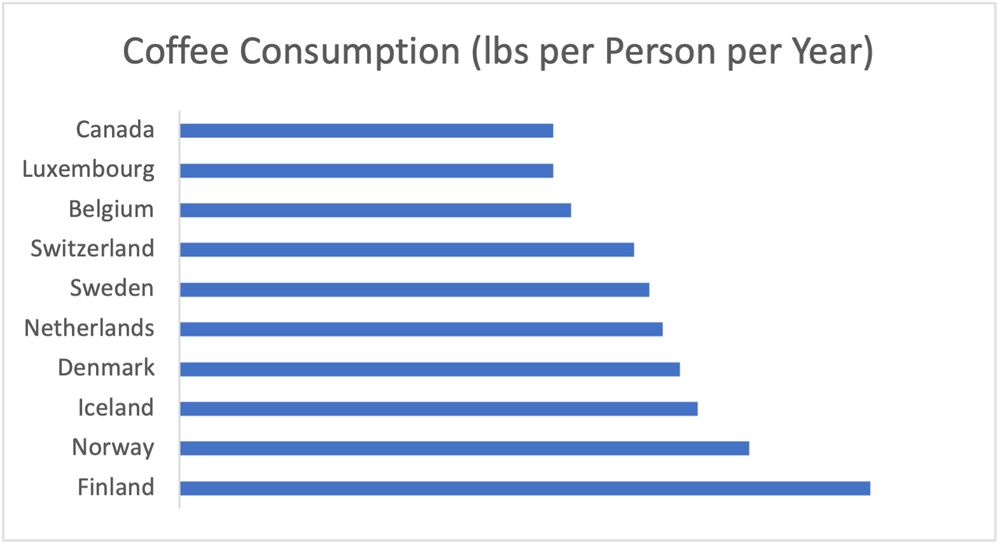
1. Trim the fat by removing unnecessary labels and gridlines.
-
Click on the data labels along the horizontal axis and hit Delete.
-
Click on the vertical gridlines and hit Delete.
2. Change the font to your style of preference.
-
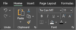
Select the chart and navigate to the Theme Fonts and chose your favourite font (here I will use Tw Cen MT).
-
Change the Font Colour to black. While font colours can be adjusted, using a standard black font is often best for the readability of your chart.
-
Adjust the Font Size to your preferred size (here I adjusted the font to size 11).
3. Draw attention to the bars by increasing their width and changing their colour.
-
Right-click any bar > Format Data Series…
-
Adjust the Gap Width to 30%
Note: a smaller percentage decreases the gap between bars and increases the overall size of each bar.
-
Change the Fill to the colour of your choice.
-
For extra emphasis, you can mute most bars to focus on your key findings (e.g., highlight the top three in a Dark Blue and mute the remaining in a Light Grey).
-
If opting to mute some colours and emphasize others, you will need to manually click on the bars you want to change the colour of one-by-one, and change their colour by right-clicking or using the Format option for the chart.
-
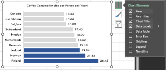
4. Add in data labels.
-
Click on any bar to highlight them all > Right-click > Add Data Labels OR
-
Click on the + symbol at the top right of your chart (when highlighted) > Toggle on Data Labels
5. Sort the data in descending order (largest to smallest).
-
Data are often entered or sorted from largest to smallest value. However, by default, Excel will plot bar charts with the top value in a table as the bottom bar and the bottom value in a table as the top bar.
-
To correct this, right-click on the vertical axis labels > Format Axis > Categories in reverse order
6. Make final touches to the bar chart template by removing the border and improving the title.
-
Right-click on the chart > Outline > No Outline
-
Click on the title and write a title that tells the story of the data being presented. Bold the import pieces and increase the font relative to the rest of the chart to draw attention to the title.
Saving and Applying a Chart Template
Once you’ve put in the effort to format a single chart to your desired preferences, it is only a matter of saving the template and applying the template to other charts without having to go through all the previous steps.
1. Right-click on the chart created in the ‘Drafting a Better Template’ section > Save as Template…
2. Next, create another default Excel bar chart with new data (see ‘The Excel Default’ section).
3. In the unformatted bar chart, right-click > Format Chart Type… > Templates > Select your bar chart template.
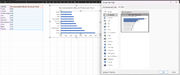
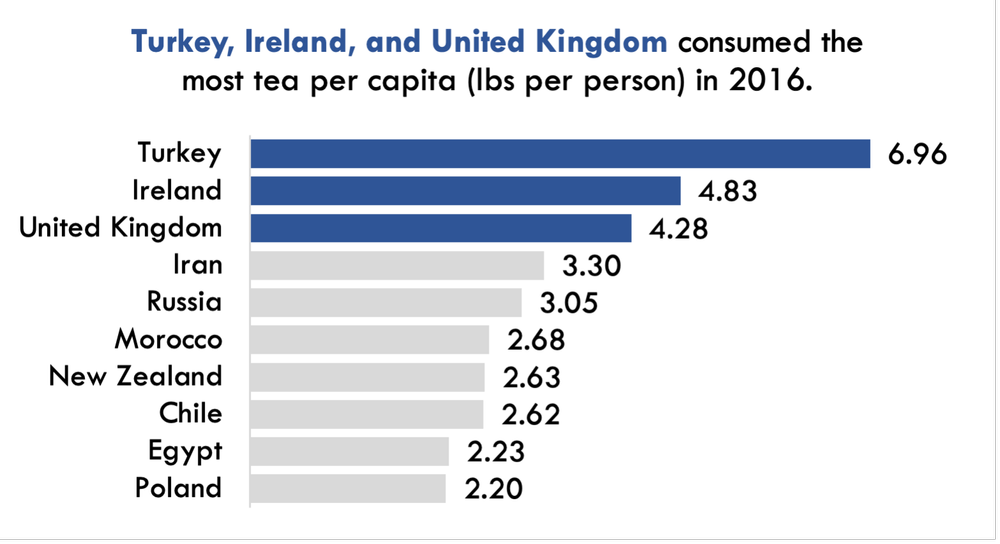
4. While the template will transfer over, you will need to make minor edits to the chart title (e.g., to highlight to top three tea consuming countries) but all other formatting will be done automatically.
A Quick Hack for Copying Over a Chart Template
Saving and applying your chart templates is always recommended. But sometimes you need to apply the same template to multiple, consecutive charts. You could follow the above process and upload your chart template to each chart individually, but there is a faster approach and one that I use often.
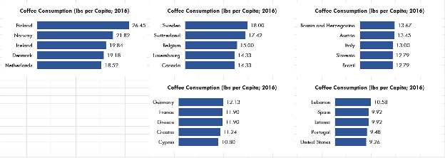
Note that in the following example I use a slightly modified template, in that I no longer highlight the top three countries and I did not modify the title. However, this approach works with any formatting or template previously created.
1. Create all the default Excel charts for the charts to which you want to apply a chart template.
2. Format a single chart to your preferred style or apply a saved chart template.
3. Next click on the formatted chart and copy (CTRL + C or Right-click > Copy) the chart.
4. Click on the next unformatted chart and on the Home tab select Paste > Paste Special… > Formats (or use the keystrokes ALT + E, S, T and Enter); this will copy the chart format to the unformatted chart.
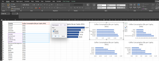
5. Follow the same Paste Special… process or keyboard shortcut for the next chart, or simply press F4 after the initial format has been pasted over once. F4 will redo the previous command, which will allow you to simply click on each subsequent unformatted chart and format it with the press of a single key.
You can create templates for all chart types, and it will save you an inordinate amount of time in your future evaluations. Even creating a basic template to build off will save you time in the long run.
Not all charts need to be identical, but a framework with consistent fonts, bar widths, etc. will improve the look and readability of your report charts. Add in your personal touches and experiment with colour, size, and labelling to create charts to wow both your employer and clients.
Do you use chart templates in your evaluation work? Let us know in the comments!