This is an Eval Central archive copy, find the original at freshspectrum.com.
How do you add alt text in Canva? Short answer, you don’t (Canva doesn’t have that feature). Long answer, read on for a workaround.
As much as I love Canva for creating infographics and micrographics, as a website publishing tool (and a PDF creator) it is a failure. It’s missing some key features required to share accessible interactive digital designs.
I decided to see if I could find a workaround to the Canva alt text issue. I think I found one and while it’s not perfect, it is a whole lot better than the nothing Canva gives us now. So that’s what you’ll find in today’s post, 4 potential workarounds I tested and the 1 workaround that actually seemed to work.
Quick PSA – Hey Canva, Stick an Alt Text Feature Here!
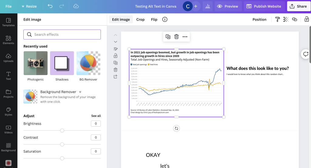
So I get that reading order might be a bit harder to implement, but at the very least alt text should be easy. You can already isolate images and edit them with filters why not add in a button for alt text?
Four potential workarounds
Until such time that Canva gets their accessibility act together, let’s test a few possible work arounds.
- Hiding text behind an image in a spot that only a screen reader could see.
- Embedding an imaged hosted elsewhere that already has associated alt text.
- Using a native integration with a tool that allows for alt text.
- Just incorporating images from Canva’s own stock image library.
How I tested the workarounds
To start, I created a couple of very basic sample Canva webpages for testing purposes. For the first I just published a Canva website template and tested it as is. For the second I created a basic website from scratch adding the elements I wanted to test.
- I used a couple of screen readers for my test. A chrome browser based screen reader and my Macbook’s VoiceOver (built in screen reader).
- I also used WAVE (Website Accessibility Evaluation Tool) by WebAIM.
What did NOT work.
I uploaded an image to my own personal website, gave the image alternative text, and then used the Embed tool inside Canva to insert the image. I thought this would work…but it definitely did not.
At its best I could get a screenreader to read the filename (but it never read the alt text).
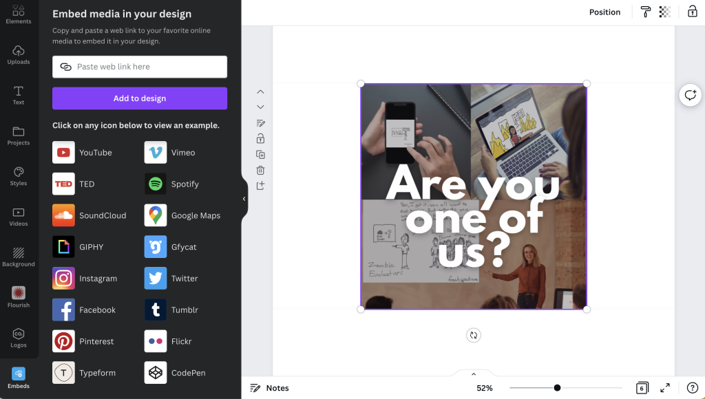
My guess is that if I played with enough embed tools there probably would be a successful workaround, but it’s just a guess.
What kind of worked.
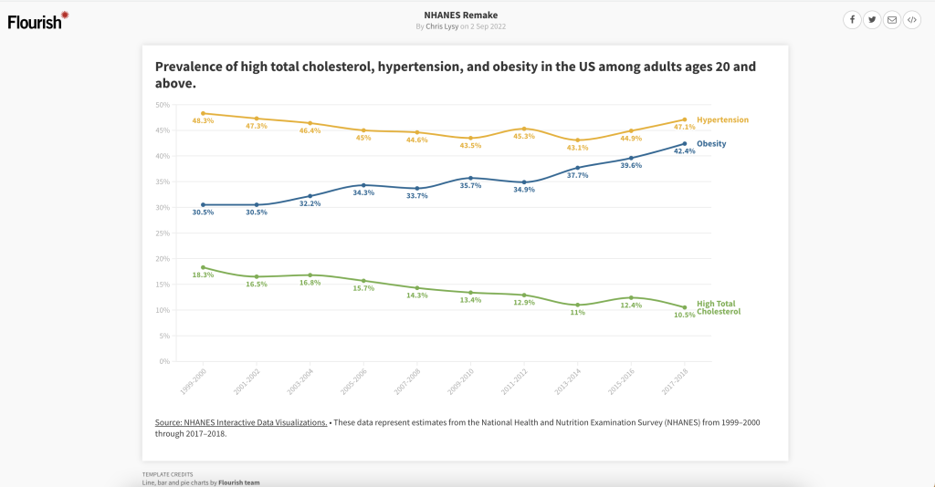
The Flourish embed sort of worked. It was not straightforward, but I could technically get a screenreader to read the alternative text I put in to describe the chart.
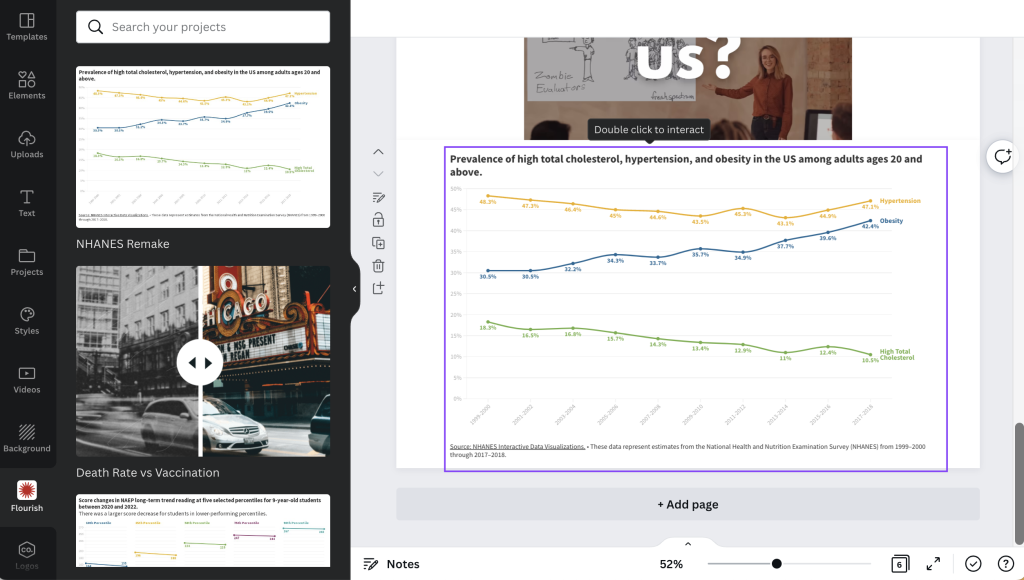
What I found interesting, is that even the chart shared on Flourish’s public site comes through inside an <iframe> which basically means that even on the share page for your Flourish visual, the image is embedded onto the page. This probably doesn’t mean much to most of you.
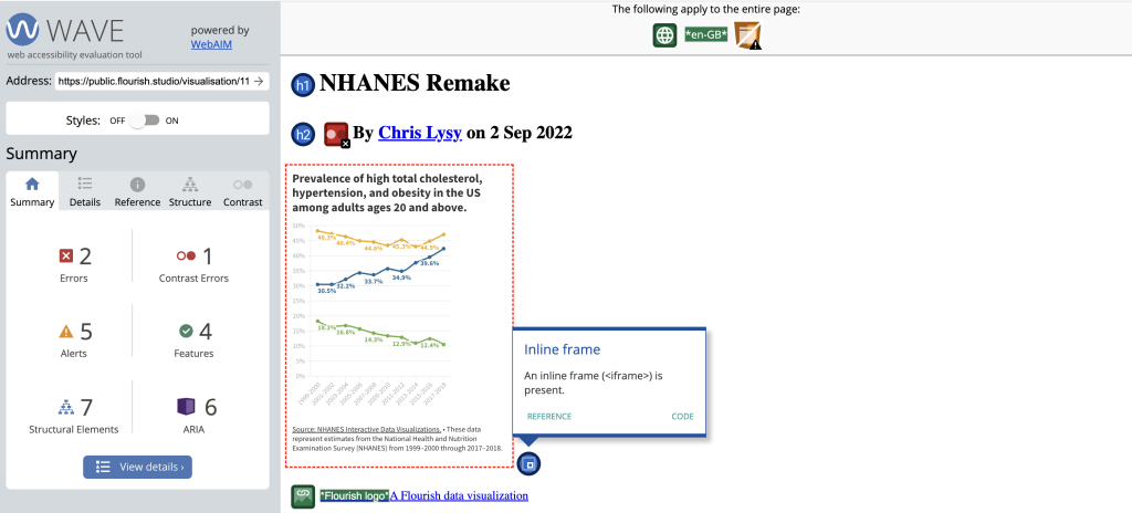
In simpler terms, I was having the same screenreader quirky challenges on the published Flourish page that I was having inside the Canva embed.
The stock photos used in Canva’s templates DO include standard alt text. There is no way to change the text, but it technically exists.
This does not include images you upload to Canva.
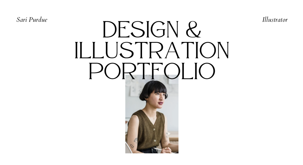
According to the Canva system, the photo above is “Asian Female Designer with tablet at work.”
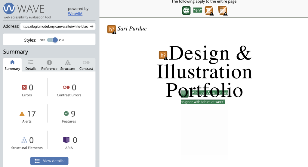
So while both of these options technically did give me alt text, you don’t really have enough control for this to be a great workaround.
What worked.
Okay, so here it is. The workaround to use if you have no other choice than to create a website using Canva (which I’m skeptical about but I don’t know your situation).
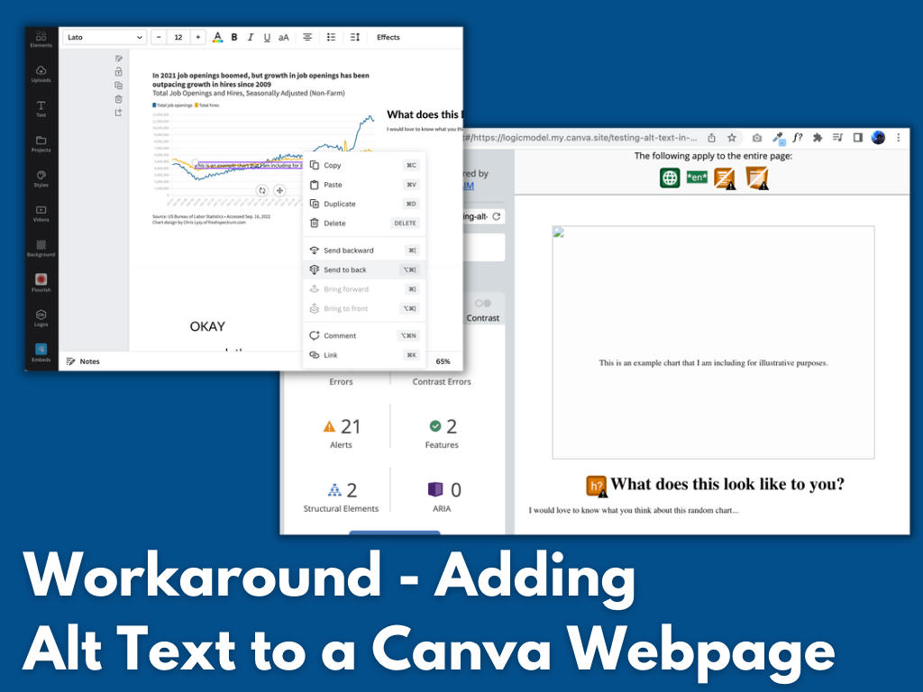
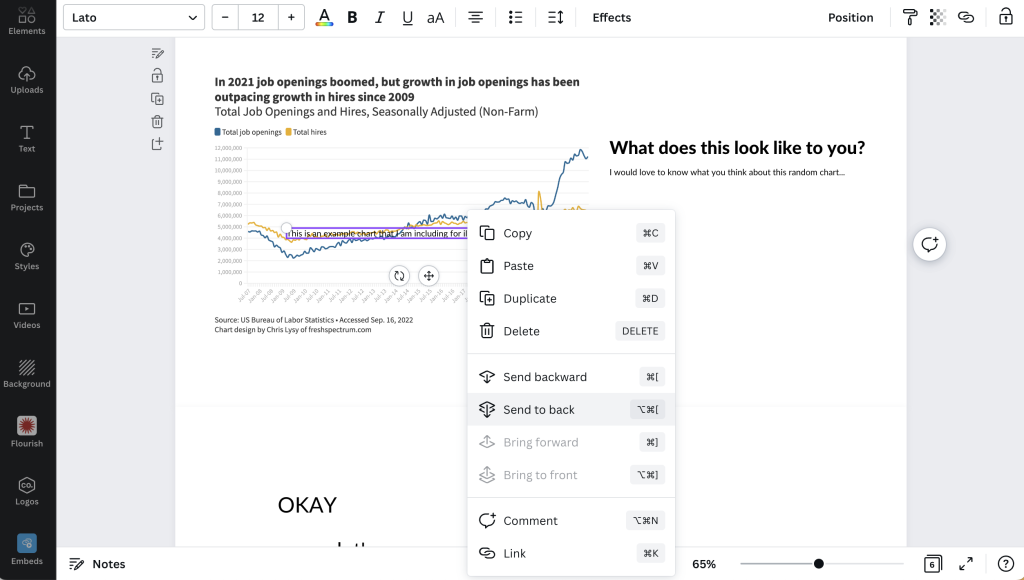
Step 1. Put a text box over the top of the image you inserted into your Canva design. Use this text box to describe the image. Then once you are done, click “send to back” to hide it behind the visual.
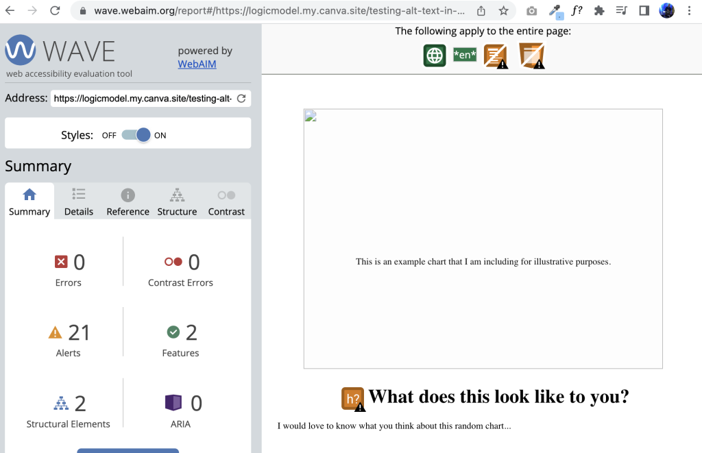
Here is what it looks like on a website. If the image does not load, the descriptive text box will show. This was also successfully read by both my screen readers in the proper order on the page.
My final conclusion: don’t use Canva for websites until they fix their accessibility issues.
Okay, so technically I found a workaround for one of Canva’s accessibility issues. But that doesn’t solve everything.
Canva should really fix the following if it wants to seriously pitch itself as a web design tool (not just for image production).
- Alt text (what we’ve been addressing in this post)
- Document tagging (being able to tag individual text boxes as headings or paragraphs is essential)
- Reading order (you should be able to guide a screenreader through a page in the proper order)
Want to read more about Canva accessibility? Check out my other post:
Canva Accessibility is bad, here is how you fix your design.