This is an Eval Central archive copy, find the original at evalacademy.com.
This article is rated as:


A style guide is a time-saving tool that helps you be consistent in your formatting when creating client and public-facing products, from evaluation plans to reports and presentations. When working with a team, style guides ensure that team members are working efficiently as they create evaluation products.
Ideally, you start a style guide early in the project, well before the first deliverable is due, but it can be made at any point. Creating a style guide doesn’t have to be complicated, it can be laid out in whatever way makes the most sense for your work.
There are five elements I include in every style guide:
-
Fonts
-
Heading Levels
-
Colours
-
Icons, Logos, & Images
-
Charts
1. Fonts
One of the simplest ways to make your project stand out is to move away from using default fonts. You don’t have to download or buy fonts, but if your team uses both PC and Macs, be wary of fonts that aren’t available on both operating systems. Google fonts has free font downloads but beware that you need to embed them in the document if you want your clients to be able to see them.
A few font rules to remember:
-
Serif fonts (the ones with little feet) are better for body text, for example
-
Garamond
-
Georgia
-
Palatino Linotype
-
-
Sans-serif fonts (the ones without little feet) are better for headings, for example
-
Arial
-
Calibri
-
Franklin Gothic Book
-
2. Heading Levels
If you aren’t using Microsoft Word’s built-in Heading Styles, let me take a second to convert you. Using their pre-set heading templates helps you build structure into your documents and allows you to use the navigation pane to quickly find pieces of information and build an automatic table of contents. Gone are the days of manually bolding and italicizing different headings to help break up your documents.
Even if you build reports in PowerPoint, creating different heading styles will help readers move through your document with ease. The defaults in Word are a great place to start. Under the design tab, you can select different styles or create your own custom style sets. I suggest starting with 3-4 heading levels, a style for quotes, and a style for information you want to stand out (call-out boxes, figures, or captions).
Quick tricks for modifying heading styles:
-
Add extra space before and after level 1 and 2 headings by clicking “format>paragraph” in the Modify Style box. This will give your document much needed white space (see our article on renovating your evaluation report for more on white space)
-
Indenting heading levels 3 and 4 can also help them stand out and add some white space
-
Adding borders (I’m particular to a wide left border) can help visually denote or colour code headings
3. Colours
Using a unique colour palette is another way to make your report stand out. There’s a lot that goes into choosing colour-blind accessible colour palettes with appropriate contrast, so I won’t get into that here. But if your client, company, or project has a brand colour scheme or logo, that’s a great place to start. Colour should be used intentionally so your style guide should include how you want the colour to be used. Check out our article on using colour consistently.
Quick tips:
-
Save your colour palette as a custom palette so you can transfer it easily across Microsoft programs.
-
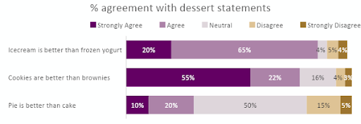
Determine what colours will be used in your charts to make sure that the same hues and shades are used in the same ways. In the example chart below, your style guide should outline what shades will be used for each response option (strongly agree, strongly disagree, etc.) so that all graphs with five-point scale are consistent.

4. Icons, logos, and images
Typically, I add icons in at the end, but if you are writing a longer report and hope to use icons all the way through, a style guide is a tool to help organize them. Pick icons that are of a similar style (e.g., thick vs thin lines, filled in or not). Add all company, client, or program logos you need in high-quality formats to the style guide or save them in a folder together.
See our article on using images in your reports.
5. Charts
Determining the basics of how your charts will look helps to make sure you aren’t spending hours as you wrap up your report by changing charts to look the same. Determine the font size of your legend, axis titles, labels, and chart titles ahead of time to keep them consistent, especially if you’re working with a team.
We have an article to help you improve your charts if you need guidance.
At the end of the day, your style guide is exactly that, a guide or starting place; don’t worry if it needs to change slightly as you put your report or presentation together.