This is an Eval Central archive copy, find the original at freshspectrum.com.
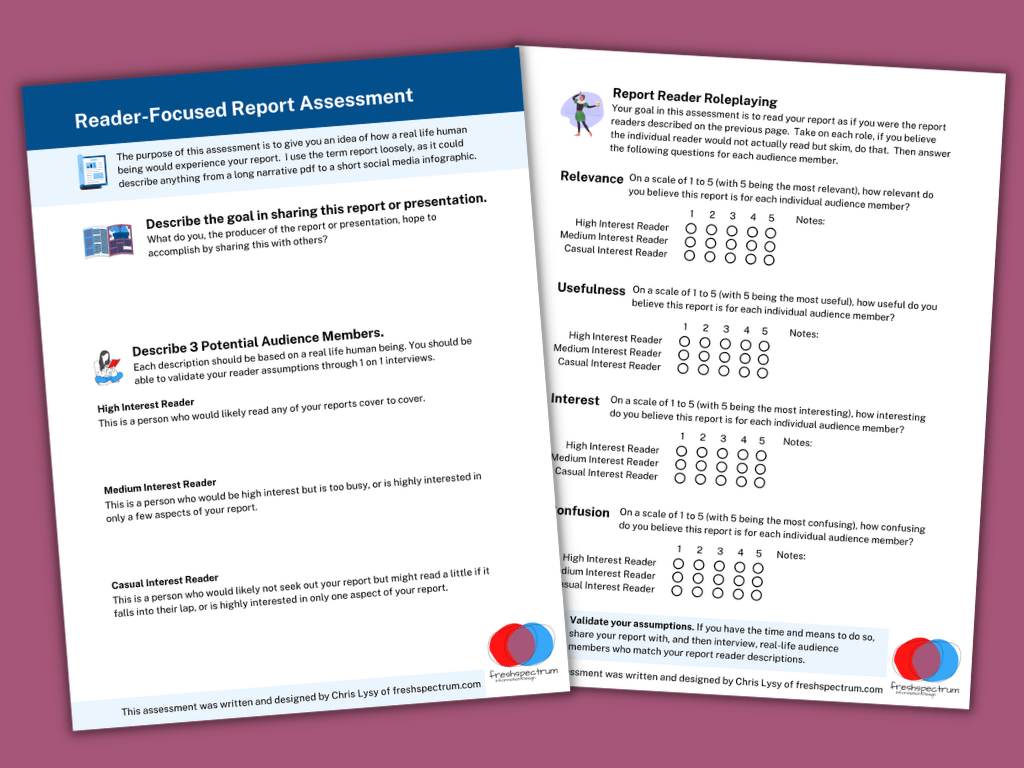
How do you tell a good report from a bad report? That’s what I hope you’ll be able to do with my new quick 2 page assessment.
So a little while ago I created a resource, it was a short 18 page eBook that walked through a 6 step process. If you’re interested you can grab it here: UX Evaluation: How to Evaluate Dashboards, Reports, and Data Visualization.
But truthfully, whether or not they should, most people are not going to go through that much effort. And you really don’t have to go through that much effort to learn a lot about the effectiveness of your report. So I decided to make something a little easier.

There are three basic steps.
Step 1. What is your goal?
You would think it would be obvious, but a lot of people don’t take the time to put this into words. But why you are sharing your report or presentation is really fundamental to your design approach.
So I start by asking you to write a sentence or two on the goal.
Step 2. Describe 3 audience members?
Breaking your audience down into 3 groups is a really nice way to help you imagine “the who” in your audience. The 3 audience approach is central to my client design work, which is why I talk about it early in my book.
While all audiences are different, interest level plays a huge role in choosing the right type of report. Because if you try to serve everyone with the same style of report you are going to fail. Shorter visual reports work better for casual audiences. High interest audiences often want far more substance. And your executives (and probably your boss), they usually land somewhere in the middle.
Taking a little time to identify a person who can represent each group can really improve how you see your own reporting. It’s also fundamental to what I’ll ask you to do on page 2.
The people you choose here can be fictitious, but you should be able to validate your assumptions by talking to real people who match your descriptions.
Step 3. Rating on Relevance, Usefulness, Interest, and Confusion.
The second page gives you a chance to role play each one of your 3 identified audience members and rate your report accordingly. What might be highly relevant to one audience member might not be relevant for another. A report could be interesting but not all that useful. It could also be potentially useful but really confusing.
There is no getting all As on this assessment. If you find yourself saying everything is highly relevant, useful, and interesting while also not being confusing for everyone…you might be a little delusional.

How to use.
This is the kind of assessment you have several people run through. Then you meet together in a conference room (or Zoom room) and talk about your findings.
If there are disagreements, or your reports are really important, find real people who match your audience descriptions. Have them read the report. Then ask the questions on page 2 (over Zoom or a cup of coffee).
Do your assumptions on how your audience would see your report align with real world user experience?
Download the Assessment.
Click on the following link to download the assessment.
