This is an Eval Central archive copy, find the original at freshspectrum.com.
In today’s post I’ll share my five favorite reporting tools. And no, my list doesn’t include Excel, PowerPoint, Word, R, Illustrator, D3, Tableau, or PowerBI.
My Quest.
I think I’ve been on a quest. Now I didn’t know I was on a quest.
It was more like something was missing but I didn’t know it. And it occurred the other day as I was re-opening my workshop, just what that missing thing was.

The four pathways.
Over the last decade I came to believe that most data people interested in better data design tend to follow one of four paths.
- You could take a coder’s path. Learning things like R, Python, SQL, and Javascript. Maybe you start calling yourself a data scientist or data engineer.
- You could take a graphic designer’s path. Learning tools like Adobe Illustrator, Photoshop, and InDesign. Perhaps you take a position in a small boutique design agency.
- You could take a BI dashboard developer’s path. Learning tools like Tableau and PowerBI. Here you can get a job in finance or healthcare and join Tableau’s data fam.
- OR…you could take the most common path and just stick with trying to create better charts and reports using Excel and PowerPoint. There is nothing wrong with this path, as modeled by Stephanie Evergreen and Ann K Emery, you can do amazing things with these mainstream tools.
As a jack of all trades, I personally tried to take all the paths…
And yes, I learned a lot. Now I can do a little bit of just about everything.
I have worked as a programmer, developing websites and applications, and know a little bit of code. I have designed and illustrated reports for NGOs and nonprofits. I’ve created data dashboards for state agencies and universities. And I’ve also created a lot of Excel charts and PowerPoint presentations for all sorts of clients.
And I thought…well maybe that’s just the kind of data designer I am. The kind that knows a bit about everything. From that vantage point I can help steer others down the right path for them. So I started a workshop all about data design where I could do just that.
I accepted that I didn’t have a straightforward path. But then by accident, I discovered a fifth pathway.
The fifth pathway.
The fifth pathway is a data communications path.
You don’t need code. You don’t need to learn complicated design software. You are hardly ever communicating large enough datasets to need data dashboards.
What you need, is to be able to create professional visual reports and infographics fast. That way you can communicate with a large range of audiences, fill up a social media posting calendar, or just spend less time creating better reports.
The fifth pathway is a mix of UX design, human centered design, agile project management, and template-based design. It requires learning a set of tools developed for social media teams, data journalists, and UX/UI designers.
It’s not a mix of the other pathways. It’s something different.
And long story short, that brings us to…
My five favorite reporting tools.
All five of these tools are nimble and web-based. They all offer free plans that can be used to create viable pro designs.
With these tools you can design professional social media illustrations, one pagers, infographics, slide docs, executive summaries, print reports, presentations, GIFs, videos, interactive web reports, and simple interactive data dashboards. Even on the free plans none of the five tools expose your designs to the public, unless you intentionally decide to share the designs publicly.
These five are increasingly becoming the tools where I spend almost all of my time as an information designer.
Number 1. Canva
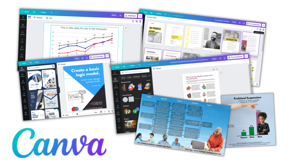
Canva for me is most everyone else’s Microsoft Office. I design almost everything in Canva. It’s where I design social media images, infographics, slide decks, and print reports. I even use Canva to develop online course videos. Oh, and I also used Canva to fully design my both of my print books.
Canva isn’t a design tool with some supporting digital assets (icons, photos, and videos). It is a full asset collection that just so happens to also be a design tool. It’s templates and asset libraries that make design faster.
You can do a ton with Canva free, but for the cost and what you get I think Canva Pro is will worth the money (I’m a partner because I love the tool, so that’s an affiliate link). If you’ve been following this blog, you’ll know I don’t do that often.
Number 2. Adobe Express
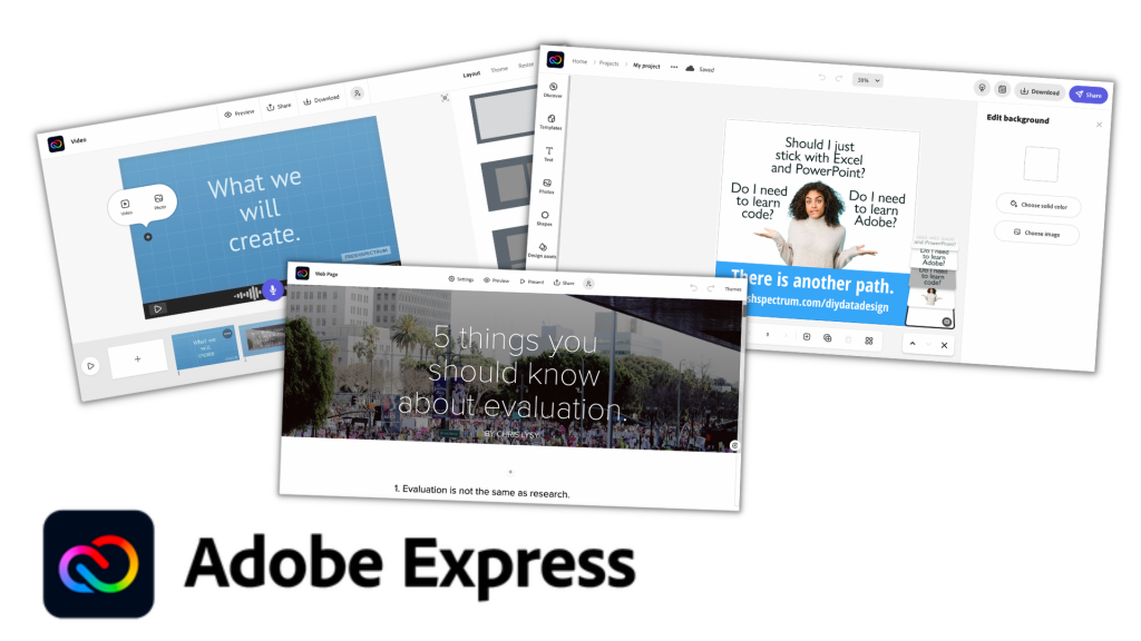
Adobe Express used to be called Adobe Spark. And spark was an old favorite of mine as tool to create videos, interactive digital reports, and the occasional illustration. But for years Adobe kind of just let Spark just exist without many updates or new features.
I think Canva’s success has pushed Adobe into reinvesting more into Adobe Express. Because lately the tool seems to be getting better. There are now a few things that you can do for free in Adobe Express that are only part of the paid plan in Canva, like a background remover. Adobe can also draw upon its huge collection of stock images and other assets.
While Adobe Express isn’t taking much of my time away from Canva, it is a viable tool that hopefully should be getting better and more competitive with time. Also, if you already have a licensed Creative Cloud account, you already have a pro Adobe Express account.
Number 3. Flourish
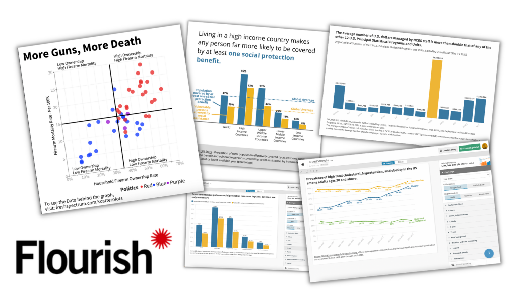
Canva has a native chart builder. But…it leaves a lot to be desired. I think that is one of the reasons Canva acquired Flourish.
Flourish is a chart building tool designed for data journalists but totally useful for any of us. With the tool you can create the kind of simple interactive charts you see attached to major news articles. Unlike Excel, which often feels like you have to break in order to create a good chart, Flourish helps you create better charts faster.
The pro version of Flourish is expensive, it really is set up for use by newsrooms and larger organizations. But luckily the free version allows you to do almost everything and is completely viable even without a pro account.
Number 4. Datawrapper
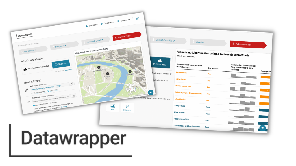
Datawrapper is in the same class as Flourish regarding target market and general use. I think in some ways it’s a little easier to use but without as many features. It’s free plan is also slightly less good with no SVG export 
That said, Datawrapper can easily do some things that Flourish cannot. Datawrapper is a pretty awesome map making tool. It’s also really nice for tables with microcharts. And since there is still a ton you can do with the free plan (SVG downloads aside), it’s also worth your time trying it out.
Number 5. Figma
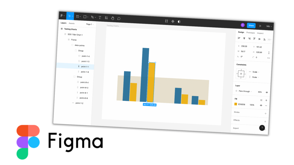
When I started writing this post I almost left Figma off the list. It is an amazing tool, but it’s not a template based tool like the other four.
Figma is a UX/UI design tool similar to tools Adobe XD and Sketch. But Sketch is Mac-only (and costs money) and Adobe XD requires a download (it has also been increasingly hiding its free version). I’ve used all three tools, and each has its positives. But I put Figma here because it is entirely web-based and the free plan is full-featured.
Figma is not a tool that will necessarily make your workflow faster. But what it CAN do, is allow you to tweak the things that are hard to tweak using the other tools. For instance, if you save a Flourish chart as an SVG, you can drop that chart into Figma and pick the image apart. Meaning you can get rid of elements, change colors of individual elements, and add annotations.
It gives you the kind of freedom you miss when using template-based tools, which makes it an ideal finishing tool.
Want to learn more about Data Communications?
My workshop is open again for new registrations!
It includes…
- Weekly Sessions (every Wednesday)
- Session Recordings (50+ hours and growing)
- Self-Paced Courses (in the process of recording more, all will be included)
- Private DiY Data Design Newsletter (once a week with tips and inspiration)
- Data Design Template Library (also will be growing soon)
And if you can’t afford the $99/month ($999/year), I have three no ask necessary scholarships for 25% off, 50% off, and even 75% off.
Click here to learn more about the workshop, the scholarships, and to register.
