This is an Eval Central archive copy, find the original at freshspectrum.com.
In today’s blog post I’ll walk you through the creation of a specific type of infographic I call a Two-Step. At the end of the post you’ll also find a link to the underlying Canva template.
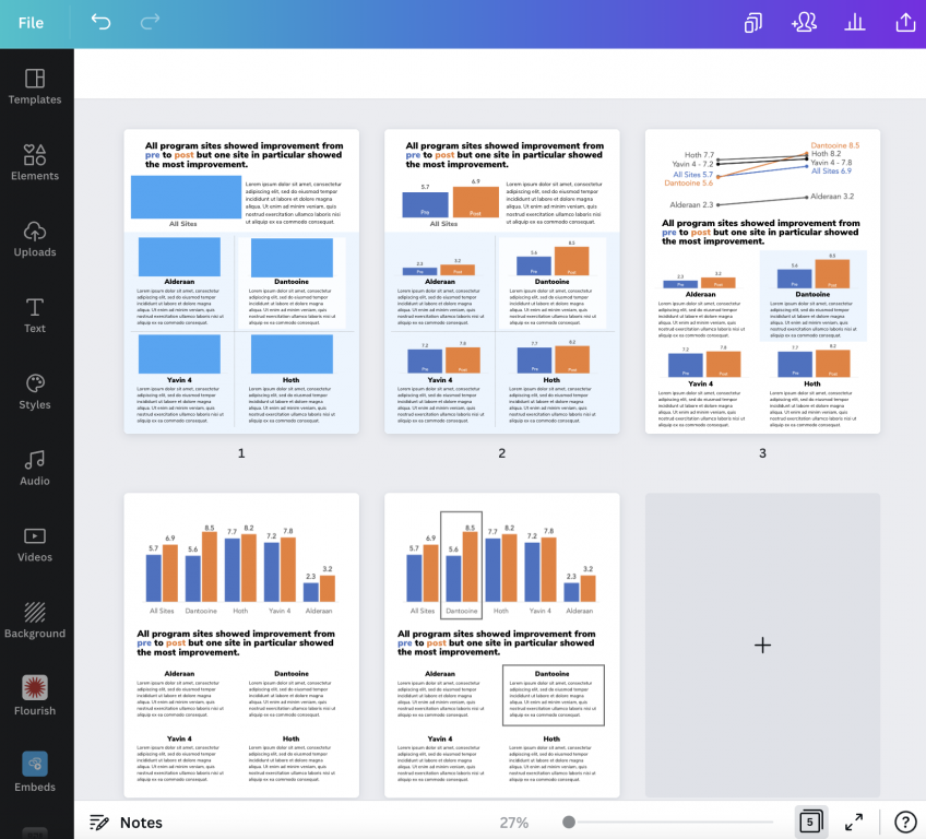
First off, what is a two step infographic?
So I’m not sure if this kind of infographic has a different name, but I call it a two step.
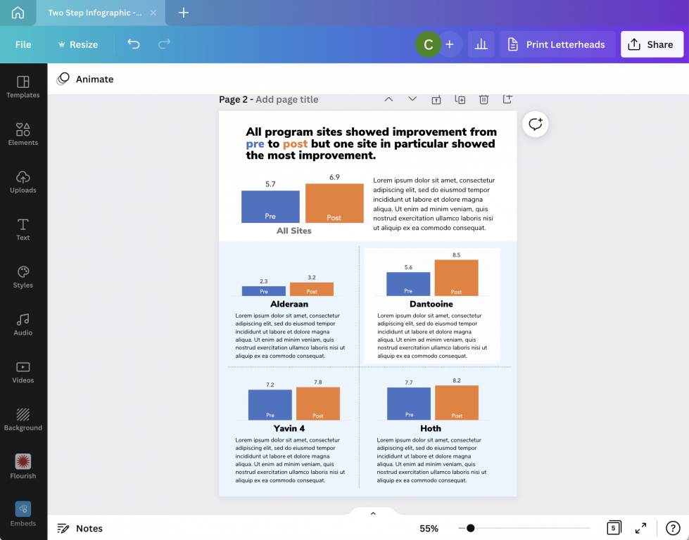
The static infographic mimics what you would expect to find in a data dashboard. When designing dashboards I like to remember Ben Shneiderman’s visual information-seeking mantra; overview first, zoom and filter, then details on demand.
The overview chart is step 1. Step 2 is a small multiple that provides a zoomed in view based on a filter variable. So for instance, the overview might be all program sites and the filter variable might be individual program sites. But that’s just an example, you could break it down using all sorts of variables such as gender, race, location, or anything else you might use to filter your dataset.
The on-demand details part is the annotations you use alongside each individual chart. Usually a takeaway, description, or some other associated sound byte.

Starting with a Clustered Bar Chart.
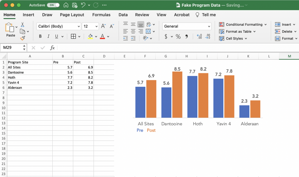
So I’ll use a little fake pre post program data for this example. Here I have pre post scores for four sites and a top level average score from all sites.
One way we might visualize this data is to just use a simple clustered bar chart. This approach is fine, but sometimes based on our audiences, isolating and discussing the individual sites is far more important than comparing the results across sites.
Breaking up your chart into Small Multiples.
The most straightforward way to create small multiples is to just create a separate bar chart for each site. You just basically copy the chart over and over again, for each one only selecting the data for an individual program site.
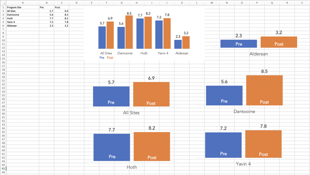
Tip: Make sure to keep your bar charts on the same scale.
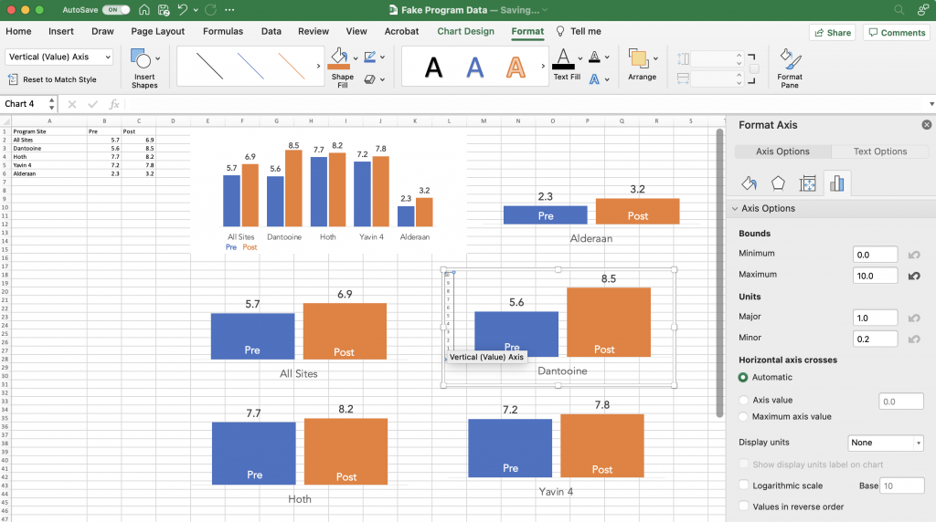
One thing to keep an eye on is that Excel’s defaults are set to change the vertical axis based on the data. It’s a setting you can turn off before you copy and paste your charts.
But if you’ve already recreated your charts and you just want to standardize the axes, you can do that. I prefer to go without axes, opting for on the bar data labels. But in order to change the minimum and maximum bounds I need to add it back in.
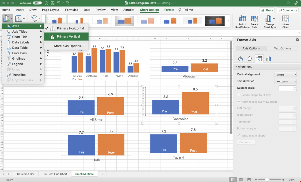
Once you have the vertical axis back you can select the axis and change the minimum/maximum bounds in the Format Pane. Do that for all your charts so that they are all on the same scale. Also make sure each of the charts is the same height and width.
Laying out your infographic.
To layout my infographic in Canva, I start with a blank one page report.
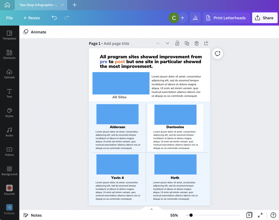
At the top of the page I put my title, followed by a space for the overall chart and some descriptive text. Then I create a similar space for each of the step 2 charts.
As one of my diydatadesign community members brought up during a recent session, creating a clear distinction between the overall and secondary charts is a good idea. In other words, make your top chart a bit bigger.
Bringing over your Excel Charts
I wrote a whole blog post about the different ways to bring Excel charts into Canva. If you’re interested you can find it here: How to Import Excel Charts into Canva, the Right Way
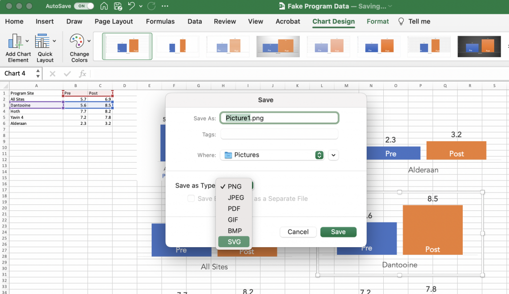
The short version is this. You can either save your individual charts as images (saving as an SVG will prevent it from getting pixelated) or just Copy and Paste. Before I copy and paste thought I first get rid of the
Bringing it all together.
Once I have all the charts, I can bring it all together. You can use color and shapes to highlight certain key findings but it’s not a requirement.
This type of infographic is particularly good when you want to share all results with a group of smaller subgroups. But you want each of the subgroups to have equal billing. They’ll still get the context of where they stand versus other subgroups, but that’s only secondary.
Want access to the final template?
Do you want access to the final infographic Canva template, along with a few other alternative layouts. You can grab the template using this link.
