This is an Eval Central archive copy, find the original at freshspectrum.com.
Looking for an infographic that is easy to write and design? This post will you through the process of creating a timeline infographic from scratch using Canva. I’ll also include the final templates at the end of this post.
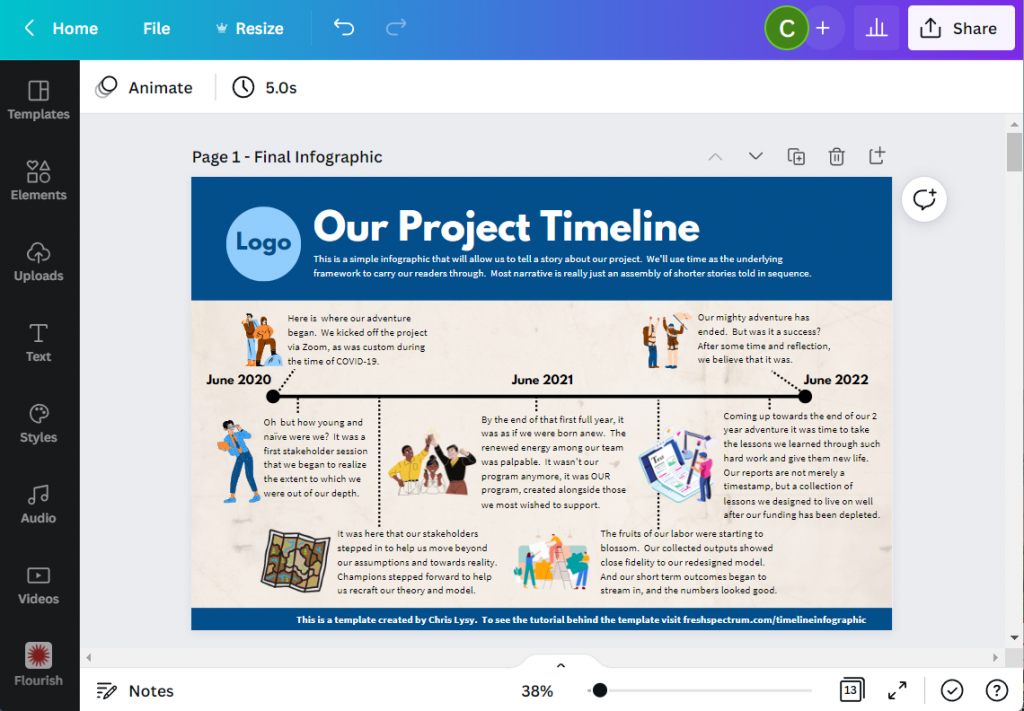
Here is what I will design – “Our Project Timeline”
This is just a simple timeline, nothing too fancy with only so many text blocks. The text blocks are fairly large (at 18pt font). So if you wanted a busier timeline with more blocks, there is certainly room if you drop the text size a bit.
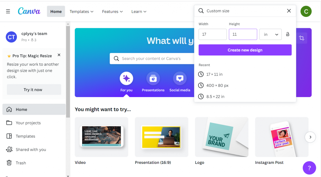
Step 1. Choose your base size.
Canva’s infographic templates are all based on a size of 800 by 2000 px. That’s a fine size if you are only sharing on the web and want a portrait style infographic.
If you plan to print your infographic, I would suggest creating with a standard paper size. Most professional office printers can easily print up to 11 inches by 17 inches (or A3 if you are going with international sizes).
This tabloid format is kind of cool because it’s like having two letter size pages side by side. You can easily fold it in half and put the infographic into a folder.
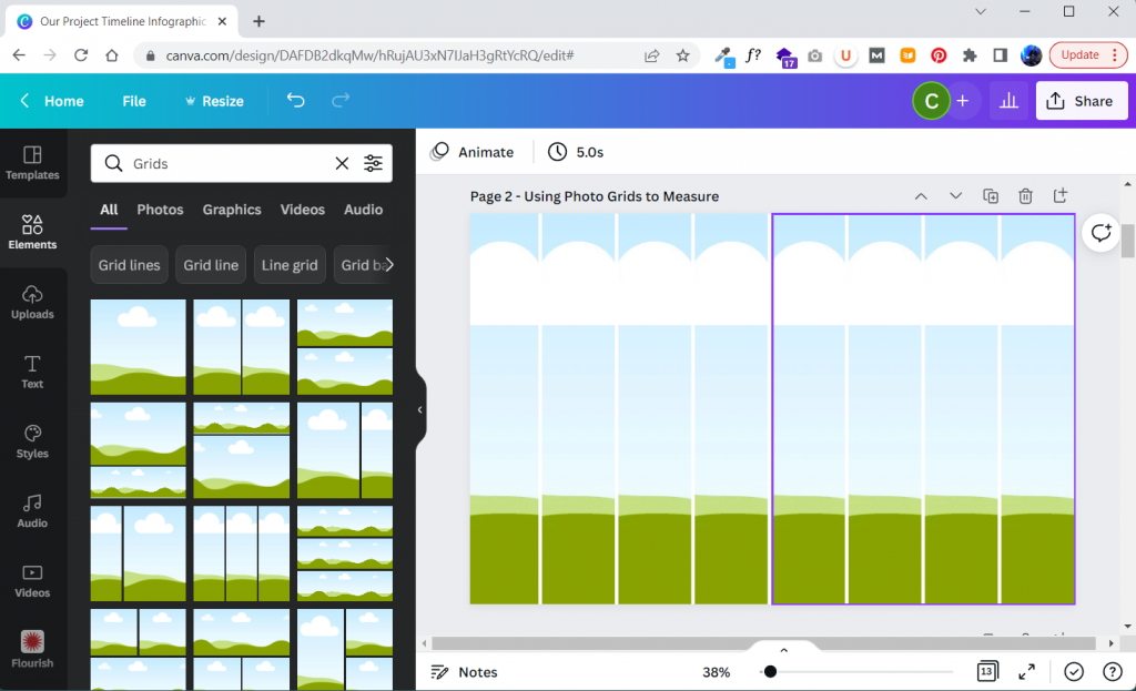
Step 2. Build your grid.
I like having a basic grid when I start designing. It really helps me arrange things.
In Canva I’ll create that grid by clicking on Elements and searching for “Grids”. These are technically photo grids, but I’m just going to keep them in the back and use them as measuring tools. Later on, after I put in content, I’ll delete the grids.
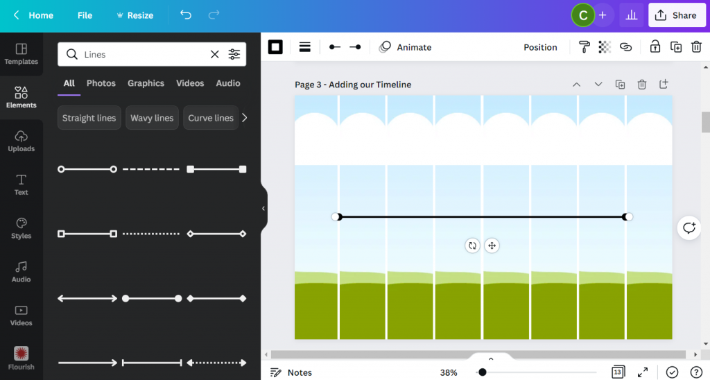
Step 3. Add in your timeline.
For my line I’ll simply search for “Lines”.
Choose the line style first, then you’ll be able to change the line weight, color, and end points. I usually place my line in the middle of the page.
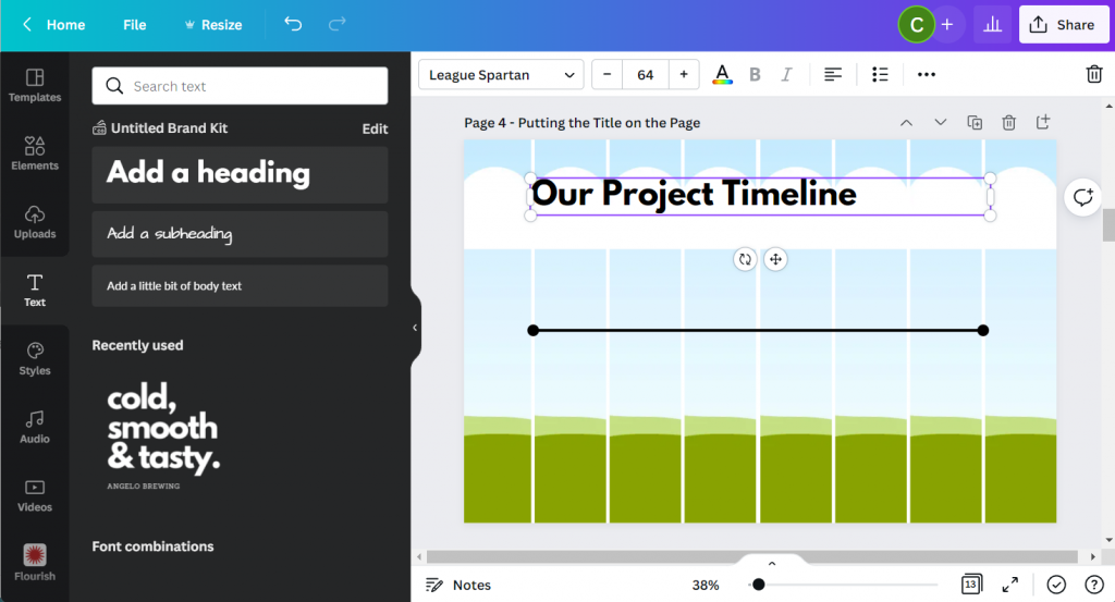
Step 4. Putting a Title on the Page.
Next we’ll add a Title. For this we will use the Text menu and Add a heading. Even though I am designing this infographic for print, I still think it will likely be reviewed via a screen most of the time. So I’ll use a pretty large font size (64 pt).
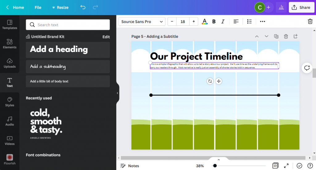
Step 5. Adding a Subtitle.
A sub heading is a great way to keep you from writing too much in your main heading. Use the subheading to setup your infographic for your reader. I’m using a fairly large font size (18pt) for a print piece because, again, I do want it to be readable on a screen.
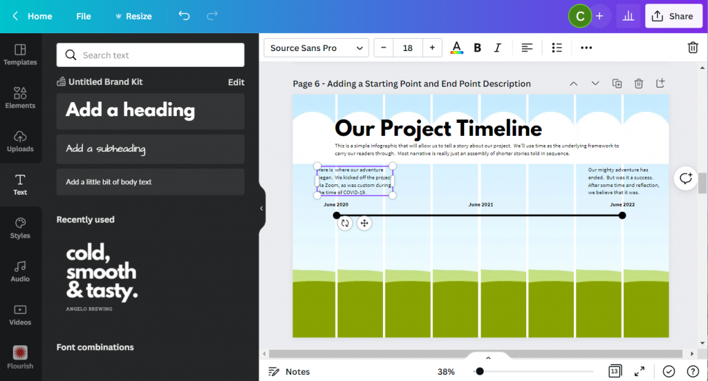
Step 6. Adding your starting and end points.
Now we can start adding blocks of text. For this template I created a block at the beginning and at the end. I also put general dates above the line.
You don’t have to create timelines exactly to scale, but it should it be close.
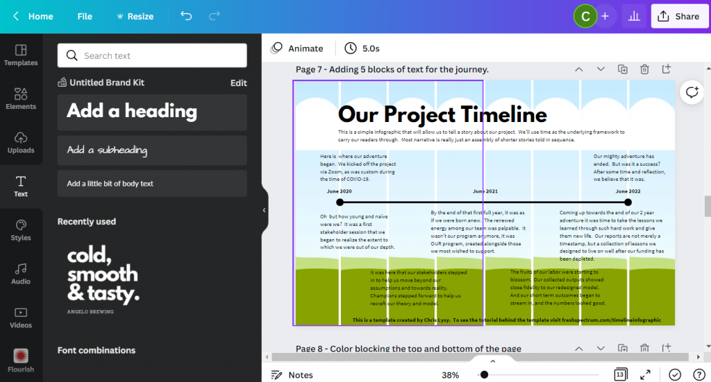
Step 7. Adding content blocks.
You have choices for the content blocks under the line. I kept the font large at 18pt, but if you have more to write you can shrink the size a bit. All sorts of infographics will drop down their text size to 10pt (sometimes less). This all depends on how much content you have to share (and how much you white space you would like to see on the page).
I also added a short by line at the bottom of the page. Most good infographics will send you somewhere at the end of the page where you can find sources or other additional information.
Step 8. Adding color blocks.
I put a couple of rectangles behind the text at the top and bottom of the page. This creates a bit of differentiation between the heading, main timeline content, and the little footer.
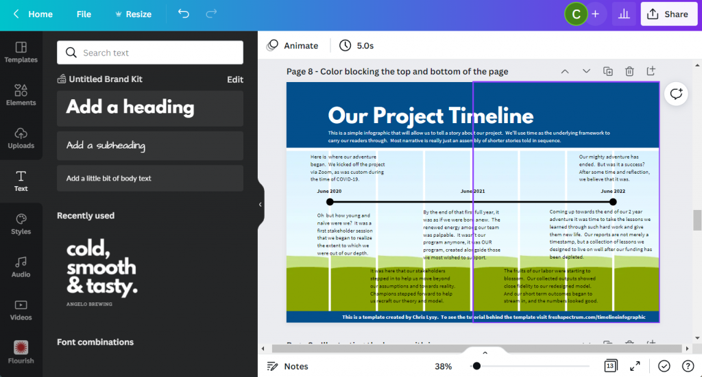
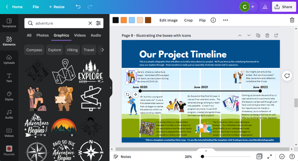
Step 9. Illustrating the text blocks with icons.
Now that we have all the text in the infographic it’s time to illustrate. One of the easiest ways to illustrate is to find icons that pair well with your text blocks. Canva has a ton of icons available through a simple search in the Elements tab (especially if you have Canva Pro).
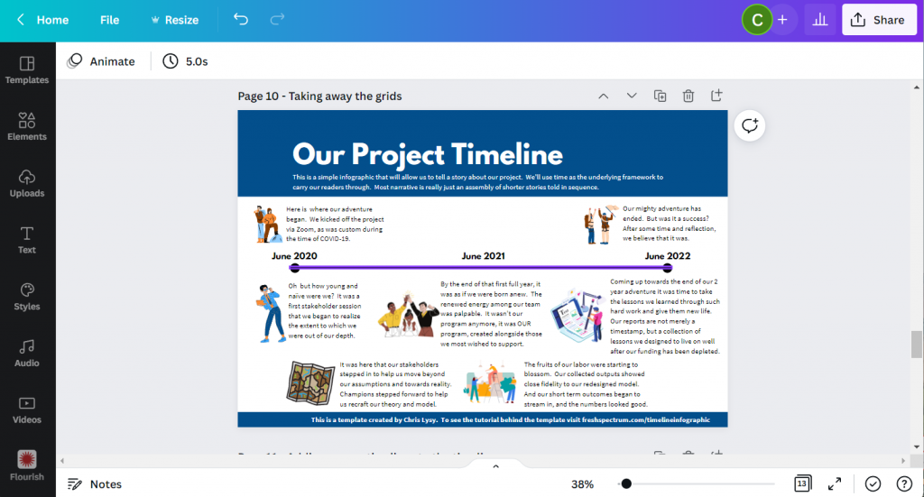
Step 10. Deleting the grids.
Once I have everything on the page, it’s time to drop the background grids, I don’t need them anymore and this lets me see the infographic like it will be seen by the reader.
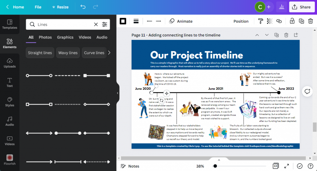
Step 11. Adding connecting lines.
So I’ll want to connect the text boxes to the appropriate times on the infographic using lines. If an icon is in the way, just click on the line and send it to the back.
At this point we really have a completed infographic and could stop.
Step 12. Adding background texture.
Black text on a white background can feel pretty stark sometimes. It has really good contrast but can feel a little too bright for your eyes.
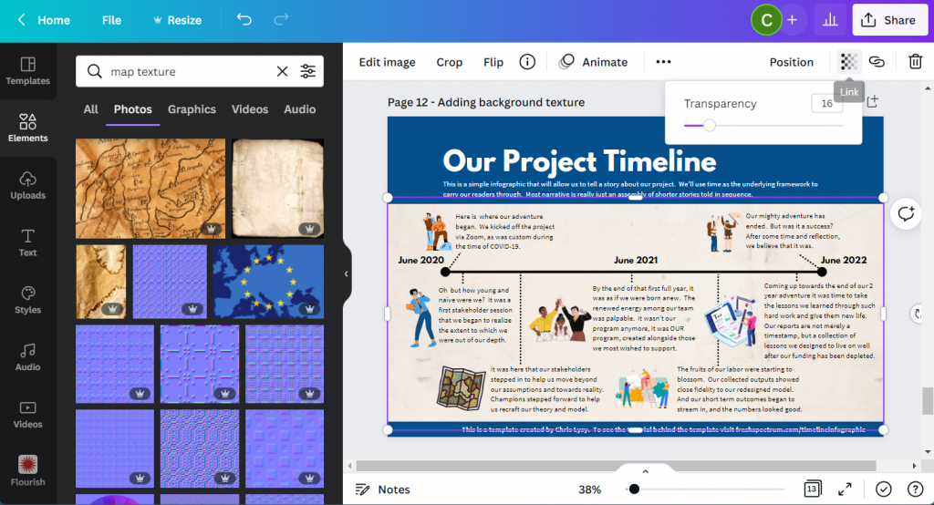
Since the random text I wrote for the infographic had a kind of adventure vibe, I put in a map paper texture in the background. It was a little too dark so I lowered the transparency and added a really light color behind the texture.
Step 13. Creating space for a logo.
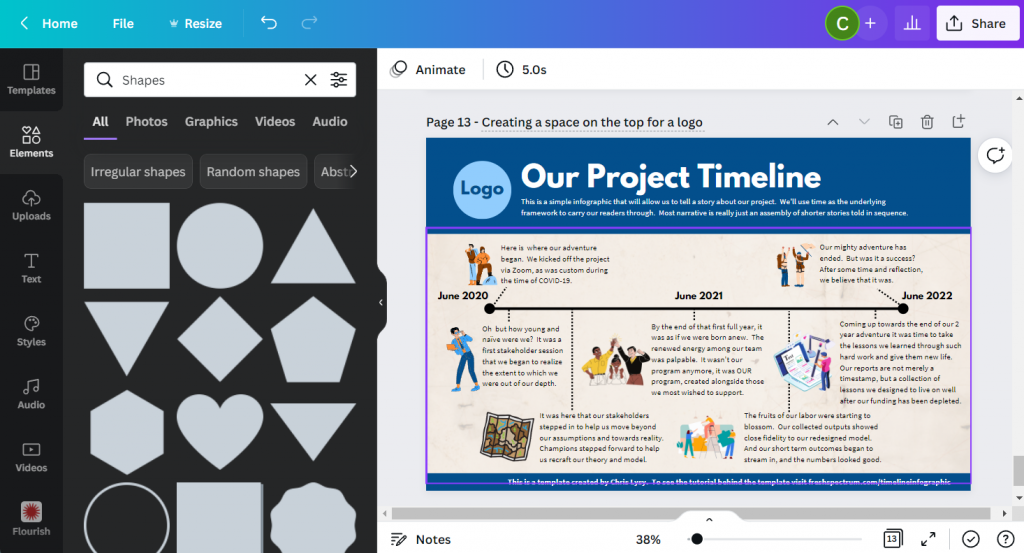
Finally, I shifted the header and subheader over a little to make room for a logo. Since this is just a fake project, I created a fake logo.
And that’s it, we now have a ready to share completed timeline infographic.
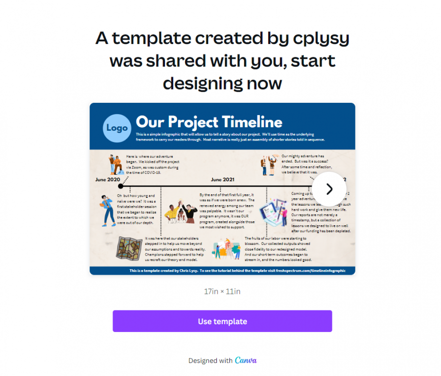
Start where I finished: grab the template.
BONUS: Template Script
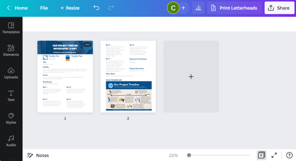
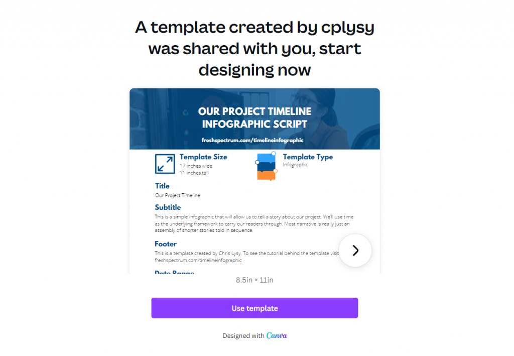
When writing an infographic, especially with a team, the actual template can be a bit of a distraction. In these situations a script can be really helpful. You don’t have to create one in Canva like I did (a simple word document is fine).
But here is an example, the script has all the words you’ll find on the infographic and some additional details. Save it as a PDF and share it with colleagues for comments and cowriting.
Grab the template script worksheet here.
Create an Infographic in an Hour Webinar
Like this tutorial? Sign up for my upcoming webinar, Thursday, June 9 at 2PM EDT.
I’ll be walking you through another example of a quick to create infographic.