This is an Eval Central archive copy, find the original at engagewithdata.com.
When the data speaks for itself
(I’m back! Let’s just say that working from home full-time with an infant and no childcare is not for the faint of heart. I’m hoping to share with you more regularly throughout the summer and beyond.)
As I’m sure has been the case with you, the past few weeks have weighed heavily on my heart.
With the news of the racially motivated slaughter of Black Americans at a grocery store in Buffalo and then the shooting rampage at an elementary school in Uvalde, Texas, I have felt a range of emotions.
I remember doing active shooter drills with elementary school students at the last school where I worked — both as a precaution and also when we thought there was an intruder in the building. Thankfully, nothing happened, but as we saw this week (and so many times before), we might not have been so lucky.
I’m also thinking about my young daughter and the world we’ve brought her into.
I’m sad for the victims and their families, enraged at our country for being the only developed country to continue to have mass shootings and do nothing about it, and I’m fearful for what might come without action on the part of our government.
But my feelings really don’t matter. This isn’t a political blog. This is, however, a prime example, of how some data tells quite the story without us having to do much to it.
Every Town for Gun Safety is skillful at letting this truly horrifying data stand on its own.
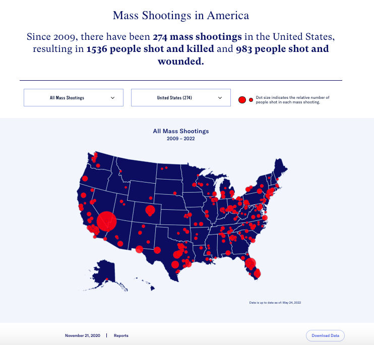
Take, for example, their interactive map of all of the mass shootings in this country in the past 13 years (274 of them).
It takes only a glance to see that:
- There are far too many red dots on this map,
- There have been some particularly catastrophic shootings in the past decade, and
- Some parts of our country have been especially impacted by brutal gun violence. Texas alone has had 30 of these 274 mass shootings (11%).
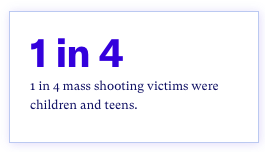
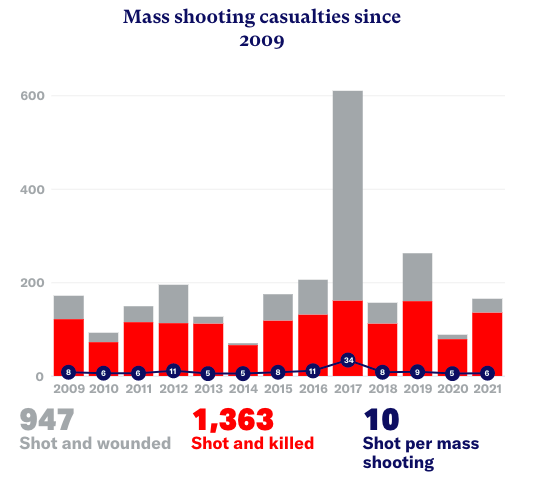
Every Town does a great job of data visualization, as seen in the graph below, but sometimes, all it takes is focusing on a single statistic to drive the point home.
I truly believe that their use of data is helping spread their message in a clear and concise way, at a time when that is more crucial than ever.
Think about your organization’s message and the key data points that are important for you to share.
Which data points tell your story for themselves?
This week, I’ll be presenting at the 2022 National Community Schools And Family Engagement Conference (CSxFE) with my clients from Greeley-Evans District 6 in Colorado.
They are doing a GREAT job of using their data to make change for students and families in their district (more on that in a future post!).
If you’ll be at the conference, we’d love to have you at our session, Using Data to Build a Culturally Responsive District Equity Strategy.


