This is an Eval Central archive copy, find the original at freshspectrum.com.
Researchers and evaluators have developed some bad reporting habits. This post seeks to dispel some of the myths that keeps those bad habits thriving.
In today’s post:
- Myth #1. Your final report should be 8.5 by 11 (or A4).
- Myth #2. Illustration is not required.
- Myth #3. Your report can serve all audiences.
- Myth #4. Telling stories and adding personal insight is unethical.
- Myth #5. Reports are annual, or end of project deliverables.
- My Creative Reporting Workshop Black Friday Sale

Myth #1. Your final report should be 8.5 by 11 (or A4).
Here is a question I’ve often asked while delivering my creative reporting workshops. “When you read a report now-a-days, what do you use to read it?”
- It’s on Paper
- A Smart Phone
- A Tablet/eReader
- A Desktop/Laptop
The overwhelming answer is…
A Desktop/Laptop.
We have a reporting habit that dictates that every report should be written on standard pieces of paper. And even though we have produced our work digitally for decades and moved the vast majority of our report distribution online, we are still stuck with this idea that a report should be “regular paper” sized and formatted.
But here is the thing. The vast majority of your audience are likely reading your report on a regular computer in a landscape orientation. Producing your report in a profile orientation makes people have to scroll to read it.
Alternative: Create your report like a set of presentation slides.

Myth #2. Illustration is not required.
Have you ever noticed how few illustrations you’ll find in academic journals?
For a long time now, if you want to add a picture to your academic writing you really have to justify the use. The idea of introducing visuals simply to have visuals is not a common value. And for awhile, when things need to be printed to be shared and black and white text only journals were cheaper to print, this seemed to make sense.
Given that the fields of research and evaluation are filled with the academically trained, this not-so-visual habit has carried forward to reporting. Because evidence and reasoning doesn’t need illustration…
Except that it does. Especially now.
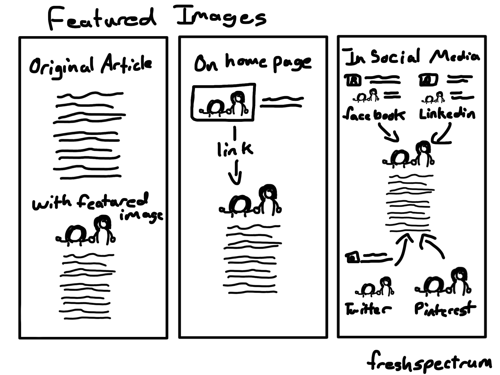
The web is a space where visuals are required, regardless of the content. Because visuals help us to map out our world. And if you want to share your work effectively on social media, through blogs, or any other digital media channel, it requires more pictures.
Quick Read: Featured Image Paradigm

Myth #3. Your report can serve all audiences.
You can’t make everyone happy.
But you can make everyone unhappy.
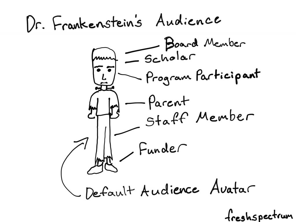
I get this argument every time I talk about report reader personas. Basically we work through a set of activities that pushes participants to think about the people they are trying to reach with a report. And ultimately somebody says, “well we have lots of audiences, and if we focus on just a few personas, we are going to leave some of those audiences out.”
And it’s true. If you create a good report you are going to leave audiences out. But creating a report that serves nobody just leaves everyone out. It’s better to be intentional about who your report serves, and even more importantly, who it does not serve.
Because pretending we don’t make that design choice every time we communicate anything doesn’t make it not true.
Alternative: Consider adapting your report into multiple infographics to reach different audiences.

Myth #4. Telling stories and adding personal insight is unethical.
Evaluation’s move toward becoming a discipline was delayed by the prominence of the value-free doctrine in the standard social sciences centering on the assertion that evaluation could not be objective or scientific and therefore had no place as a scientific discipline.
Michael Scriven on the Differences Between Evaluation and Social Science Research
I think we have inherited this idea from Social Science’s inferiority complex. That in order to be objective and scientific, we should leave our own commentary and stories out of our work.
But regardless of where you stand on the value-free doctrine, reports are not meant to be devoid of all humanity. They are the result of an expert (or set of experts) collecting, analyzing, and sharing evidence and analysis.
These are people hired because of their expertise and insight. They also tend to be the ones who have spent the most time with the specific findings they are attempting to share. As such, their commentary is valuable.
And if that describes you. Remember that the audience would like to see what you see. Understanding what you have experienced in the process of collecting and analyzing can help them see the data through your eyes. Don’t keep it secret and just hope that they see it in the same way.
Don’t know how to find the stories in your data? Start here.

Myth #5. Reports are annual, or end of project deliverables.
For lots of data people, reports are an every once and awhile thing.
- You create a report when the project is coming to its end.
- Or if the project is long term, you might create a report annually.
This kind of deliverable reporting is what I call the noun form of report. The problem with this type of reporting is that it usually involves a lot of waiting. And then, when it finally comes time to report, you have either run out of funding, run out of time to properly share your work, or you have just lost interest and have moved onto the next thing.
But report is also a verb. Reporting is something that can be done on a regular basis, when the methods have been constructed, during the data collection, and while the evidence is being analyzed. Since distribution is now a button click (and not anything that needs lots of organization) why wait until you can package everything together?
What to report differently? Join my creative reporting workshop. Black Friday Sale through Nov. 30.
Want to boost your creative reporting skills? Now’s the time to join my workshop as I’m offering the biggest deal since the launch.
The deal.
7 Day FREE Trial + 25% off with Annual Plan (that’s a $125 discount)
You can also get a 7 Day FREE Trial with our new Monthly Plan ($50/month).
What you get:
- Weekly Live Group Coaching Sessions
- Recorded Coaching Sessions
- Practice Activities, Short Lessons, and Inspiration
- Accountability and Support Forum
- COMING SOON – Self-Paced Courses
You can learn more and register at diydatadesign.com.