This is an Eval Central archive copy, find the original at evalacademy.com.
This article is rated as:


“Accessible” content sounds like a great thing to aim for! But what does that actually mean? It can have different meanings, but “accessible” tends to refer to one of two ideas (or both at the same time):
-
It might refer to content that is designed to be accessible for people with disabilities, where barriers have been removed so that everyone can access and understand it.
-
It could also refer to content that is approachable to an audience, where the content is jargon-free and easy to follow.
Addressing both of these definitions of “accessible” in your written reports maximizes the reach of your work and ensures that everyone has equal access to the information in the report. It’s worth noting, however, that written reports are not the best and only way to present your findings. Depending on your audiences, there are a wide range of other creative formats you can use to share learnings, such as one-pagers, newsletters, infographics, videos, presentations, or even a podcast!
Even so, written reports are common in evaluation and may be the most suitable format for a specific project or audience. Some simple tips can help create a written report that is still engaging for all, including people with vision impairments or colour blindness, people who use assistive devices, and neurodivergent people. Accessible reports also help all readers by reducing eye strain, providing a clear structure, and communicating the message in multiple ways!
How do you make a report more accessible? Here are a few components to consider:
-
Colour: Are you using colour intentionally? Is colour the only way to make sense of something (like a legend)?
-
Contrast: Does your text clearly stand out from its background?
-
Images: Would someone miss important content if they weren’t able to see the images and graphs?
-
Font: Would the text be comfortably legible if it were on a smaller screen or printed?
-
Headings: Are there properly formatted headings that divide the content?
-
Logical, clear structure: Does your report flow logically from one idea to the next?
-
Language: Is your text written in language that is clear and jargon-free?
These are just some questions to get you thinking about what can impact accessibility. But don’t worry—the rest of the article will take you through some of my favourite tips for improving accessibility!
1. Colour
While colour can make documents brighter and more interesting, it may not be accessible to everyone reading your report. Using similar shades or certain colour combinations can make them challenging to distinguish, whether it’s due to colour blindness, visual impairment, computer screen quality, or greyscale printing.
Be thoughtful with the colour palette of your report. If working with a client, use their established brand colours whenever possible, as they are usually designed to offer cohesiveness and contrast. In addition, you may want to consider the meanings that certain colours have in different cultures (read more about Color Symbolism in Different Cultures Around the World). You can also use the Coblis Color Blindness Simulator to check how your colours might look to people with various colour vision deficiencies.
A general rule is to avoid relying solely on colour to communicate something. Aside from colour, you can use text, icons, labels, or positioning to help identify elements. While colour is often used in graphs for example (like in legends), it shouldn’t be the only way to read them. It’s a good idea to keep labels as close to their bars or lines as possible, so that colour legends aren’t necessary.
Another way to make charts and graphs more readable is to use contrasting colours. The next tip in this article goes into more detail about contrast, but in simple terms, use both light and dark colours to make them more distinguishable. Using white outlines (e.g., an outline of ¾ to 1.5pt weight) around any coloured objects can also help prevent neighbouring colours from “merging” if you aren’t able to switch colour palettes completely.
In the example below, I took a chart with very similar colours, applied white outlines, and moved the legend to match the bars. Even without abandoning these colours, the edited version is much easier to follow thanks to a few very simple changes.
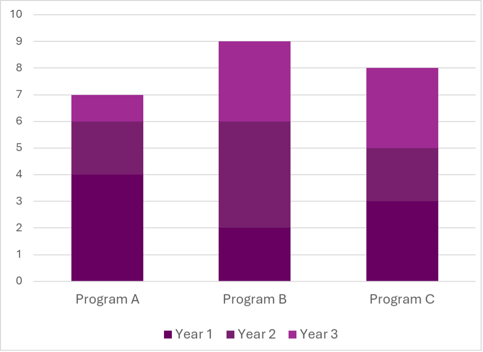

If you’re ever not sure about the accessibility of your colours on a page or chart, simply print it out in greyscale and you can see for yourself how easy or hard it is to read or follow!
2. Contrast
Have you ever struggled to read a website or document that uses white text on a yellow background, or black text on a dark blue background? That’s because there’s low contrast!
Certain colours are easier to detect on some background colours than others, because of the difference in brightness between the two colours (the contrast). The less contrast there is (the more similarly bright or dark the colours are), the more challenging it will be to read or understand the content. There are standard combinations we use because they make text “pop,” such as black or dark grey text on white or pale backgrounds and white or pale text on black or dark grey backgrounds.
Contrast is especially important with smaller text or objects. You might be able to use a less contrasting font colour for your bolded, 20pt heading, but you should stick to high contrasting colours in your body text or small graphics.
A general tip is to be mindful of how light and dark your text, objects, and backgrounds are. If you’re using a colour that’s lighter or closer to white, make sure to contrast it with a dark colour that’s closer to black. When you’re limited in colour choice (e.g., you’re using a client’s brand colours), try using other techniques to enhance the readability by using boxes around content, applying an outline in a higher contrasting colour to your text, or increasing the font size.
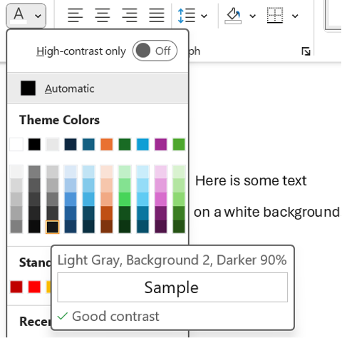
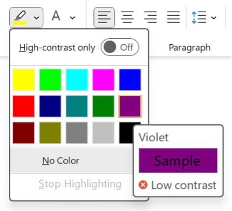
My favourite tool for this is this WebAIM Contrast Checker. You enter your foreground (text or object) colour and your background colour, and it calculates the contrast ratio. The tool suggests aiming for a ratio of 4.5:1 or even 7:1 for adequate contrast. Some Microsoft tools also guide you in choosing contrasting colours. Look for the icons below the colour sample when choosing text and highlight colours (see below images for examples).
3. Alt Text and Captions
Visual elements in your report, like images and charts, often contain crucial information; it’s important that everyone has access to it! In digital contexts, alternative text (or alt text), captions, and image descriptions therefore serve to describe visual content for people who cannot see it. A built-in alt text or similar feature should be available in most programs, including Word, PowerPoint, Canva, and Pages.
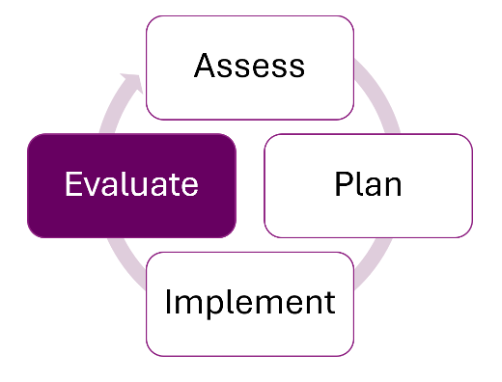
Screen readers will announce that it’s an image, so your description doesn’t need to state this. Just aim to provide a concise summary of the image’s content so that someone could understand its purpose without seeing it—think Tweet length! For example, for the below image, the alt text might read: “A diagram showing a cycle of four stages. Clockwise starting at the top, the four stages are: assess, plan, implement, and evaluate. Evaluate is highlighted in purple.”
Images that serve a purely decorative purpose and do not contain any necessary content do not need to be described. You can choose the “Mark as Decorative” option, if available, or enter “Decorative” in the Alt Text description field. Any images, charts, or graphs that contain content that is not found anywhere in the text should have alt text. For visual elements where the content can also be found in the text, treat them as decorative images.
4. Font
The font style you choose can impact how readable your report is. Some types of fonts can be much more challenging to read, like cursive, all caps, narrow, and wide fonts. Avoid these fonts! On the other hand, certain fonts are recognized as being more accessible, such as Arial, Tahoma, Verdana, Aptos, and Calibri. In general, sans serif fonts are easier on the eyes, but familiar serif fonts (like Times New Roman) will work too.
To reduce eye strain and increase cohesiveness in your report, stick to just a few fonts. For example, you might choose one font for your body text and one font for your headings, or you might use a single font for everything. If you do use more than one font, make sure you are consistent in how you use them (i.e., don’t use your headings font to add emphasis in the middle of a section of body text).
Read more about consistency in our article, Six Hacks for Renovating Your Evaluation Report: Consistency is Cool!
5. Font Size
Consider your medium when choosing font sizes. For reports that will be read on computers, body text of 11pt or even 10pt font is acceptable, as readers can zoom in easily. To ensure your report can be read when printed out, aim for a font size of at least 12pt for body text. All headings and titles should be larger than your body text, increasing based on hierarchy. For example, if your body text is 12pt, you might use 14pt for Heading 4, 16pt for Heading 3, 18 pt for Heading 2, 20pt for Heading 1, and your title might be 24pt. Use consistent font sizes for the different types of text throughout your document (tip: use a style guide for this—check out our style guide template!).
These are general guidelines, but you know your audience best! You may want to go larger than the recommended body text size if you know that your readers are very likely to print out your report, are less familiar with the content or language, or may have visual impairments.
6. Text Effects
Whenever possible, it’s best to choose your words thoughtfully to add emphasis, as this is available to everyone. That said, if you do want another way to make something stand out visually, bolding is usually the most accessible text effect; italics can be hard to read, and underlining should be reserved for hyperlinks. If you choose to use text effects like italics or bolding, restrict yourself to only one or two. Using too many text effects can make your document look overwhelming and cluttered. It’s also important to be consistent in the meaning, so if you use italics to indicate definitions, then italics should only be used for definitions.
A note on bold text: Some people use bolding to highlight main ideas in a paragraph, as I have done in this article. It creates focal points on the page that draw and direct a reader’s eyes (read our hack for making things pop). When used thoughtfully, this can help your audience, including people with cognitive or learning differences, navigate written text. Just make sure to be intentional about it and only bold the most important points!
7. Headings
A common way to make quick headings is to put them on a separate line and bold them (or underline, or use a different font, etc.). When a screen reader or text-to-speech program reads these headings, however, they can’t necessarily identify that it’s a heading. It might read it out as part of the following sentence, making it hard to understand.
Did you know that Microsoft Word has built-in heading styles that you can customize however you’d like? This is a great way to provide structure and cohesiveness to reports and ensure that screen readers can detect and properly read out headings. It also allows people to quickly navigate to specific sections of your report.
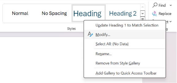
To change the default heading styles in Microsoft Word, look for the Styles section under the Home ribbon. Right-click one of the heading styles (such as Heading, Heading 2, or Heading 3), and choose Modify. You can then edit the font, size, colour, and effects on your text to help it stand out.
8. Structure and Flow
Navigating a poorly structured report can make reading much harder and slower, for everyone! Help guide your audience through your ideas smoothly by incorporating some easy organization tips.
-
Transitions: Make sure your ideas flow clearly from one sentence to the next. It can help to use transition words and phrases like “in addition,” “similarly,” and “however” to create links between ideas.
-
Lists: Use bullet points or numbering for lists longer than three items.
-
Hyperlinks: If you have any hyperlinks, use descriptive text stating where the link leads to, rather than using an ambiguous phrase like “click here.”
-
Headings: Use headings and subheadings to logically organize different topics.
-
Paragraphs: Separate distinct ideas into different paragraphs.
-
Page breaks: Consider using page breaks when beginning a new section of the report, to avoid starting at the bottom of a page.
-
Sentences: Avoid long sentences with lots of commas. Instead, break them into shorter sentences that are easier to follow. Vary sentence length to reduce fatigue and keep readers engaged.
A good rule of thumb is that if it looks visually overwhelming or sounds long to you, it probably would to others, too!
Check out the following articles for more tips to improve the structure and flow of your writing:
9 Common Writing Mistakes in Evaluation
Practice Proximity – Six Hacks for Renovating Your Evaluation Report
9. Plain Language
Using plain language in reports benefits many types of readers! From English language learners to people with cognitive challenges to busy executives, writing in a simple, concise, and straightforward way helps people engage with your report.
Check out this article about plain language for some tips and tools for incorporating this technique into your writing!
10. Symbols and Punctuation
Using symbols, special characters, and punctuation correctly makes it easier for everyone to read your writing the way it was intended.
A common mistake is to create a bulleted list by typing symbols, like asterisks or dashes. Screen readers may or may not be designed to read these kinds of symbols out loud. As a result, they may read out the symbol itself, or they may not recognize that it is a list of items. Instead, use built-in bulleting or numbering features.
Symbols can also create a burden for your readers. Limit unnecessary symbols or special characters, like asterisks (*), ampersands (&), number/pound signs (#), arrows (← ↑), equals signs (=), greater than or lesser than symbols (< >), and tildes (~). These symbols aren’t always read aloud by screen readers, and they make sentences harder to skim or read.
It’s best to use proper punctuation while keeping it simple. Stick to periods, commas, question marks, and colons. Use other punctuation like exclamation marks, semi colons, and ellipses sparingly. To sum up, save your audience time and effort by taking a few extra seconds to check your symbols, special characters, and punctuation marks.
It’s a great idea to strive to make your report more accessible for everyone. There’s a lot to think about when it comes to accessibility, but even incorporating just one or two of these tips into your next report will make it more approachable and readable for your audience. You can also check the accessibility of your report by testing it out. Ask a colleague to review it for visuals, readability, and language, or try one of the following tools and techniques:
-
Test how your colours and images might look to people with various colour vision deficiencies with this Color Blindness Simulator
-
Apply a greyscale filter to images and charts to check if they are still easily understood
-
Use the WebAIM Contrast Checker to check for sufficient contrast
-
Try reading out your alt text to a colleague who isn’t looking at your image or chart. Can they understand it?
-
Hear your report for yourself by using a screen reader like VoiceOver (on Mac) or Word’s built-in screen reader, called Immersive Reader (found in the View tab)
-
Use a readability checker to check the complexity of your writing
-
Try out Word’s built-in Accessibility Assistant, which will check for colours and contrast, missing alt text, and headings
Which tips will you try out first in your next report? Let us know in the comments!
Learn more about designing reports with these templates and articles:
New Template: Style Guide Template! — Eval Academy
New Infographic: 10 tips for designing quality reports! — Eval Academy
Or read more about how to incorporate equity into all parts of an evaluation:
How can we incorporate diversity, equity and inclusion in evaluation — Eval Academy