This is an Eval Central archive copy, find the original at freshspectrum.com.
This is the second in a series of posts on chart design in Adobe XD. In each post we will take on a different chart type. Today we’ll talk about one of my all time favorite charts, the Icon Array.
What you’ll find in this post:
- An Oversimplified How To
- How to do more with your Icon Array.
- Icon Array Inspiration
An Oversimplified How To
Creating a bar chart (or column chart) in Adobe XD is just a little shape creating.
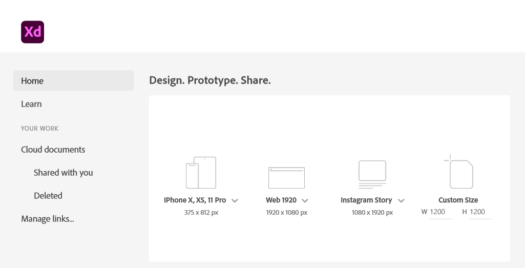
Step 1. Start by creating an artboard in Adobe XD. It doesn’t matter which you choose, you can create multiple artboards of different sizes within each Adobe XD file.
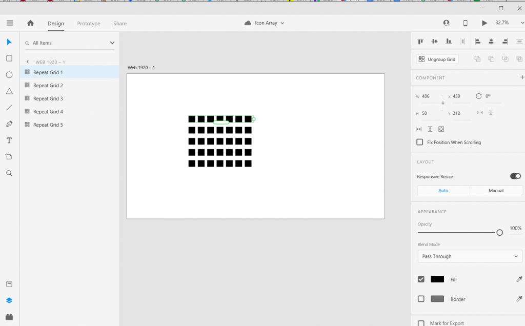
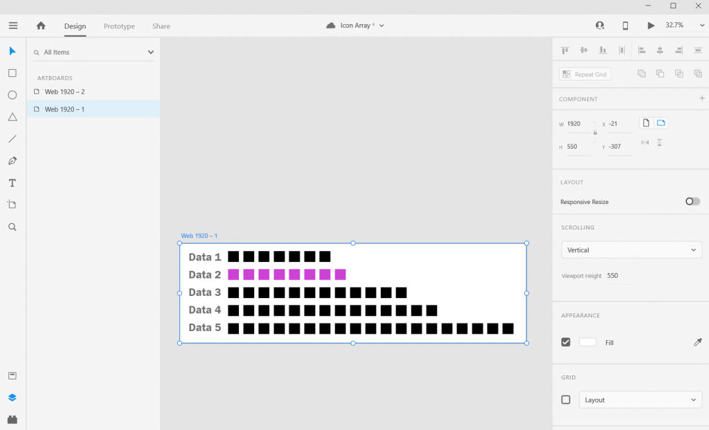
You should also have some data… I’ll just use some random numbers: 7, 8, 12, 14, 19.
Step 2. Draw a square by clicking on the little square icon and drawing it on the artboard (you can also change the fill color if you’d like). It’s okay if it’s not a perfect square, we’ll fix that in the next step.
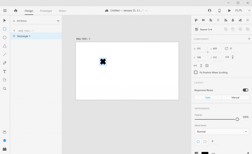
Step 3. Adjust the size of the square using the panel in the upper right hand of the screen. I’ll make mine 50 pixels wide by 50 pixels tall.

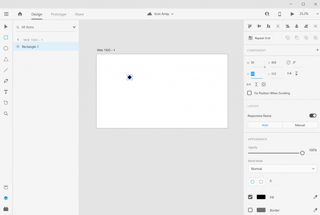
Step 4. Use “repeat grid” to copy the square across, till you have the number you want to visualize (in my case, 7).
Step 5. Now Copy/Paste your Grid so you have 5 rows, then drag them apart to create the series.
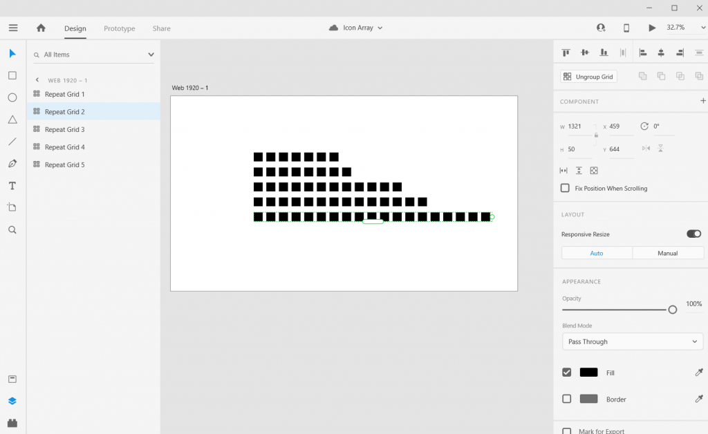
Step 6. Now drag out each row until the number of boxes match the frequency you are trying to visualize.
And there you go, you have an icon array chart.
How to do more with your Icon Array.
Okay, so now you know the basics, let’s look at what else you can do. Adobe XD is a design program, not a spreadsheet. What you lack in automatic charting, you gain in complete control over formatting.
Stretch and Skew
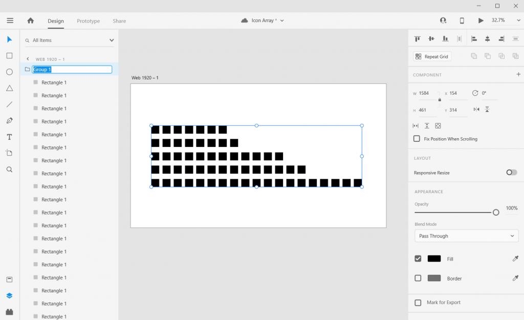
Adobe XD is a vector design program, so you can stretch and skew to your heart’s content without sacrificing quality. Usually I will ungroup all of my individual grids, then group all the squares together. This lets me lock the proportions and turn off the responsive resize. This let’s me move the chart around without changing the initial look.
Adding Color
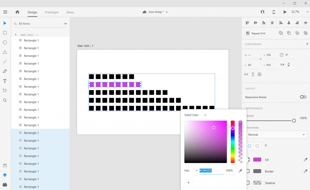
Add color by just selecting a square and then clicking on the box next to “Fill/Border.”
Adding Labels
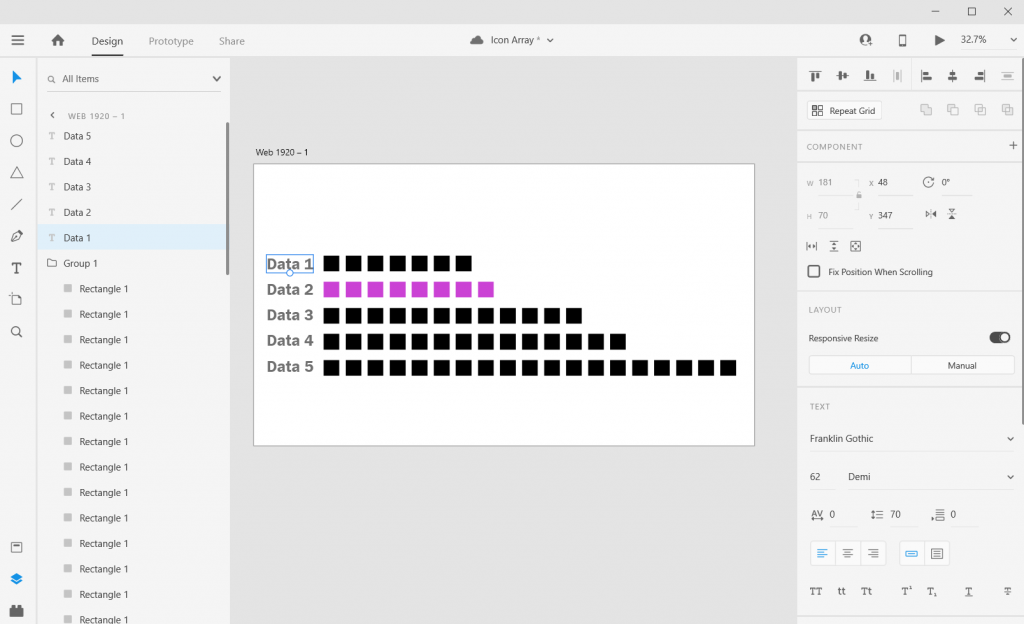
Add labels by clicking the “T” icon and entering the text somewhere on the page. You can easily shift the text placement, change the size, change the font, or change the color.
Adjusting the Art Board
Adjusting the art board is as simple as adjusting the size of any shape within the artboard. Just click on the artboard title, you’ll be given the ability to drag the sides (or you can just change the pixels in the W & H boxes on the right side of the page).
Shapes, Icons, and Pictures
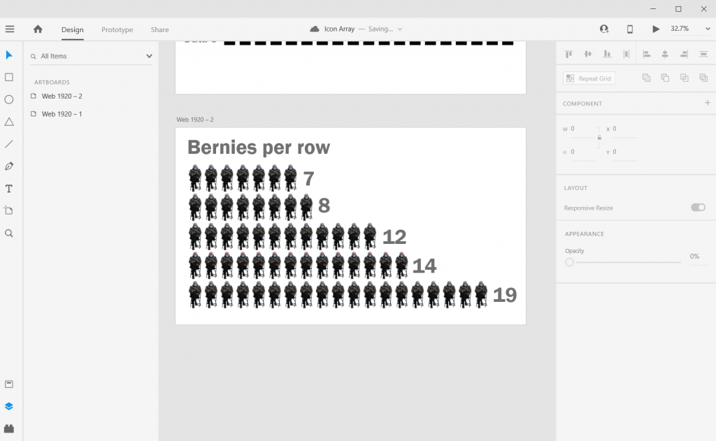
You can create an icon array using this approach with any kind of icon you have. It can be shape you’ve drawn (like the first example), an icon you pulled from a site like the Noun Project, or a picture (like the Bernie Sanders meme cutout).
Alternate Shapes and Sizes
You can also copy/paste or duplicate artboards. This lets you create all sorts of different shapes and sizes for different dissemination tools.
Beyond the Basics
This is just the basics. There are all sorts of things you can do with Icon Arrays in XD.
Icon Arrays, in my personal opinion, are vastly underutilized. Most of your basic charts (bar charts, line graphs, pie charts, etc.) don’t show you the values underlying the visual.
For example, say you have two equal bars, each would show you 50%. In one chart you have an “n” of 2. In the other chart you have an “n” of 1,432. These are very different datasets but the bar charts would look identical. The icon arrays would provide you with more depth.
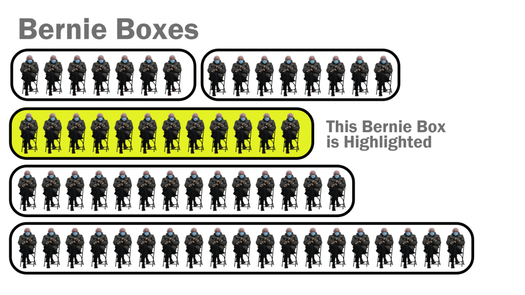
Icon arrays can also help you individualize the data. If each point represents a person, knowing that as a reader can help you connect with the data.
Icon Array Inspiration
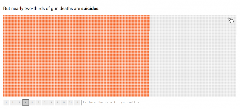
So this Icon Array by Ann K Emery is a pretty simple visual. A lot of Icon Arrays you see in the wild tend to be alternative pie charts using a base 10, 100, 1,000, etc. and highlighting a proportion.
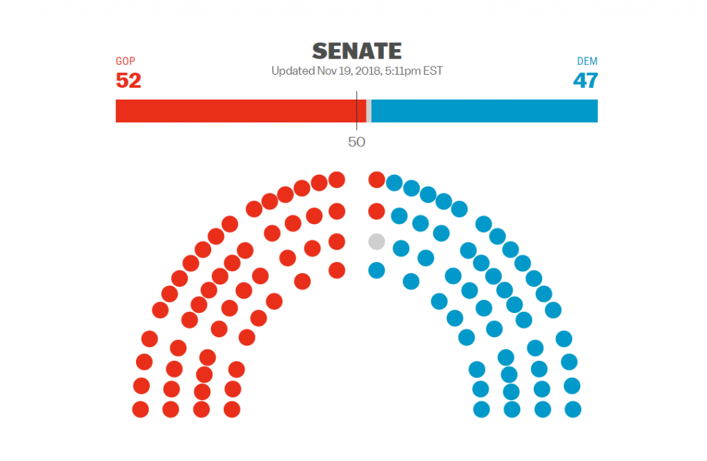
Icon arrays have been seen more often in election data in recent years. This icon array mimics the look of the U.S. Senate chamber.
Icon arrays can also make really easy interactive visuals. Take this Senate chart for instance, each dot represents a senator. If you wanted, you could create an interactive version where you highlight a dot and the individual Senator appears in a pop-up box.
Icon arrays also make for really good story telling visuals. It let’s you dive into the data, using annotations to highlight individuals as well as groups of people.
If you’re interested in a short course on icon array design, part of my free Data Viz for Anti-Racism course walks through the process of creating an icon array infographic.
